Celebrates World Art Day with Dulwich PICTURE Gallery: Discover the latest exhibition Soulscapes
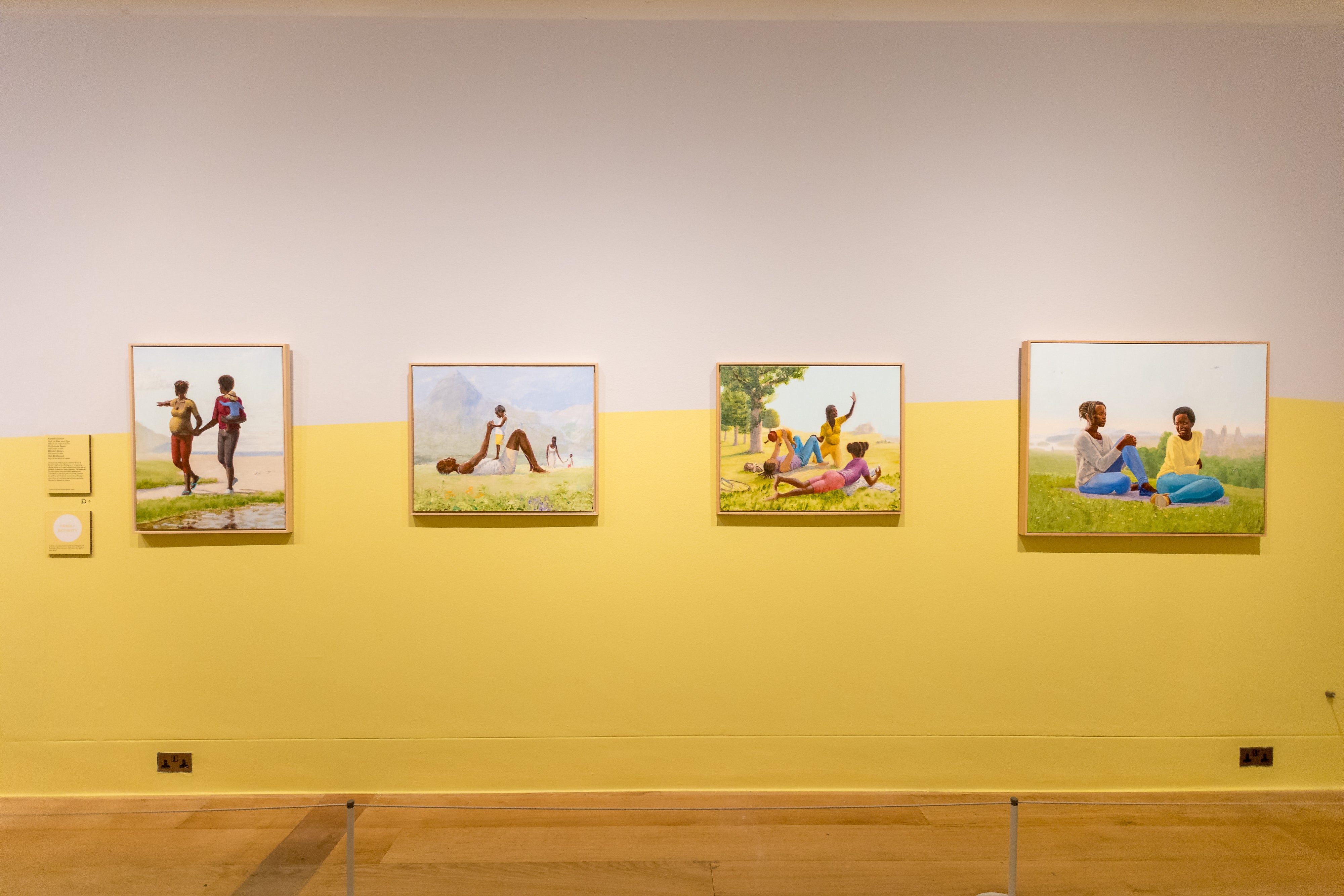
From Left: Idyll of Abar and Piye (2020); Mumbi's Return (2019); On Episode Seven (2020); and Call Me Blessed (2016) by Niru Ratnam
Walls in Verdure Yellow™ No.148 paired with Sloane Square™ No.92
Longstanding partner of Mylands, Dulwich Picture Gallery is showcasing its latest exhibition, entitled 'Soulscapes'. This exhibition, curated by Lisa Anderson, showcases 30 contemporary works spanning across a number of mediums including painting, collage and tapestry, created by leading artists from the African Dispora.
'Soulscapes' aims to show the power of the landscape, our connection with the world and exudes themes of joy, belonging, memory and transformation. Artists include Hurvin
Anderson, Phoebe Boswell, Njideka Akunyili Crosby, Kimathi Donkor, Isaac Julien, Marcia
Michael, Mónica de Miranda and Alberta Whittle, alongside a number of today's emerging artists.
Mylands is delighted to support each exhibition narrative with its high quality paint. Exhibition designer Melanie Mues takes us behind the scene, discussing the Exhibition palette and its unique split wall design. Explore the exhibition and discover interior design looks featuring the Soulscapes colour palette.
SOULSCAPES: DISCOVER THE EXHIBITION COLOUR PALETTE
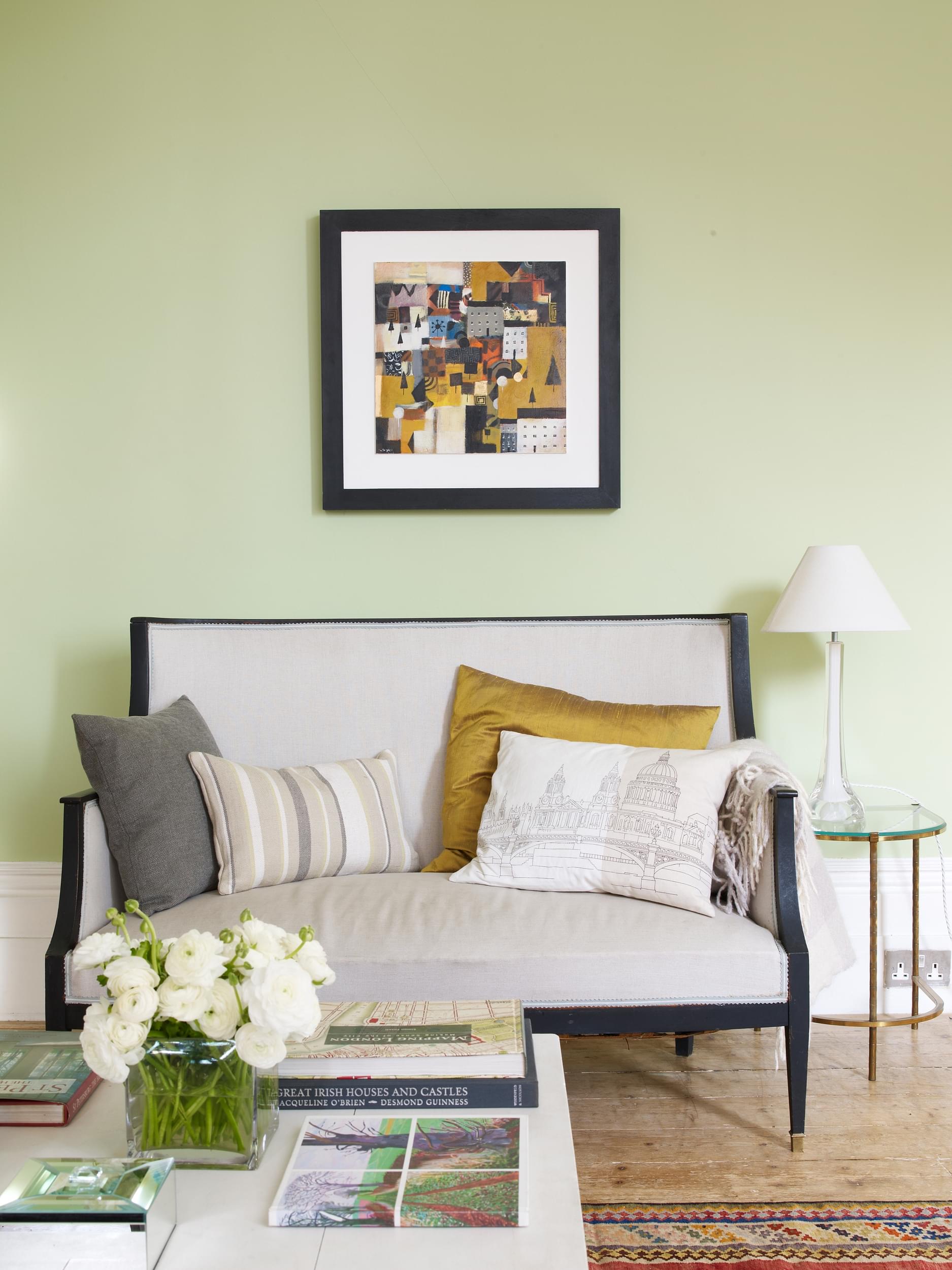
Walls in French Green™ No.187
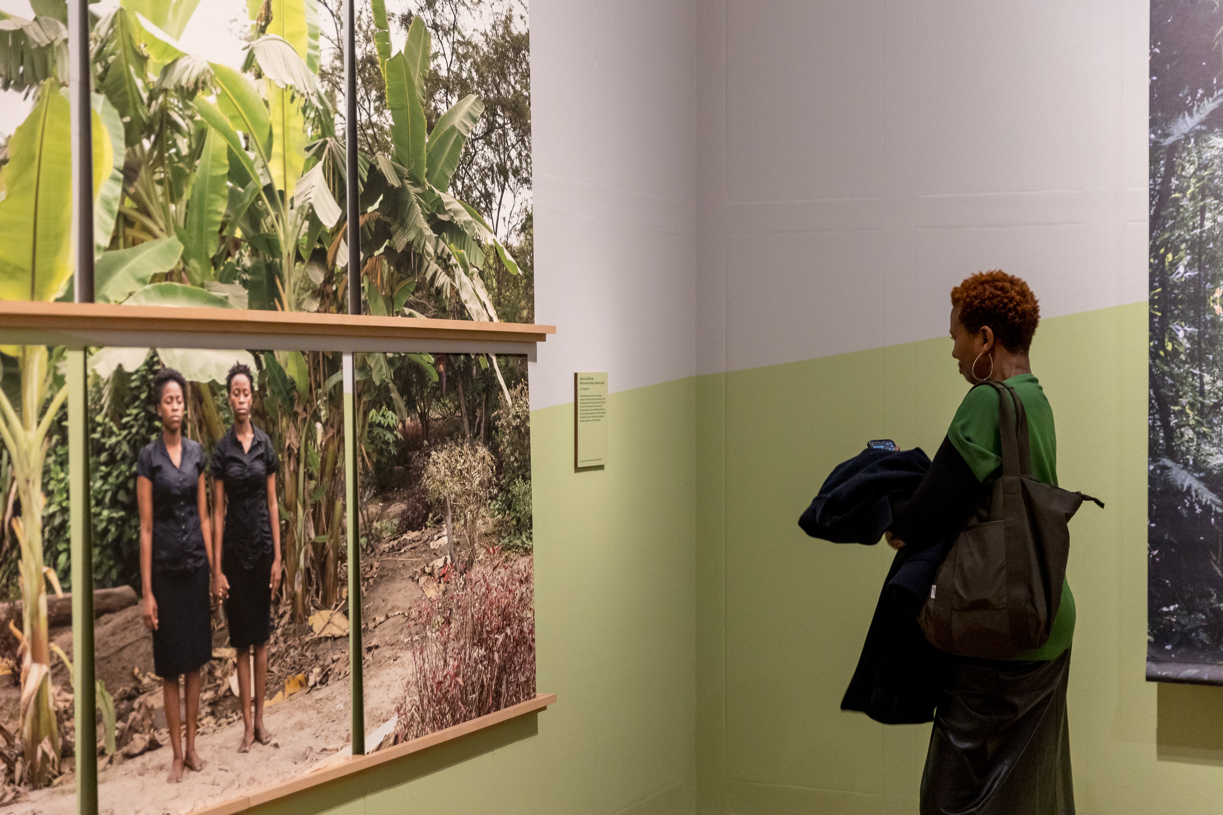
When Words Escape, Flowers Speak (2017) by Sabrina Amrani Gallery
Walls in French Green™ No.187 paired with Sloane Square™ No.92
FRENCH GREEN™ NO.187
"I was directly inspired by the works in each room – by their mood and colour. As you walk down the linear route of the exhibition, one notices a change of mood [...] Green was the obvious choice for the first room, as it is a classic colour to depict landscape. The pale green supported the artworks rather than over-power them. All colours in fact are supporters, not competitors." - Melanie Mues

Walls in French Green™ No.187
French Green™ No.187 is based on a historic colour that played a pivotal part in interior design during the 19th century. It is a soft pastel hue that gives brightness, vibrancy and a fresh feel to any atmosphere. Coupled with being both timeless and stylish, it allows for an everpresent injection of lushness and joie de vivre. Pair with a white primer and undercoat
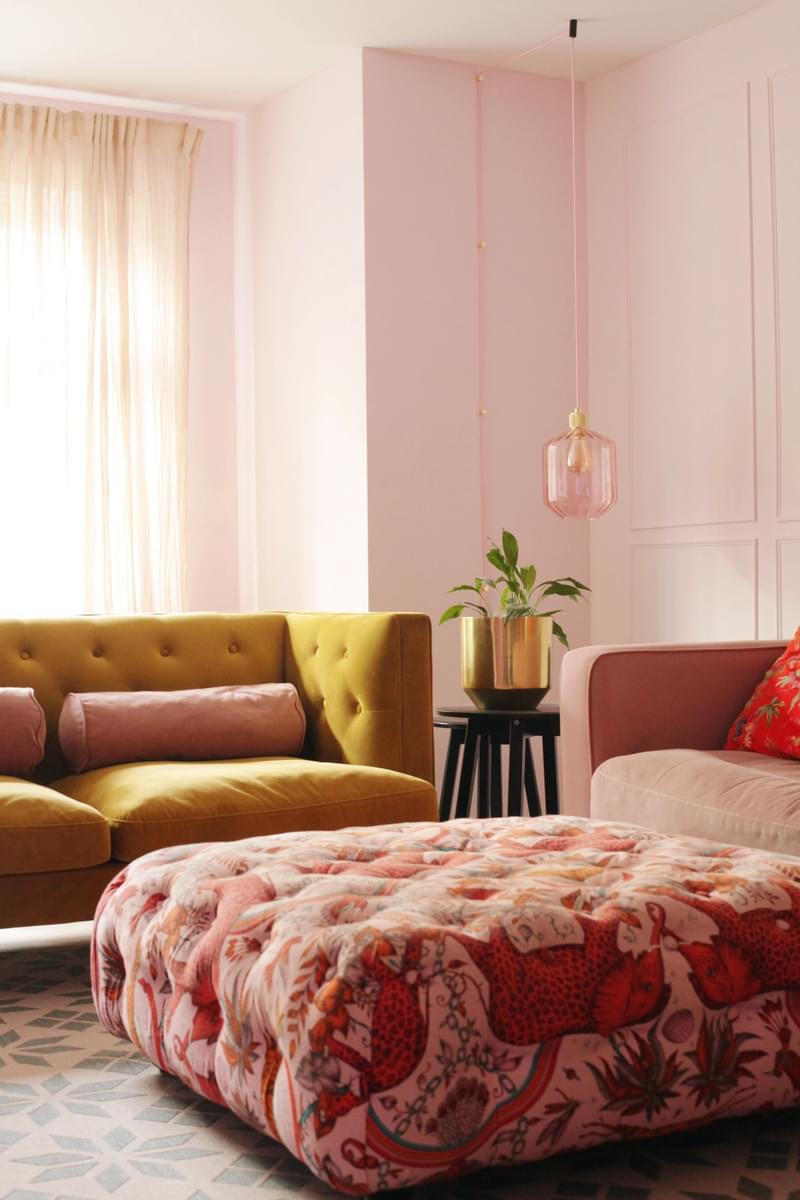
Walls in Floris™ No.27
@halfpaintedhouse
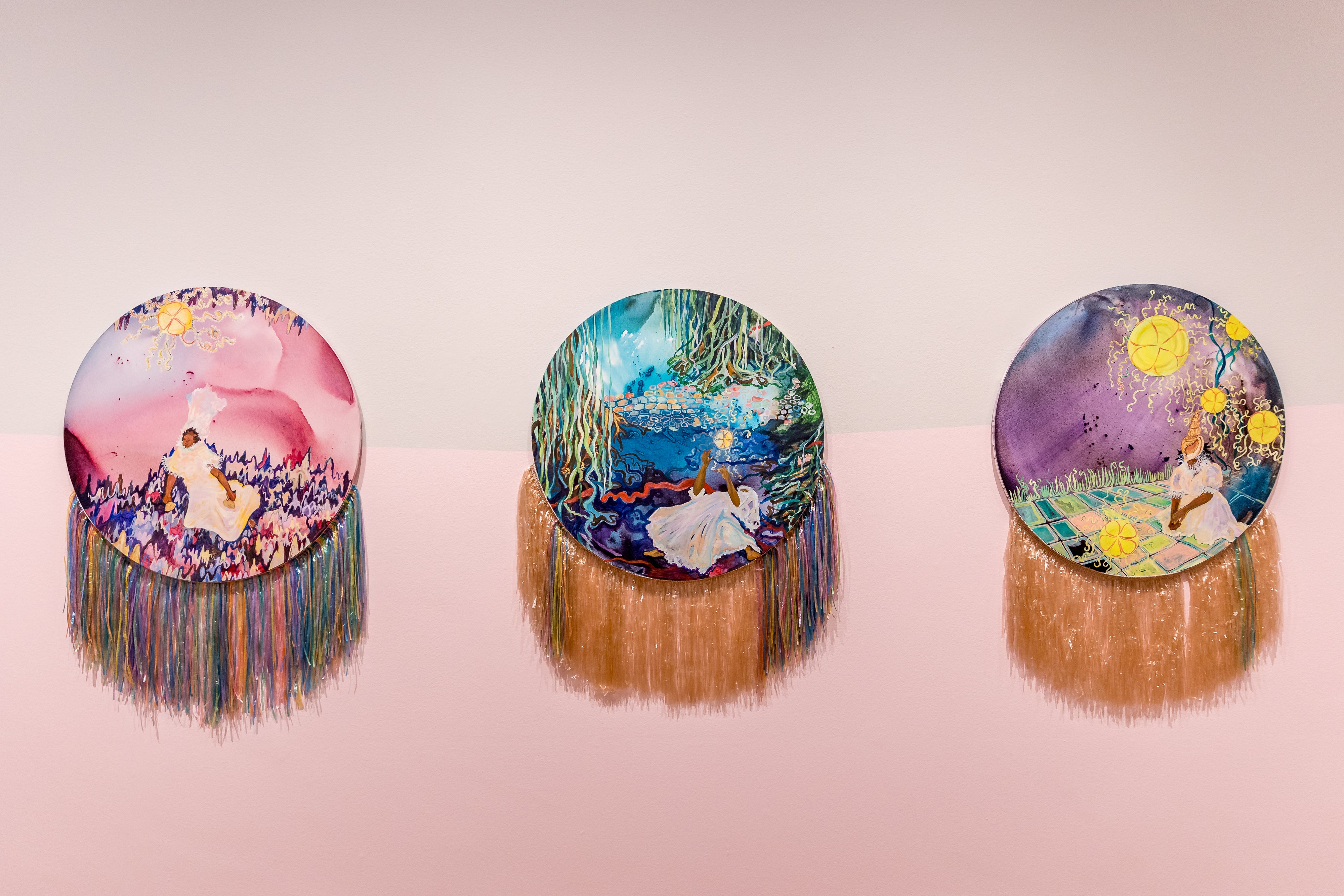
From Left: Listening To My Breath Falter, I Lay Suspended In The Guilty Trustful (2023); When Water Holds Sand, We Vibrate Towards Recovery (2023); Unlearning Lessons And Moving Towards A New Way (2023) by Alberta Whittle and The Modern Institute
Walls in Floris™ No.27 paired with Sloane Square™ No.92
Floris™ No.27 received its name from the iconic London perfumery and is a pretty pale pink that envelopes sophistication whilst leaving a striking reminder. With an umber undertone, Floris™ No.27 brings depth and beauty for a dream inspired feel. Couple with a white primer and undercoat.

From Left: Listening To My Breath Falter, I Lay Suspended In The Guilty Trustful (2023); When Water Holds Sand, We Vibrate Towards Recovery (2023); Unlearning Lessons And Moving Towards A New Way (2023) by Alberta Whittle and The Modern Institute
Walls in Floris™ No.27 paired with Sloane Square™ No.92
FLORIS™ NO.27
"The very pale pink in the following room ‘Memory’ was the perfect partner for the green room, the transition looked great. The colour was inspired by Alberta Whittle’s work ‘Listening to my breath falter, I lay suspended in the gully, trustful (2023). The soft, dream-like pink staged a very low contrast to the grey in the upper part of the room (the sky), so that the entire room felt airy and wide." - Melanie Mues
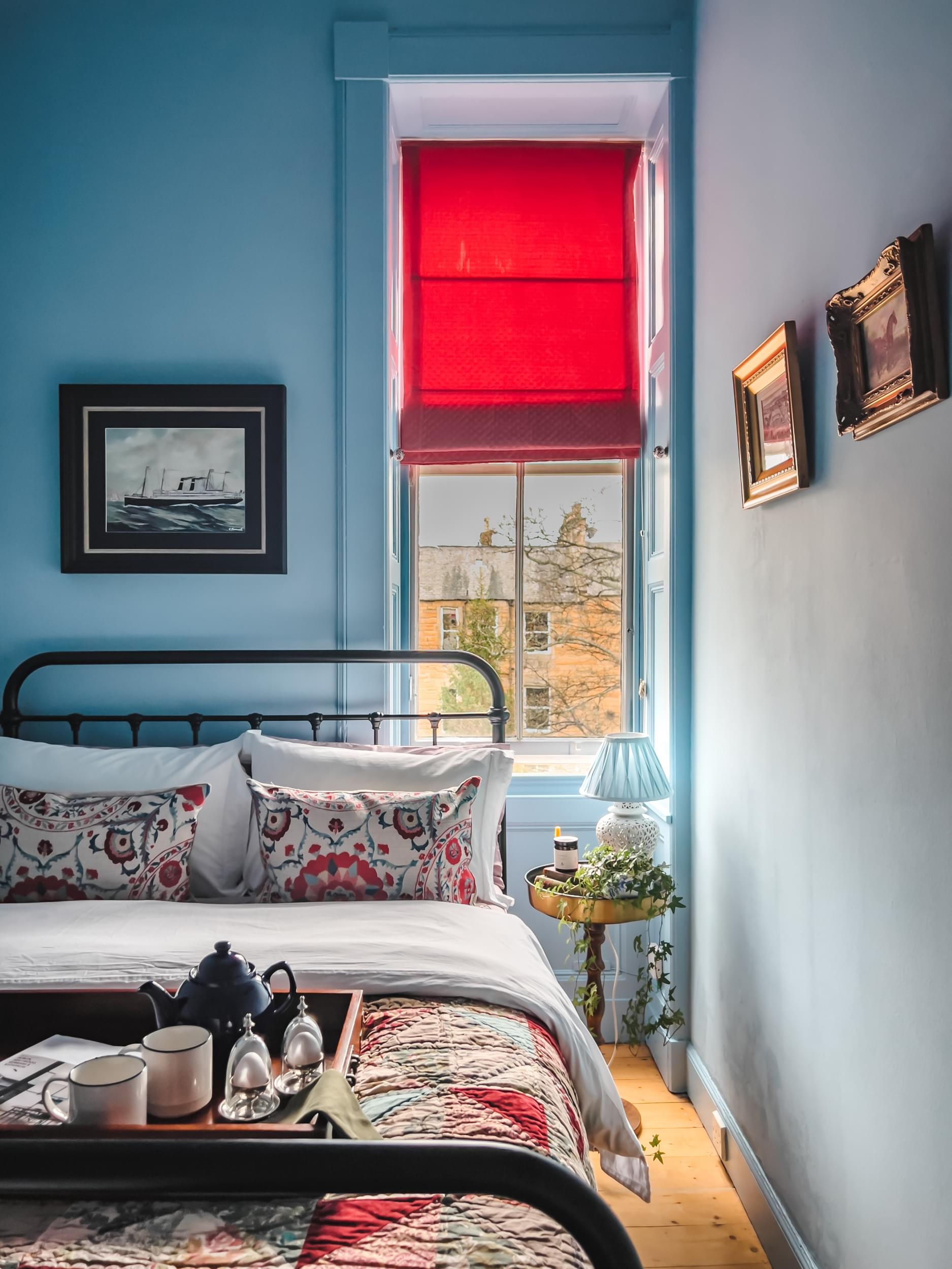
Walls in Bedford Square™ No.229
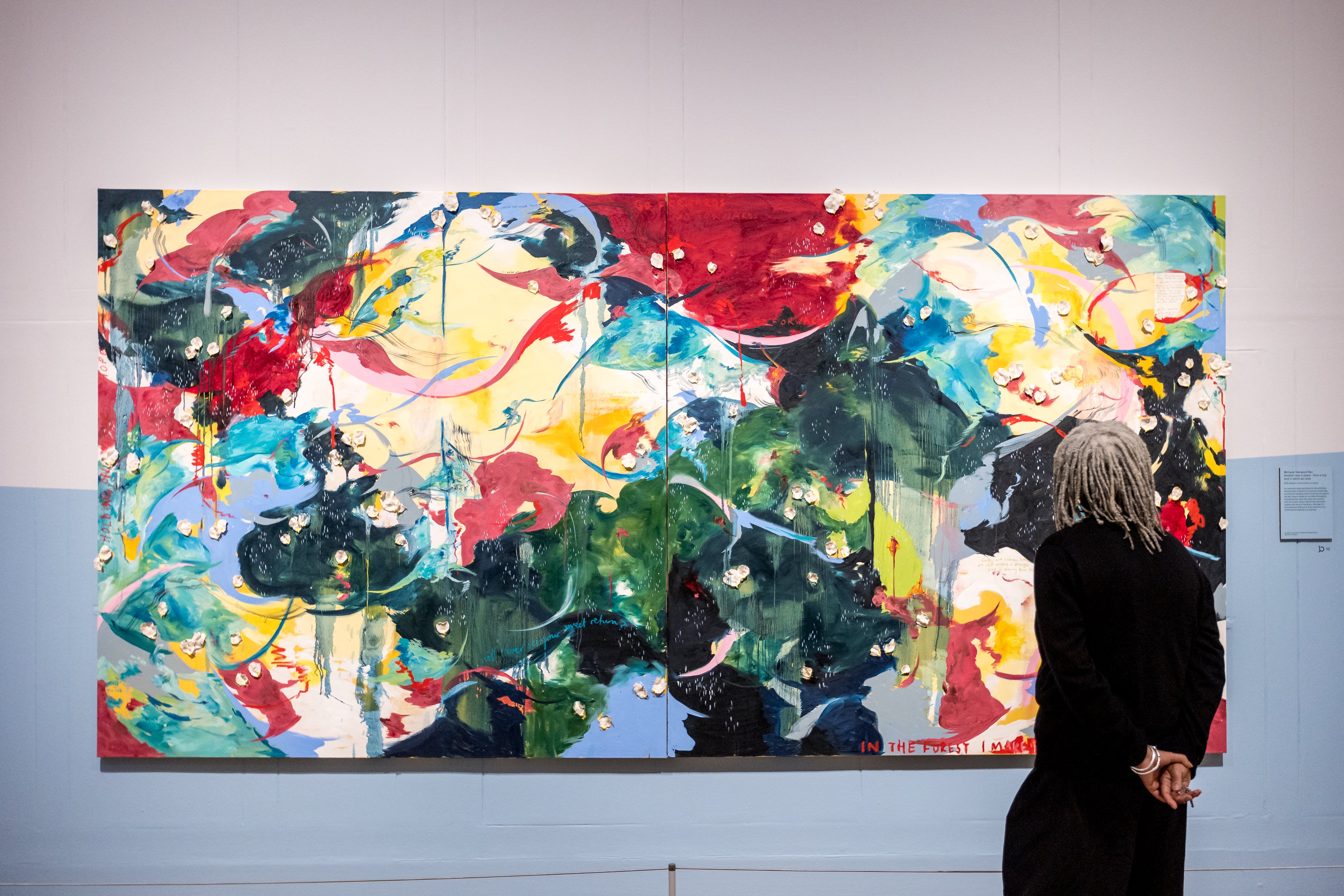
Another Rest In Peace - From A Holy Land In Which We Cam (2023) by Michaela Yearwood-Dan
Walls in Bedford Square™ No.229 paired with Sloane Square™ No.92
BEDFORD SQUARE™ NO.229
"The muted blue of the last room (transformation) brought out the blues in the paintings present here. It’s a thoughtful and calm room. The paintings here are large scale and immersive,
the wall colour is the ideal backdrop in this room allowing the paintings to tell the stories." - Melanie Mues
Bedford Square™ No.229 brings a calming element to the spaces you most relax in. It is reminiscent of clear skies on a summer day, evoking joy and happiness whilst bringing a sense of tranquility and peacefulness. Use with a white primer and undercoat.
Soulscapes is running from 14th February until 2nd June 2024. Book your tickets here.
BRING THE LOOK HOME: EXPLORE SPLIT WALL PAINTING
SLOANE SQUARE™ NO.92
Stylish, refined and elegant this classic off-white is named after the London square.
A pale neutral with hints of yellow and violet which create an off-white paint that looks slightly warm or cool depending on its surroundings. Slightly darkened with black, Sloane Square™ No.92 is traditional, stylish and sophisticated.
Sloane Square is a perfect neutral to create a unique interior look with half painted walls. A featured used by many interior designers, split wall painting is a great way to add a unique feel to a space. It will help make your artworks standing out and create a new narrative in the room.
Half painted walls can also help make a room with very high ceiling or very large more warm and comfortable.
With a graphic pattern and diagonal lines as cleverly used at the Dulwich Gallery, dividing your wall space can as well give an additional sense of space increasing perspectives and giving additional length to a wall.
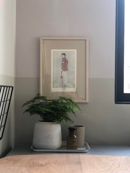
Walls in Sloane Square™ no.92 (Upper Walls) Ludgate Circus No. 89 (Lower Walls & Skirtings)
Home design by @House Obsessed


