Paint Meets Pattern
"Wallpaper never exists in isolation, it's part of a wider conversation in the room. Pairing it with paint felt like a way to guide that conversation, so everything works together from the outset." - Annika Reed
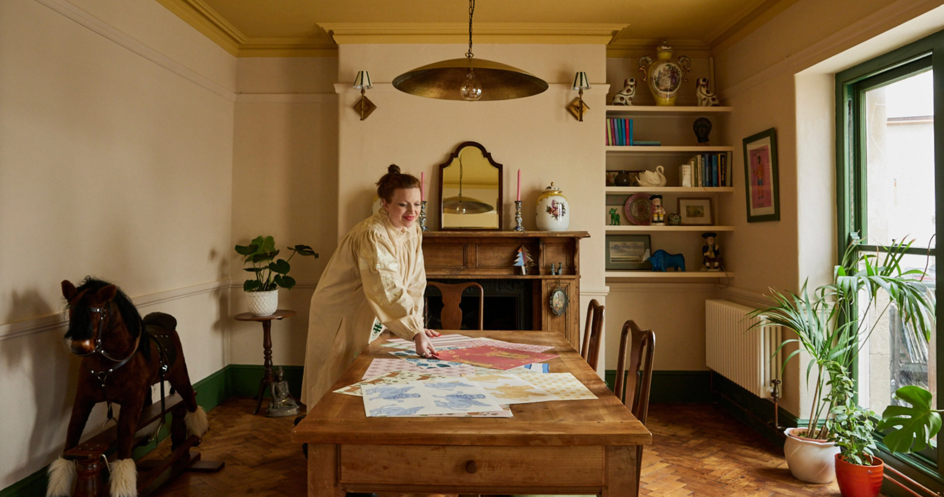
In a world of mass produced interior design choices and trend-driven aesthetics, Annika Reed stands apart as a designer deeply rooted in craft, storytelling, and tradition. Driven by the allure of the absurd, Annika infuses her work with a unique blend of historical and folklore influences, all offered up through a lens of whimsical irreverence.
A two-time award winner, Annika designs wallpaper and prints, using traditional printmaking techniques. Her playful designs weave narratives that bring life to the spaces they are installed in.

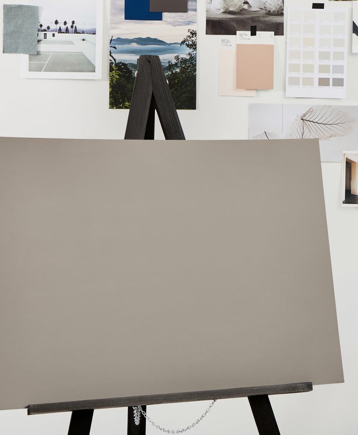
Annika Reed in her studio
Annika's process is meticulous and expressive, allowing each line and layer to contribute to a broader story. There is an intimacy in her work and an understanding that pattern is not only decorative, but emotive. Each design invites the eye to linger, revealing playful and joyous details with subtle narratives that unfold as you take it in.
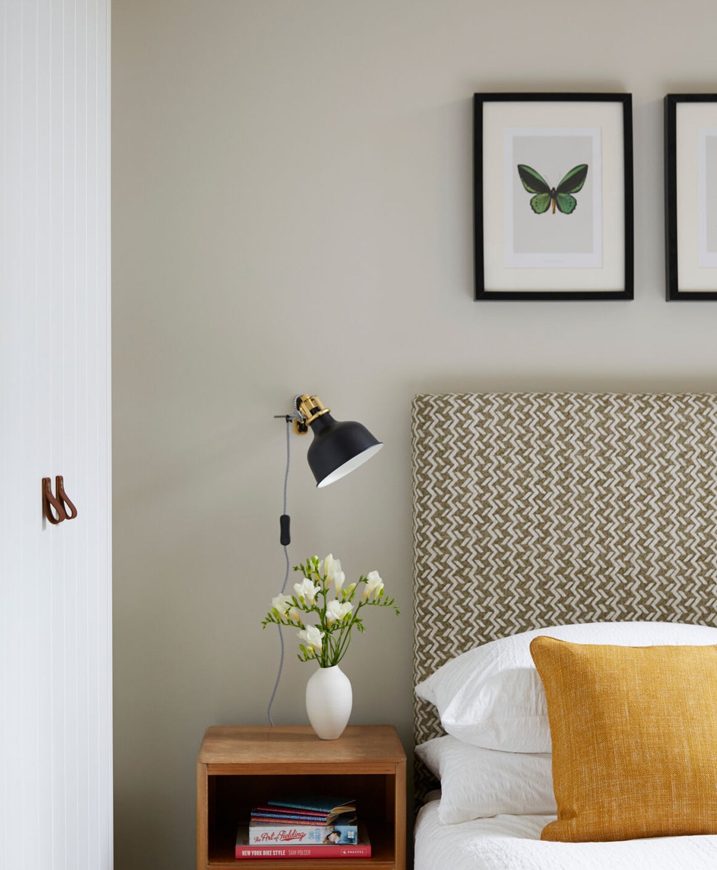
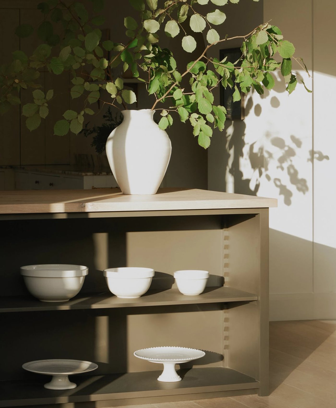
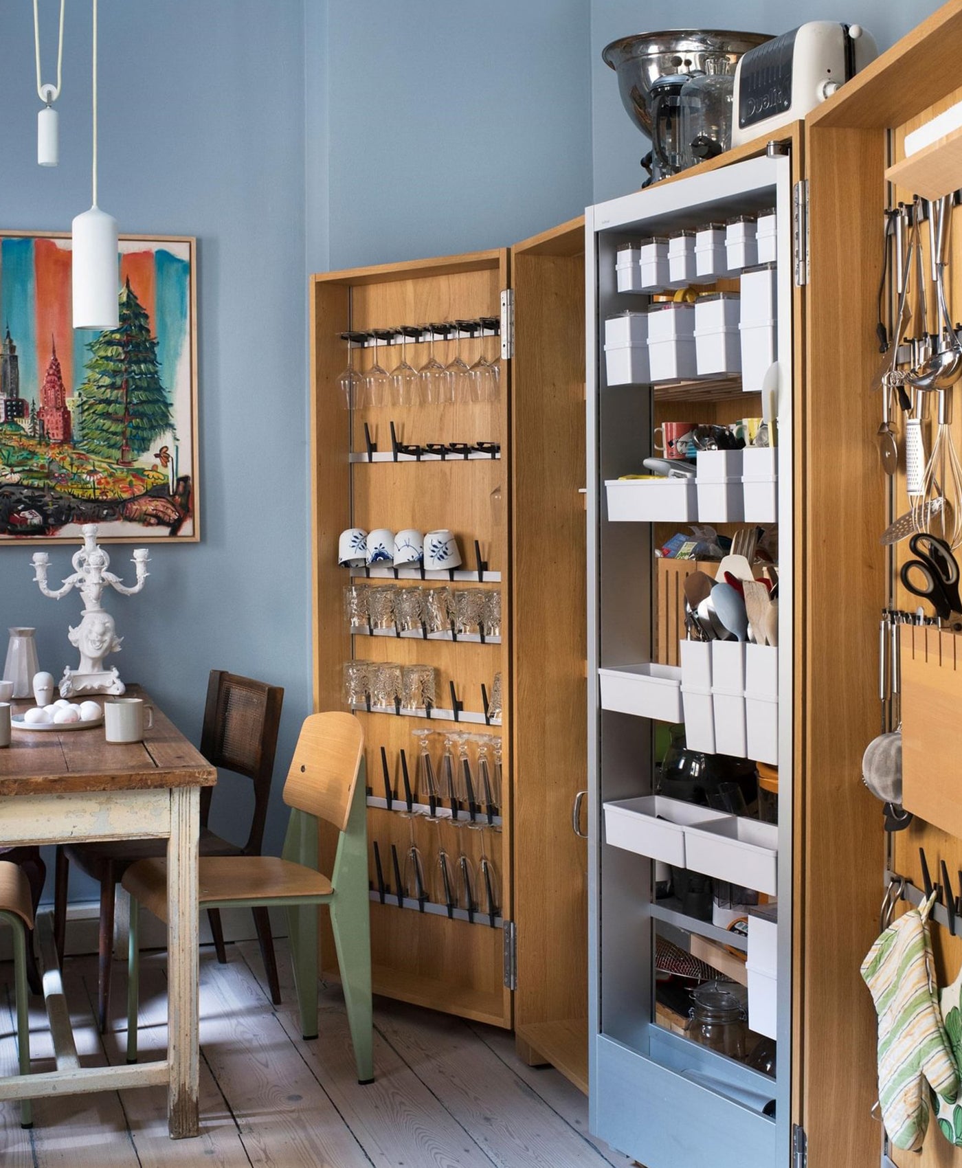
It is this shared appreciation for craft and depth of colour that forms the foundation of her collaboration with our paints. Annika has carefully selected shades from our collections to sit alongside her wallpapers, creating combinations that feel harmonious and dynamic. The interplay between paint and pattern is deliberate with each element evaluating each other.
Annika says "One of the main things that put people off buying wallpaper is not that knowing what colour paint to pair it with. I wanted to make it easier and more streamlined for people".
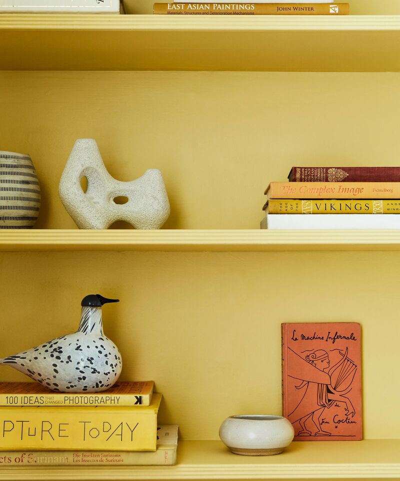
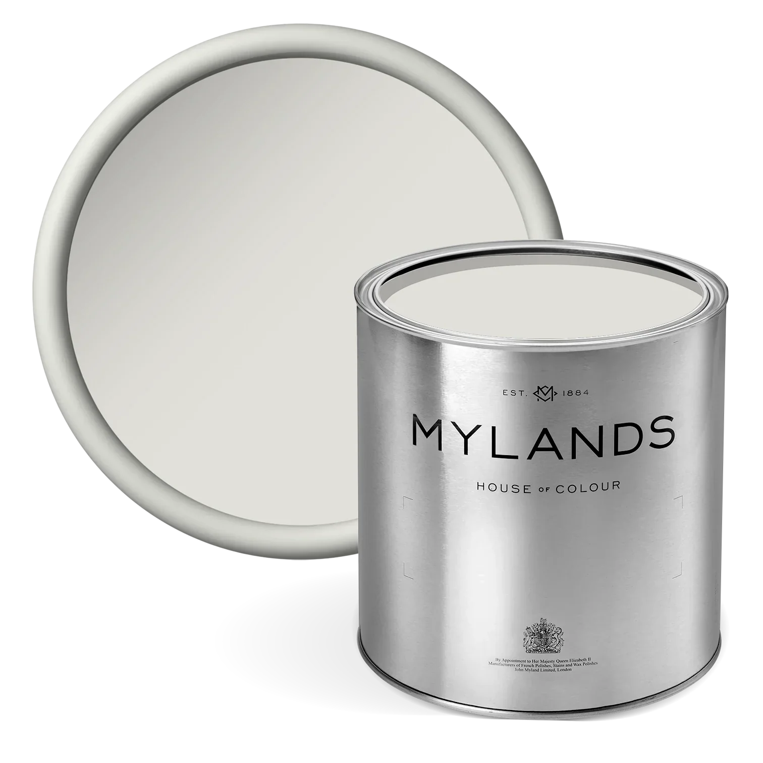
Tones of Sunshine

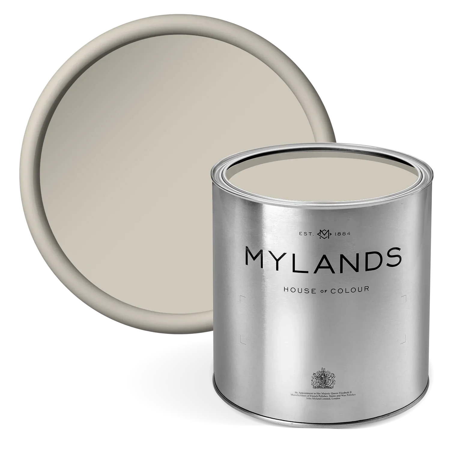
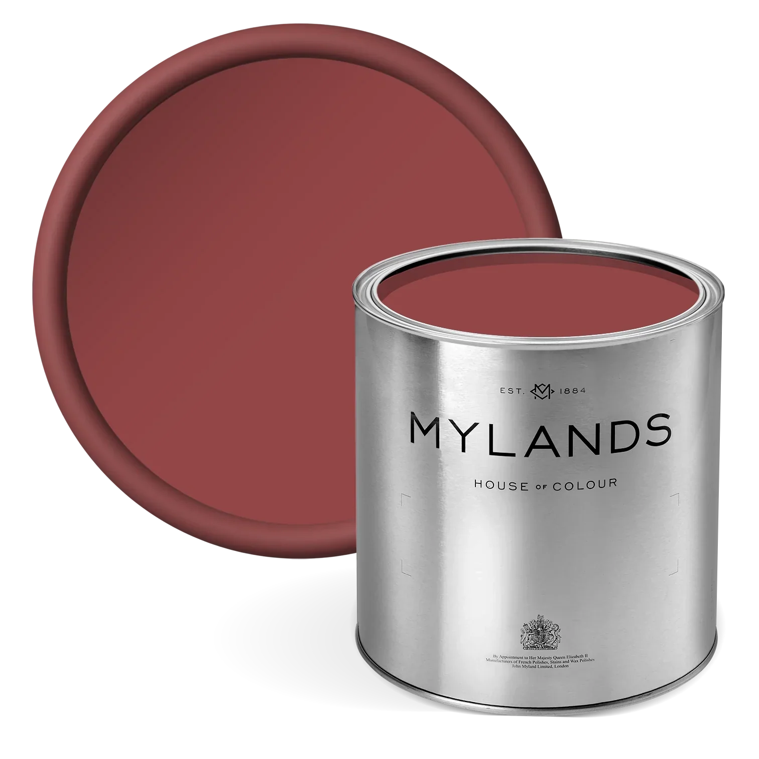
Displayed Left: Sunshine Masquerade with Wharf Sacking™ No.127, Eaton Square™ No.232and Arts Club™ No.281Right: A Muggle of Jugs with Honest John™ No.58 ,Henna BH.18 and, Wheatsheaf BH.23.
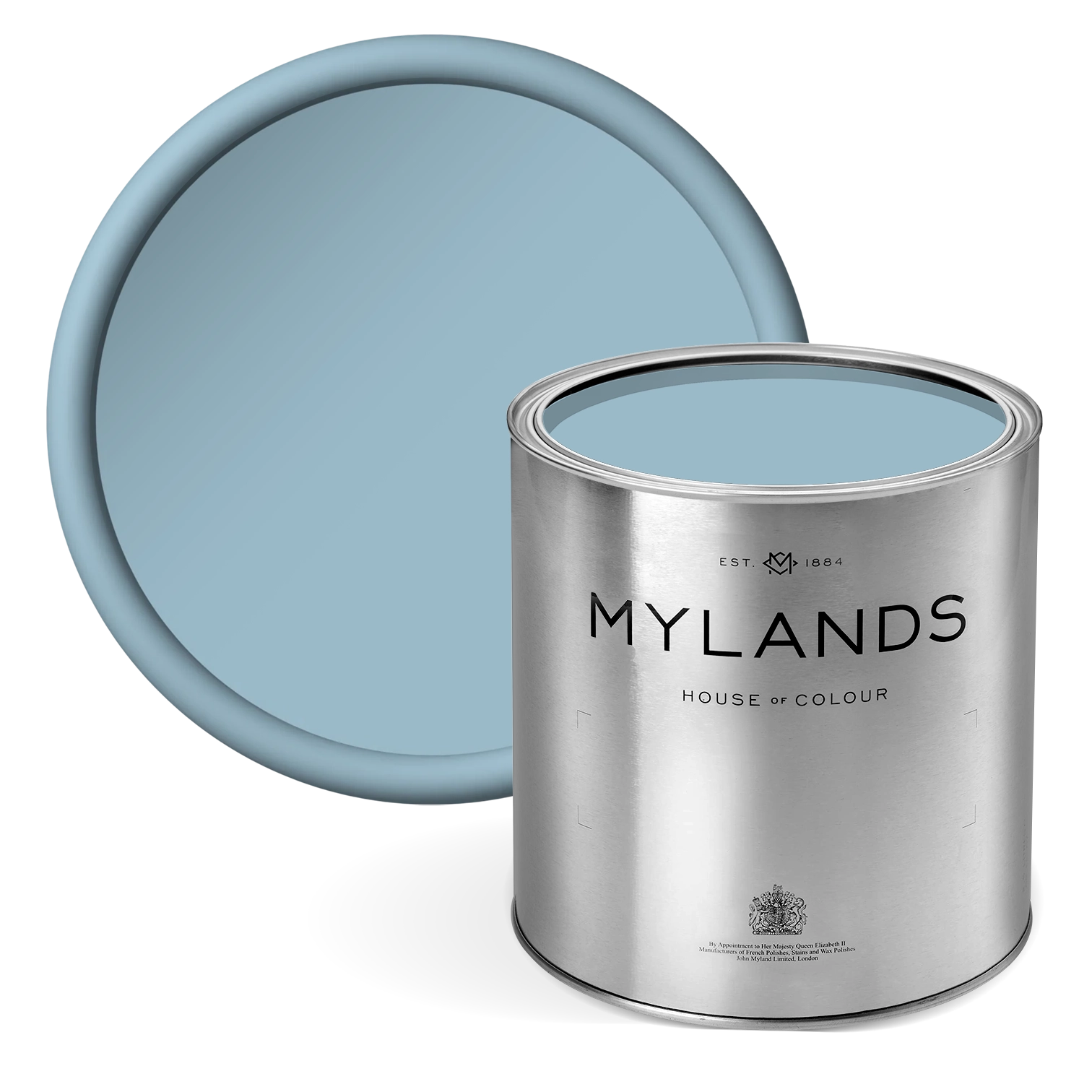
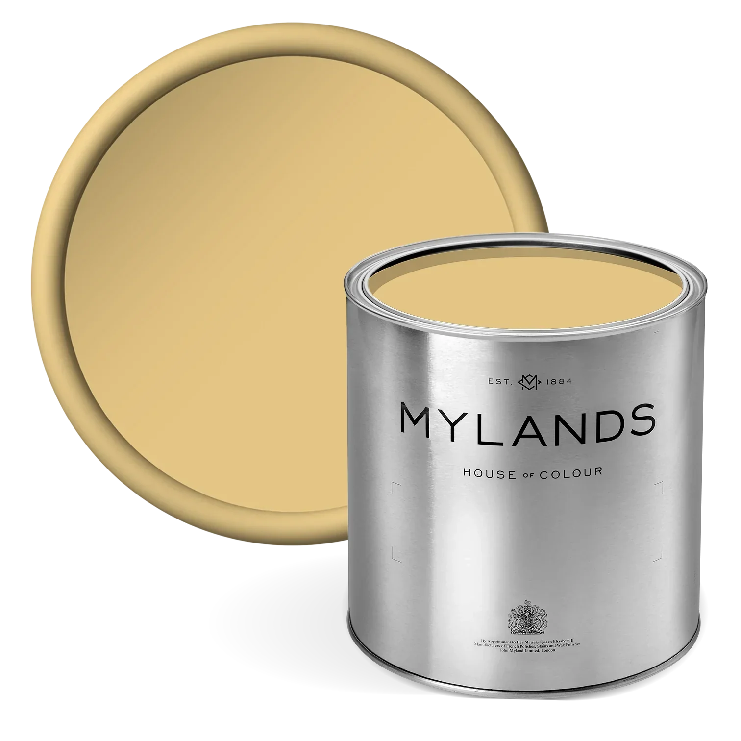
Sunshine Masquerade is a joyful celebration of the circus's vibrant spirit, bring the warmth and energy of the sun into your space. To compliment its motif, Reed has chosen a trio of warm shades to bring out its whimsical radiance. It's first component consists of Wharf Sacking™ No.127, a shade that represents the traditional sacks in which we still receive raw materials from India. Its tones of deep yellow and cream allow it to provide the perfect sunny balance. Eaton Square™ No.232 and Arts Club™ No.281 bring forth feelings of cosiness, warmth and happiness with their depth and softness.
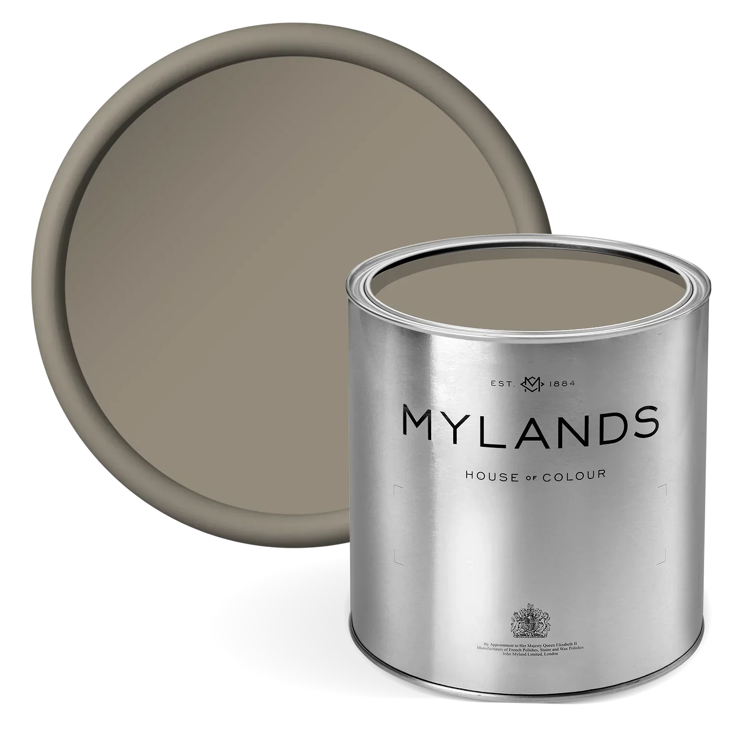
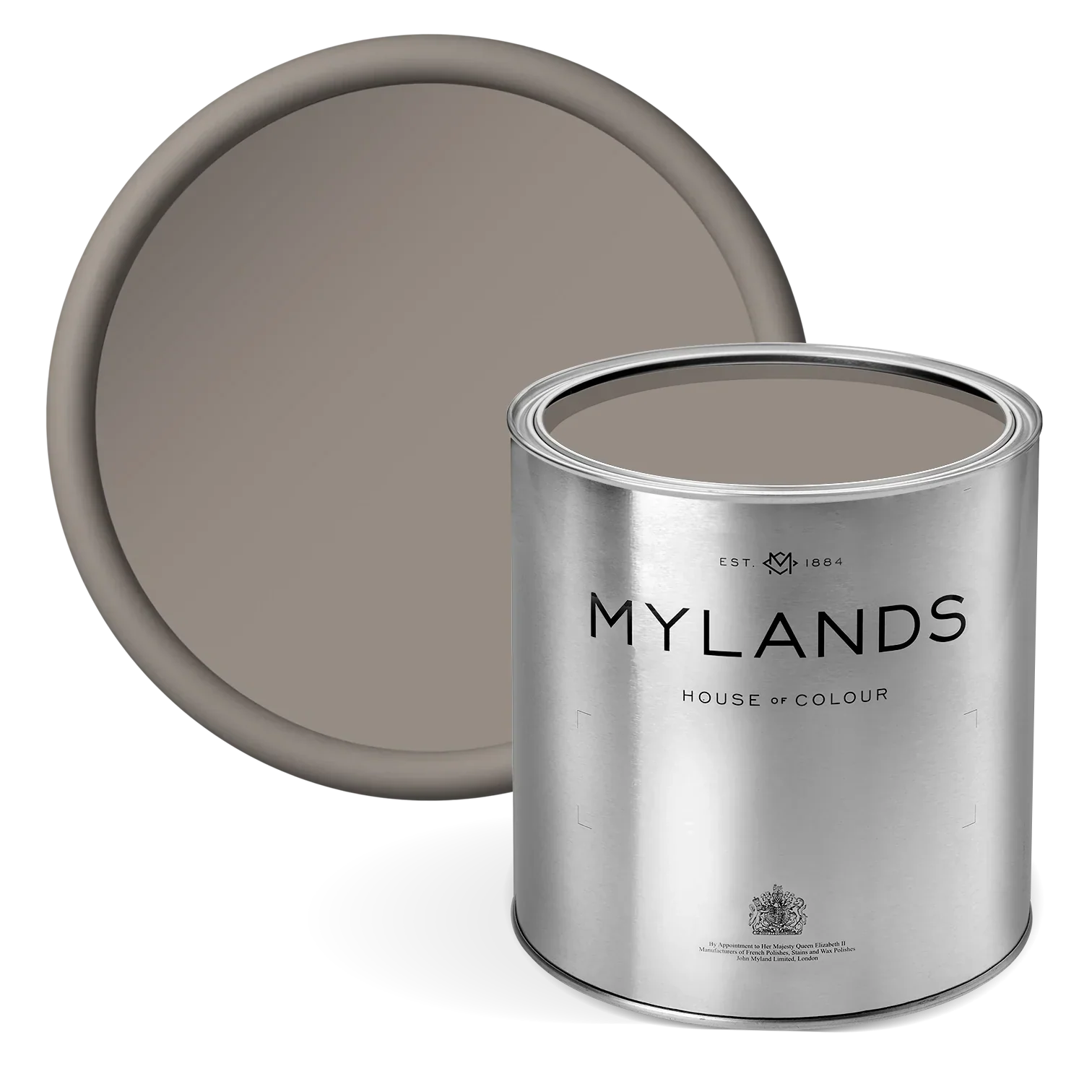
Inspired by Athena the goddess of wisdom, war and crafts, A Muggle of Jugs is a playful pattern that transports you back to the wondrous ancient Greece. This has been paired with a terracotta palette of Honest John™ No.58, Henna BH.18 and Wheatsheaf BH.23. Such colours evokes elements of a rich, earthy warm that bring that gentle, lived-in softness. With understated tones of beige, terracotta and a muted, golden hue, together they amplify the sunlit depth and natural elegance of the fabric.
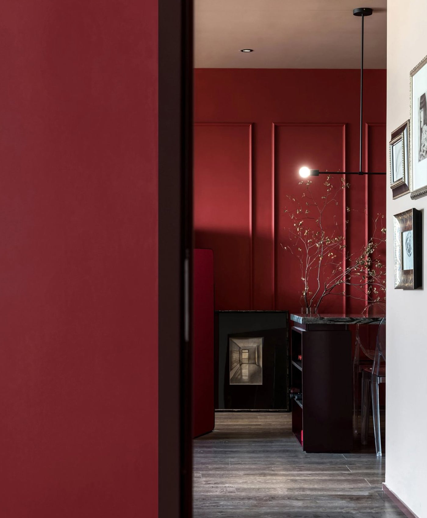
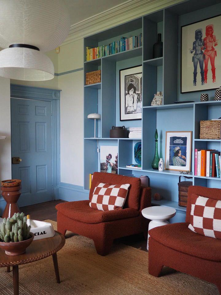
A Blue Lagoon

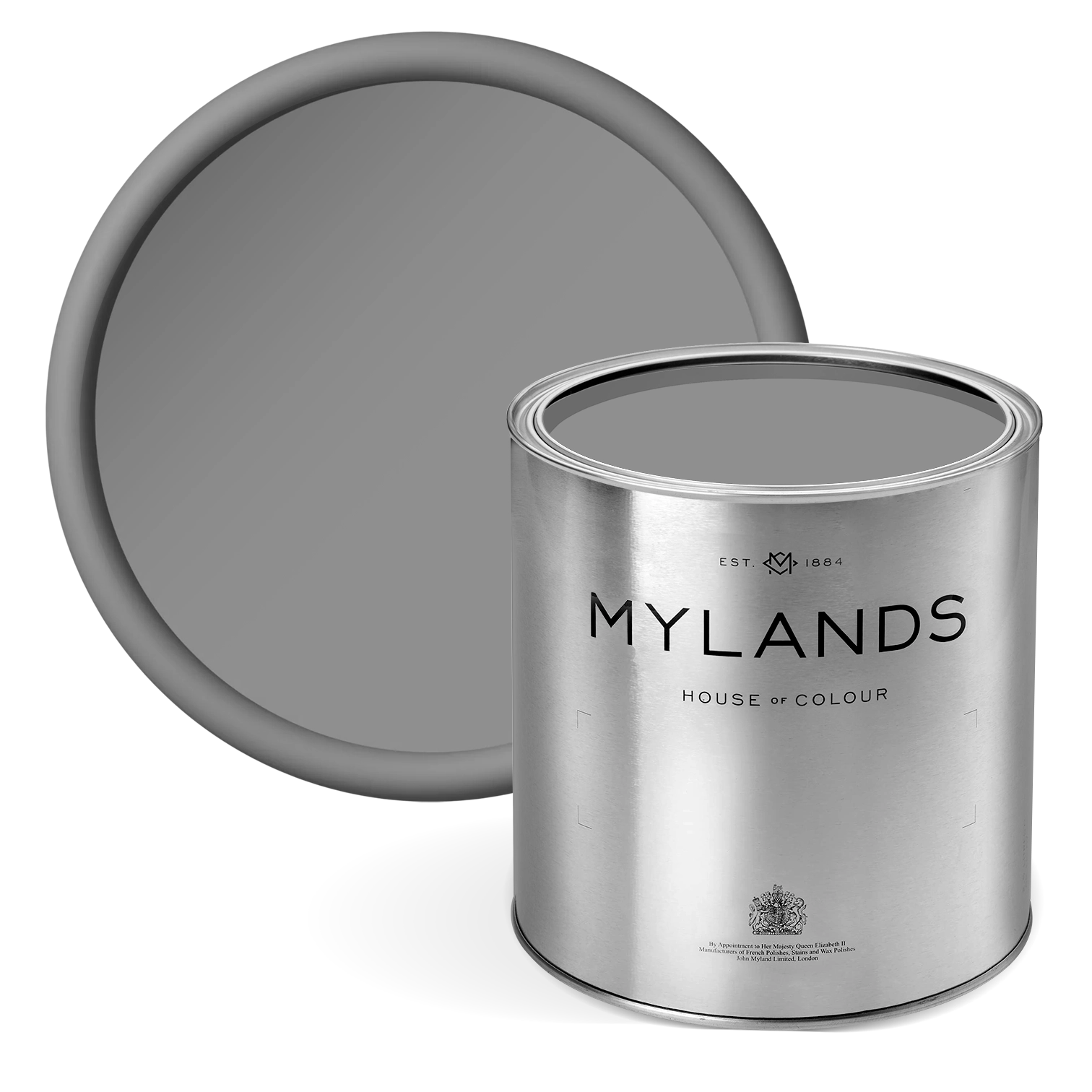
Displayed: Left: Mermaid with Temple Bar™ No. 70 , Bloomsbury™ No.267, and Long Acre™ No.102. Right: Balancing Act with Acanthus Leaf™ No.12, Henna BH.18, and Burlington Arcade™ No.216
On the left is a wallpaper called Mermaid, a pattern highlighting the enchanting depths of the ocean. By capturing the mystique of the sea, this design weaves together sailors' legends and mermaid lore, where laughter and tales drift on coastal breezes. Paired with the soft trio Temple Bar™ No. 70, Bloomsbury™ No.267, and Long Acre™ No.102. These shades bring forth notions of the spring and the ocean at its most peaceful rest.
The pattern on the right is perhaps more of a British inspired combination. This pattern is called Balancing Act, where every stripe tells a story of circus elegance and coordination. Alongside it sits Acanthus Leaf™ No.12, Henna BH.18, and Burlington Arcade™ No.216.
This richly balanced combination, allows for a grounded, calm and elevated structure within your interiors. Placed next to a stripe like this, it would evoke a contemporary look while bringing that heritage and style.
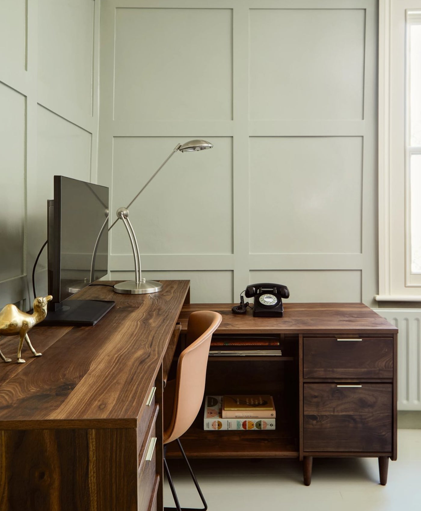
When asked what her favourite Mylands colour is, Annika says "I love blue so Eaton Square™ No.232 is one I return to often. It has depth without heaviness and shifts beautifully with the light, it feels steady and easy to live with."
Between Forest and Sea

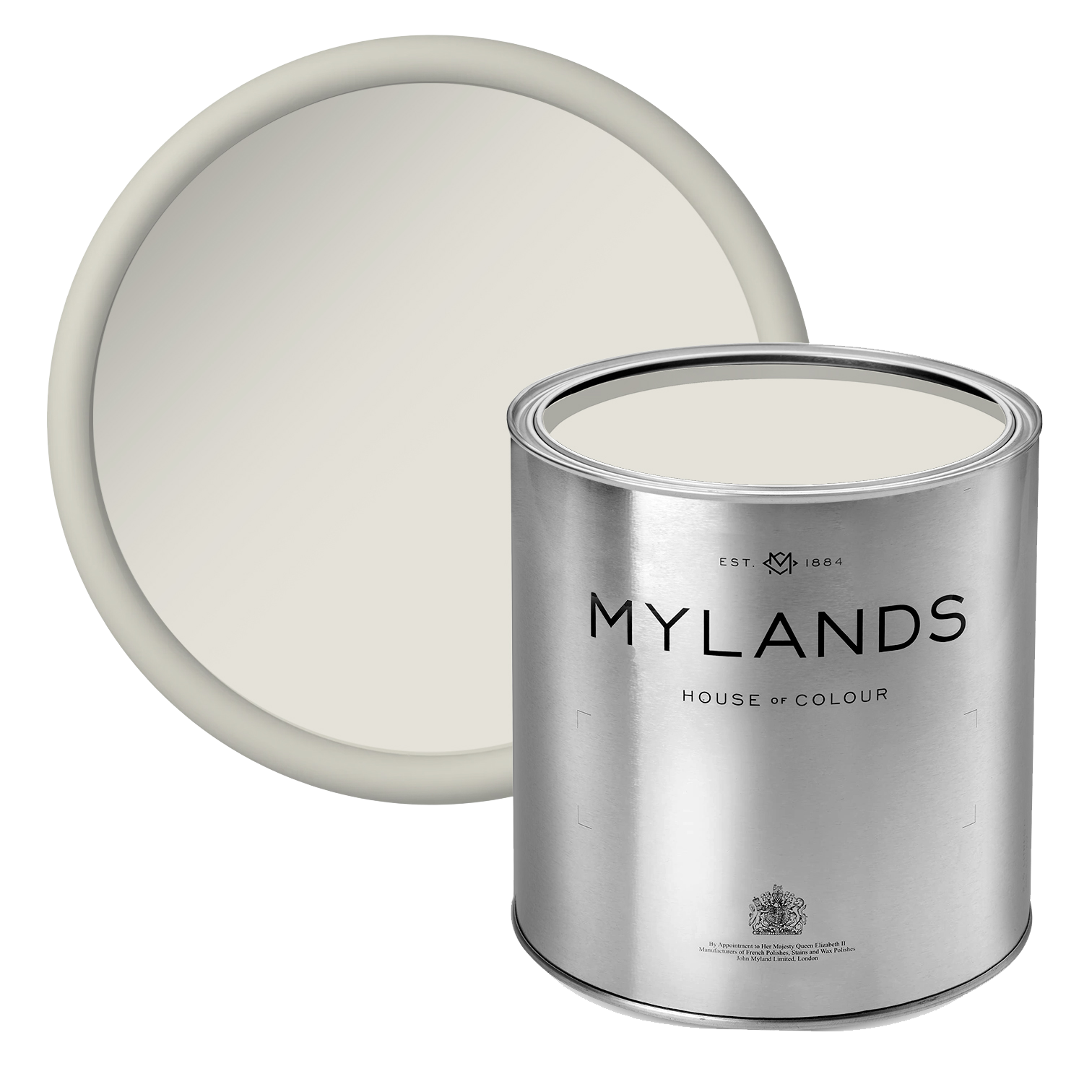
Displayed: Left, Kit Moon - Blue Moon with Acanthus Leaf™ No.12, and Burlington Arcade™ No.216,Right: Bluebell. with St James™ No.40, Primrose Hill ™ No.201 and Boathouse™ No.33
On the left is a wallpaper called Kit Moon -Blue Moon, a delightful celebration of the playful and whimsical crescent moon. Its charming design captures the essence of change and renewal with its array of half moons, creating a lively backdrop that's perfect for any rooms seeking touch of light-hearted magic. Paired with Acanthus Leaf™ No.12 and Burlington Arcade™ No.216, this combination evokes a spirited style. The greenish-blue and soft neutral add a grounding touch, providing the perfect shades to infuse into your space.
On the right is Bluebell. Stepped in British Folklore, bluebells are said to ring to summon wood fairies and are a symbol of humility and everlasting love. Traditionally, they were thought to bring peace and calm to those who kept them close and act as a gentle balm for busy lives. Paired with St James™ No.40, Primrose Hill™ No.201 and Boathouse™ No.3, these shades add to the wallpapers flowery essence, making it a perfect combination for a cosy part of the home.
What made you chose Mylands?
"It was the history and they way the paint is made. There is something reassuring about a company that's been producing paint in the UK for over a century; it carries a sense of longevity and care that aligns with how I approach the pattern. It felt like a natural pairing."
Click here to see all of Annika's wallpaper paint pairings.