Beata Heuman's 188 Hammersmith Office
The transformation of 188 Hammersmith, Interior Designer Beata Heuman's London studio and showroom, is a making of Heuman's design philosophy in hand with a considered colour palette, The Dependables. Far more than a workspace, this studio and showroom is the living embodiment of Beata’s distinct work, one that balances elegance with bold character. The Grade II listed townhouse offers an entry into Heuman’s masterful world of interior design and offers a home-from-home for clients, guests and friends alike.

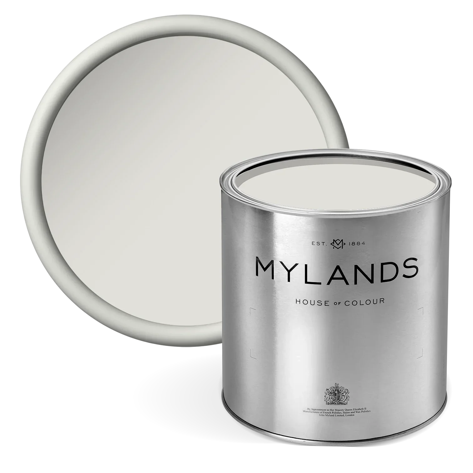
Walls and Ceilings in Beata White BH.01
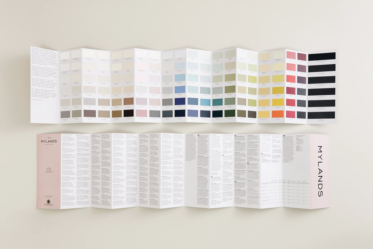
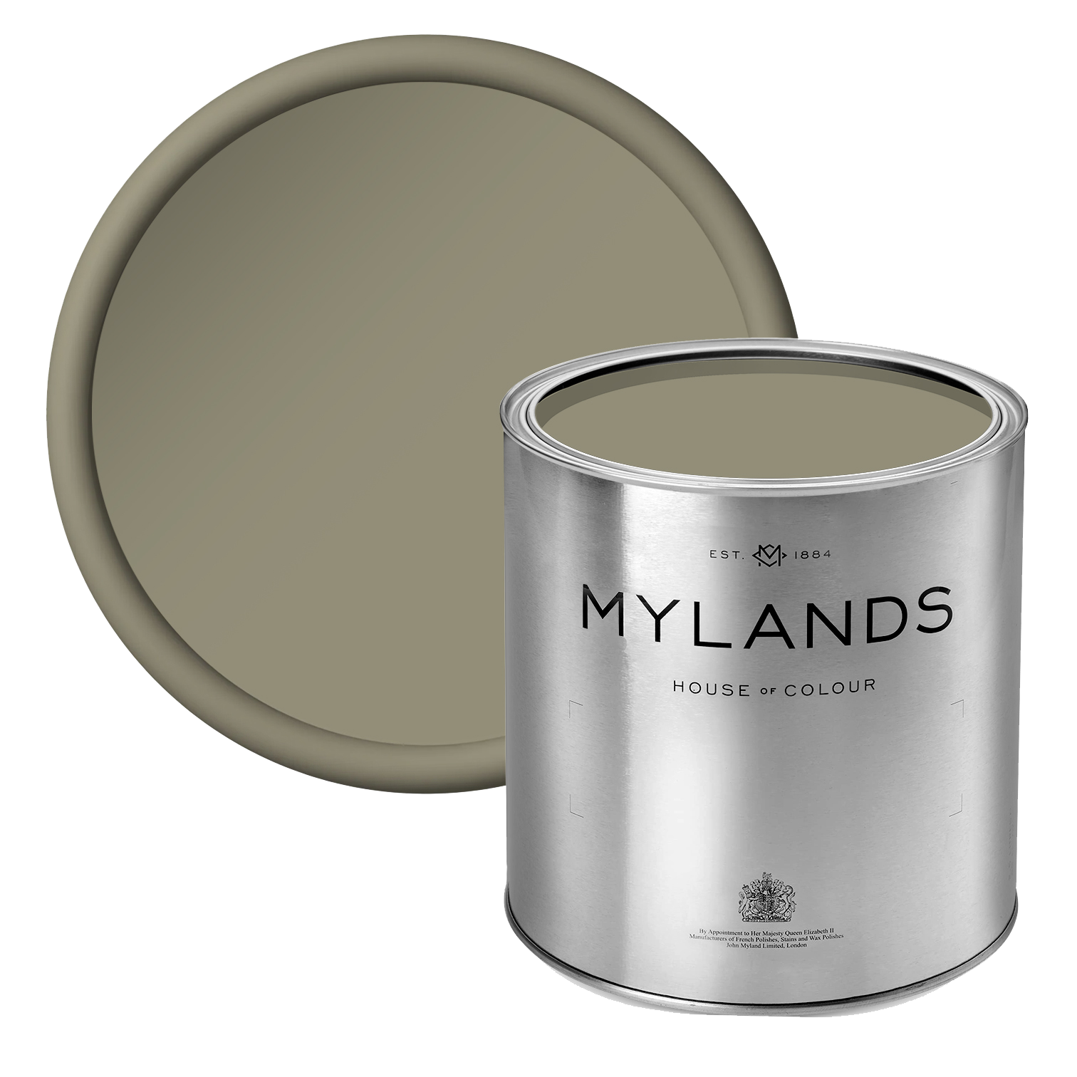
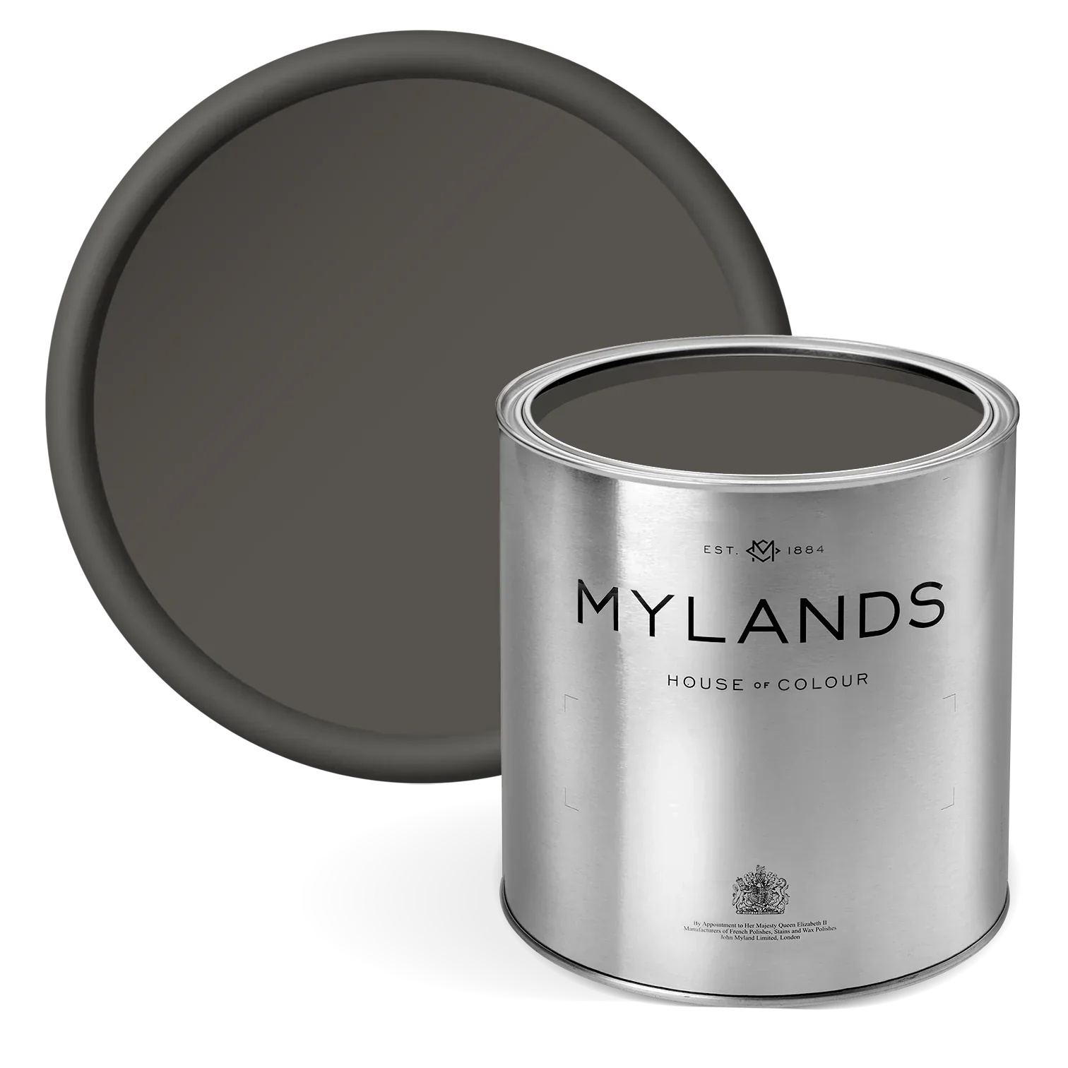
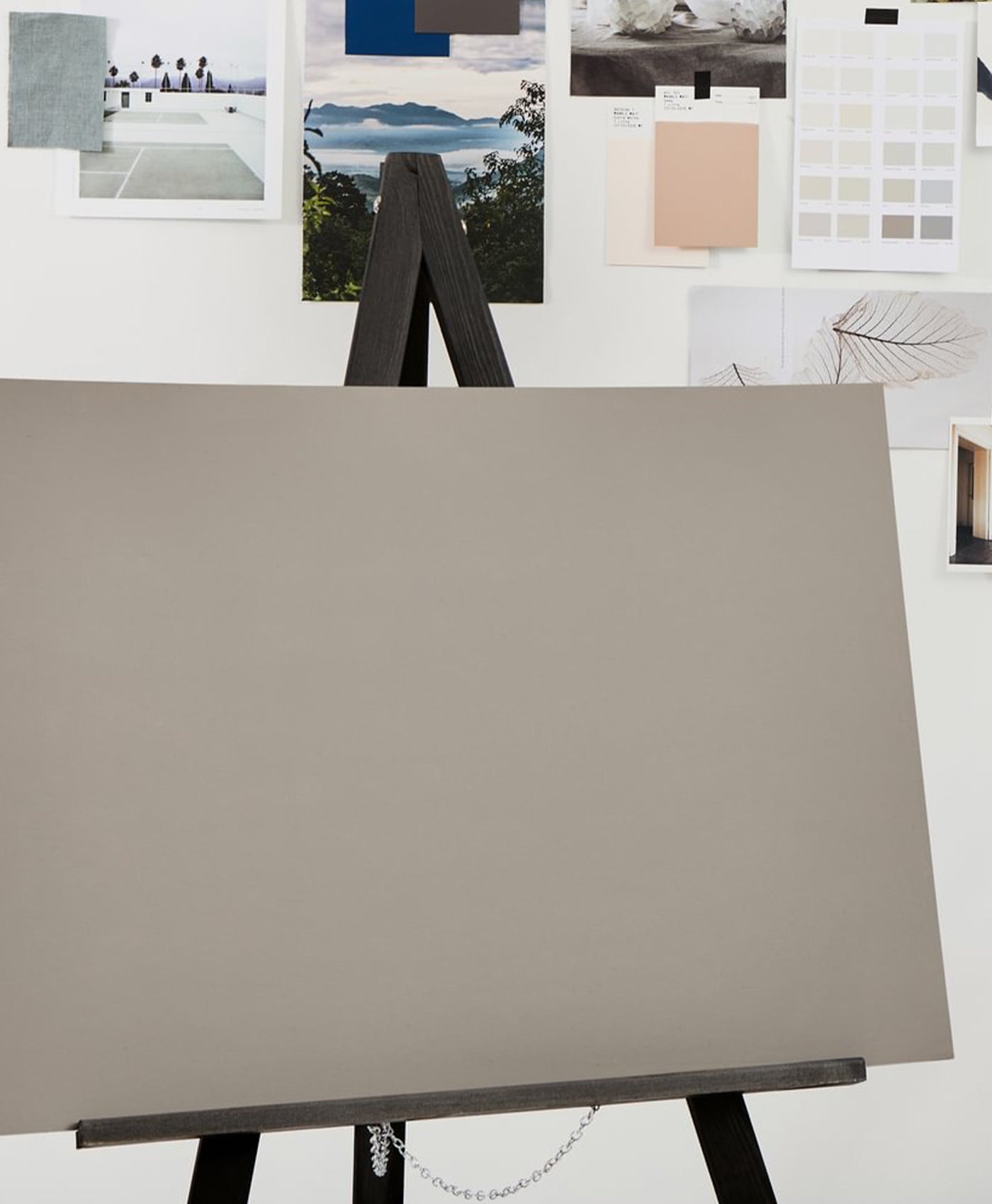
At the heart of Beata's studio and showroom, lies The Dependables Collection. A considered colour palette of 24 vivid, and reliable paints that has been born out of necessity: colours with depth, flexibility and a timeless appeal. Made with a mutual devotion to craftsmanship, authenticity, and effortless design, the palette is a homage to Beata's interior design journey.
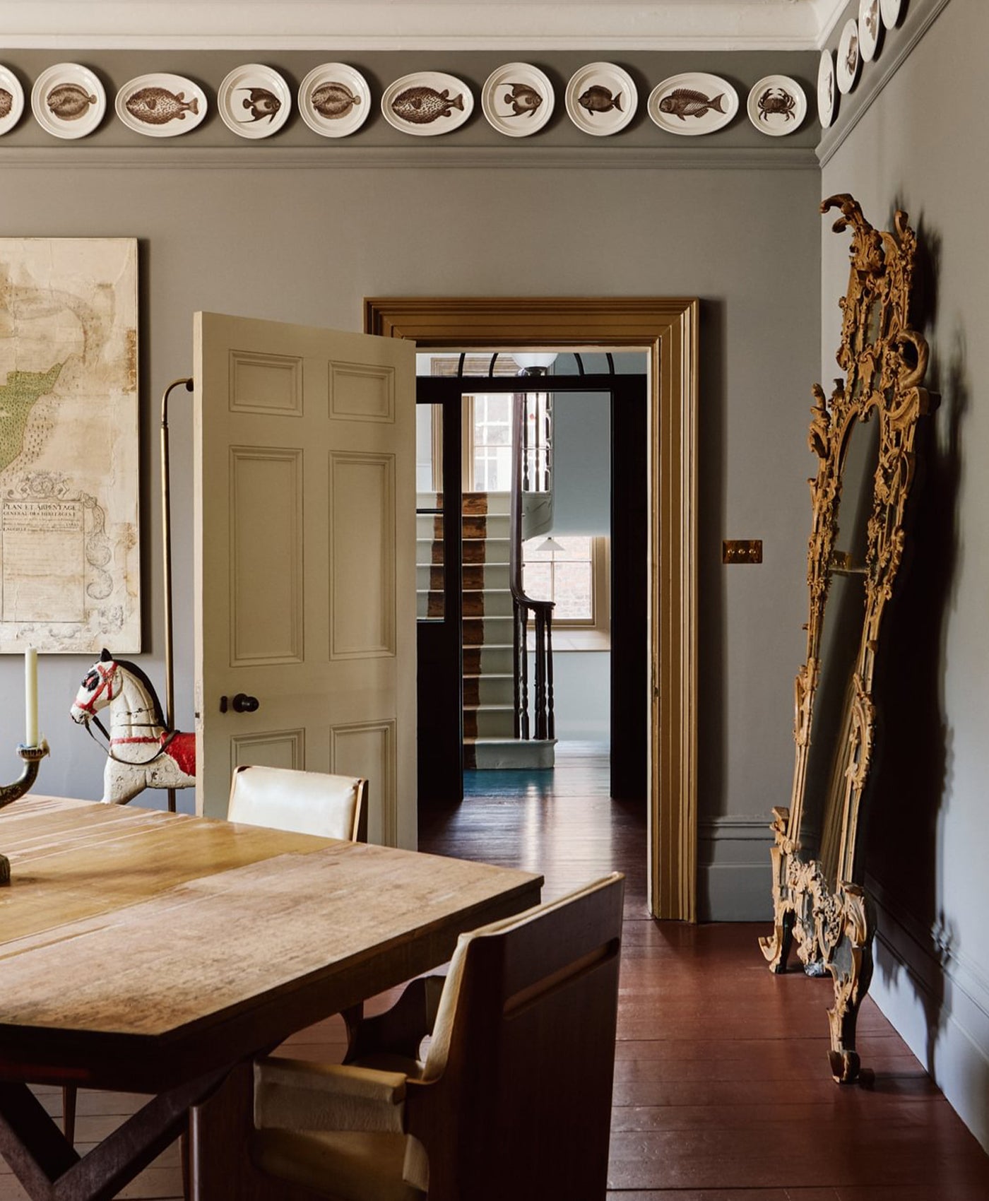
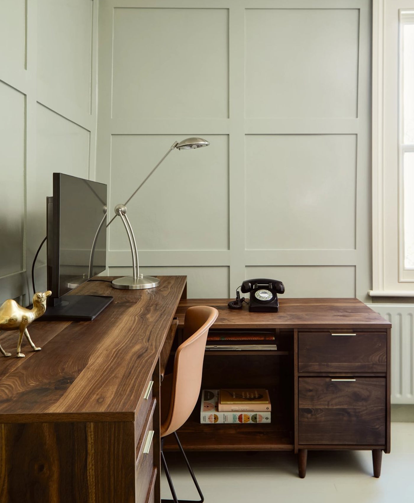
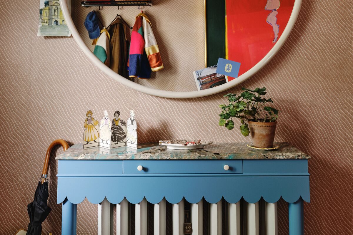
Located in centre of London, 188 Hammersmith showcases Beata’s signature style elements. For example, sitting proudly is the iconic Dodo Egg Light in front of a grand Forest BH.16 painted door. Once through, a warren of unique rooms await with every element; from furniture to diligently designed lampshades and accent colours, all sourced or produced by Heuman and her studio.
The space evokes years of honed design expertise, layered with deeply personal style expressions and expeditions. Yet, the colour palette displayed within the studio, has been thoughtfully considered, drawing on a philosophy that champions both individuality and elegance.
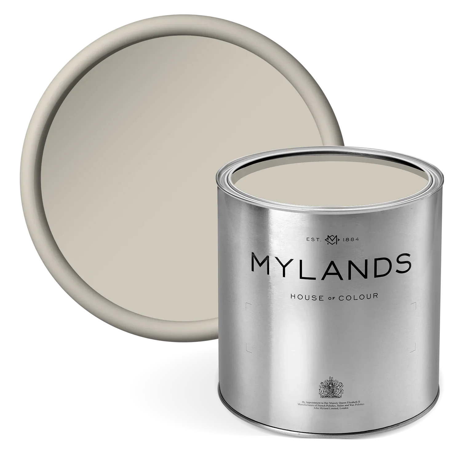
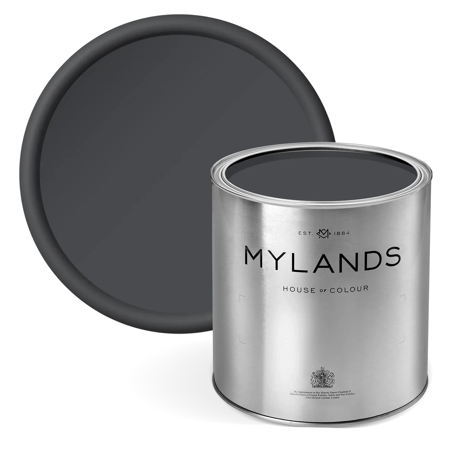
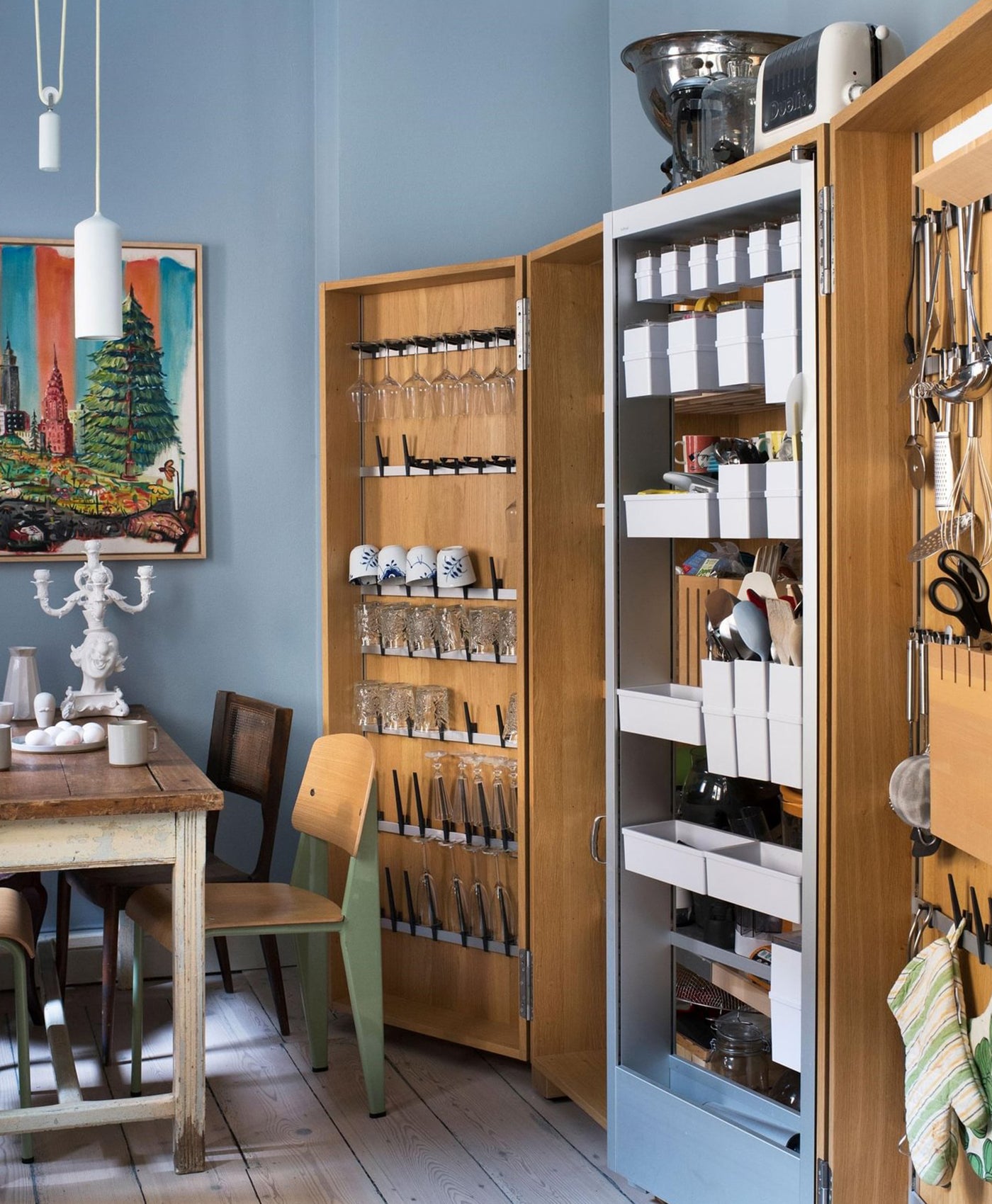
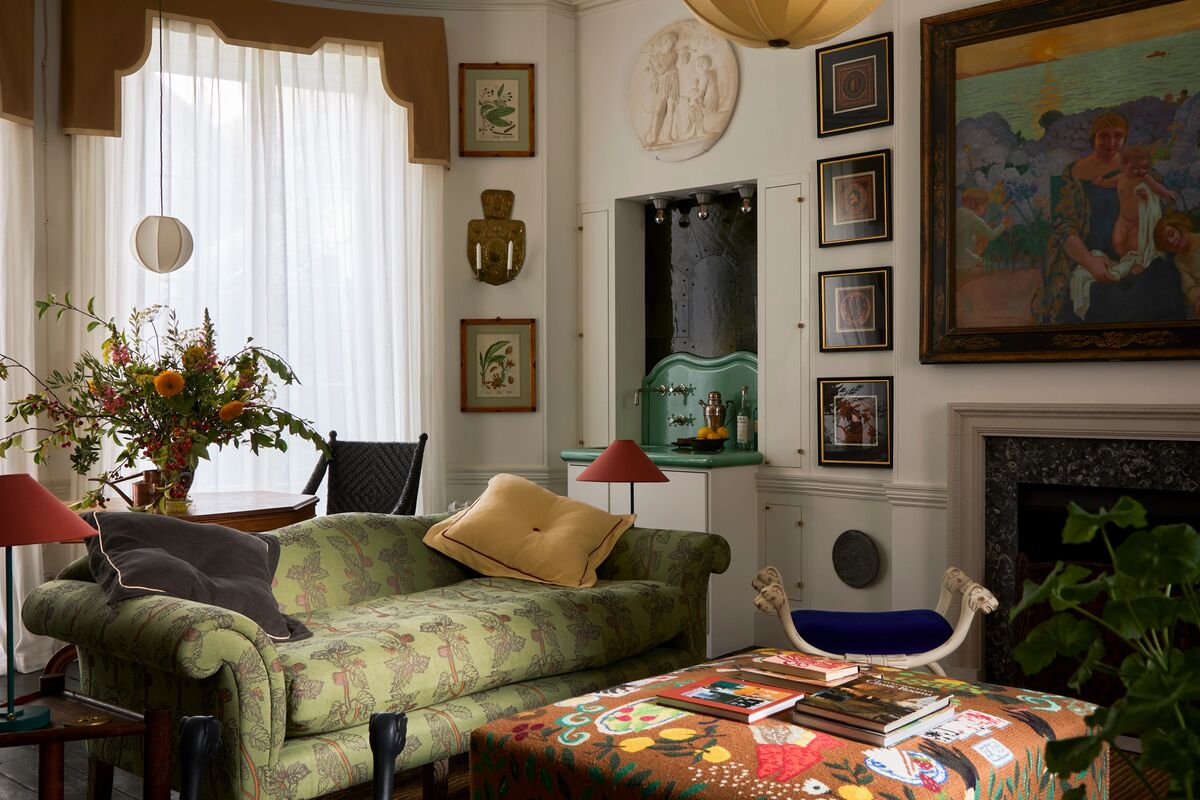
Within the showroom are soft calming neutrals, such as Beata White BH.01, Old Man's Beard BH.03, and Butter BH.21, along with the confident placement of bold mid-tonal accents like Thunder BH.12, Caca D'Oie BH.15, Crayfish Party BH.19, and John's Pantry BH.24, that reflect the signature balance between function and fantasy.
These carefully chosen hues do more than simply colour the space; they imbue it with rhythm, character, and a refined style that feels both inviting and intelligently composed; intertwining modern warmth with an enduring colour scheme.

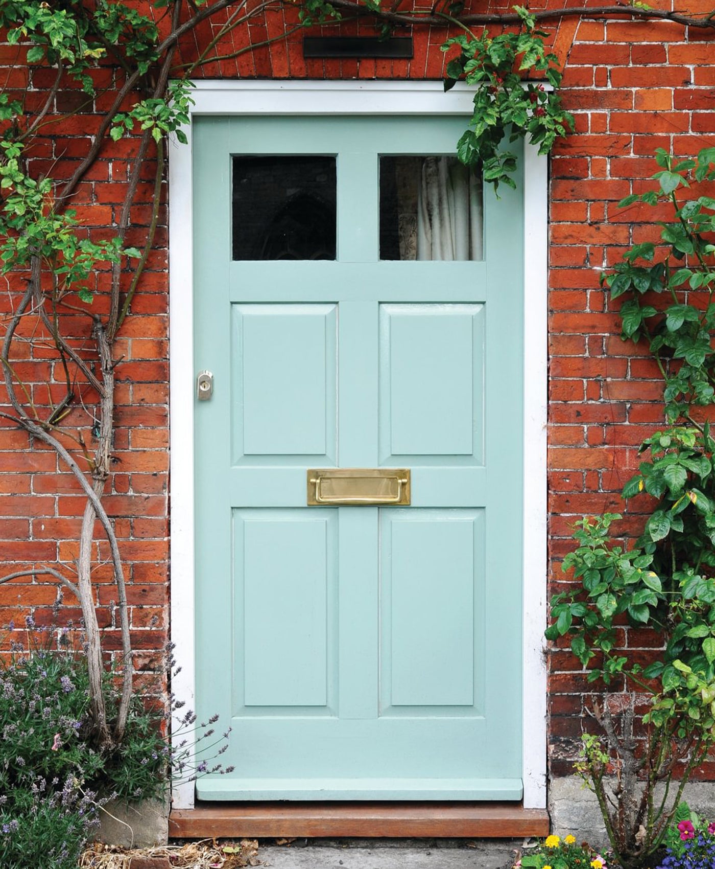
188 Hammersmith Front Door in Forest BH.16
188 HAMMERSMITH

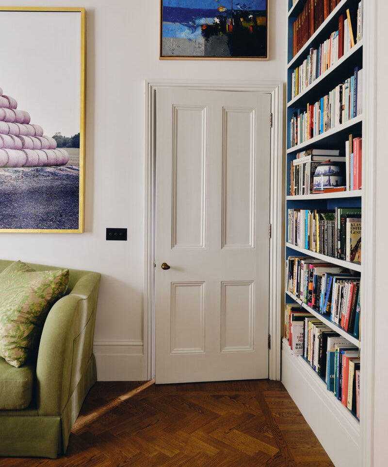
Beata's Library with Forest BH.16 displayed on the Crosslap Lattice of Bookcase and Dining Chairs in Thunder BH.12

The Drawing Room adorned in Beata White BH.01 - Walls and Ceiling

The Library, Dado, Panel Below, Skiting, External of Cabinet in Beata White BH.01 , Interior of Cabinet in Crayfish Party BH.19
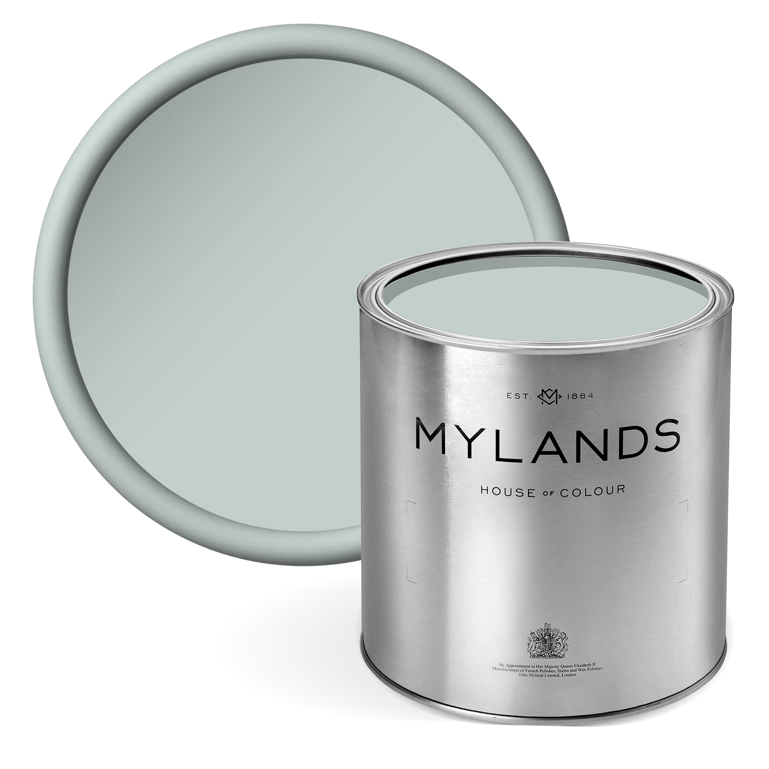
A 'GO-TO' WHITE : BEATA WHITE BH.01
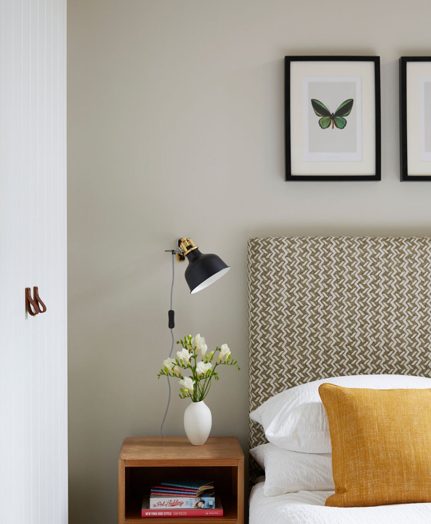
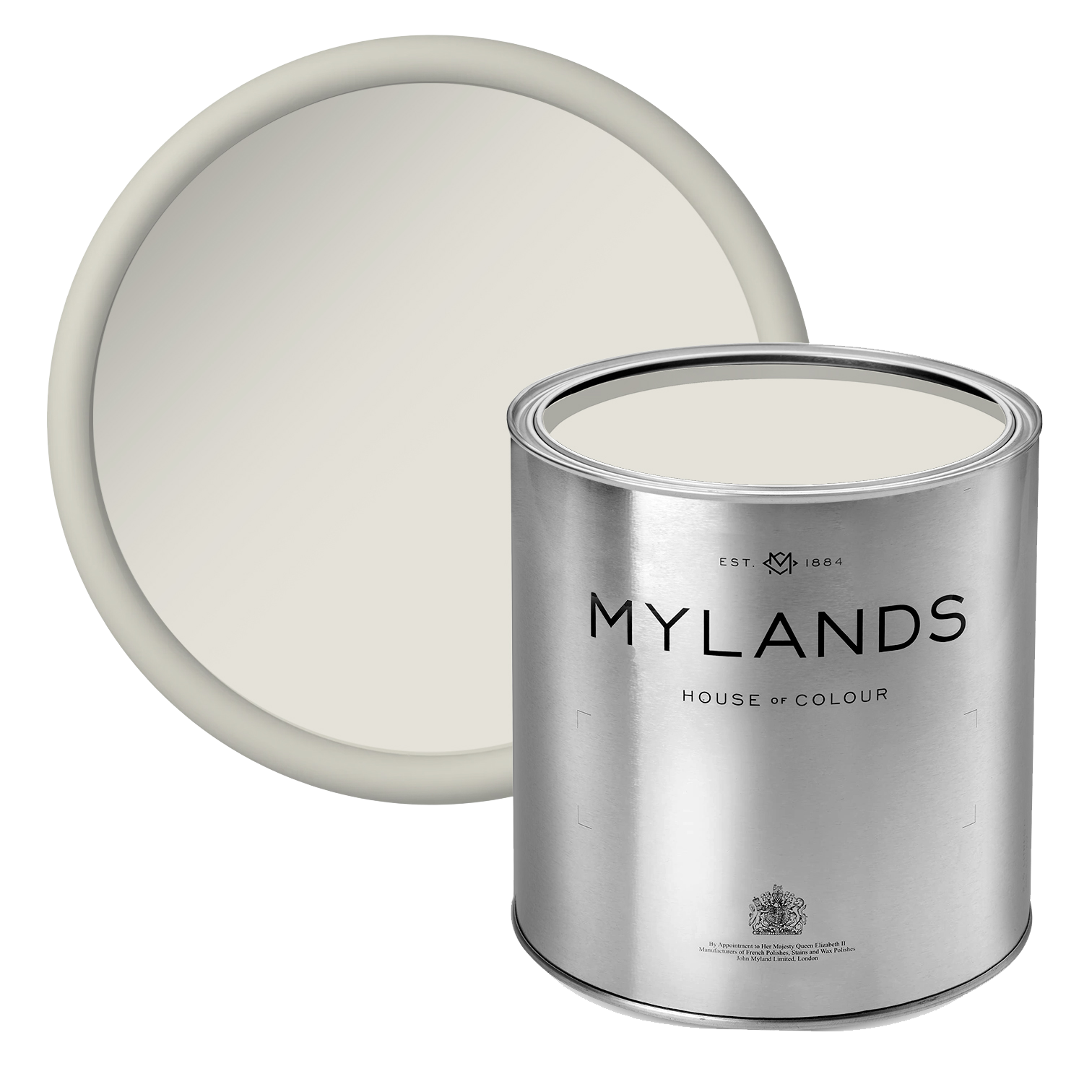
Placed throughout 188 Hammersmith, is the main neutral, Beata White BH.01 - Beata’s ‘go-to’ white. It consists of warm undertones so versatile it works well in almost any setting. This handsome shade serves as the grounding neutral in The Dependables, chosen for its subtle and enduring complexity. Although labelled a ‘white’, the colour is an elegant interplay of tones. A hint of grey for its understated coolness, which offers a clarity without starkness, while its soft warmth adds depth and approachability.
This unique balance makes Beata White BH.01 remarkably adaptable, yet effortlessly contemporary and traditional, allowing it to attune to a range of conditions and architectural styles.
A anatomic colour, it becomes a staple in the palette. Whether used across expansive walls for a clean, cohesive backdrop or paired with bolder hues to provide contrast, its quiet sophistication anchors any room with ease. Beata White BH.01 brings clarity and calm to any space; reflecting natural light beautifully and providing the perfect canvas for creative work. Its presence at 188 Hammersmith is a testament to its versatility: elegant, effortless, and designed to work in harmony with the entire Dependables Collection.
Beata Heuman’s tip for white paint:
"Consider picking one white that you use throughout the house – with that decision made you can move onto other more interesting things. White walls can still allow you to have a scheme that feels colourful and uplifting by injecting that energy with your fabrics, art and loose furnishing. You can’t go wrong with this one."

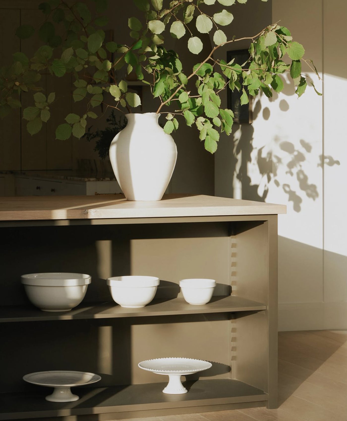
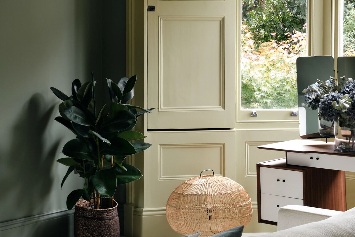
The Kitchen, displayed in Beata White BH.01

The Kitchen, Walls and Ceilings in Beata White BH.01 , Window in Crayfish Party BH.19, Door, Architrave and Skirting in Overall BH.10

Walls and Ceilings in Beata White BH.01

Walls and Ceilings in Beata White BH.01, Tongue and Groove Joinery in Overall BH.10
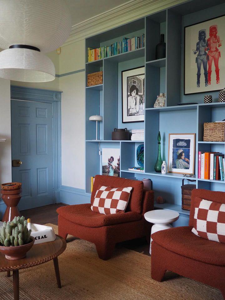
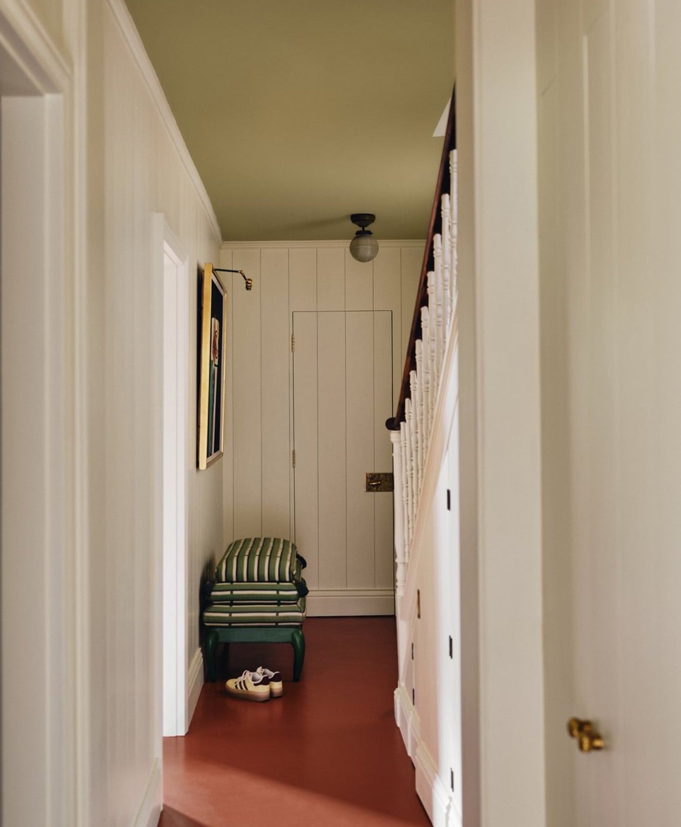
RICH TONAL HUES
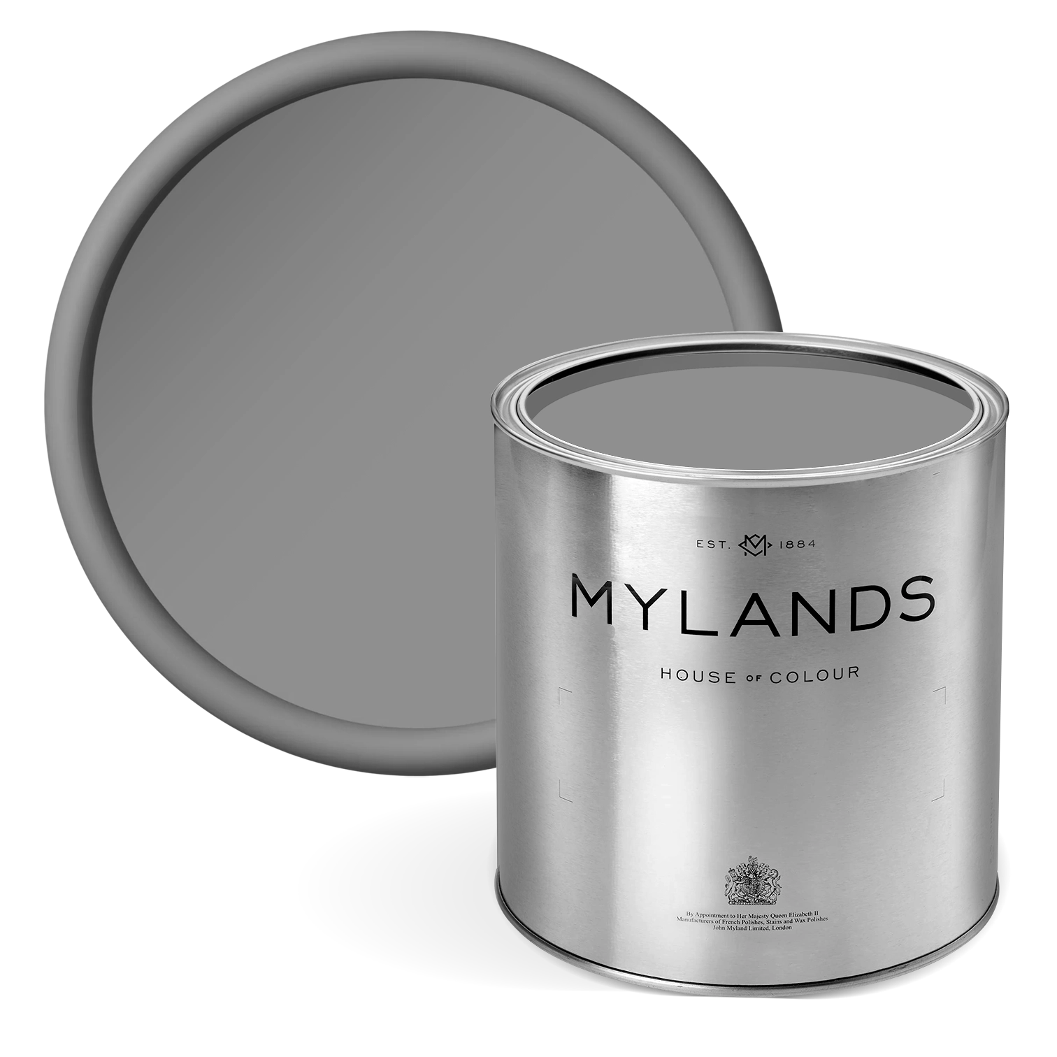
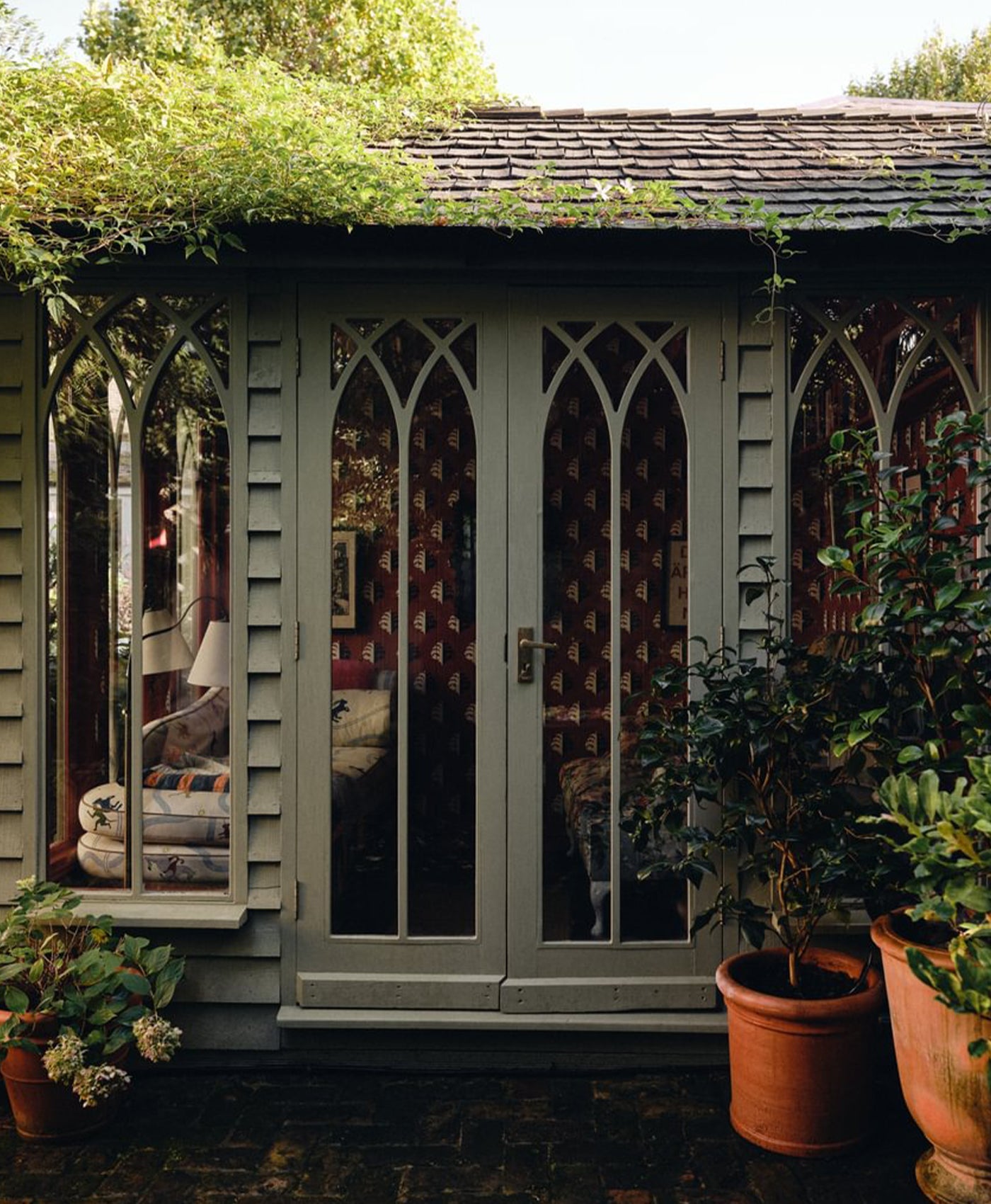
Throughout the studio, she masterfully deploys a palette of rich accent colours to sculpt a space that feels both elevated and effortlessly lived-in. These carefully placed hues, ranging from mid tones to dramatic darks, do more than add visual interest; they shape the emotional and spatial rhythm of the interiors. Each shade is a tool of intention, used to balance light, enhance form, and evoke a layered, sophisticated atmosphere.
The tonal range seen throughout the studio, bold in places, restrained in others, is not about showmanship but rather about the subtle art of balance throughout colour design. Deeper shades provide visual weight and grounding in areas flooded with natural light, while more vibrant tones are used to animate and uplift features that might otherwise recede. This thoughtful approach results in a space where contrast feels natural, transitions feel seamless, and every colour carries purpose.
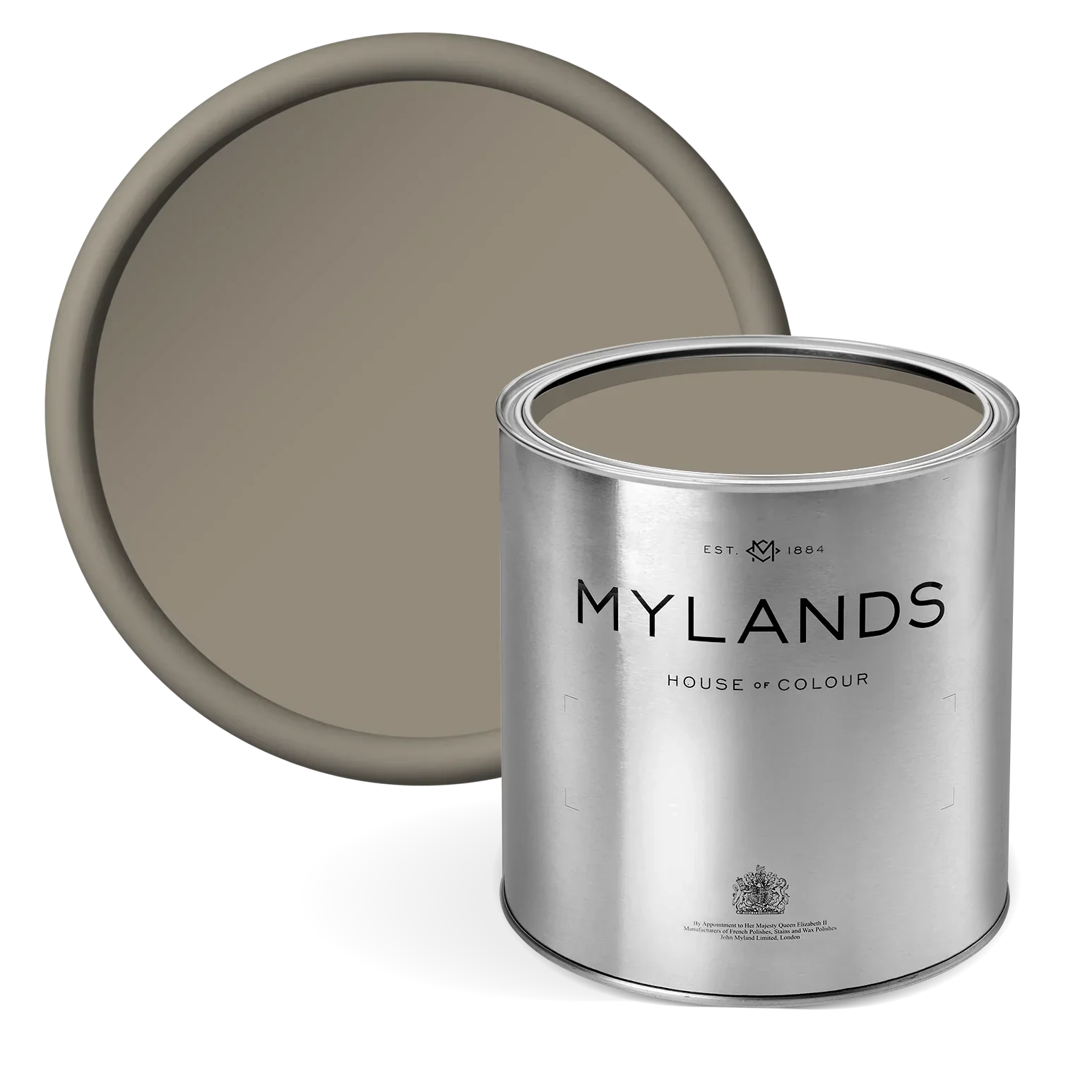
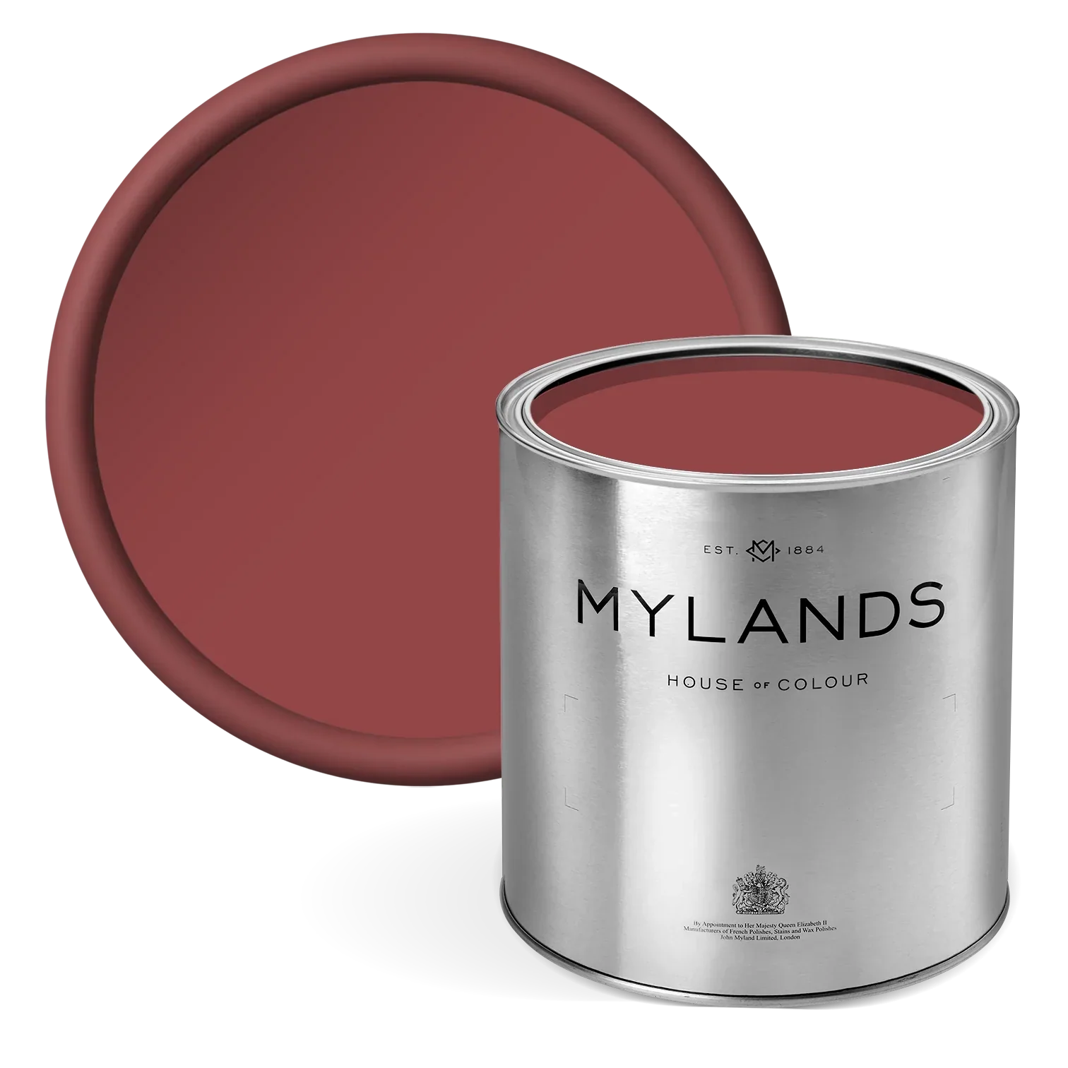
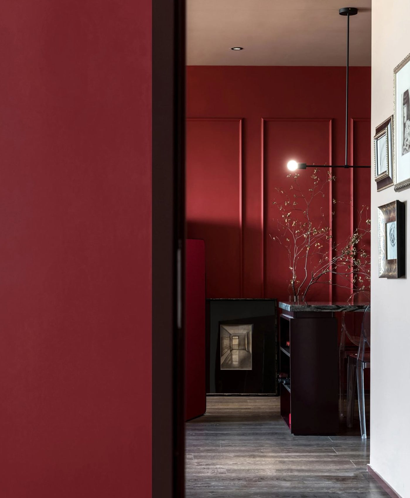
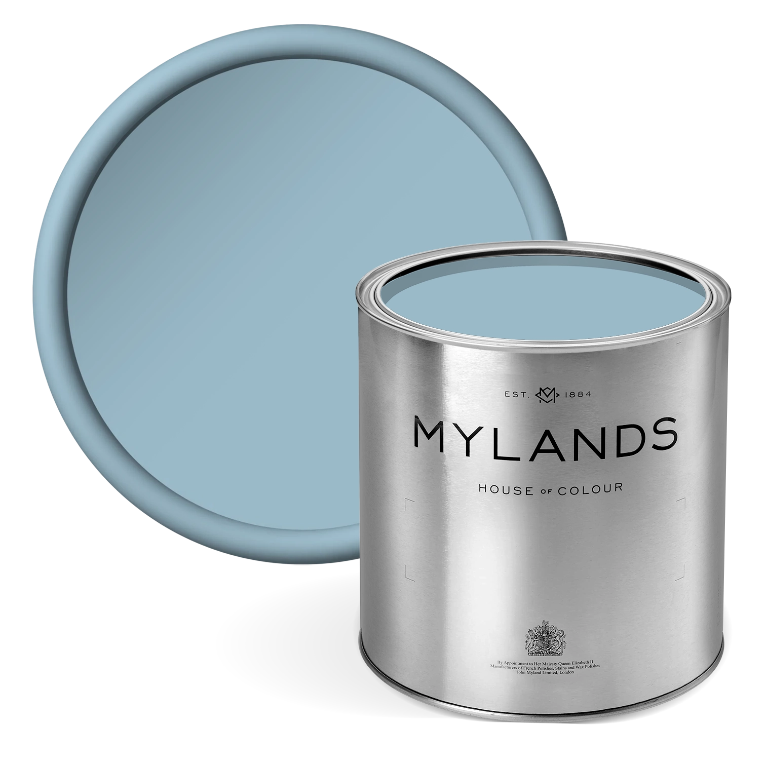
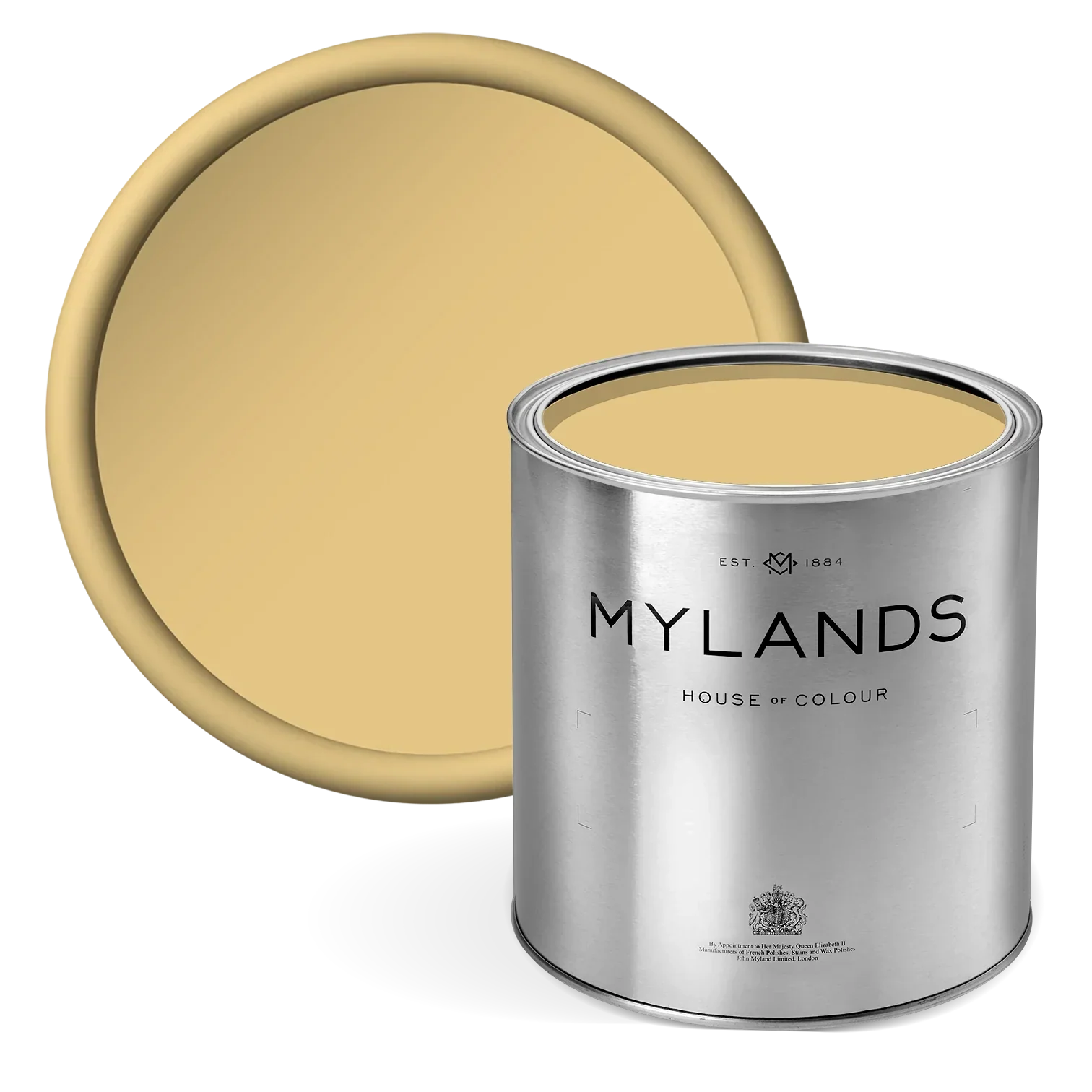
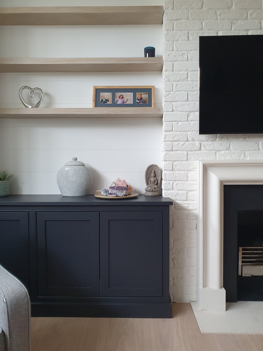
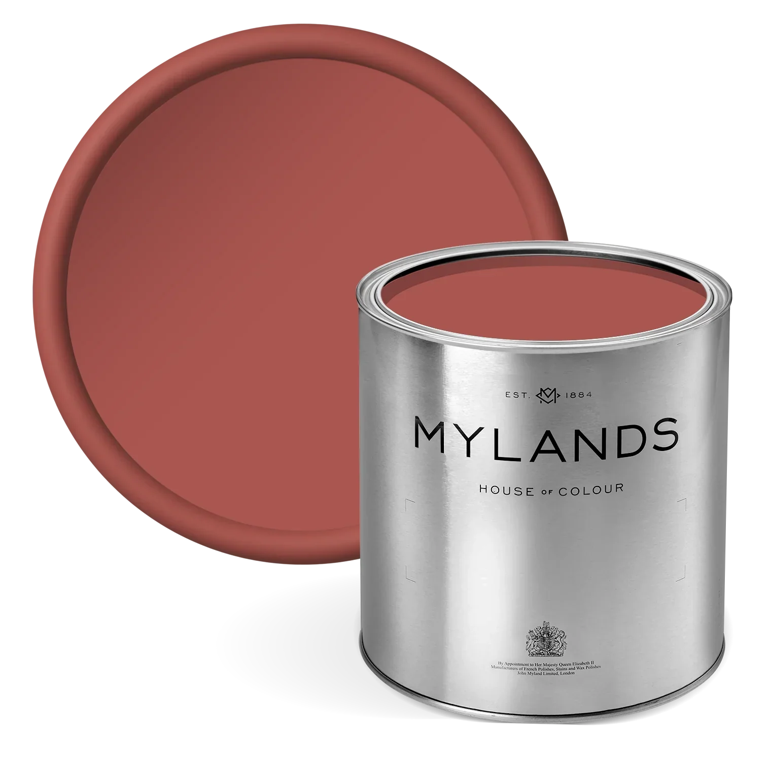
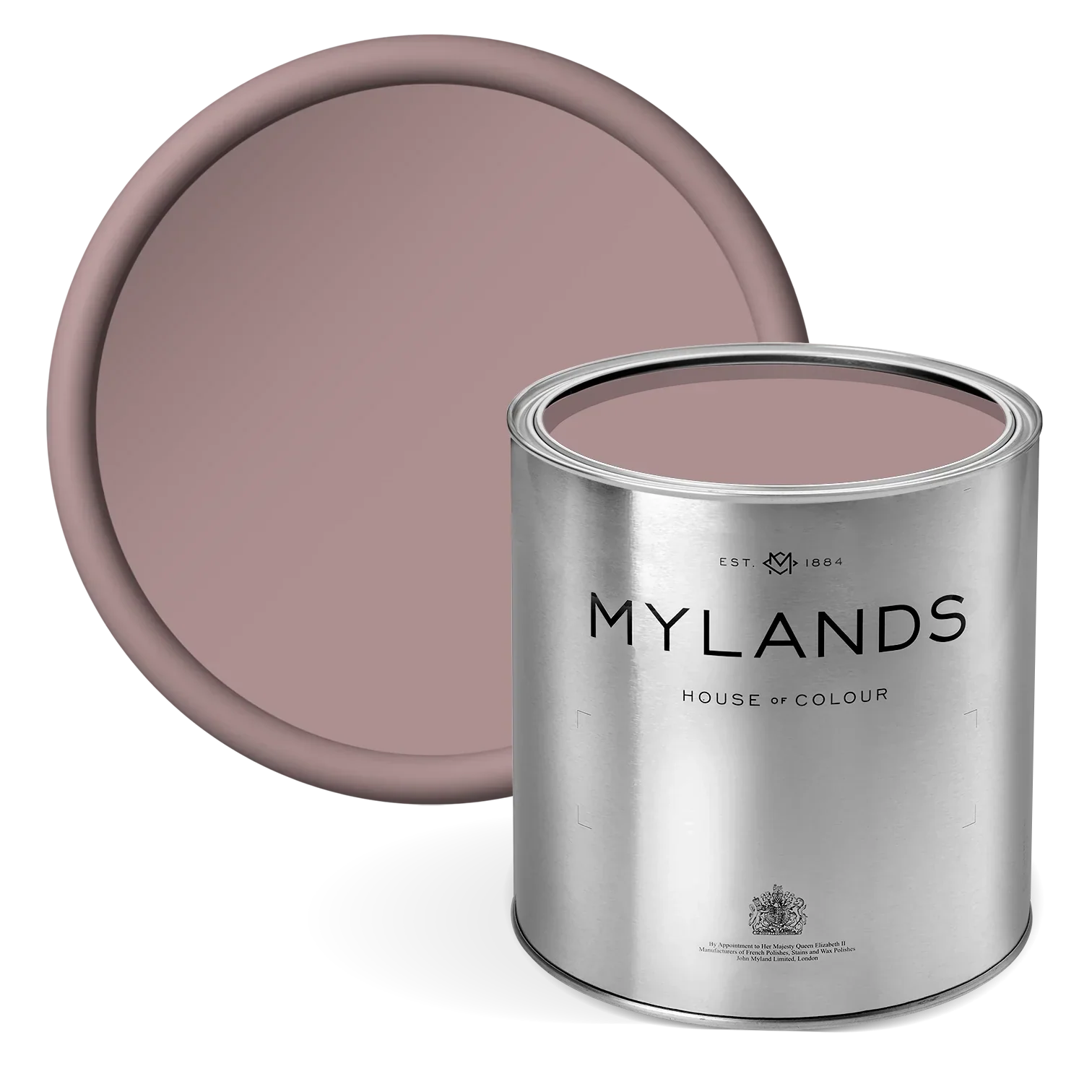
Among the most striking of these accent tones is Overall BH.10, a deep and velvety mix between green and blue, Beata’s two favourite colours, that brings quiet elegance to selected joinery and architectural details. Its richness offers a refined anchor, creating a sense of depth and permanence. Crayfish Party BH.19, by contrast, delivers a joyful burst of energy - a spirited red that dances across trims and frames, adding modern flair without disrupting the room’s poise. Then there is John’s Pantry BH.24, a luscious and handsome ochre yellow hue that punctuates the palette with charm and individuality, drawing the eye without overpowering.
Together, the interplay of The Dependables creates a dynamic but harmonious composition, one that feels both curated and deeply personal. Within this studio, colour is never an afterthought. It is a central design language, a means of storytelling, expression, and spatial refinement. At 188 Hammersmith, the effect is nothing short of exquisite: a studio that is not only functional, but emotionally resonant. One where every room tells its own story, yet all are united by an overarching sense of balance, elegance, and imaginative restraint.

Door, Woodwork and Window in John's Pantry BH.24, Painted Floor in Henna BH.18

Walls and Ceiling in Wheatsheaf BH.23

Powder Room, Doors, Architraves and Skirting in Overall BH.10, Painted Floor in Henna BH.18, Tongue and Groove Panelling and Ceiling in Butter BH.21
Far from a traditional workspace, this is a home for ideas. A living studio that celebrates creativity through craft, where every tone, texture, and finish has been chosen with purpose. The result is a space that doesn’t just support the creative process, it elevates it. A true embodiment of Beata’s creative personality: imaginative, layered, and elegantly unexpected.
"The idea was to create a capsule collection of colours that ticked a lot of boxes and gave a broad yet concise range which could serve your whole house. They all have their own character but they also work as a whole."- Beata Heuman
188 shall act as the studio’s first by-appointment showroom, allowing visitors to physically experience and interact with Shoppa: the rapidly growing collection of interior products designed and produced by Heuman. Spanning fabric and wallpaper, furniture, hardware, homeware, lighting and rugs, each piece is recognisable for its playful spirit whilst remaining grounded in simplicity, line and colour.

Sills in London Brick BH.07, Window Frames in Wheatsheaf BH.23

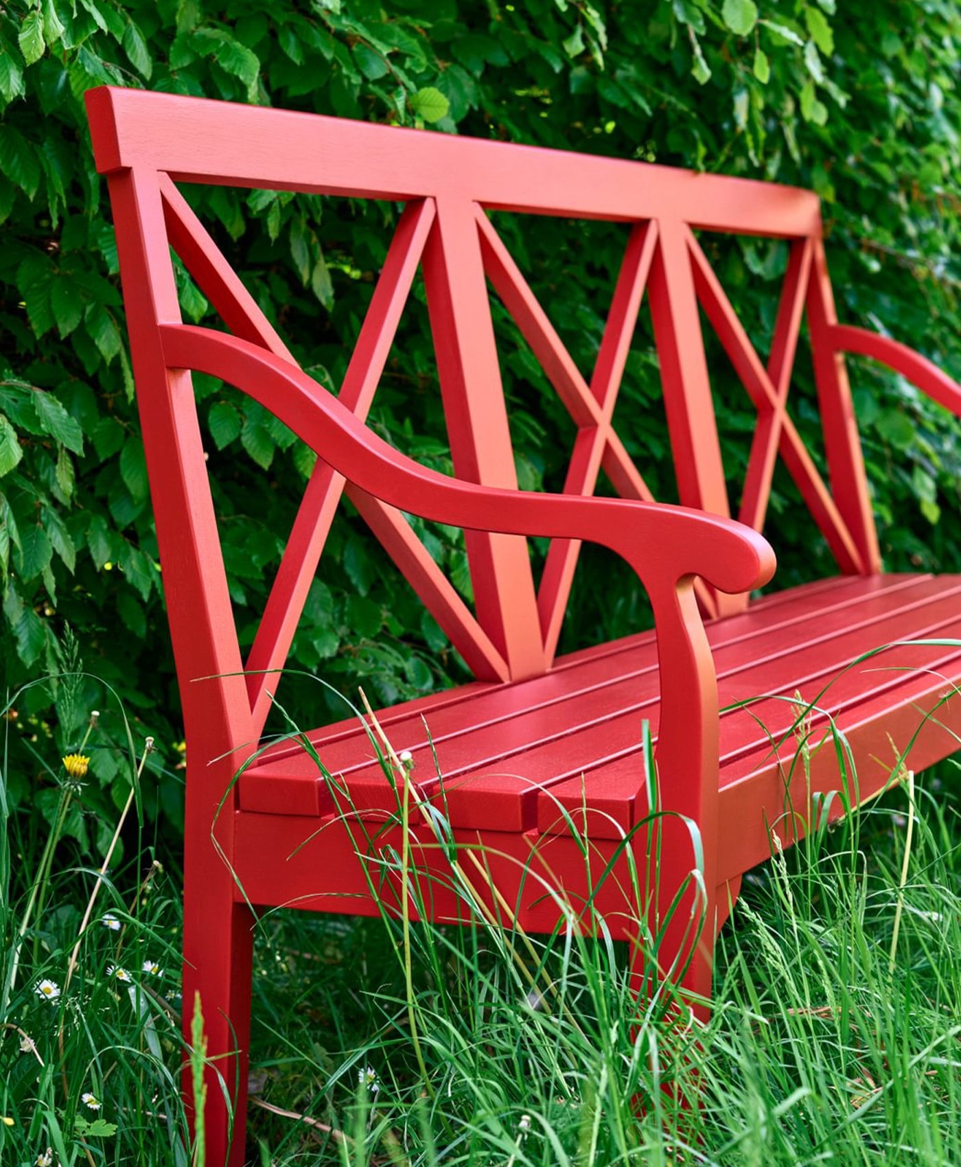
Trellis in Overall BH.10, Bench in Crayfish Party BH.19