Breathing Colour Into Cecil Beaton's Fashionable World
 Walls in Rain JB.03
Curated by photographic historian and Vogue contributing editor Robin Muir, the National Portrait Gallery’s exhibition celebrates Cecil Beaton’s extraordinary influence on fashion and portraiture, tracing his meteoric rise and lasting legacy. The gallery presents an intimate encounter with some of the twentieth century’s most iconic figures including Marilyn Monroe, Audrey Hepburn, Elizabeth Taylor and Marlon Brando: Queen Elizabeth II and Princess Margaret; Lucien Freud, Francis Bacon and Salvador Dali. Each portrait is imbued with life, drama, and depth while being masterfully enhanced by our distinctive palette of colours.
 Left to right: Blomster JB.01; Rain JB.03; FTT-006™ Shocking Pink
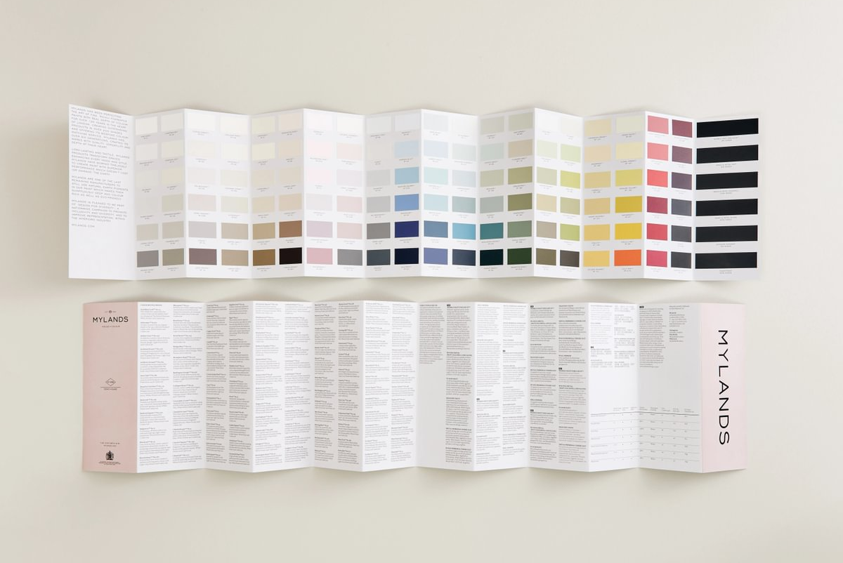
Around 250 items are on display, spanning photographs, sketches, costumes, and letters, all set against walls awash in a curated colour scheme that allows the portraits to pop. Soft, nuanced shades like Whitehall™ No.9, a warm off-white with subtle ochre undertones, and Rain JB.03, a gently uplifting grey-green, create a refined backdrop that perfectly frames Beaton's world of glamour and creativity.
Accent hues punctuate the exhibition with bold personality: the near black Blackout™ No.41, a purple tinted blue, Blueprint™ No.50, and the sophisticated Market Green™ No.38, each add depth, style, and character. Meanwhile, the rich mineral red of Blomster JB.01 and the vibrancy of FTT-006™ Shocking Pink, interject striking moments that draw the eye and enliven the gallery experience.
Together, this masterful interplay of colour elevates the gallery's atmosphere, echoing Beaton’s signature flair for drama, theatricality, and visual storytelling.
 Walls in Blueprint™ No.50
Throughout several interlinked themes, the world of Cecil Beaton is explored in detail. The exhibition traces his journey from a child of the Edwardian era, experimenting with his first camera on his sister and mother (c.1910), through his inventive years at Cambridge University, to the striking portraits of high-society figures, such as Stephen Tennant and the Sitwell siblings that first established his reputation.
As such, our colours pull you through the exhibition, guiding you through Beaton's journey. Muted, understated tones for his youth and experimentation, to richer, royal shades that echo the glamour of his later career; mirroring his striking compositions with his larger-than-life personality.
Our CEO, Dominic Myland says "Cecil Beaton's Fashionable World celebrates creativity that transcends the ages, and we are delighted to see how the exhibition's designers have confidently incorporated our colours to enhance the works and the visitor's experience."

Walls in Blueprint™ No.50
Our signature Marble Matt Emulsion graces the exhibition walls, selected not only for its rich, velvety coverage and depth of colour but also for its environmentally conscious formulation.
Jude Simmons, Head of Design, National Portrait Gallery comment "We found the perfect range of Mylands colours for this show, adding a touch of theatre, glamour and fun, but giving a serious note when needed. Rain by Jinny Blom works especially well with the vintage black and white photographs, a colour I'll certainly be using again."
Want to visit? Find tickets here and explore our colours at The National Portrait Gallery.