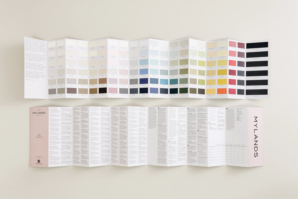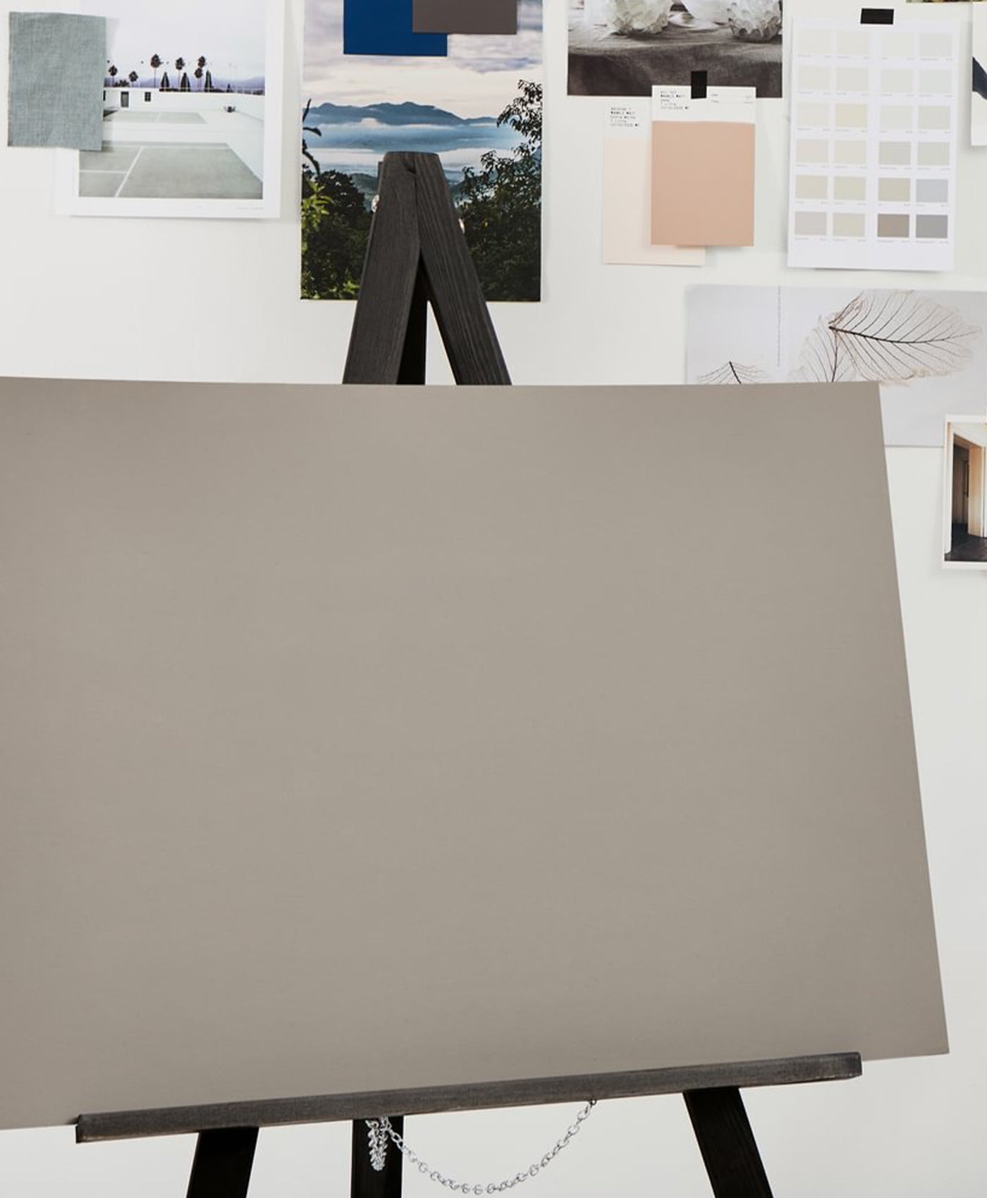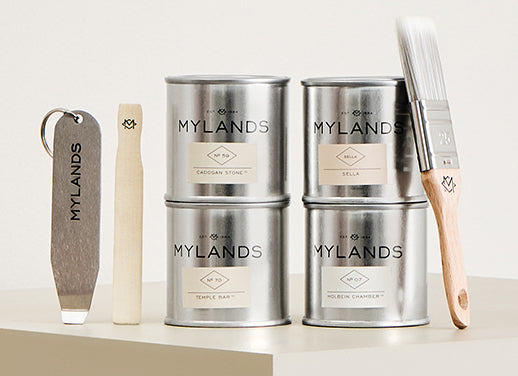
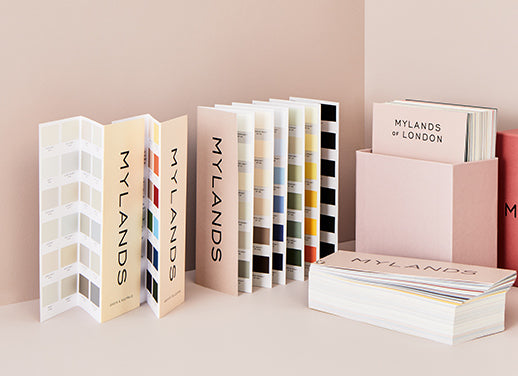
Introducing the Archive Collection
Mylands are proud to announce our latest collection of 12 colours, chosen from the company's extensive colour archives in a celebration of Mylands' heritage and colour legacy. The Archive Collection is rooted in the past, but with a timeless appeal that makes each paint perfectly suited to modern interiors. The collection’s colours range from soft pinks, honeyed yellows, rustic oranges and gentle blues through to bold reds and rich greens, all of which have been carefully curated to deliver a fresh new palette that uses rich tones and intensely pigmented formulations.
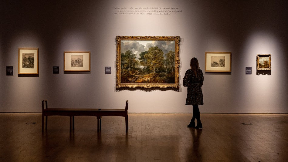
The Mylands archive contains countless bespoke colours developed for clients over our long history of manufacturing the highest quality paints for use in the home, and in film, television and theatre productions thanks to our longstanding relationship with the industry. The Archive Collection consists of carefully selected colours from these extensive libraries that each stood out due to their individual character and tone. The collection also includes selected colours from the British Colour Council, whose original books are in the Mylands archive, which was an industry standards organisation during the 1930s-1950s.
Each selection is beautifully characterful and is sure to bring a stunning depth and sense of joy to a space. Read more about each paint below, or browse the collection here.
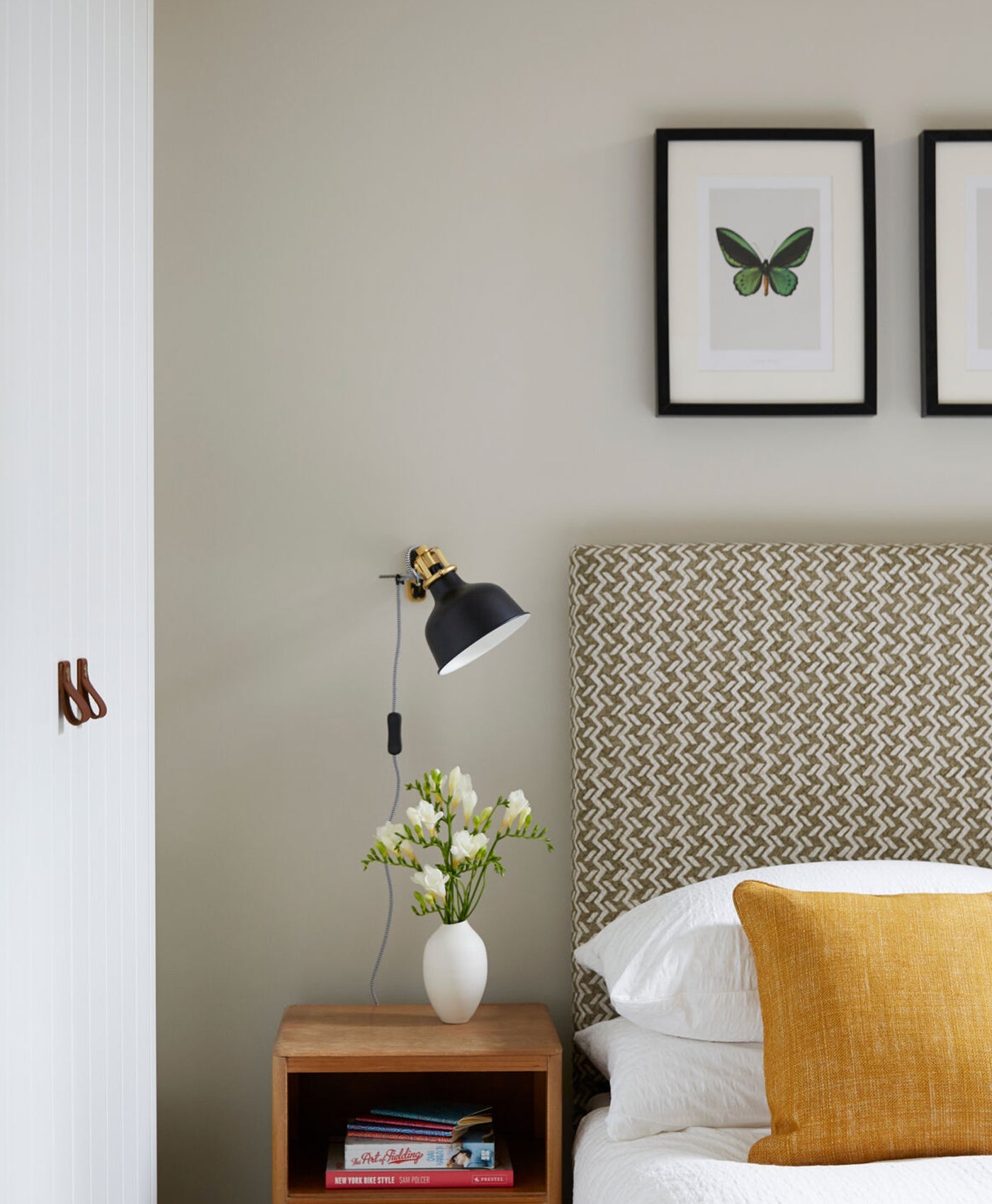
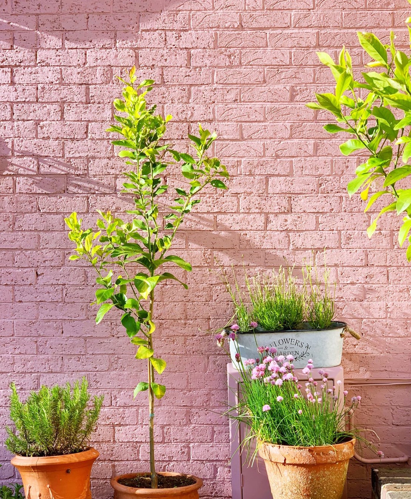
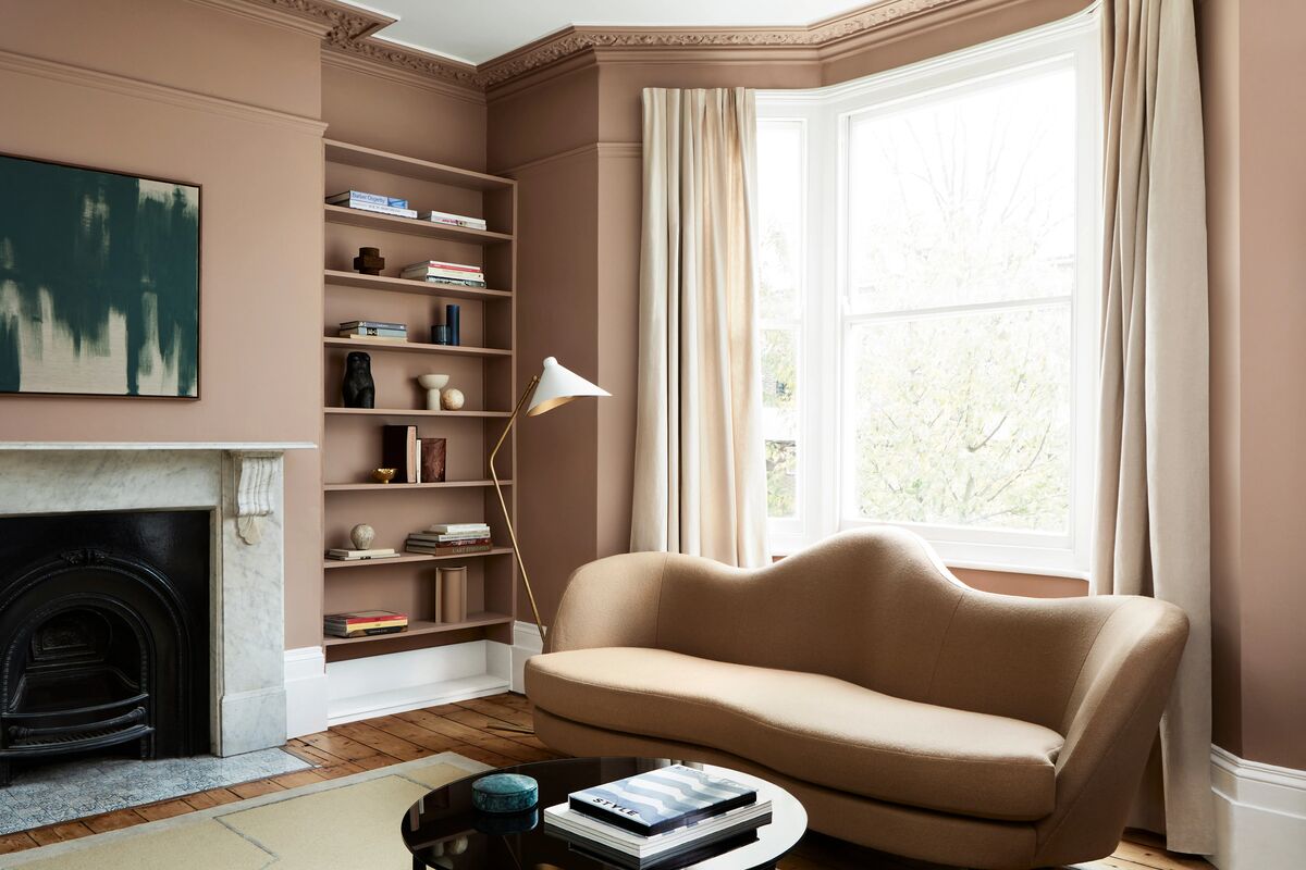
GENTLEMAN’S PINK™ NO.221

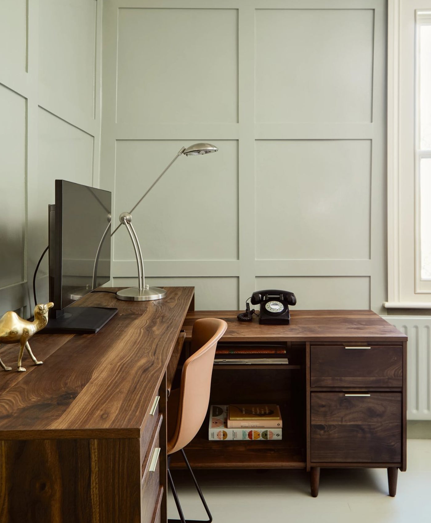
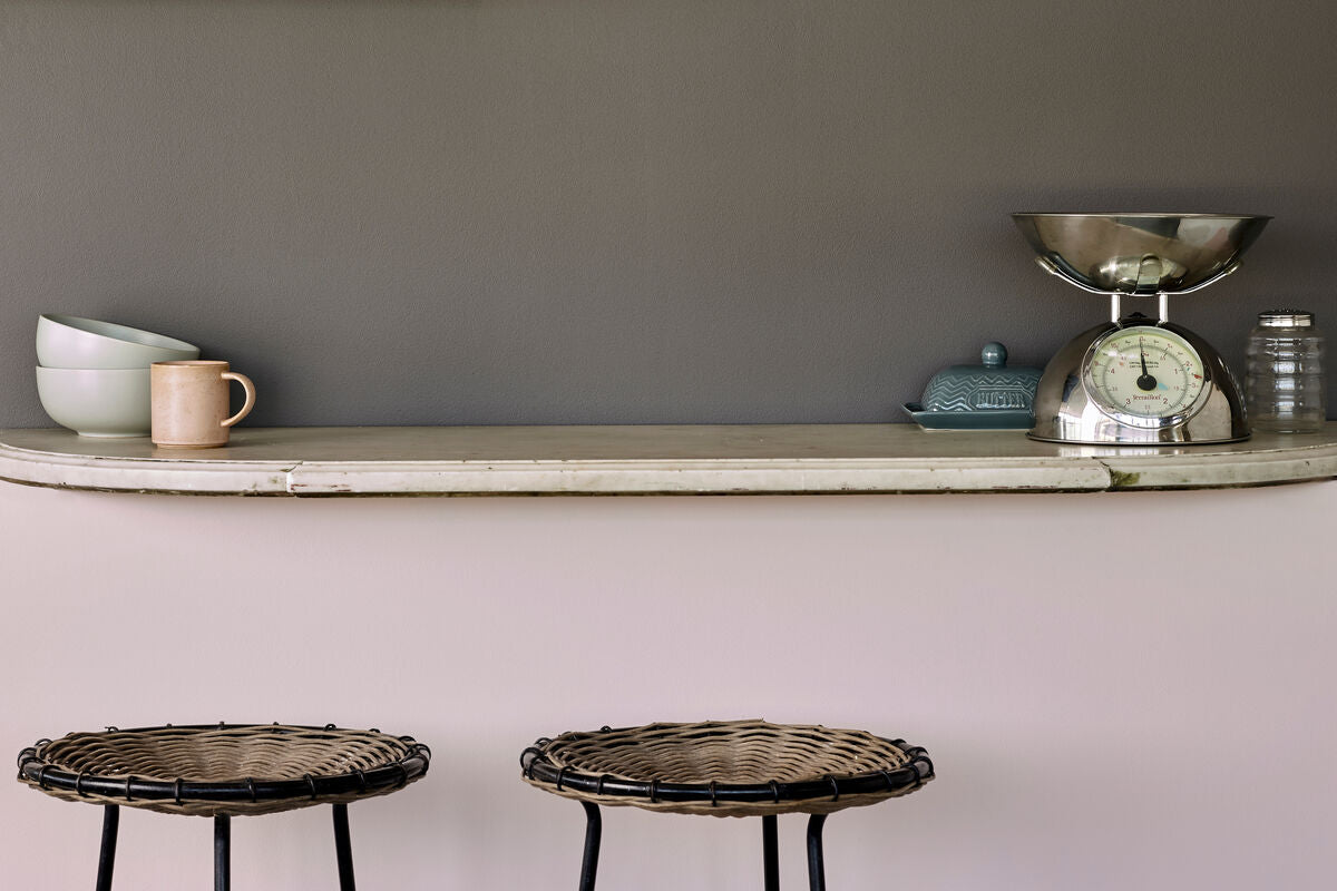
Walls below counter painted in Gentleman’s Pink™ No.221, Upper walls in Rose Taupe™ No.292
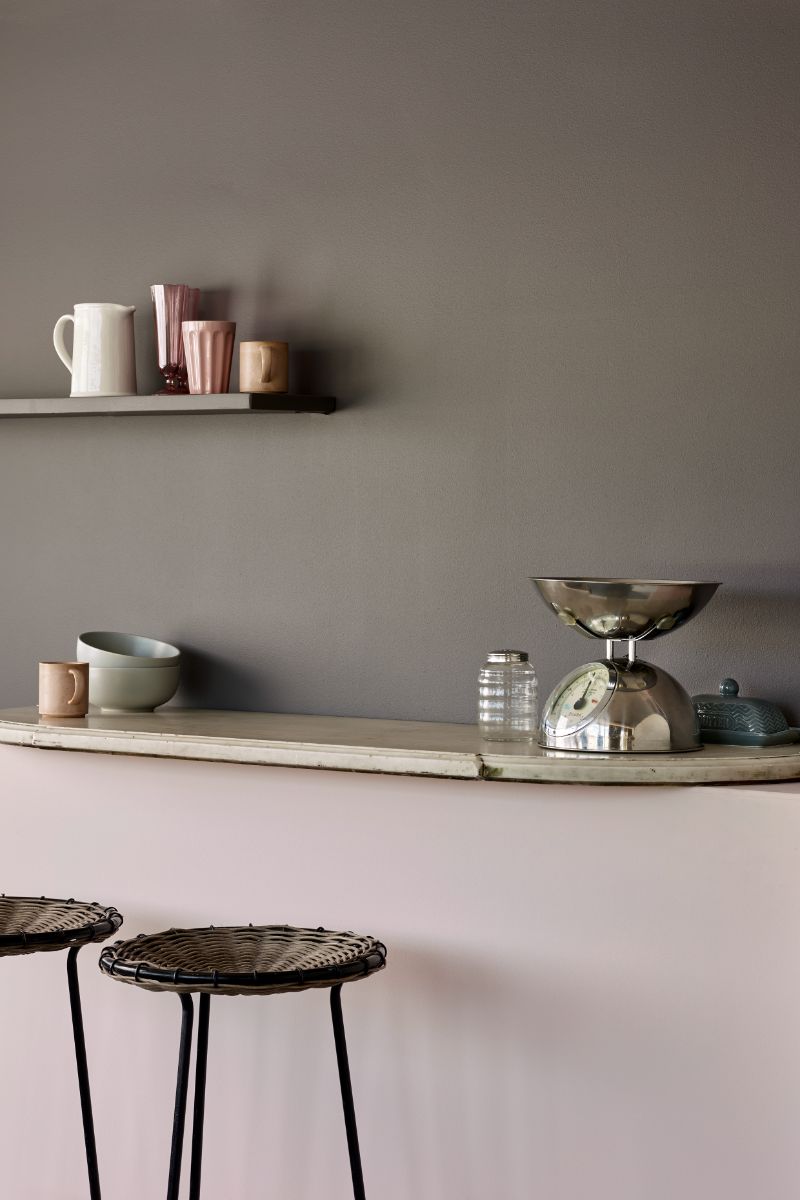
The first paint in the collection is a pastel pale pink with a drop of red and violet. Gentleman’s Pink™ No.221 is inspired by an English gentlemen’s shirt, and this subtle shade is packed with character.
Peach Flesh Pink™ No.268


Hallway walls painted in Peach Flesh Pink™ No.268
Peach Flesh Pink™ No.268 is a fresh, peachy shade that is both punchy but delicate and incredibly versatile, containing yellow oxide and bright red pigment.
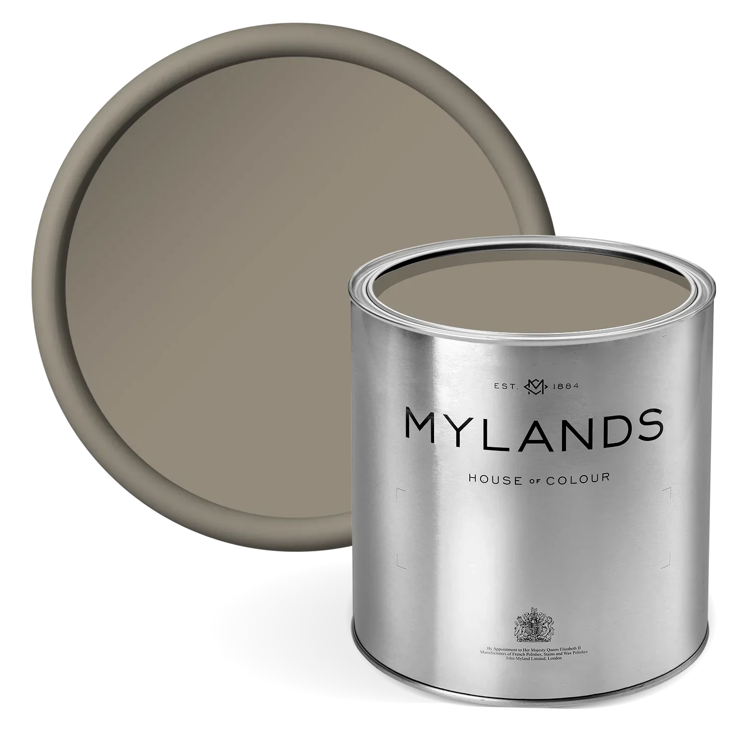
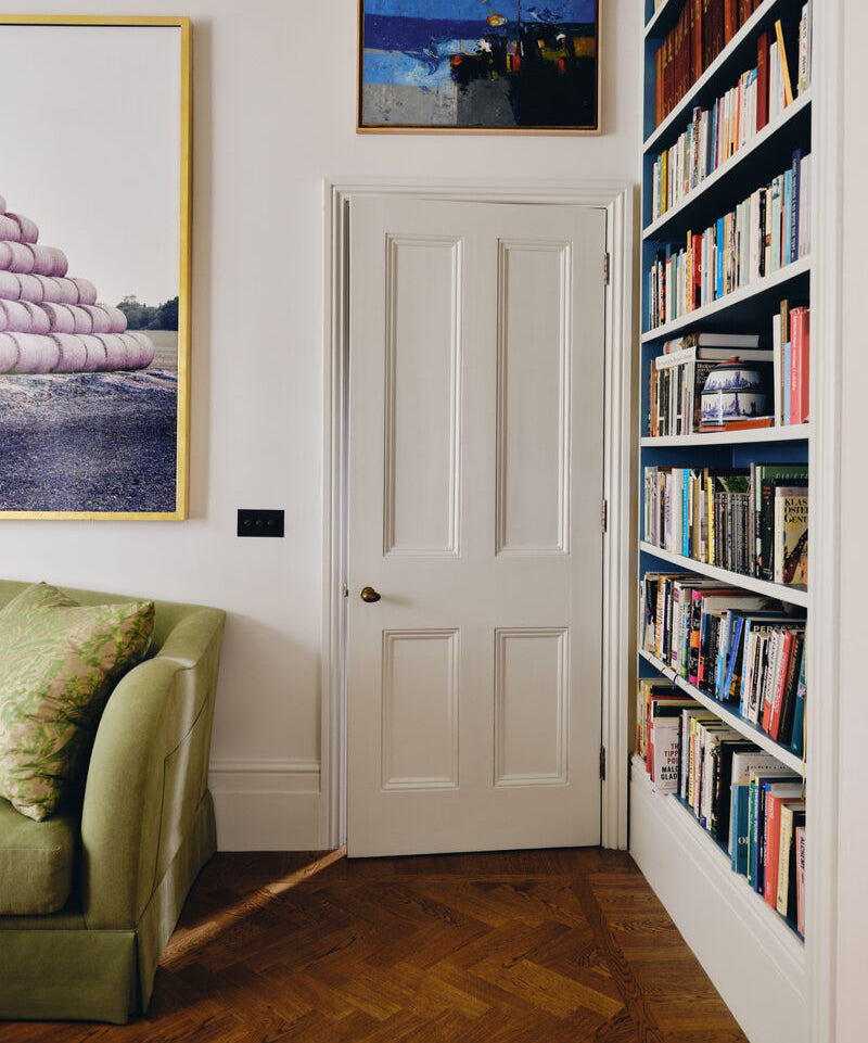
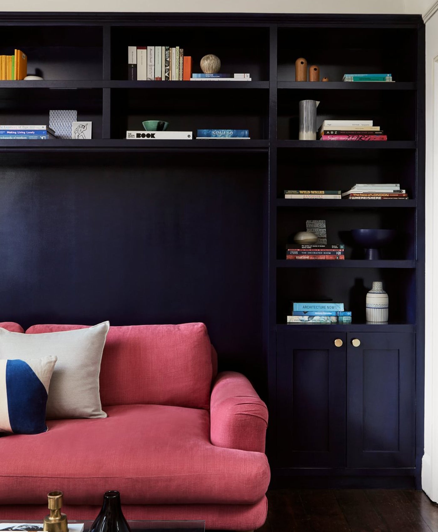
EGERTON PLACE™ NO.297


LIVING ROOM WALLS and shelving PAINTED IN EGERTON PLACE™ NO.297
A deep, earthy mushroom pink of umber and red with a touch of black. This bespoke colour was originally created for an attractive period property on this sought-after West London square.
SORREL GREEN™ NO.207

Green walls painted with Sorrel Green™ No.207

Inspired by the perennial herb, bring elements of the outside world in with this vibrant botanical green. Containing bright yellow, umber, and a touch of white.
PLEASURE GARDENS GREEN™ NO.214


Living room walls painted in Pleasure Gardens Green™ No.214
A dark green containing red with a drop of violet to deepen the tone. Pleasure Gardens Green™ No.214 is named after the leafy Vauxhall gardens on the south bank of the River Thames and just a stone’s throw from Mylands’ original store.
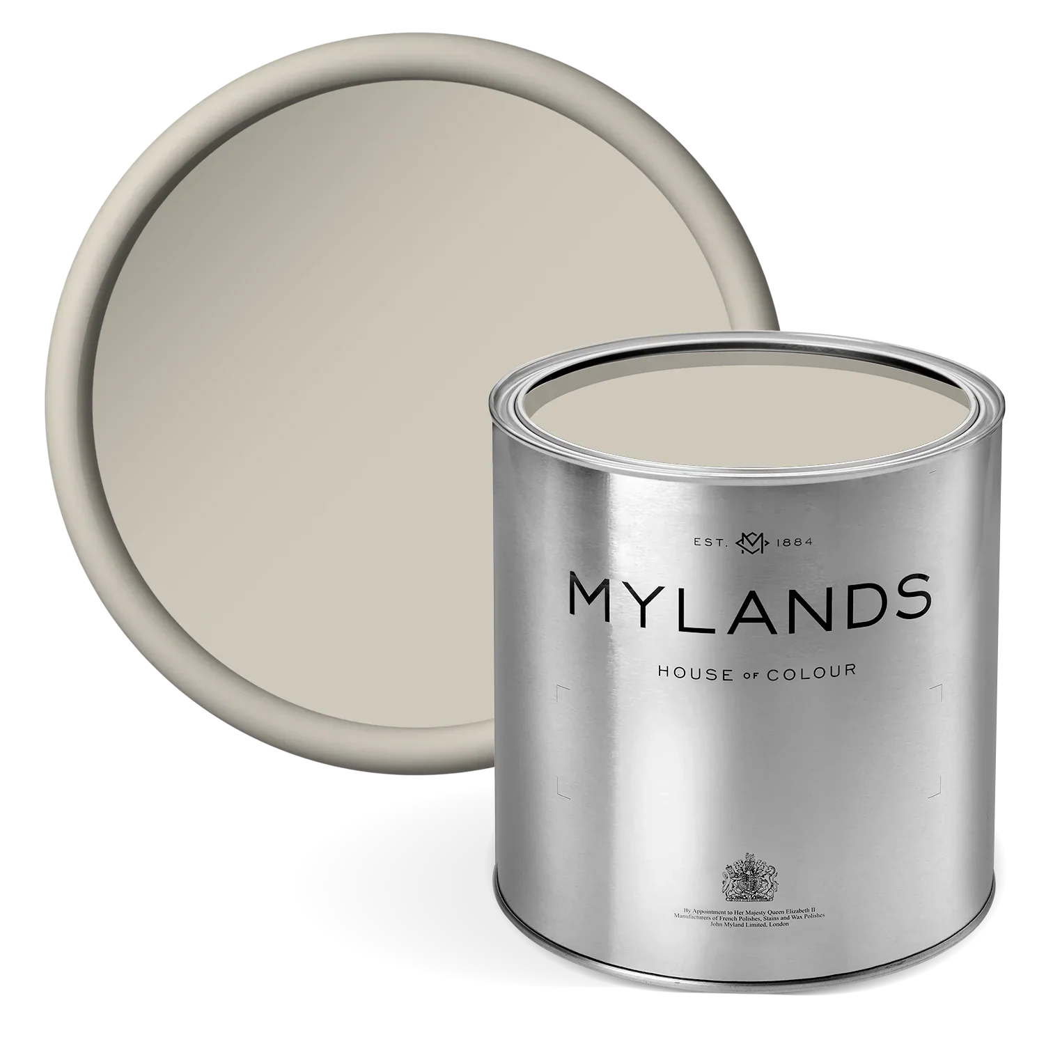
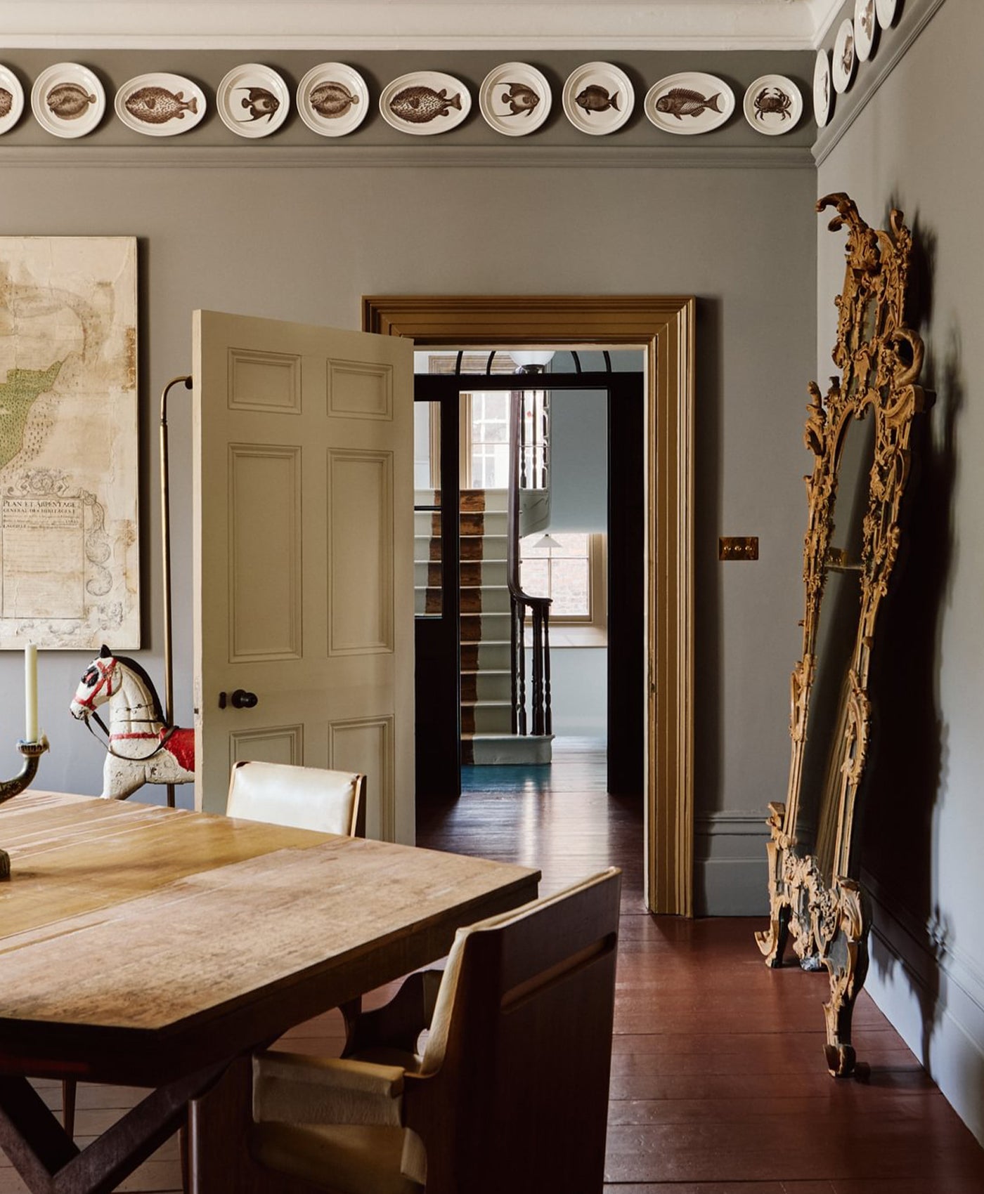
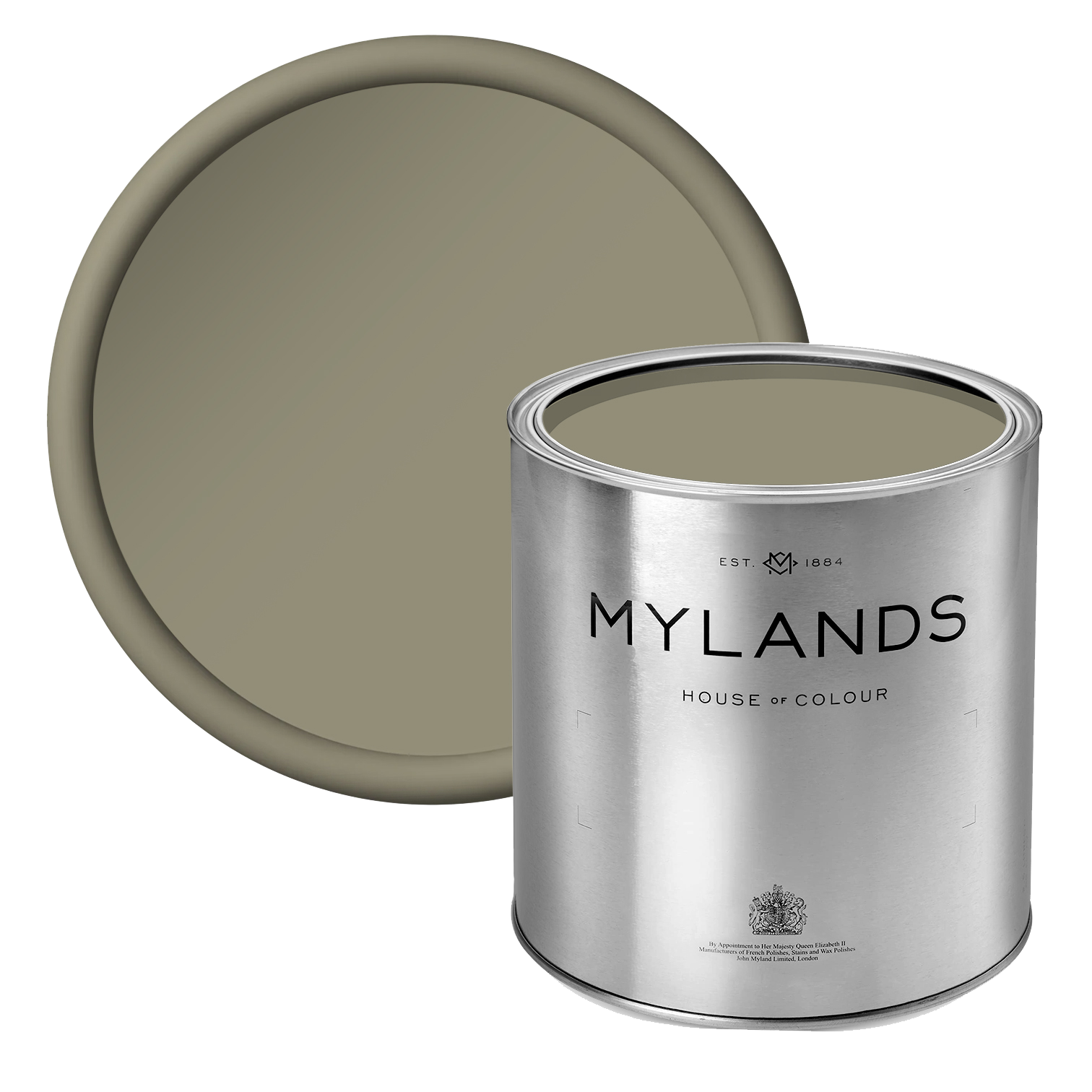
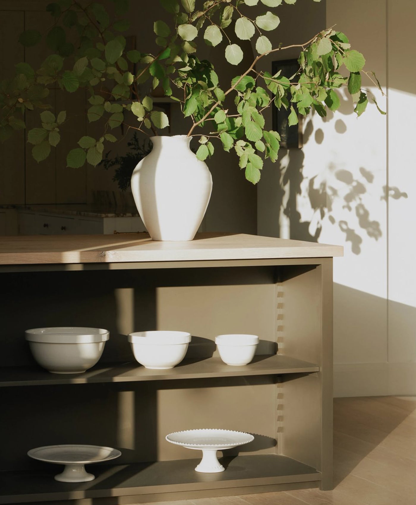
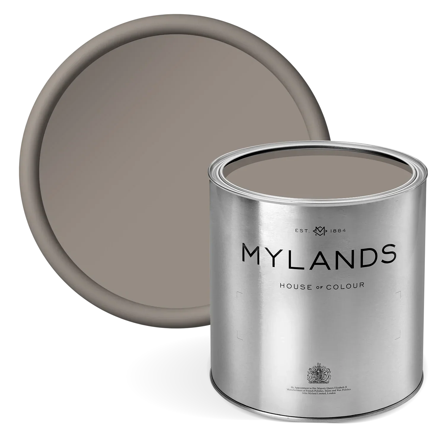
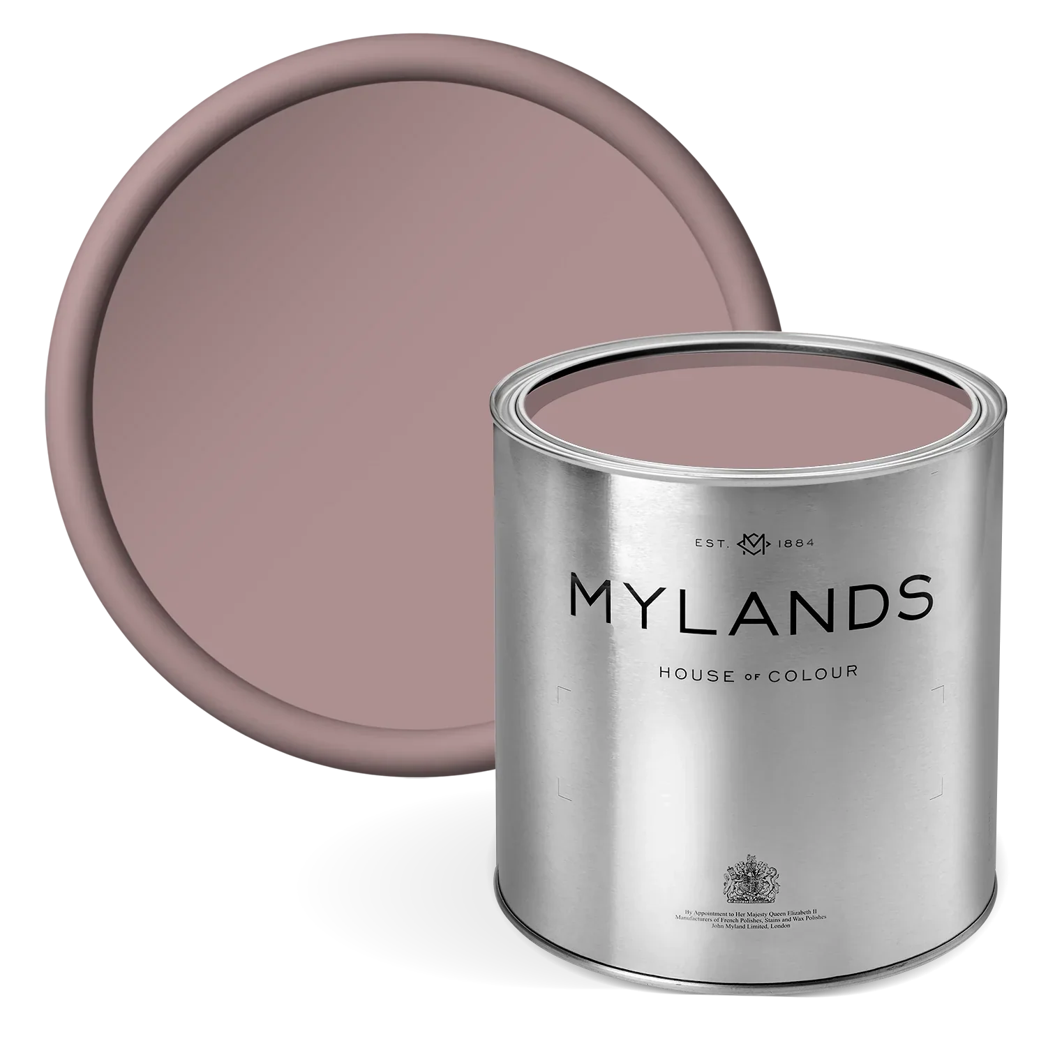
ROSE TAUPE™ NO.292


Walls and shelving painted in Rose Taupe™ No.292
With a vintage feel, a deep brownish grey containing bright yellow, red and black pigment. This warm shade, originally from the British Colour Council, is both a timeless neutral yet rich and atmospheric.
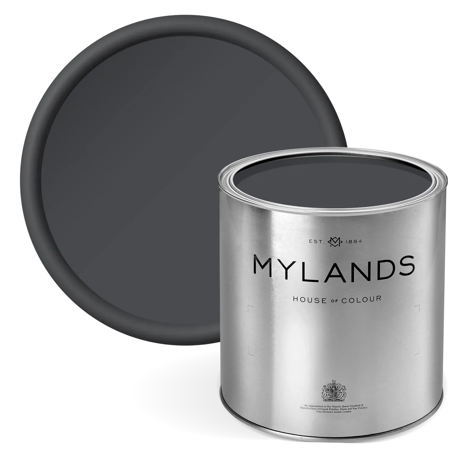
EMPIRE VIOLET™ NO.80

Walls in Empire Violet™ No.80
A regal, jewel-like dark purple of red, umber, and black. This statement hue from the British Colour Council creates both intimacy and drama in any room.
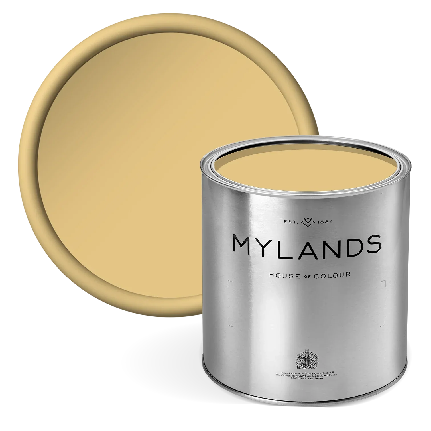
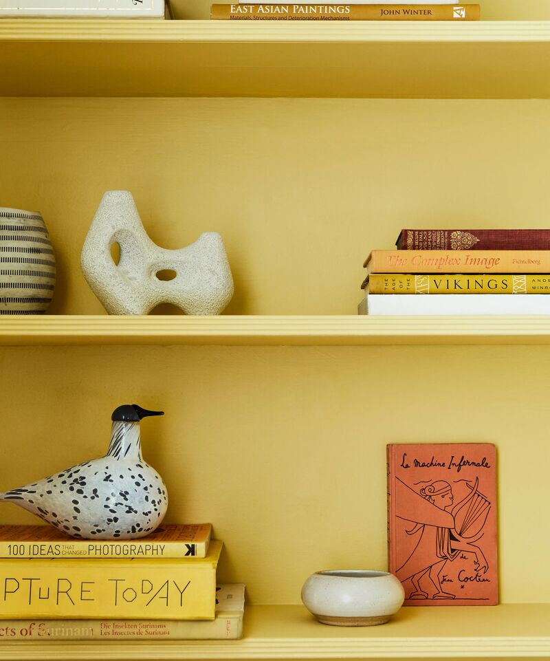
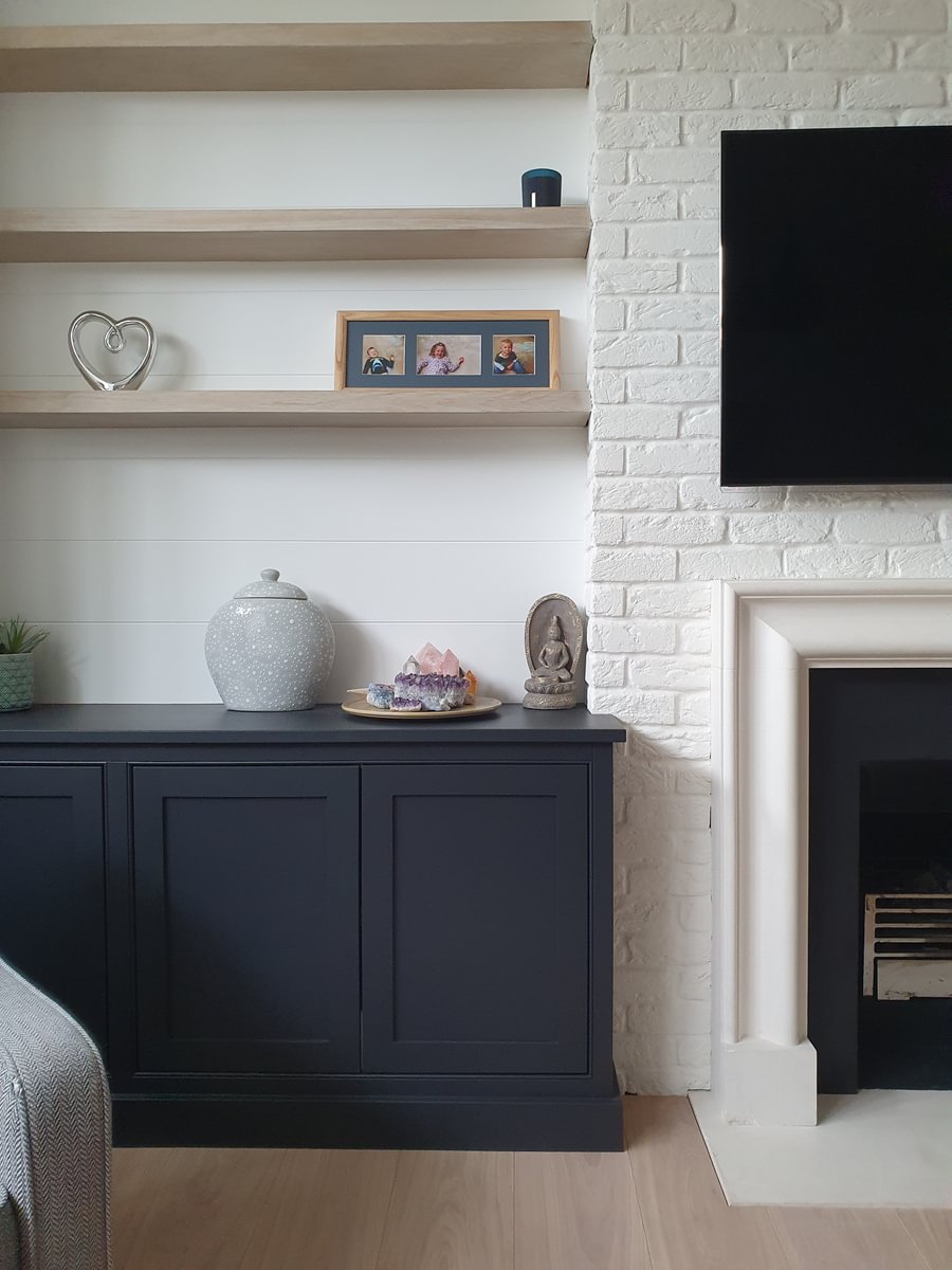
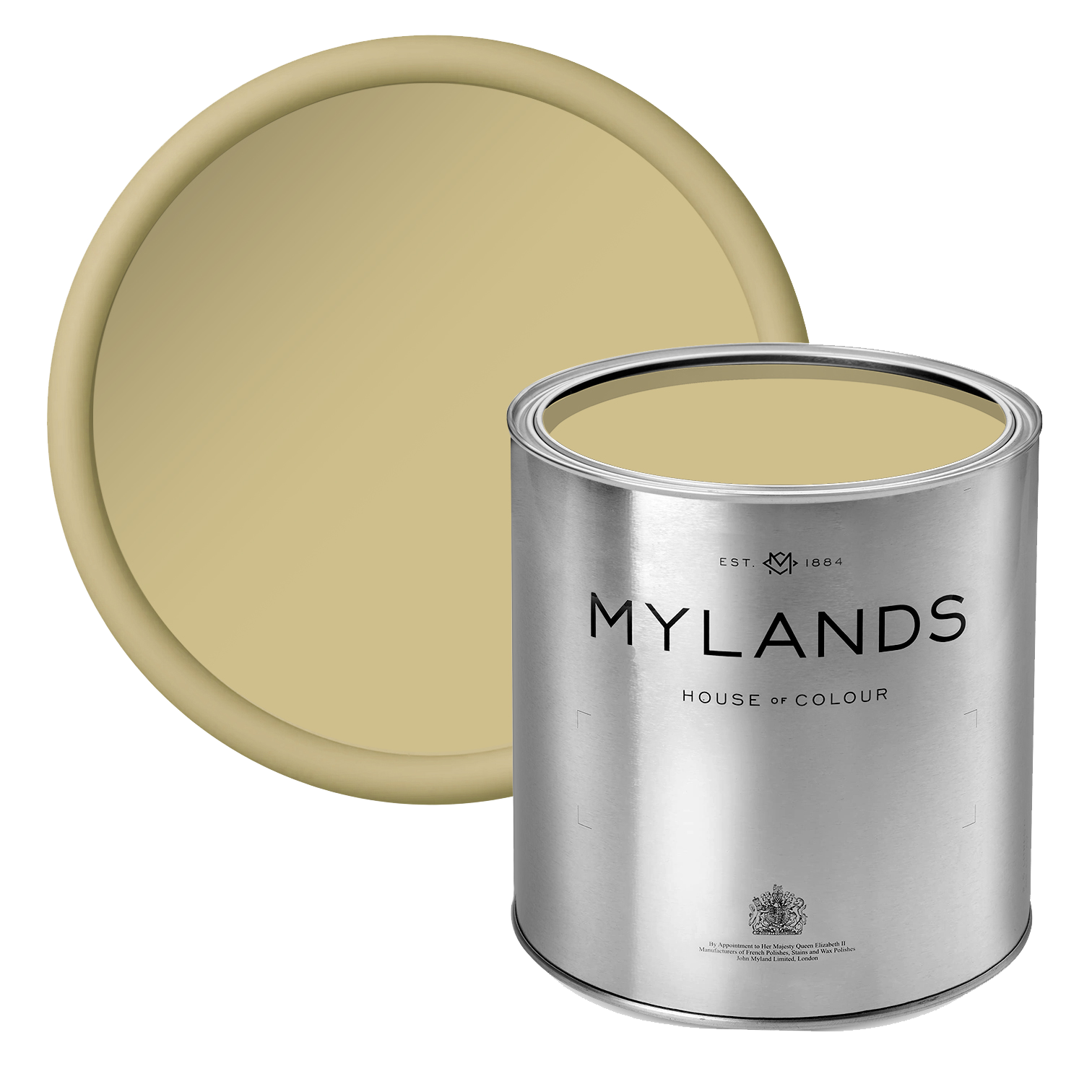
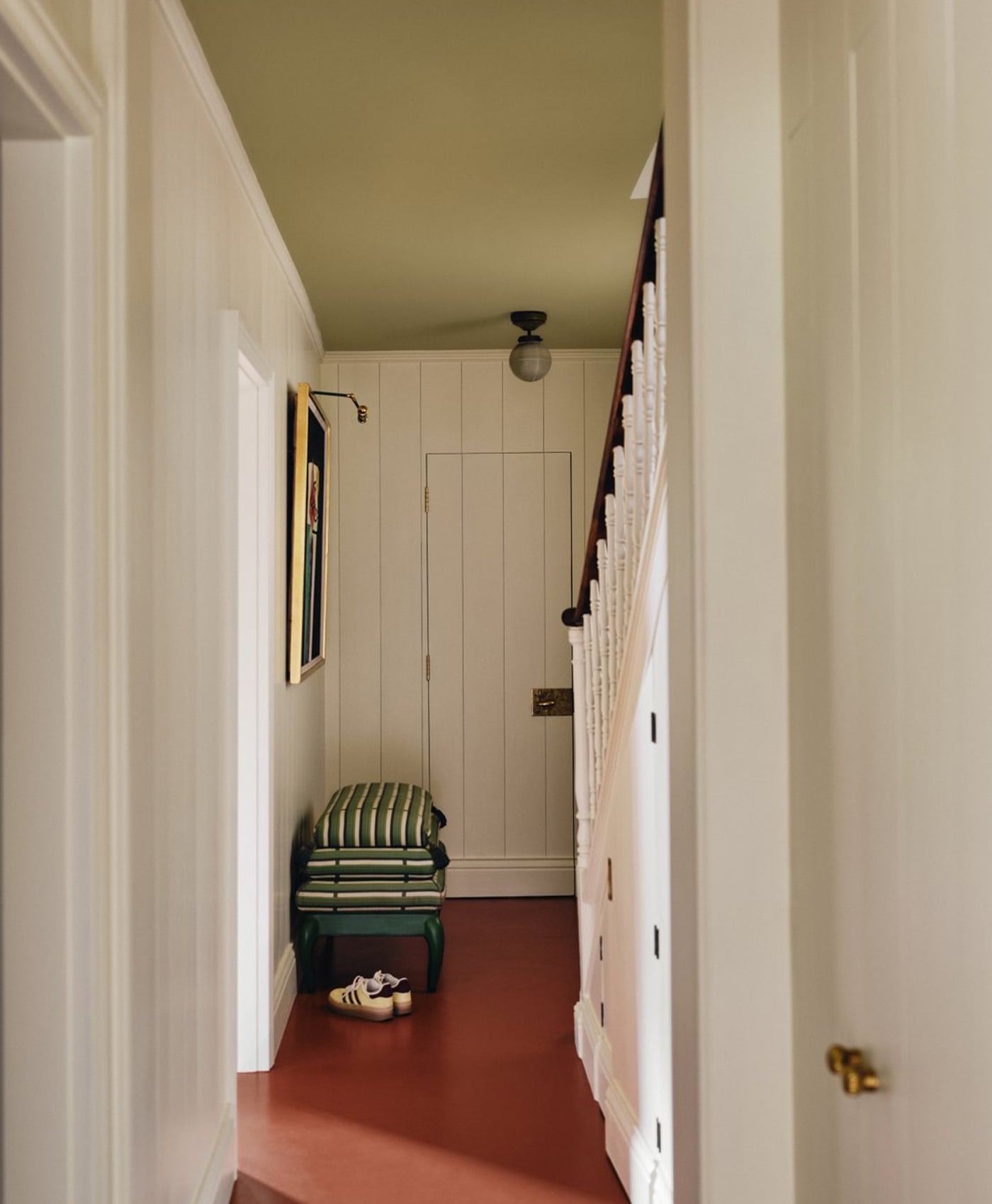
BEEHIVE PLACE™ NO.140


Bedroom walls and woodwork painted with Beehive Place™ No.140
Combining umber, green and white to form a bright sunshine yellow. Named after the street of the original 1884 Mylands store. This colour is warm and muted yet bold enough to make a statement.
CORAL ORANGE™ NO.277

Dining room walls painted with Coral Orange™ 277

A colour reminiscent of underwater coral marine life. Bright red and yellow come together to form a vibrant and muddy orange shade full of optimism.
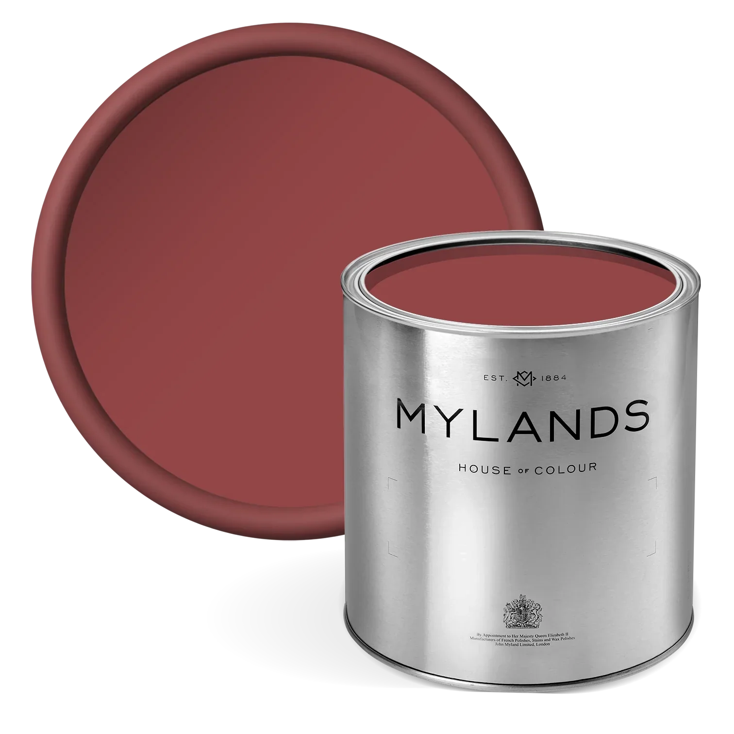
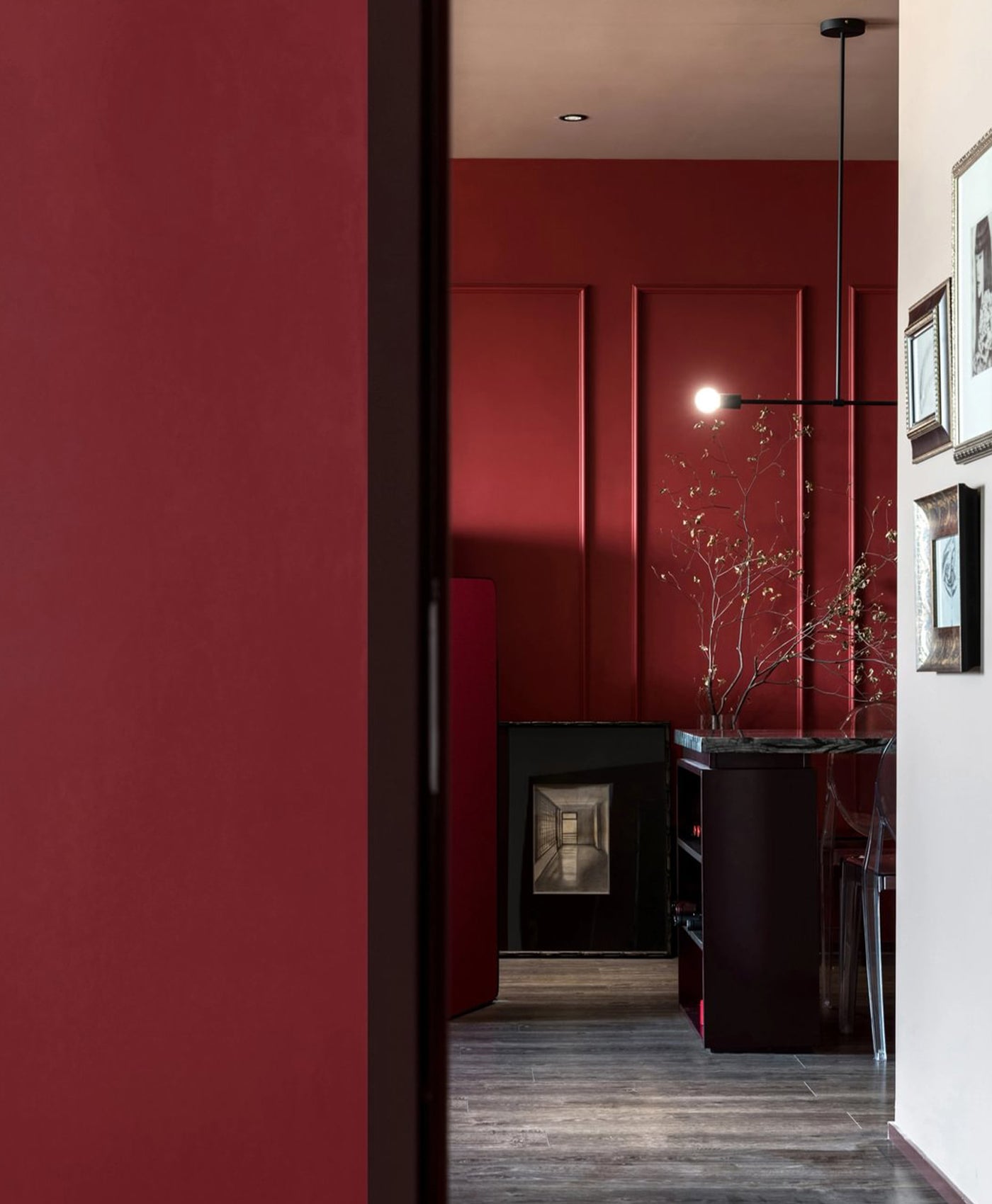
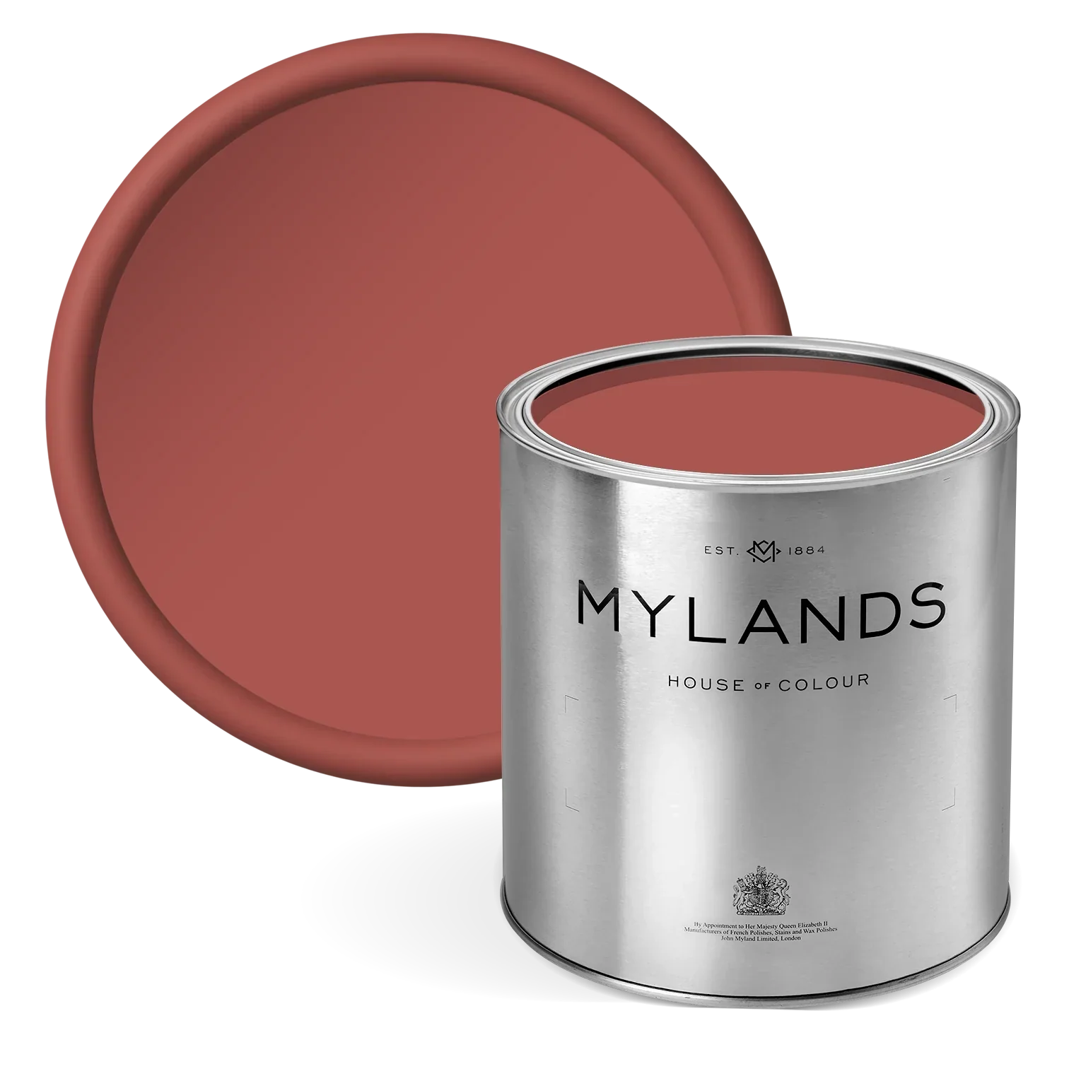
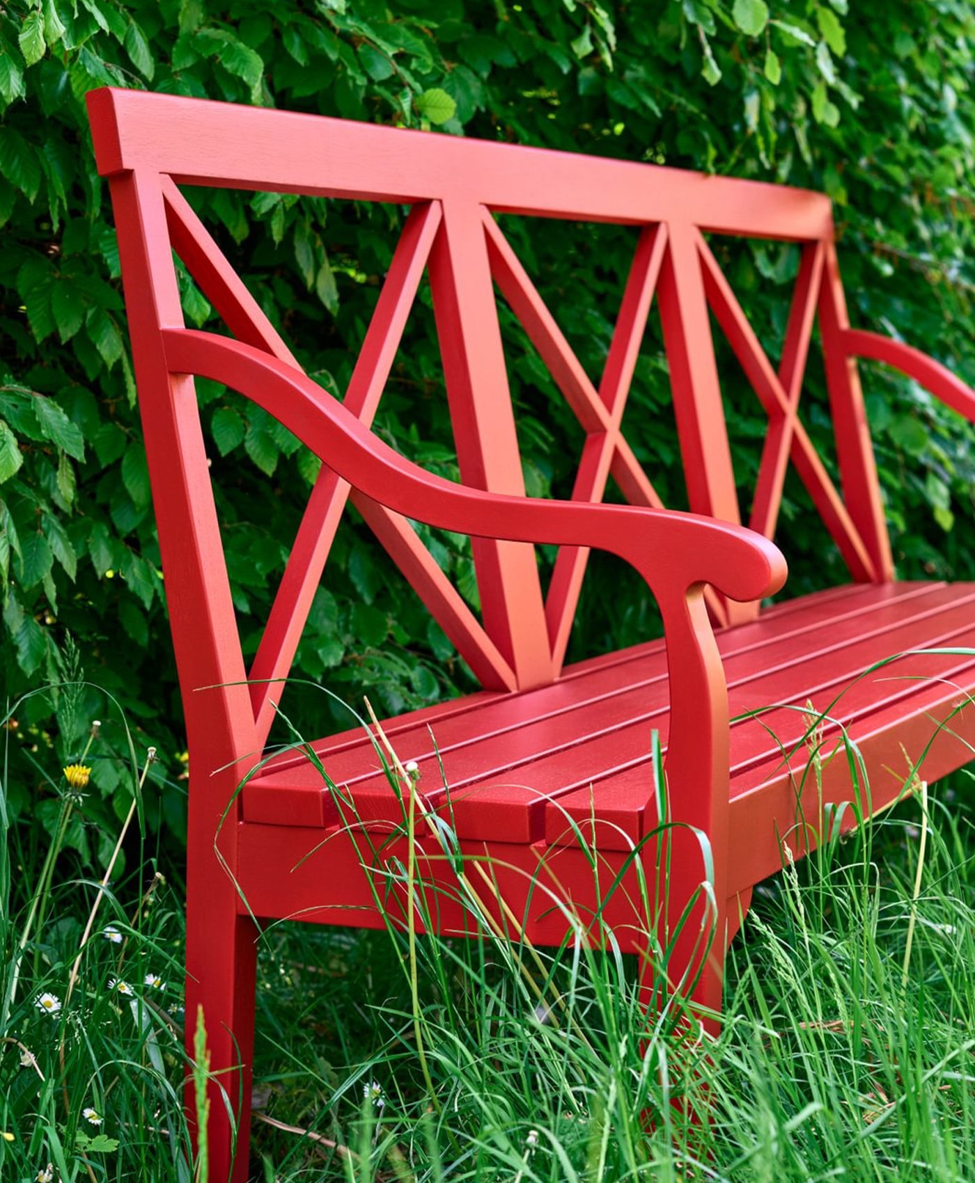
RED POST HILL™ NO.68


Bedroom walls in Red Post Hill™ No.68
Named after a South London road, this classic post box red contains a mix of six pigments: bright red, magenta, violet, black, yellow, and white.
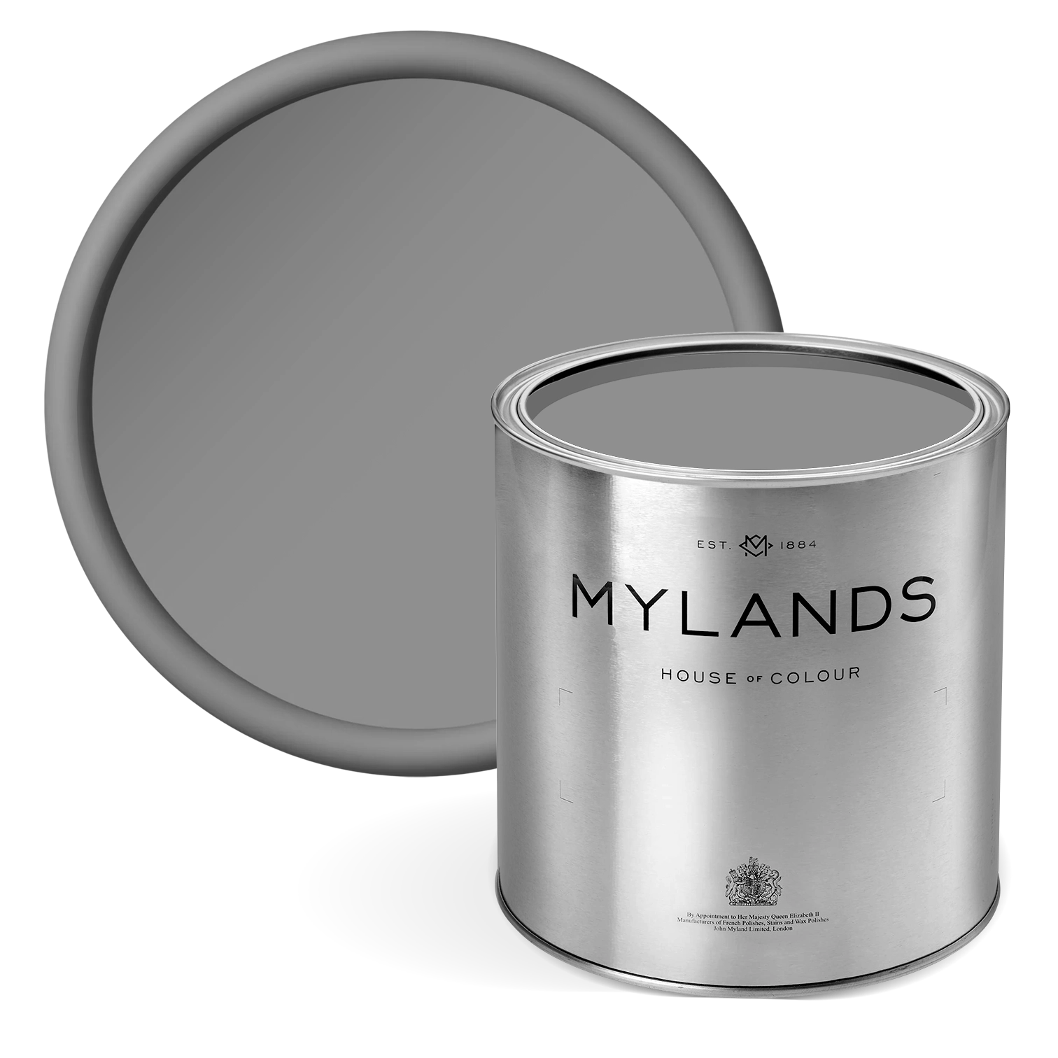
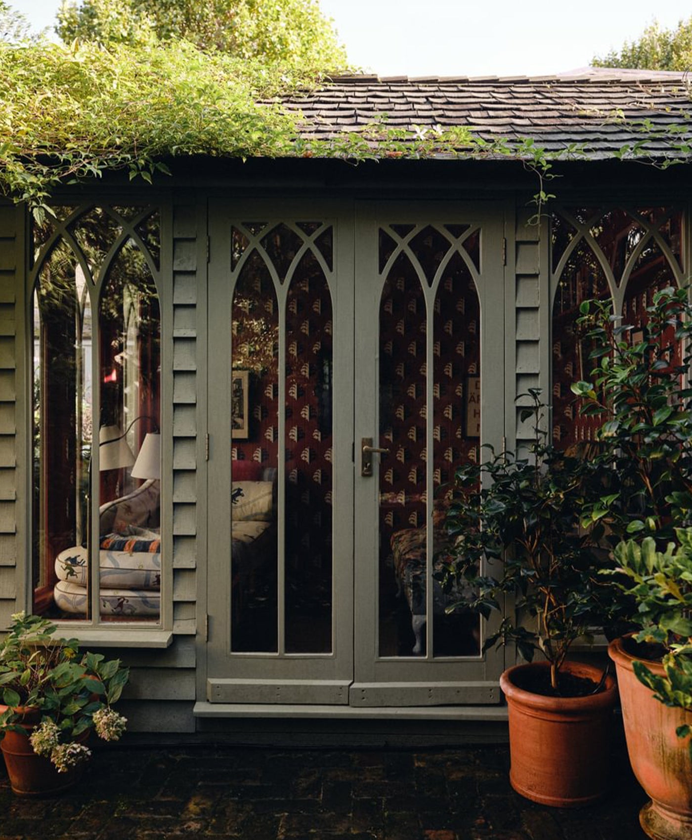
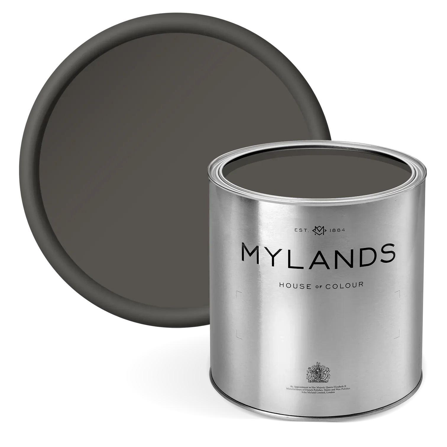
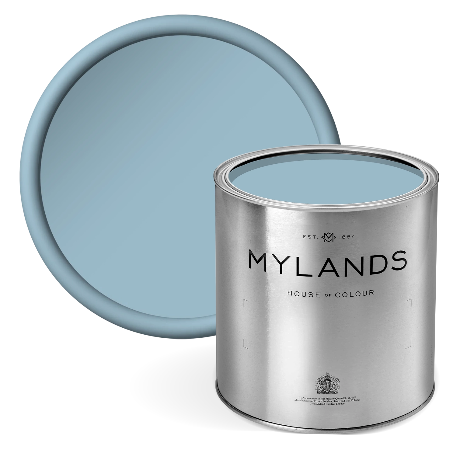
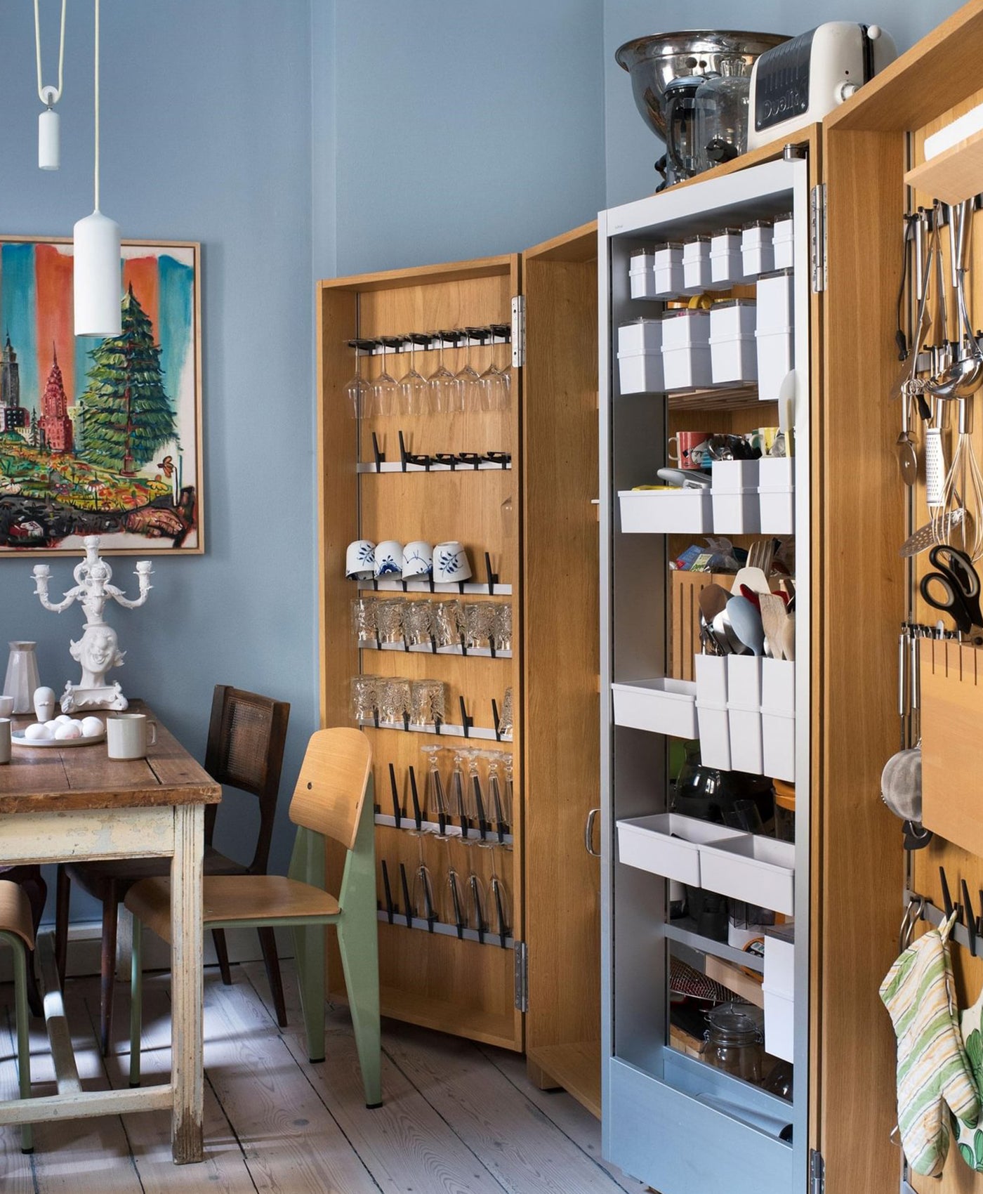
PROPER BLUE™ NO.67

Walls in Proper Blue™ No.67, Woodwork in Sorrel Green™ No.207
A bold and energetic deep cobalt blue of green, violet, and black. Evoking an ocean of endless depth whilst still appearing tranquil and still, it pairs beautifully with almost any colour scheme.
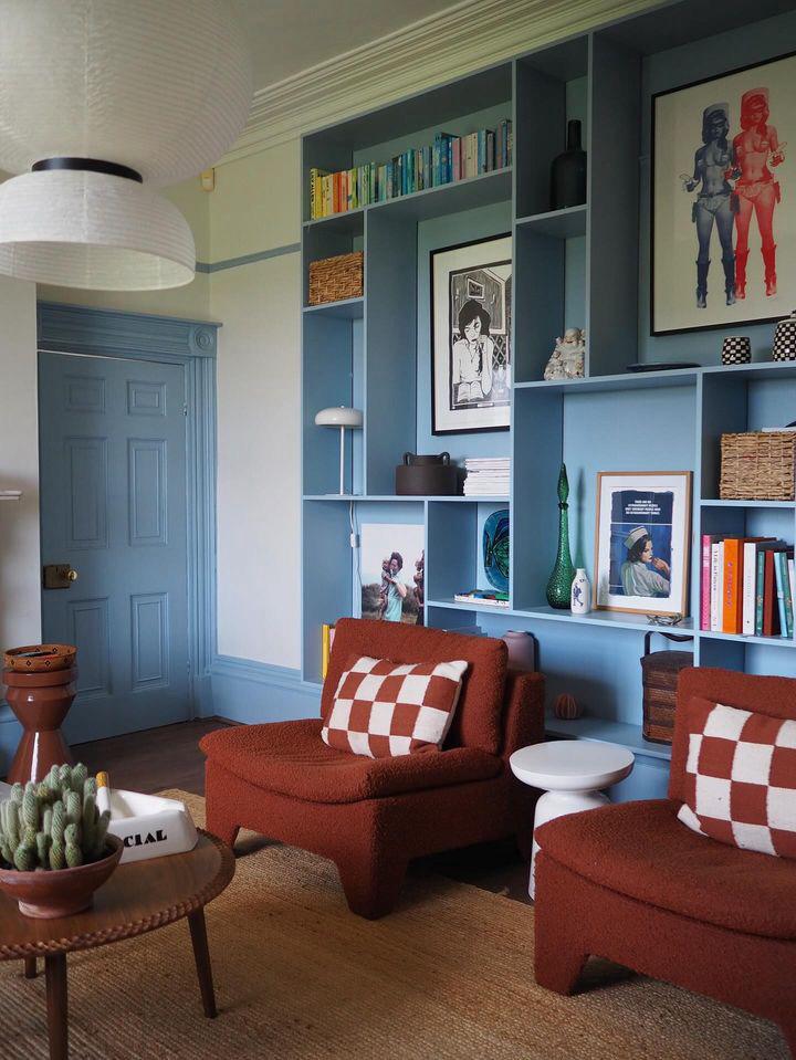
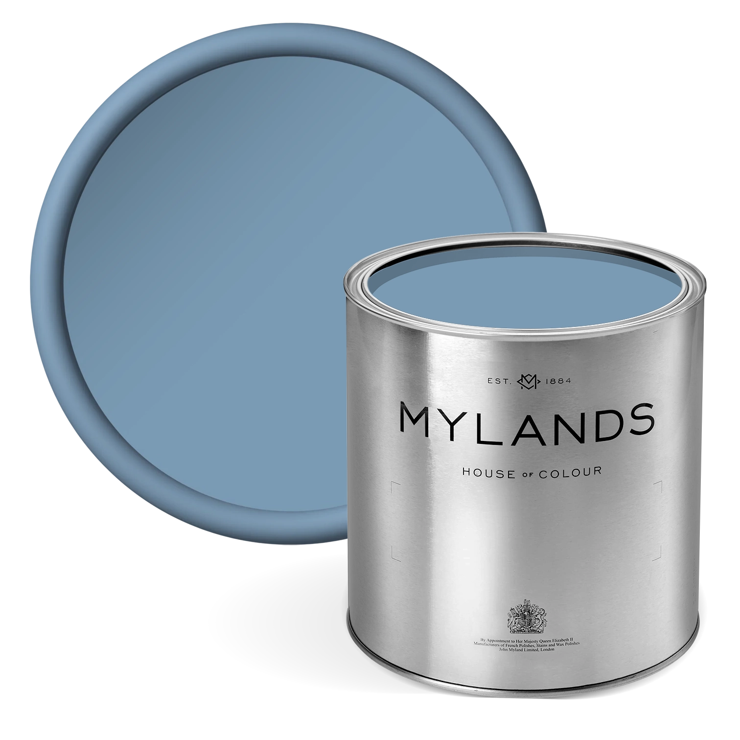
ENAMEL BLUE™ NO.78


Bedroom walls in Enamel Blue™ 78, bedframe and shelving in Red Post Hill™ 68
A richly pigmented light and bright blue. A combination of white, black, and violet form a striking and serene shade.