Skip to content

suppliers to the royal households

4.8 star rated by our customers

award-winning paint collections

Your palettes

Palette page
Palette page

Save colours to

Keep your palettes

Your palettes are saved on this device only. Sign in to keep them on your phone and computer, and to share them with our colour specialists when you book a consultation.

Sign in Create an account

Order samples

Colour Swatches · Coming soon

A card painted in the real paint, first three free.

Tell me when

    Your basket

    Your basket is empty.

    Shop colours Order samples

    Bestsellers

    Change finish or size

    How to Decorate with Contrasting Colours
    Inspiration

    How to Decorate with Contrasting Colours


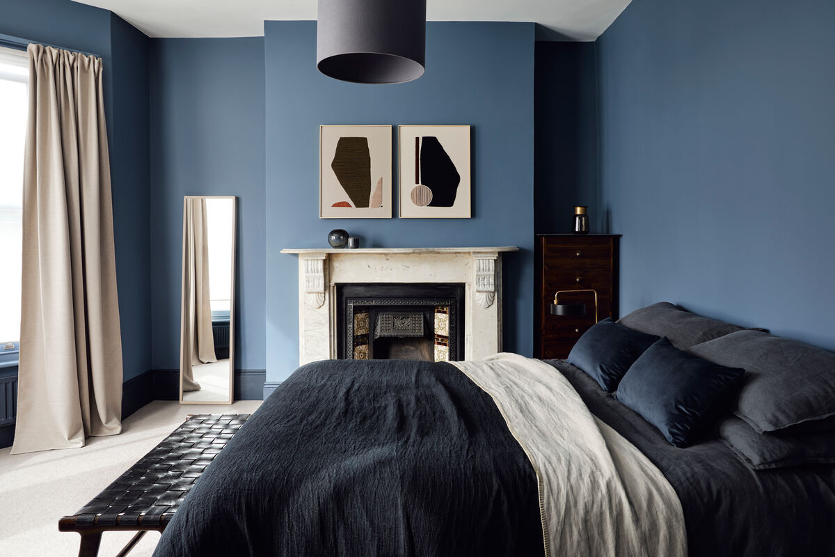
    Customers are gaining confidence with colour and incorporating it in new ways in the home. Moving away from the conventional choice of off-white for woodwork, Mylands is seeing its customers opt for something more characterful to inject visual interest without overpowering the room. An easy to live with mid-tone wall can be dialled up with a high-contrast detailing, bringing personality to a space.

    Walls in Soho House© No.266, SKIRTING & RADIATORS in Oratory® No.237, FLOORS IN Downing Street® No.10 

    For high-glamour, nothing beats a glossy dark floor, seen here in the iconic Mylands Downing Street® No.10. Anchored by a darker, dramatic tone on the floor, a room's beautiful proportions and natural light can be highlighted. Adding another layer of interest, the skirting has been painted in the cool stone-like shades of Oratory No. 237.

    Walls in Maritime© No.236, SKIRTING in Bond Street© No.219

    Walls in Golden Square@ No.131, Woodwork in Lemon Salts@ No-43 

    The layered effect also works well in brighter shades; this charming baby's room uses a playful palette, contrasting the cheerful ochre yellow of Golden Square© N 0.131 against the light freshness of Lemon Salts® No-43, with pops of brightly coloured furniture and accessories.

    For a fresh, modern feel, perennially popular off-whites such as the delicate Kensington Rose® N 0.22 can keep a space light and airy, while a high-contrast colour on the woodwork brings it edge. This inverted paint treatment creates a feeling of elegant contemporary chic. 
    get your free colour card

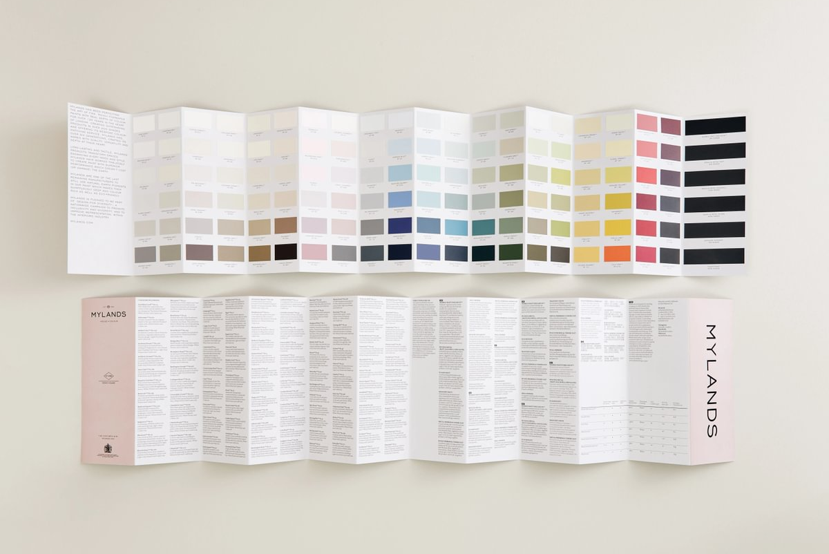
    Discover Mylands' unique curation of colours for you home. From warm neutrals to rich deep tones, Mylands' paint collections are available in unrivalled formulations for a seamless, durable finish.

    Order your colour card now >

    sample the quality

    Paint more with less. Our Marble Matt Emulsion has more pigment than any other paint, giving you more coverage with fewer litres. Discover this exceptional paint today.

    Order sample pots >

    featured in

    Read more

    Colour Trends this Spring
    Colour

    Colour Trends this Spring

    As we continue to improve our homes while spending so much time in them, many consumers are updating their spaces with a fresh lick of paint. This Spring, we've seen some interesting choices in col...

    Read more
    Colours of Summer
    Case Study

    Colours of Summer

    A careful edit of fresh, muted colours pays homage to summer in the city. Mylands introduced a fresh new palette, Summers of London, inspired by Mylands’ hometown and the histor...

    Read more