Choosing An Alternative to White
Sometimes, a bright, stark white can feel too harsh and off-putting, especially during the winter months. Its brilliance can appear cold under soft natural light, and in rooms with limited sunlight, it risks creating a space that feels more clinical than comforting.
This is where softer whites and warm neutrals come into their own. Shades with gentle undertones of chalk, stone, or brick bring quiet depth to interiors, adding richness without overwhelming the senses.
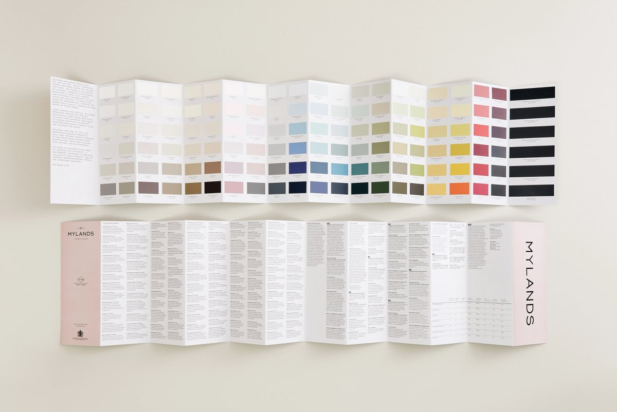
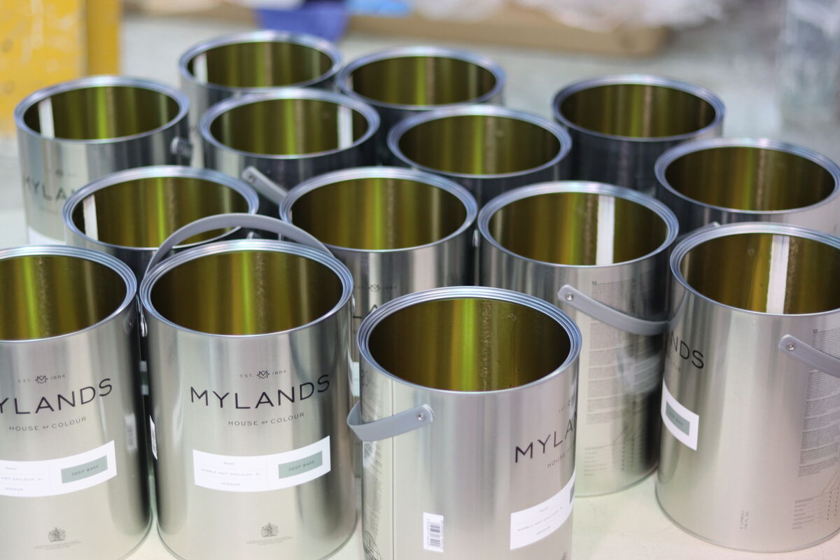
Explore our carefully curated range of soft whites, warm neutrals, and gentle hues—perfect for bringing subtle warmth and sophistication to your interiors this winter, or as a considered alternative to white.

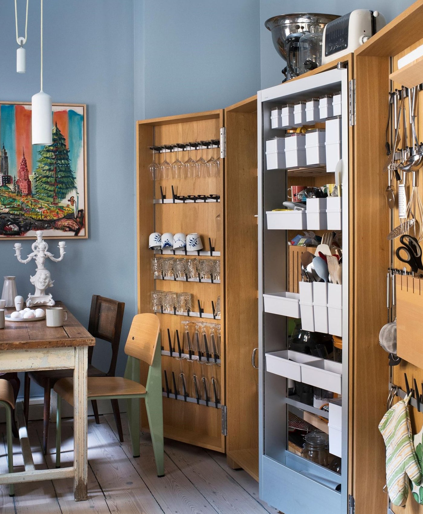
Fridge in Bone BH.04 (Gloss), Walls in Bone BH.04 (Matt)
Finding a warm neutral
All neutrals have an undertone. This could compromise of any colour, such as yellow, brown, pink or green and therefore, those components will add different levels of warmth. Warm neutrals can make a room feel toasty and inviting. They can make a living room feel friendly and cosy or a bedroom feel comforting.
For years, cool grey has reigned as the neutral of choice, a quiet backdrop for modern interiors. But, softer, warmer neutrals are taking centre stage, bringing a sense of depth, light, and understated elegance that cool tones can no longer match.
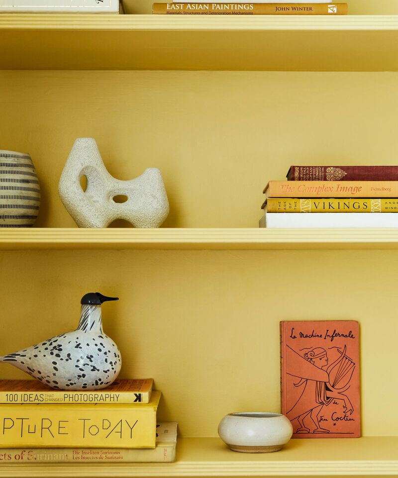
To stay ahead of the curve, consider stepping away from icy greys and embracing the richness of stone, cream, dusty pinks and butter yellows. These shades enhance natural light, complements textures, and creates interiors that feel effortlessly composed and inviting.

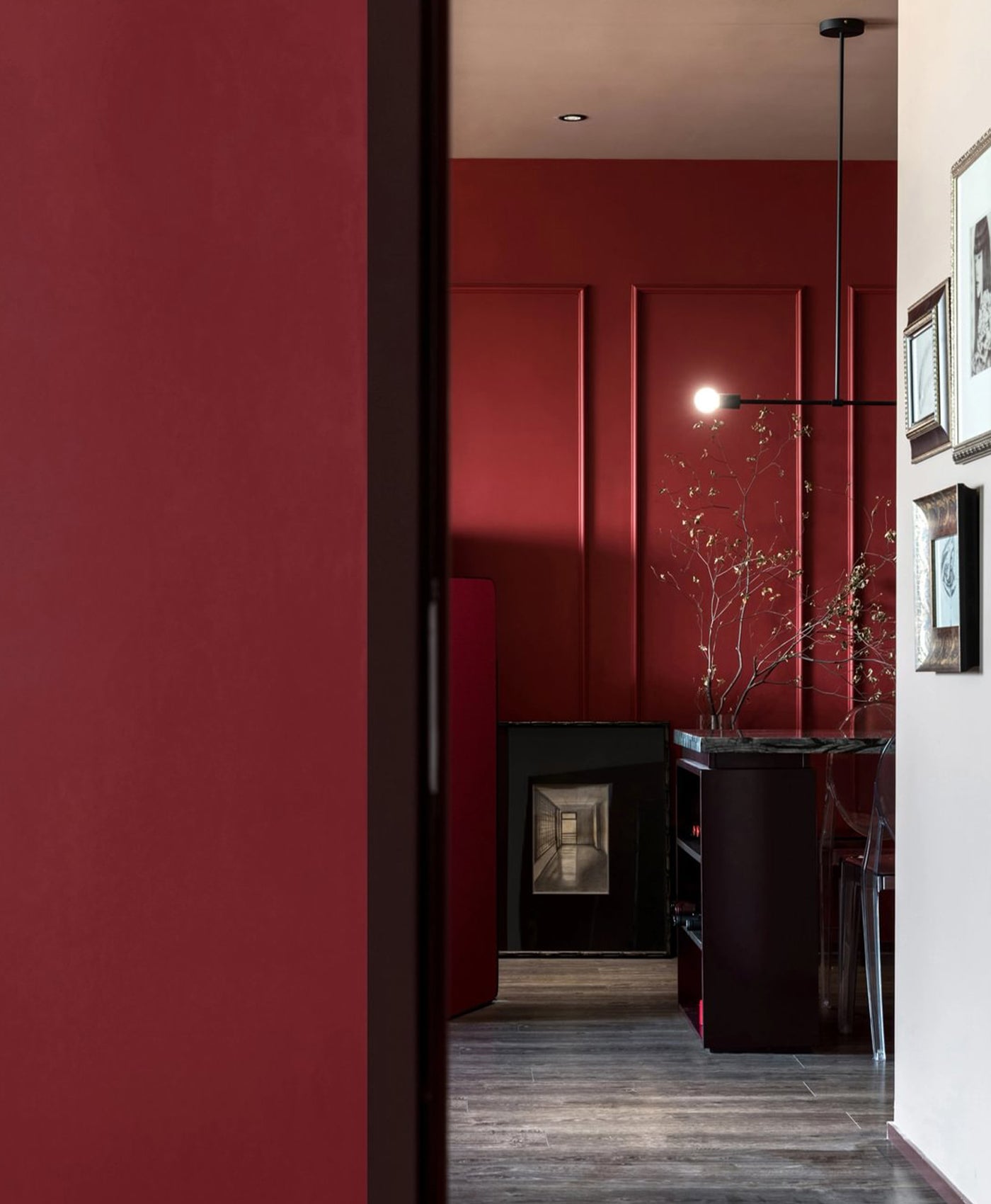
Walls in Cadogan Stone™ No.59
The main thing to consider when choosing a neutral or a softer white paint is the amount of natural light in the room.
We recommend using sample pots to test out the shade before you paint an entire living space. Neutral tones can look different with varying amounts of light. Check it at different times of day and with artificial light too. All of those factors will affect its appearance and will help you to decide which neutral shade works best.
For a warm room?
Whilst streams of natural sunlight can feel wonderful, you need to offset it with the right neutral palette. Opt for a warm neutral that is on the less toasty end of the scale.
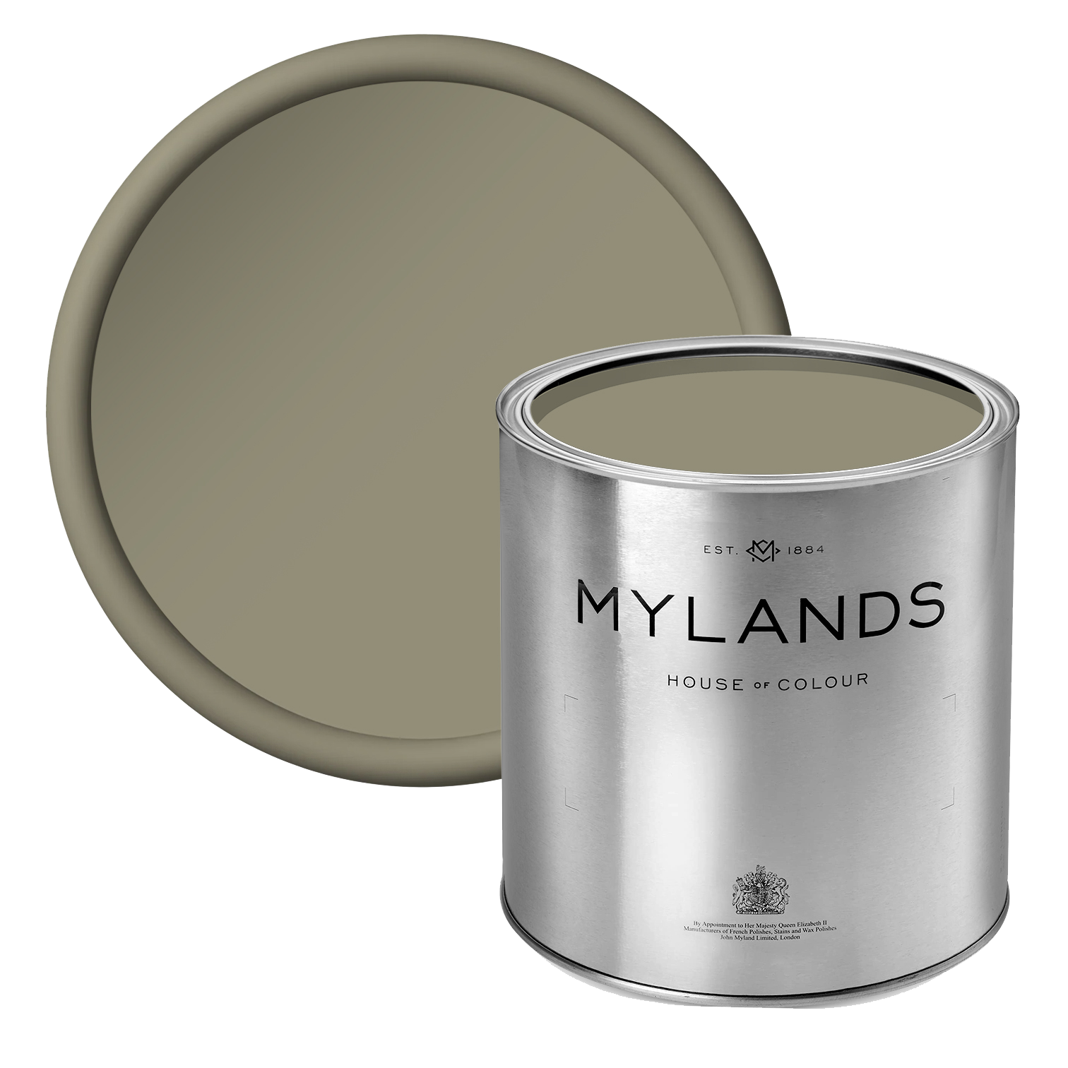
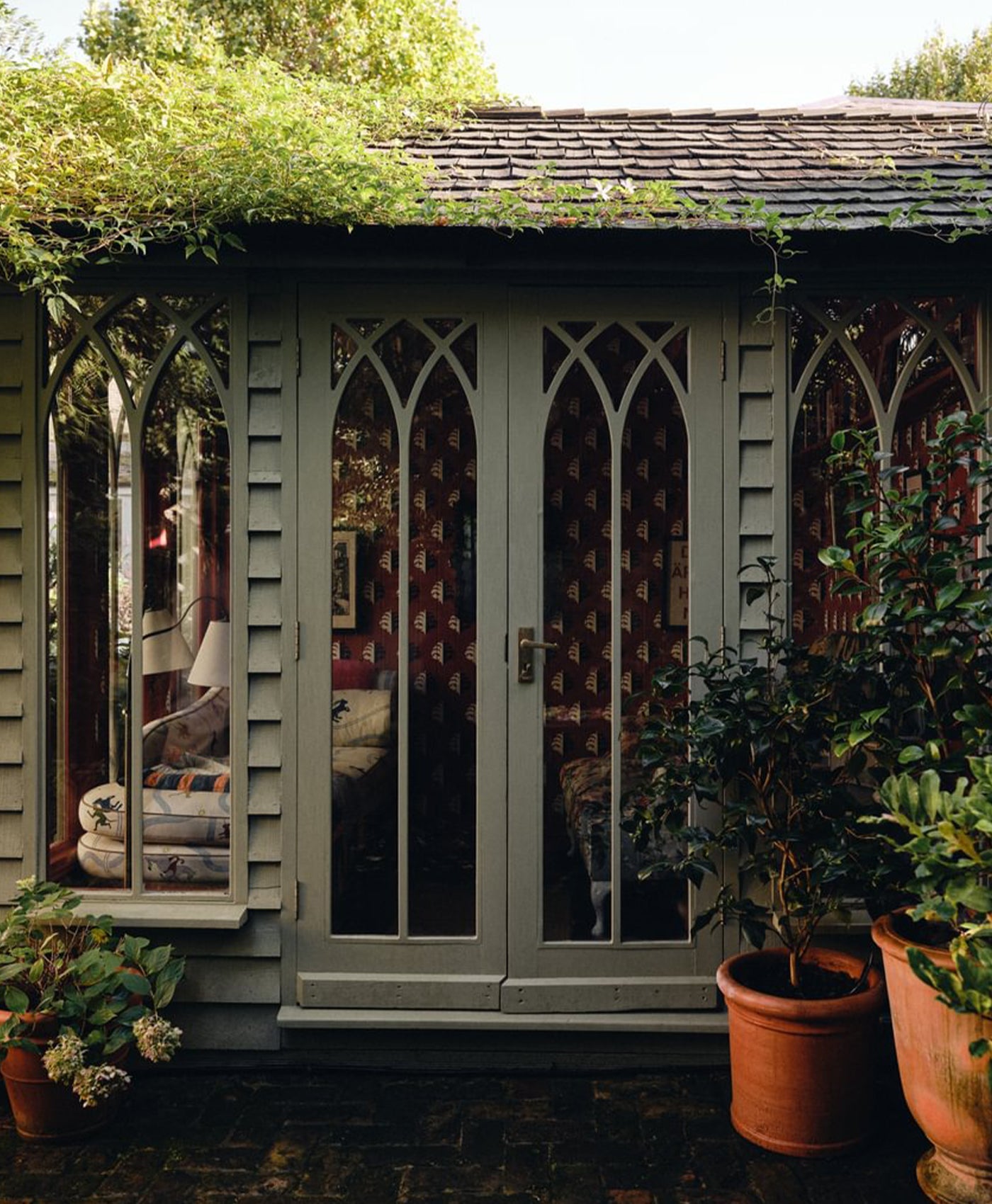
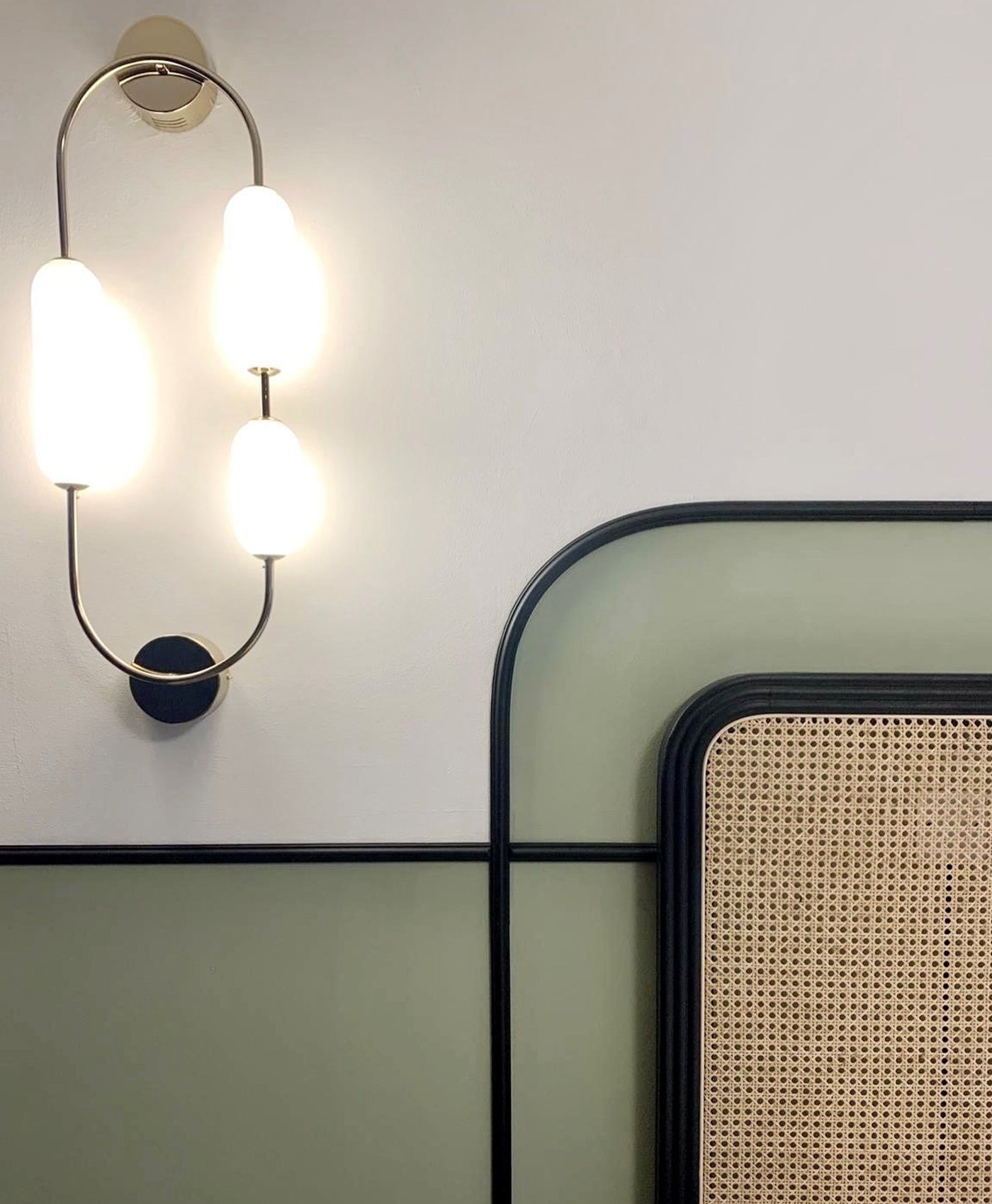
Yellow undertones can bring too much sunshine to an already sunny, warm room. These hues can look more brown than yellow in warm rooms. Thus, balance the room’s interior design with off-white or a neutral with green or stone undertones. Here, this interior has used Alderman™ No.60.
It’s a soft, earthy neutral paint colour with a green undertone. It feels calming and gentle, and just right for this space.


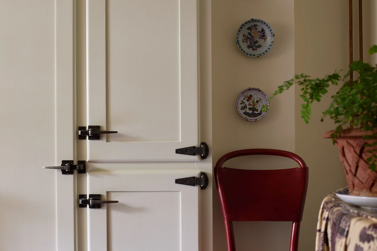
Walls in Honest John™ No.58,
Our alternatives to white
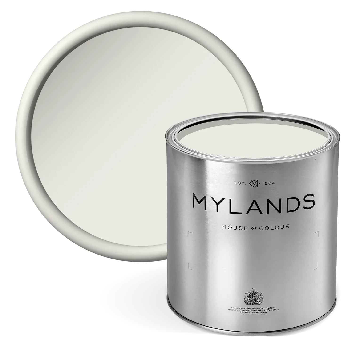
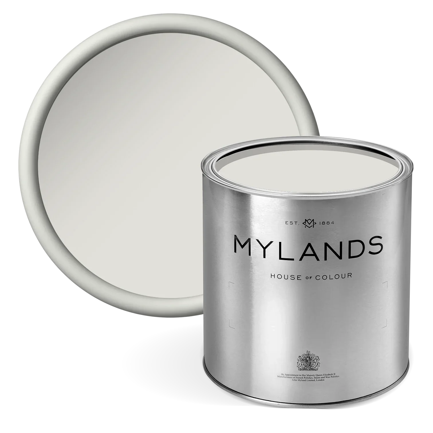
Beata White BH.01
Although this is still a white, Beata White BH.01 is a soft, gently warmed off-white with a delicate hint of yellow that brings a natural luminosity to interiors. Neither stark nor creamy, it offers a beautifully balanced neutrality that feels calm, considered and effortlessly liveable.
An elegant alternative to pure white, this colour lends spaces a sense of softness and elegant character, perfect for interiors where comfort and sophistication go hand in hand.

Walls in Beata White BH.01
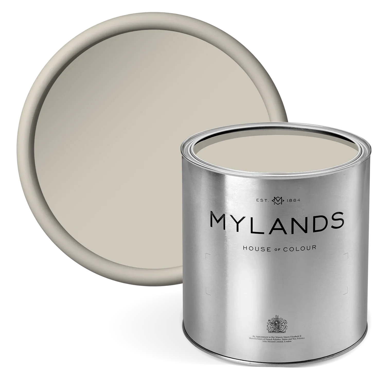
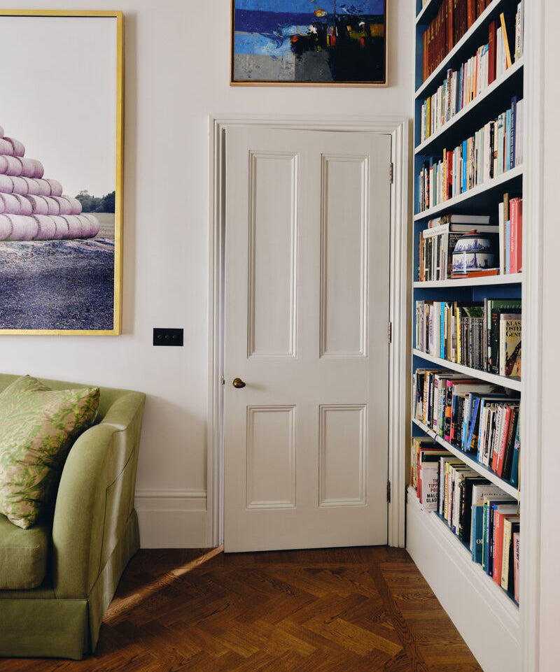
Bone BH.04
Bone BH.04 is a softly understated neutral with gentle warmth and natural, chalky character. Sitting comfortably between white and stone, it offers depth without heaviness and brings a quite elegance to interiors.
More of a creamy white, it is mixed to evoke the memory of a 1940s kitchen, working nicely on boarded walls and woodwork. But, with subtle undertones that feel organic rather than overt, this shade creates a space that feels calm, balanced, and refined. A considered alternative to a white, Bone BH.04 has sense of softness to both period and contemporary interiors.

Walls in Bone BH.04
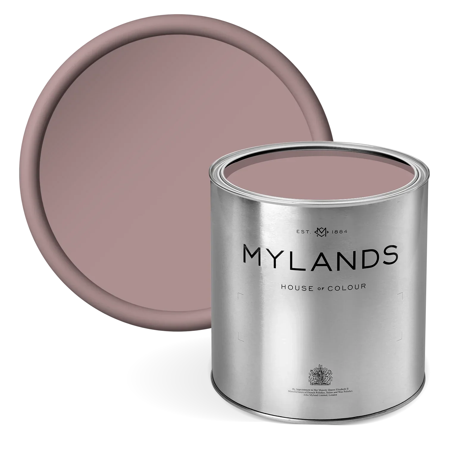
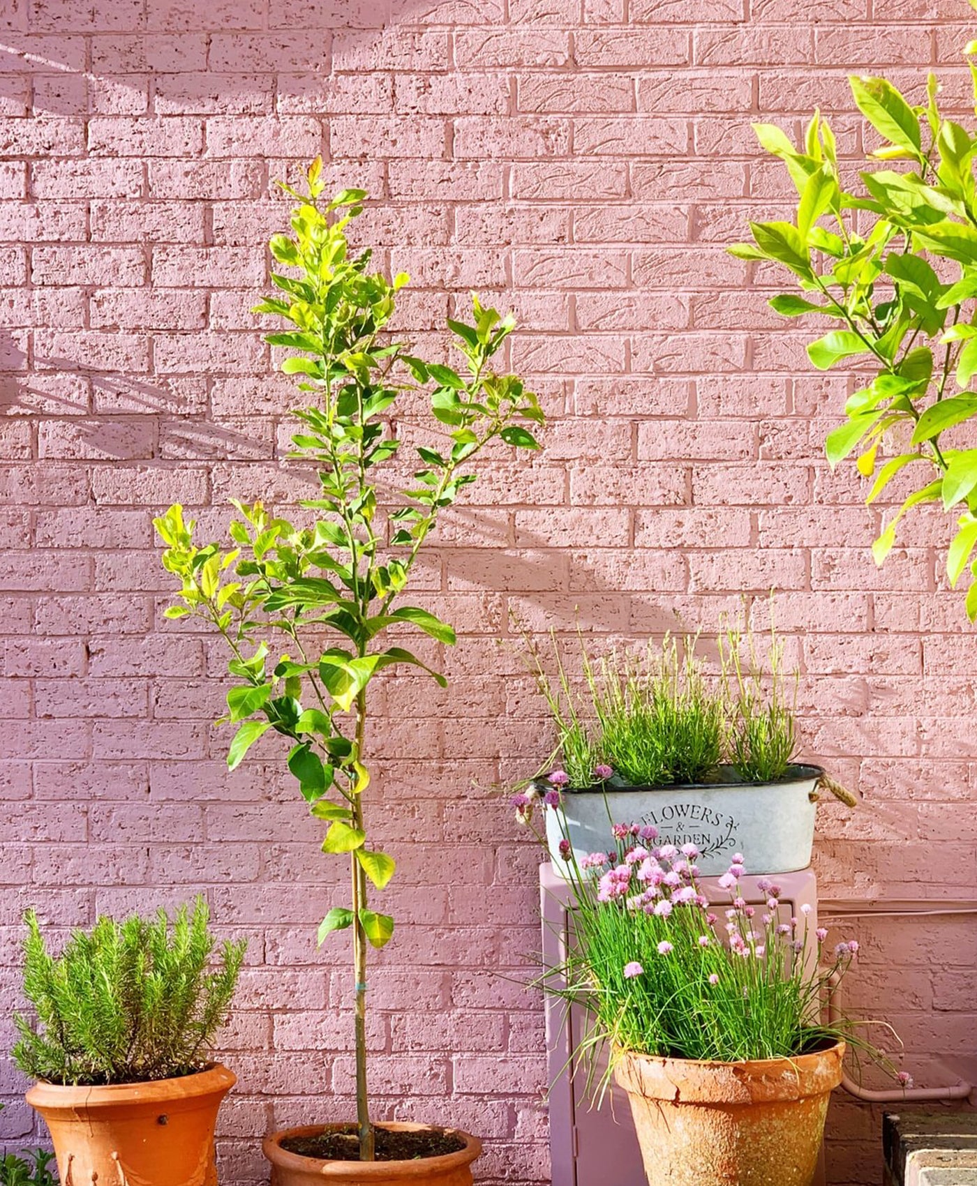
Pediment™ No.73
A pink toned shade, Pediment™ No.73 is a warm neutral blush with depth and control, offering beautifully balanced softness. It's delicate blush is tempered by a subtle grey undertone, lending the shade a sophistication that feels timeless.
This shade is an ideal alternative to white because it offers the same light-enhancing qualities as a pale neutral or white but, with an added warmth and tone.

Walls in Pediment™ No.73, Window in Bespoke Colour
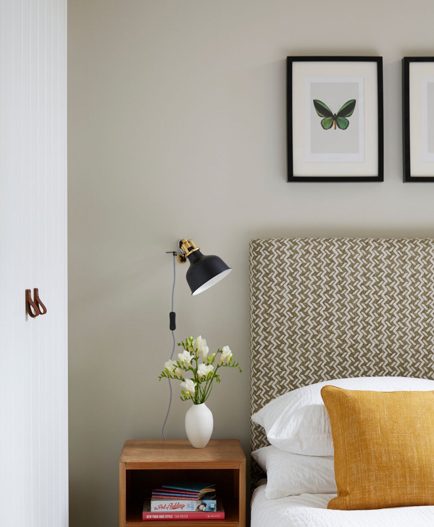
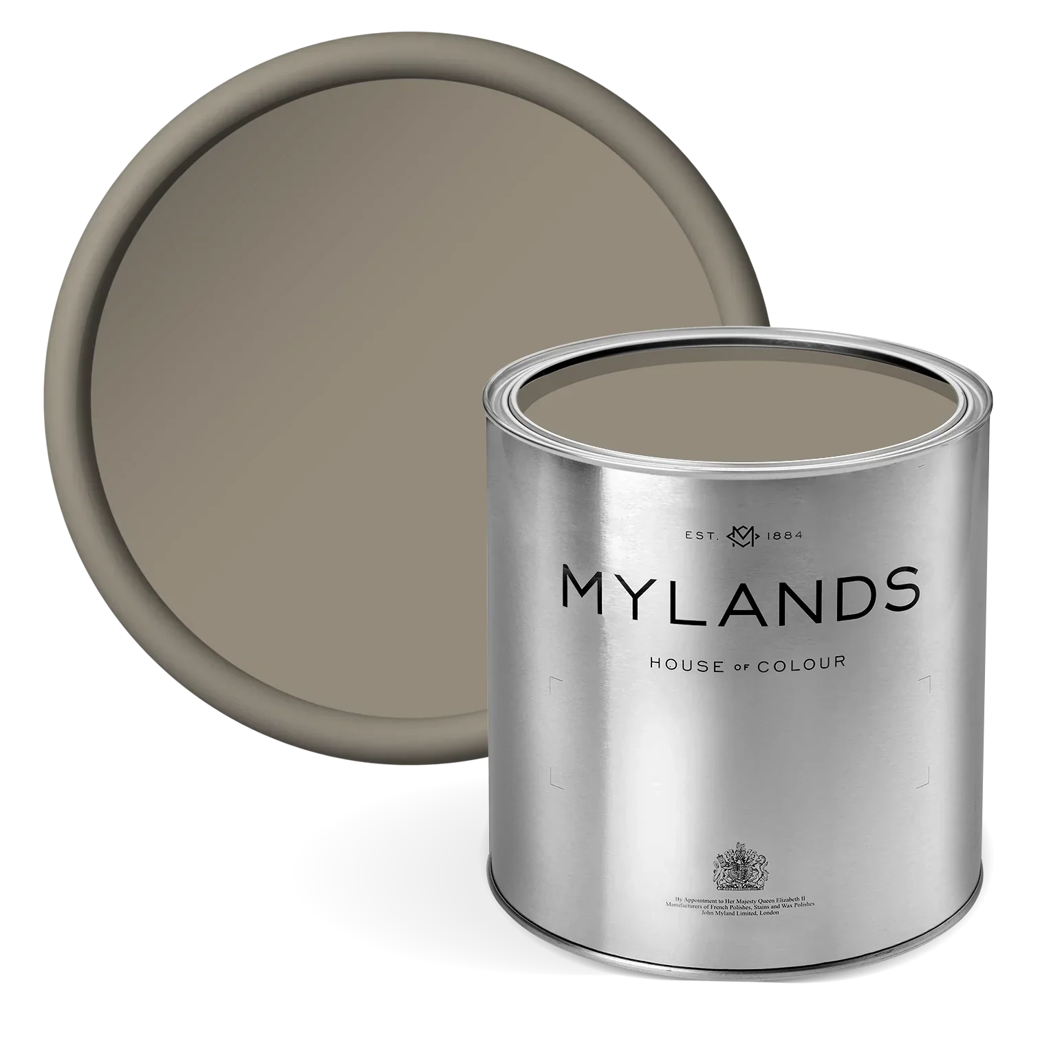
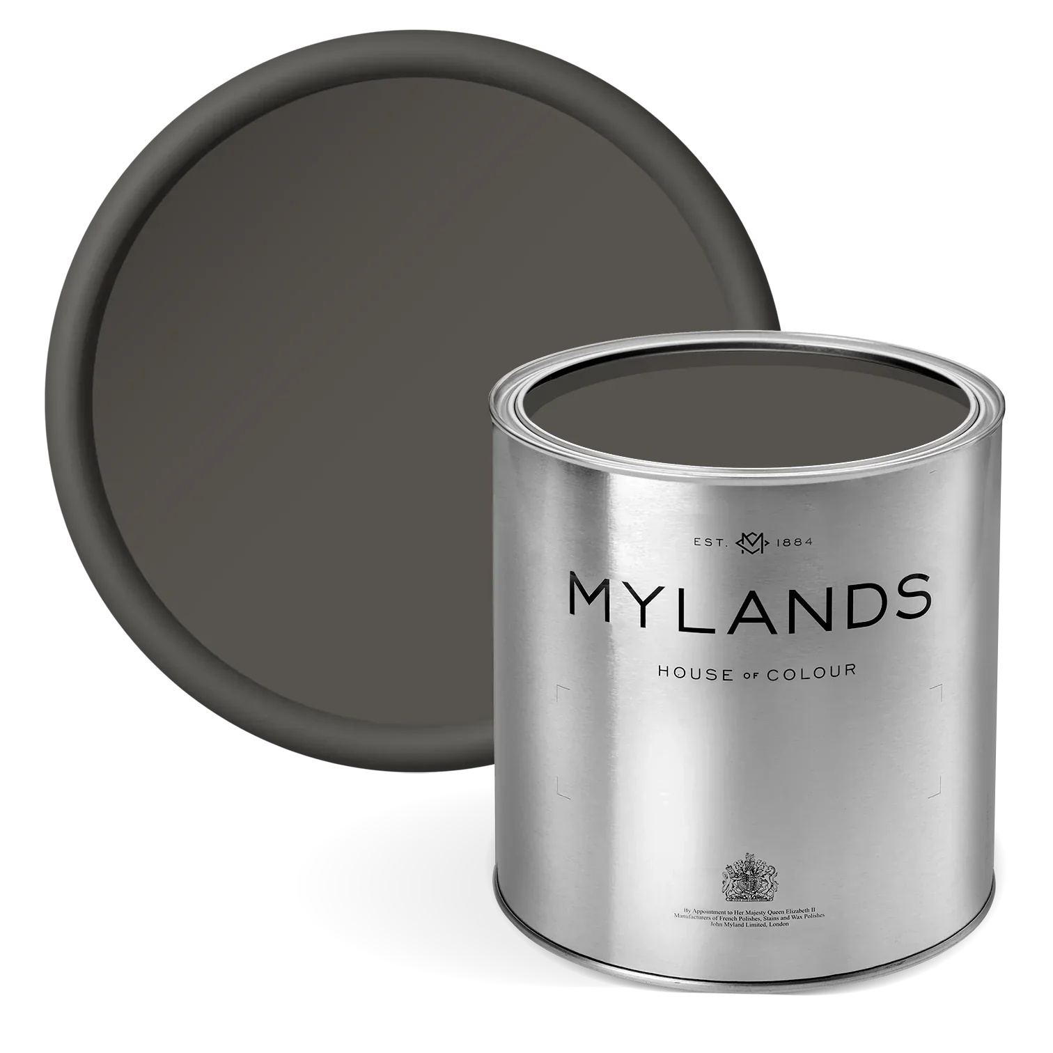
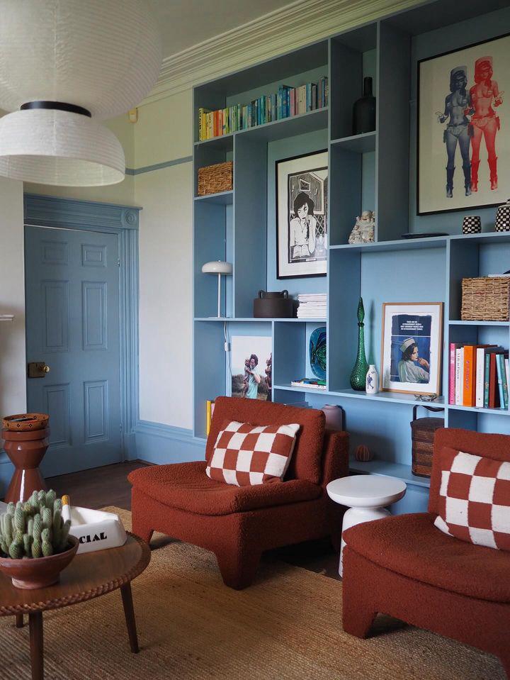
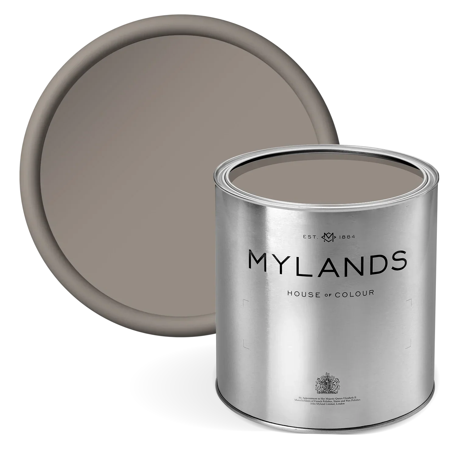
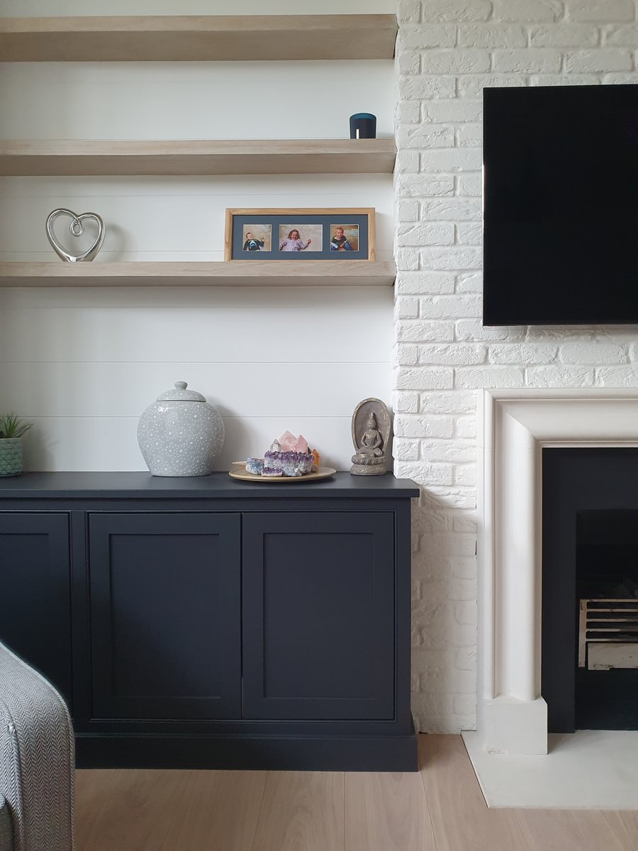
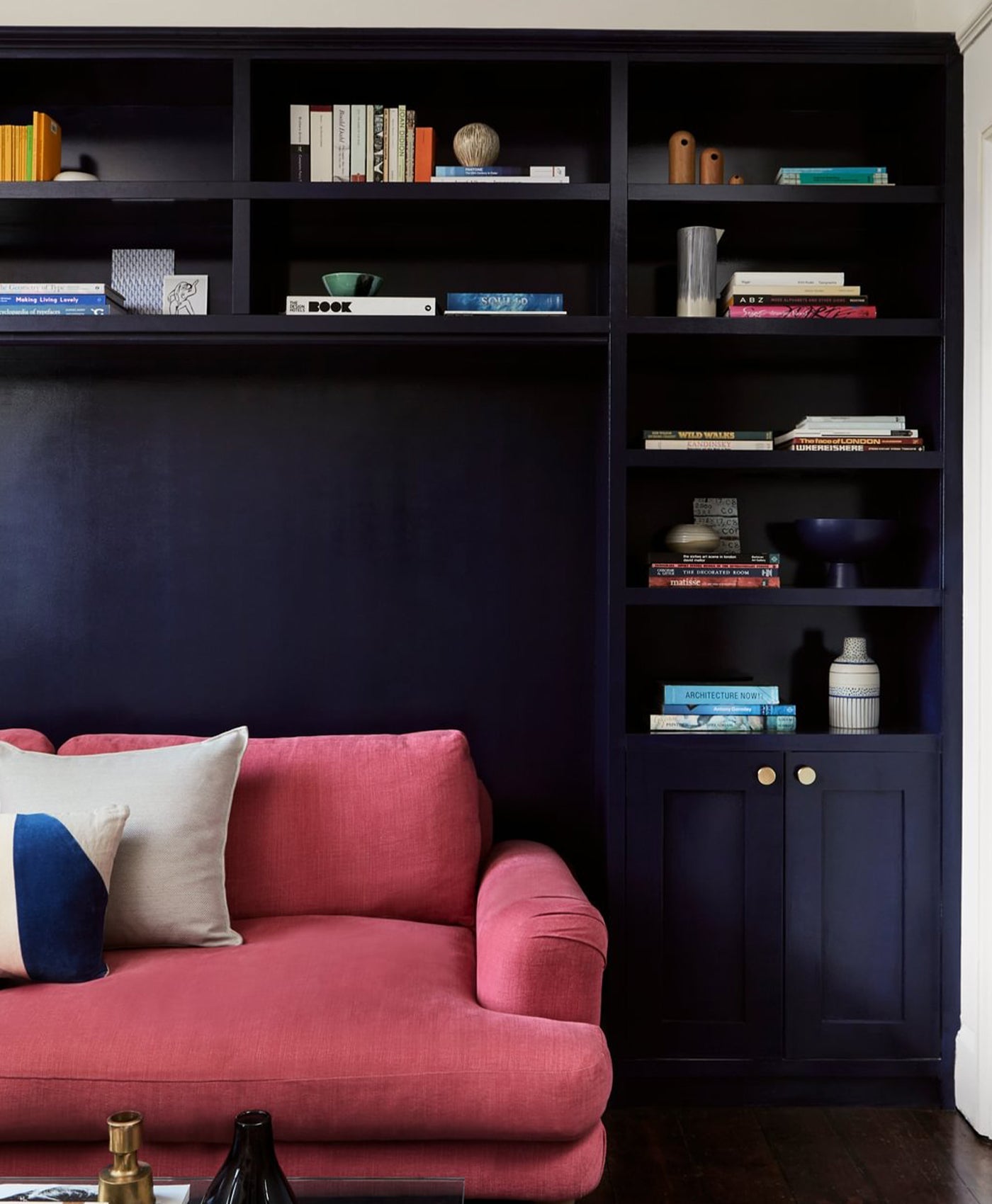
Hoxton Grey™ No.72
You may think that grey would be a cool neutral, and you’d be right. But a grey with umber or brown undertones will add a degree of warmth. It can create a very calming mood, and a classic, refined sophistication. Mylands Hoxton Grey™ No.72 ticks all of those boxes. It combines grey with the warmth of brown and umber to create a perfect warm neutral.

Walls in Hoxton Grey™ No.72 - @violetandgeorge
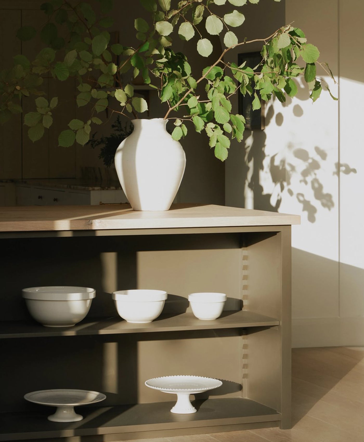
Temple Bar™ No.70
This warm and earthy neutral fits into a natural colour scheme and is a good alternative to white. It works well with organic features and textures like wooden floors and furniture, plants and brick or earthy tiling. In this photo, Mylands Temple Bar™ No.70 paint brings a cashmere-soft feel. It’s less harsh and bright than pure white, benefiting from a chalky finish. It’s a perfect colour for this living space, flowing from kitchen to dining room.

Island in Brompton Road No.205, Cabinetry in Temple Bar No.70 - @whistablefurniturepaintingco
Look through our range of neutral paint colours to find your alternative to that harsh white.