Colours of Summer
A careful edit of fresh, muted colours pays homage to summer in the city.

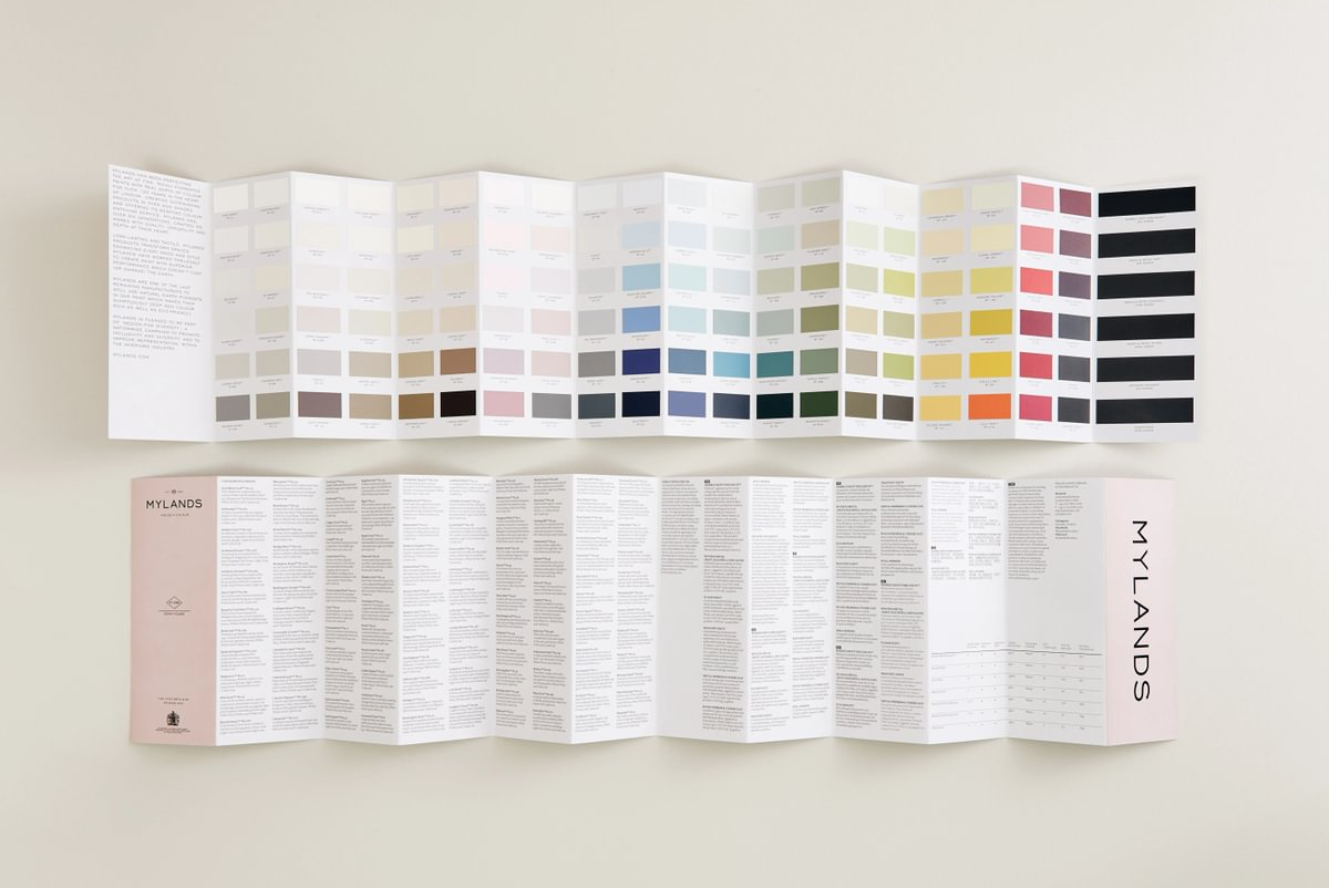
Mylands introduced a fresh new palette, Summers of London, inspired by Mylands’ hometown and the historic architecture and landmarks of the city as seen in the summer light to celebrate the best of summer 2020.
The edit of colours has been carefully curated to feel fresh, but familiar and timeless, bringing an exciting chromatic energy to any interior.
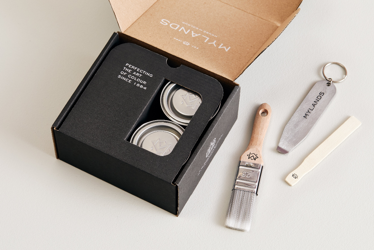
Since its inception in 1884, Mylands has earned a reputation for colour expertise, meticulously devising and creating colours to bring out the best in any interior. A rarity in modern paint production, Mylands continues to carry out much of its colour creation by eye, believing that a digital colour match cannot compete with the craftsman’s touch. Mylands considers its master colourmen to be the best in the business.

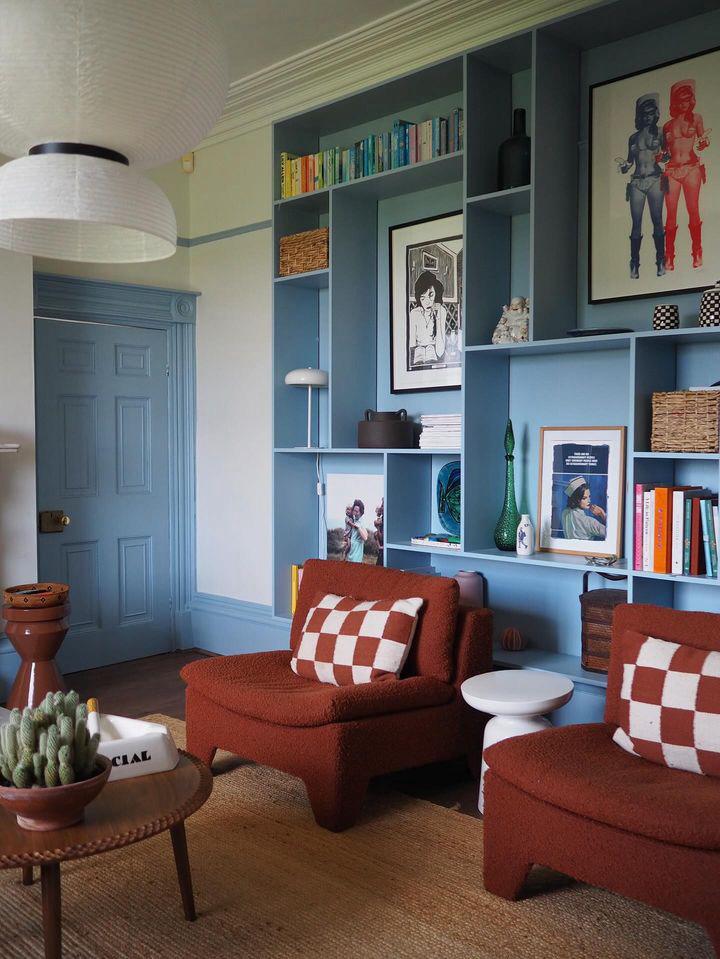
A playful child’s room with light, fresh colours used in an unexpected way, with Golden Square bringing a cheerful shot of ochre yellow that works well with the cool tones of Notting Hill.
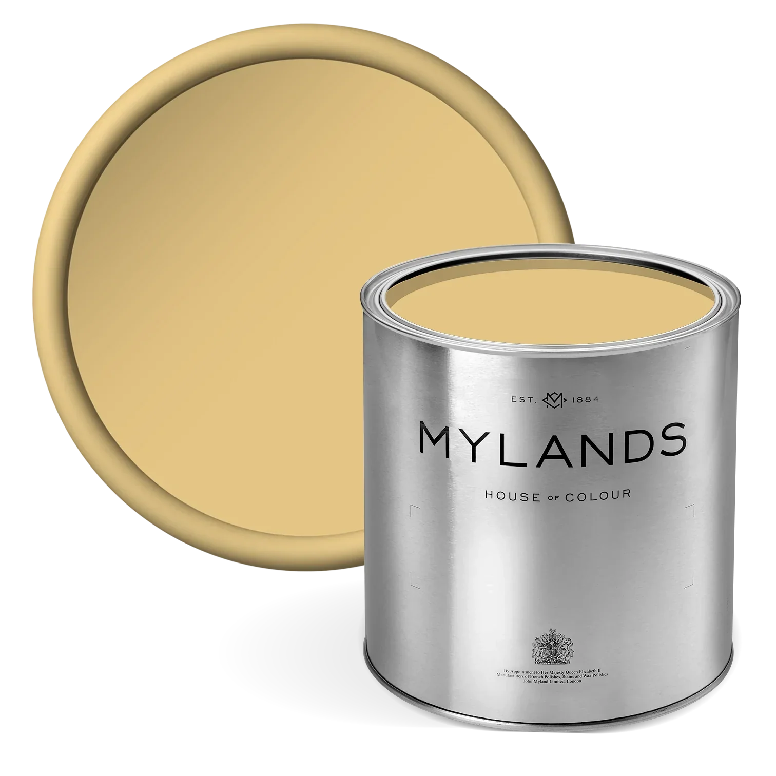
Golden Square No.131 A deeply evocative colour inspired by the boutiques and bistros in the streets around Soho’s Golden Square.
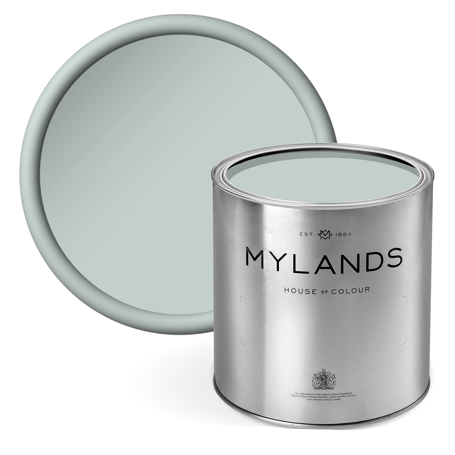
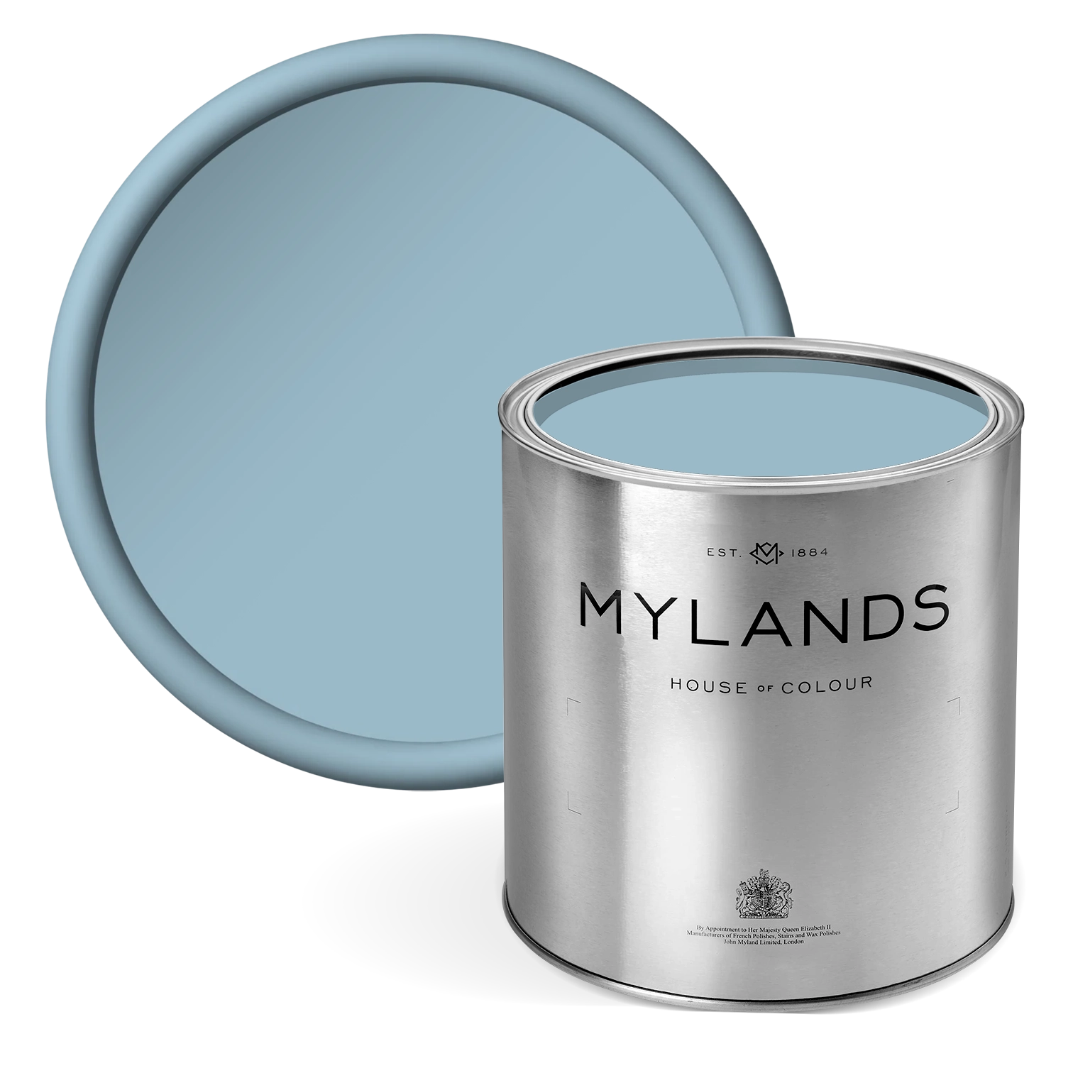
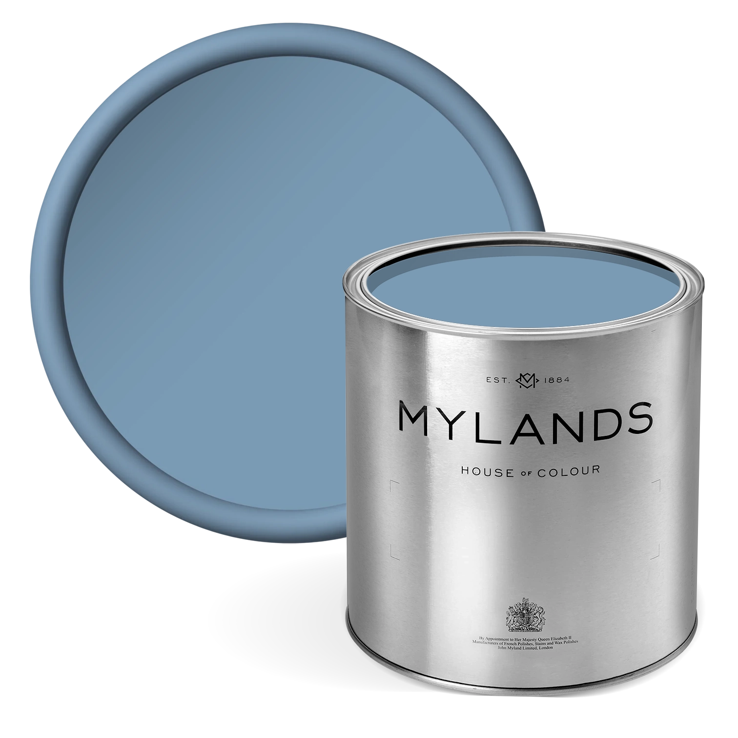
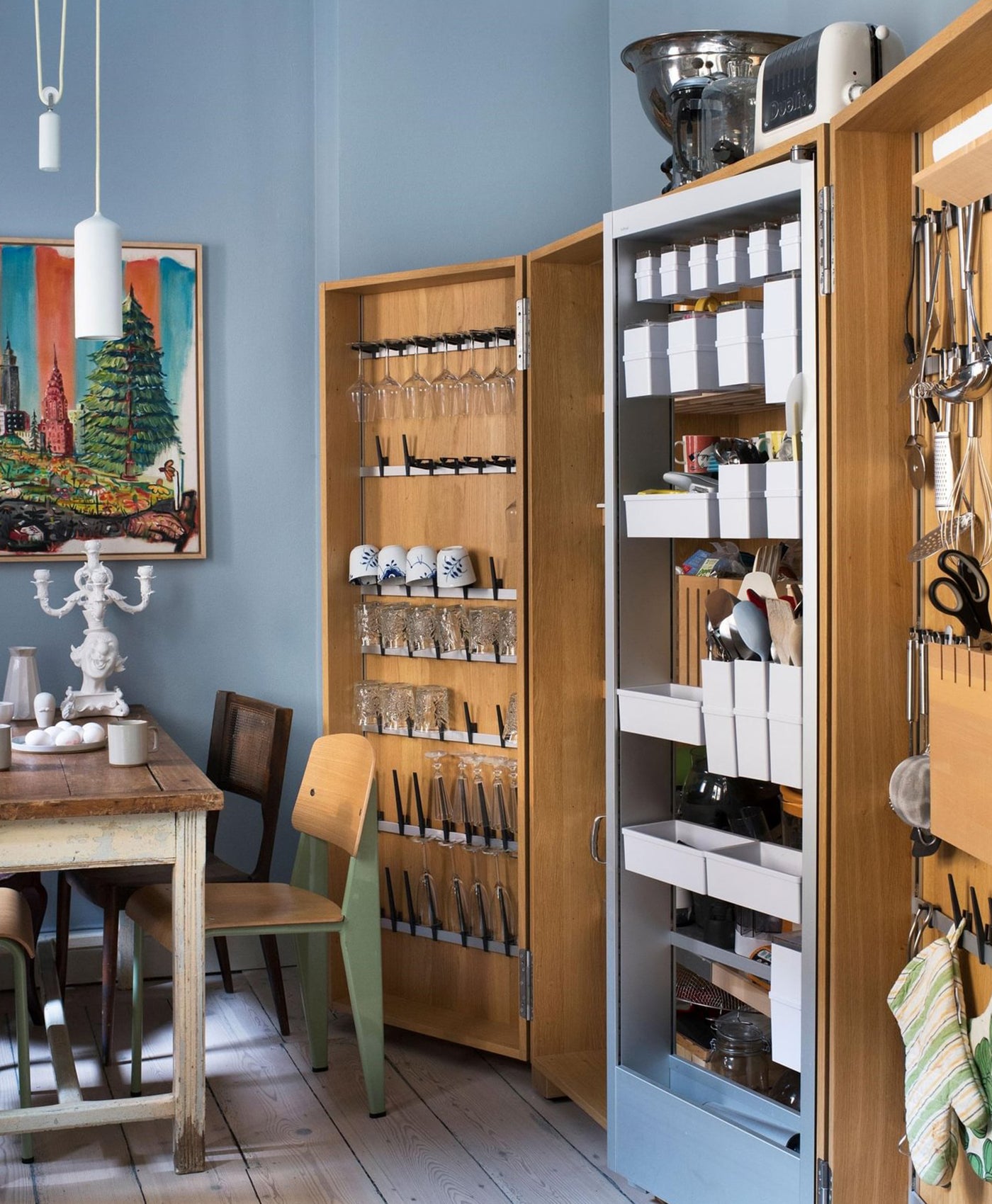
Notting Hill N0.213 This colour is reproduced from a paint sample discovered in Notting Hill.
A soft overall feel, but with the confident use of a bright pop of colour.
Covent Garden Floral No.270 Colour from a wallpaper document found in a house in Covent Garden.
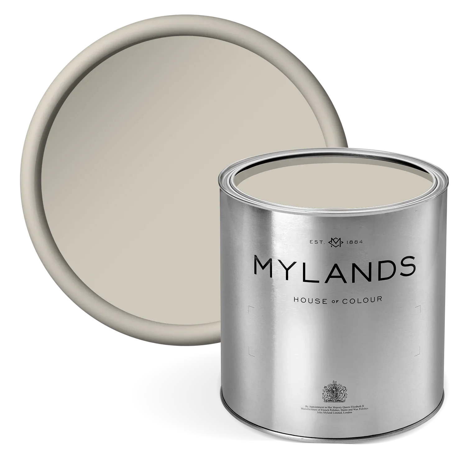
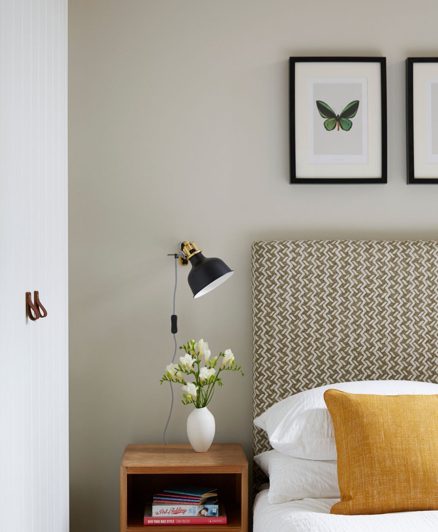
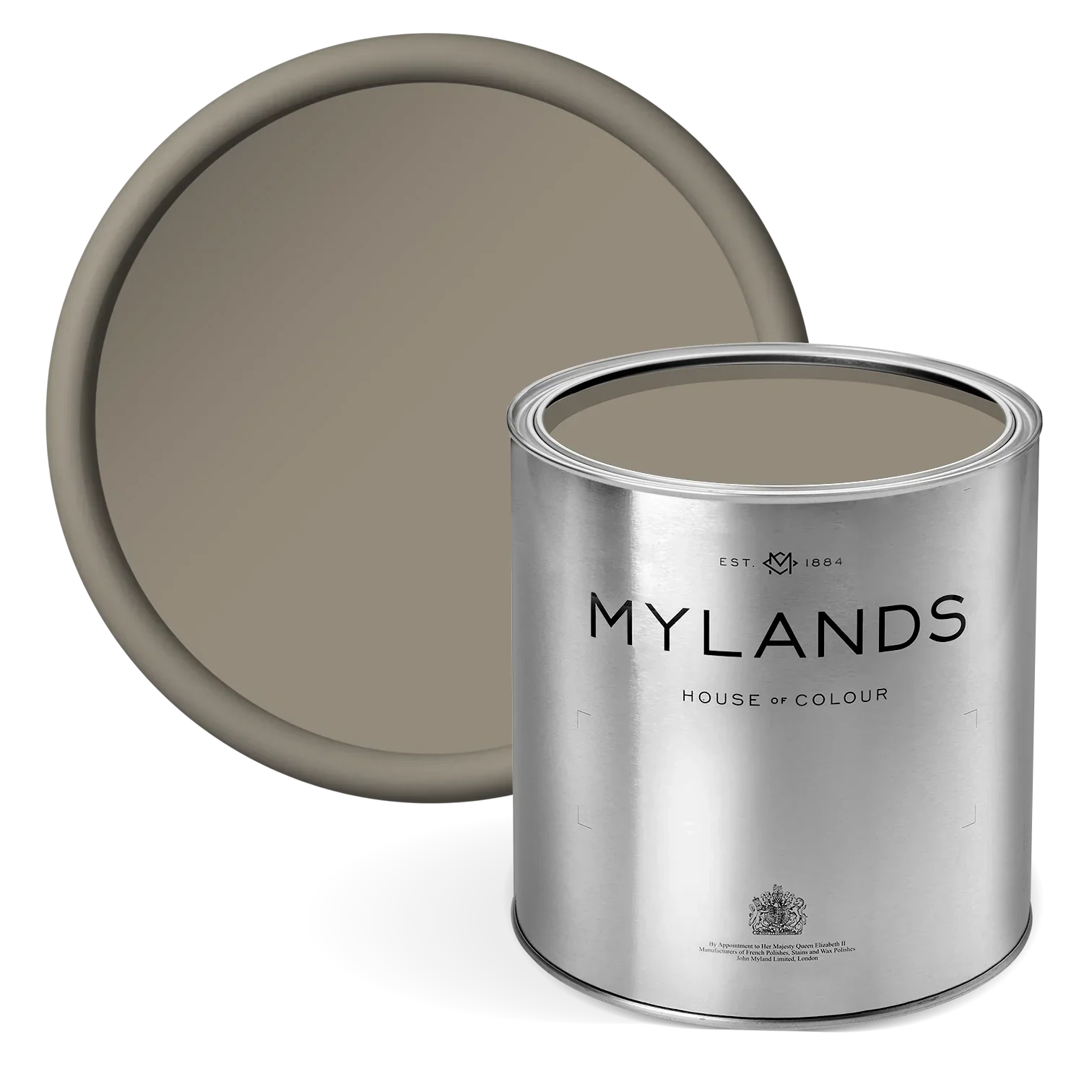
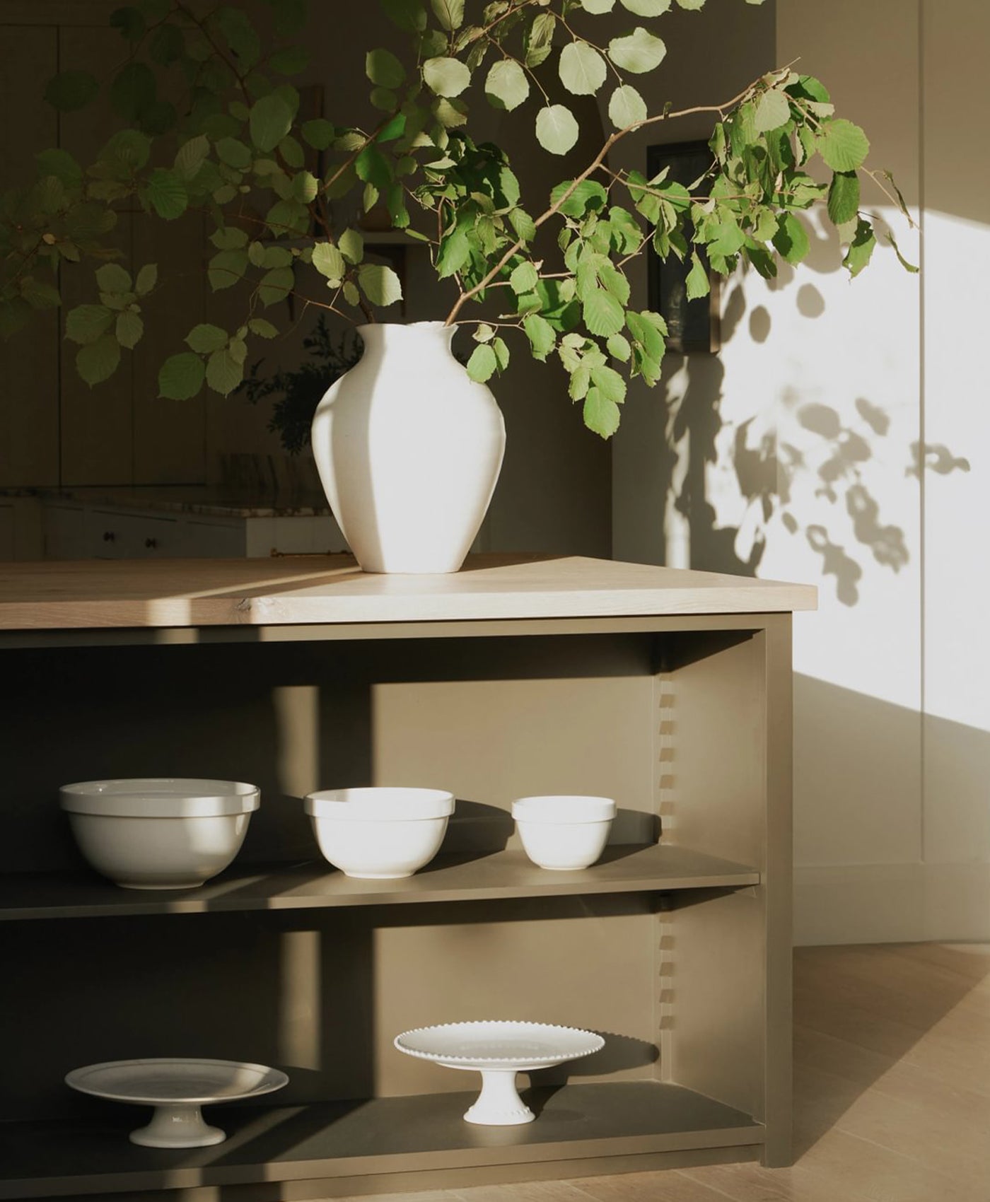
Smithfield No.19 A warm neutral from Mylands’ archives, originally created for a residence in Smithfield.


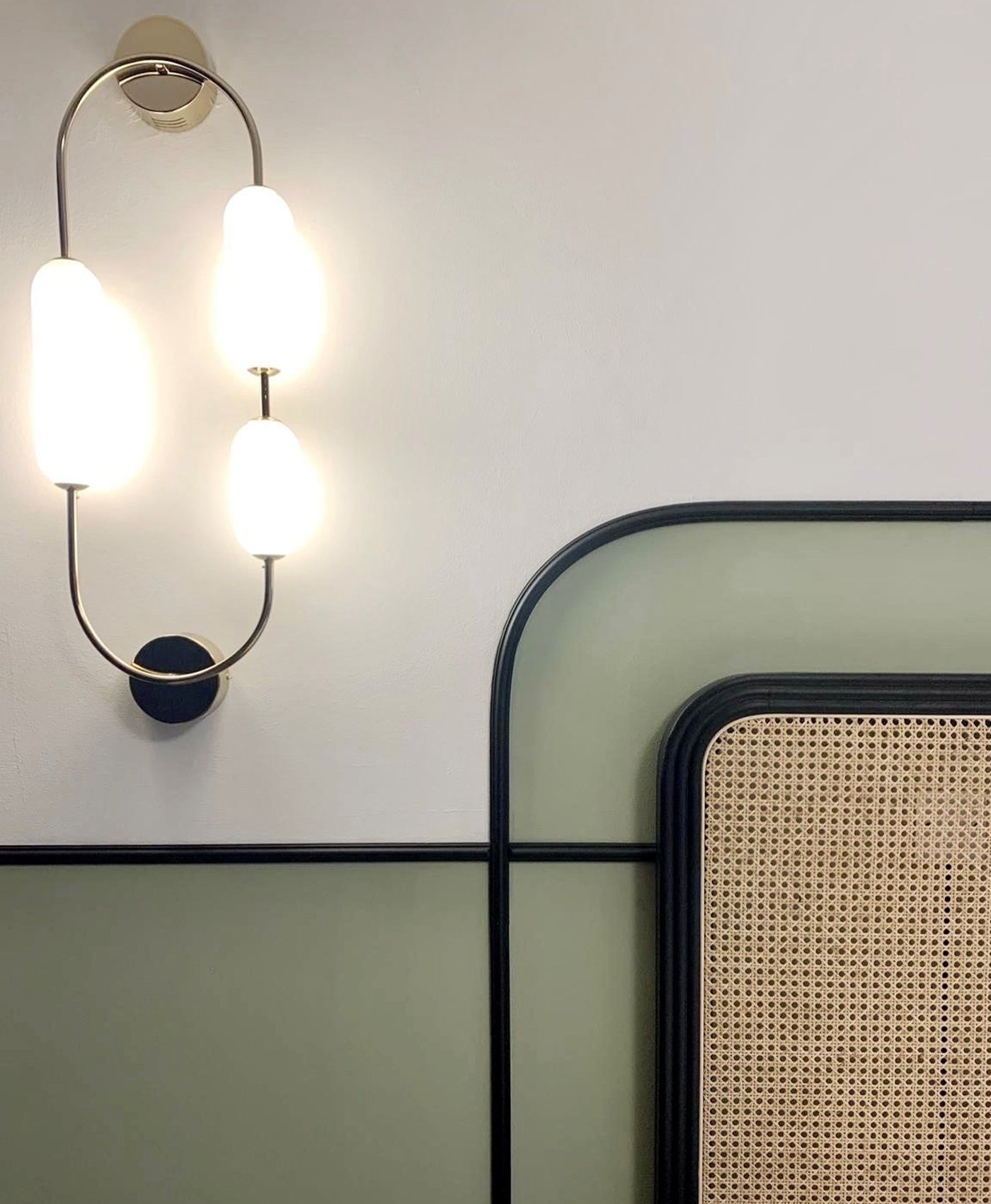
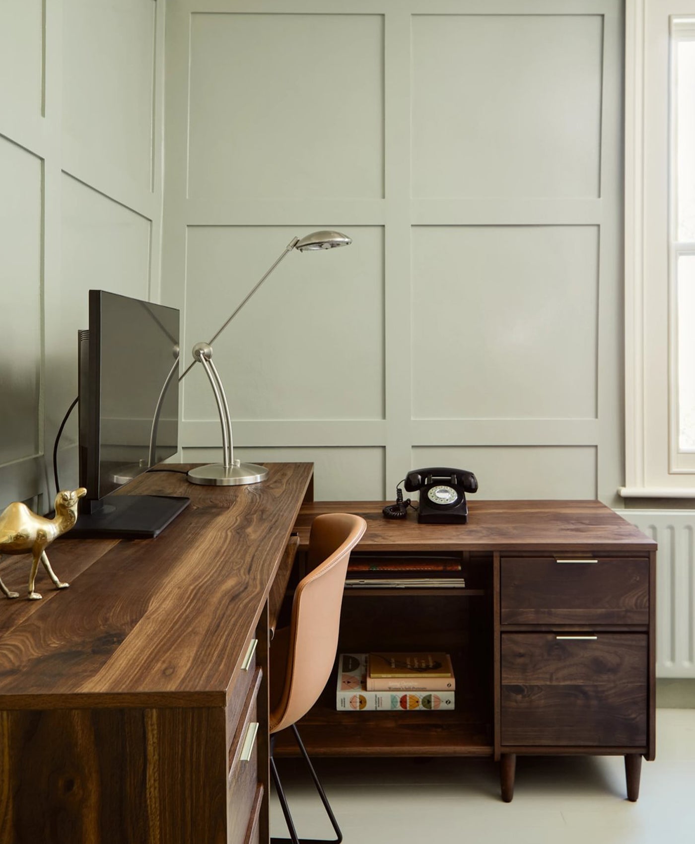
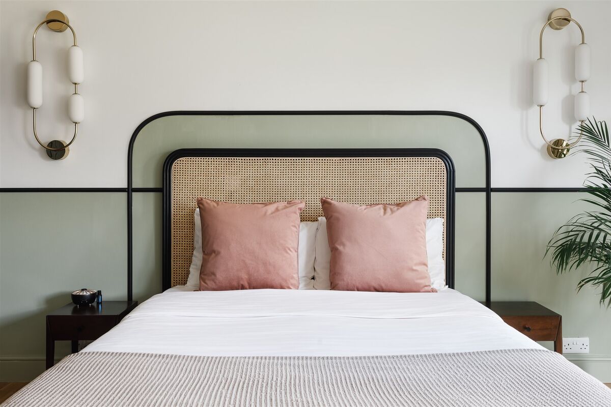
A soft, calm interior with a green accent tone that is so gentle it works as a neutral colour.
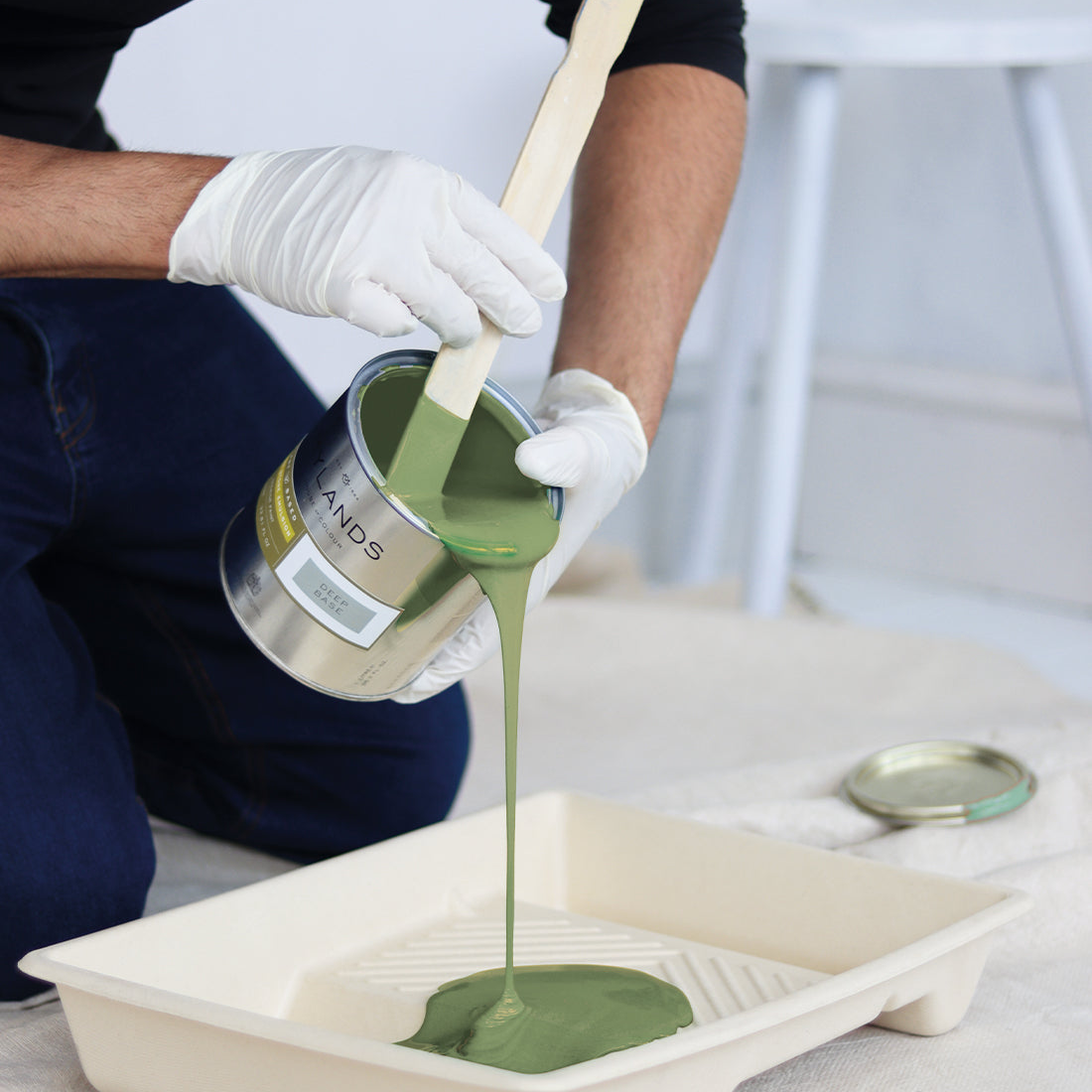
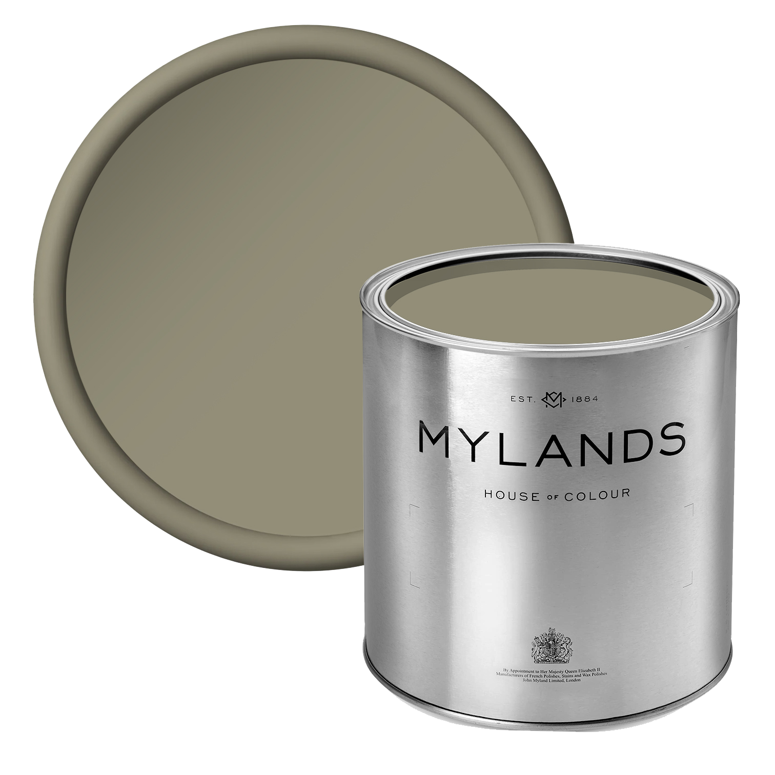
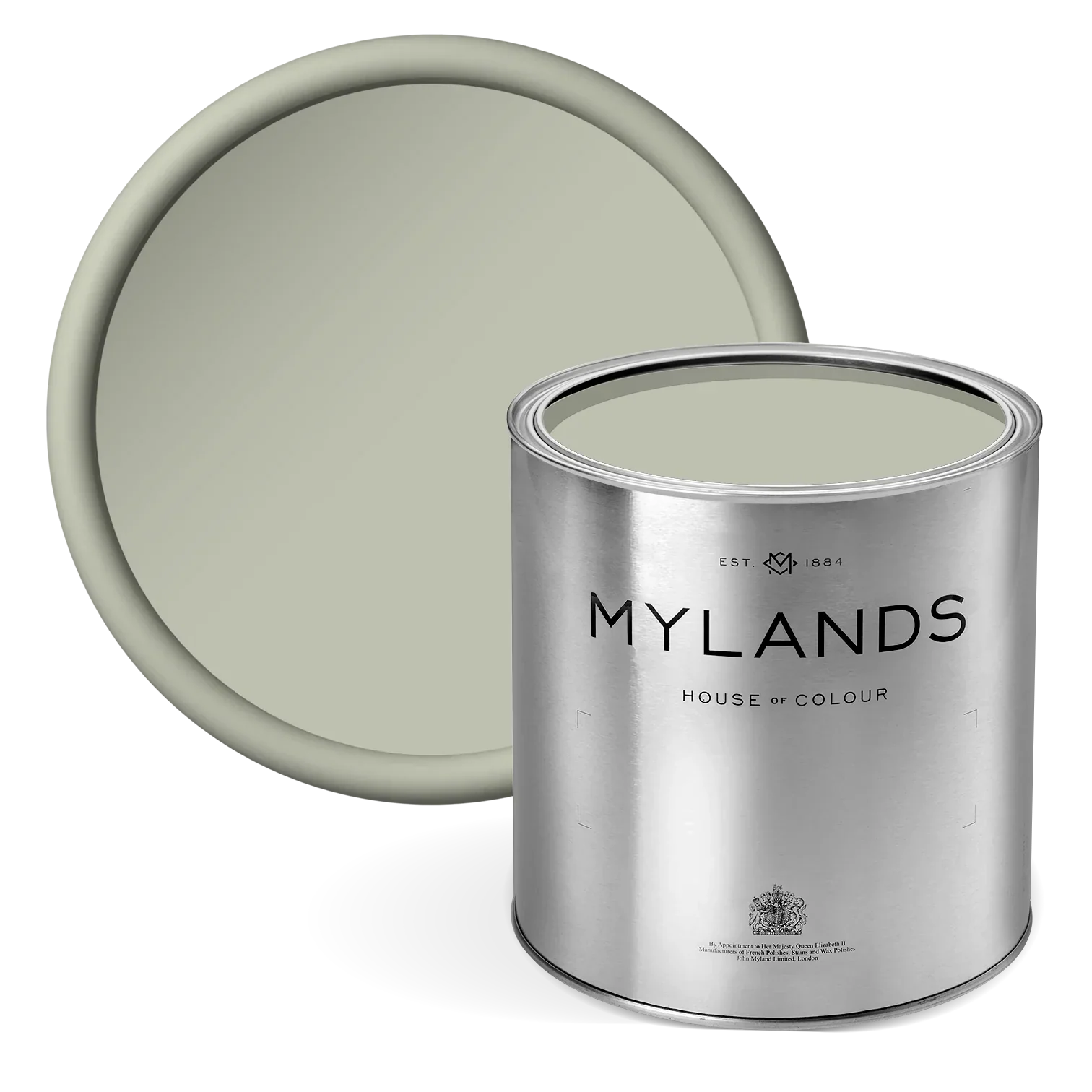
Stockwell Green No.203 The site of the original Mylands shop opened in 1884. A mixture of dark Georgian and rich apple green.
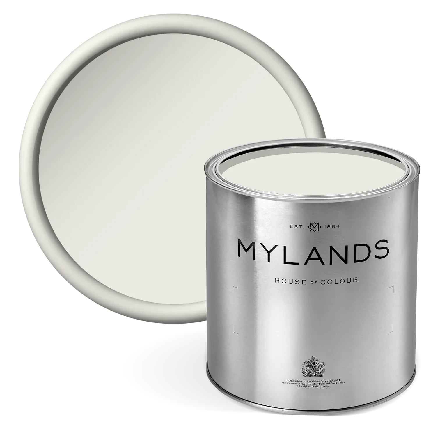
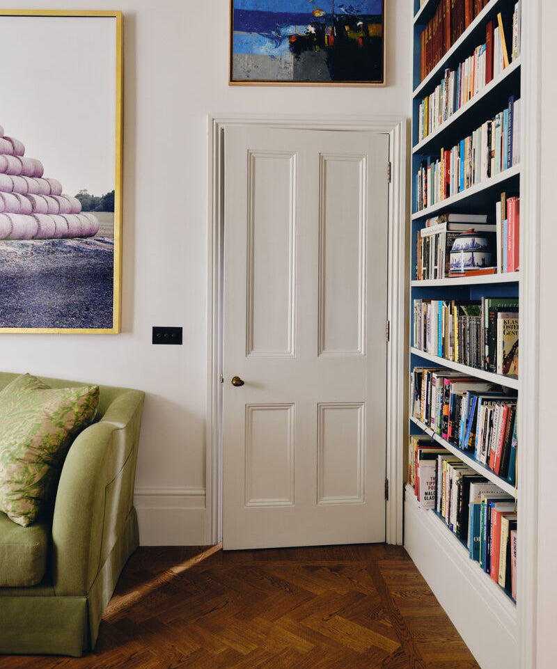
Clerkenwell No.21 An off-white shade, with the natural tones of China clay. Clerkenwell was once a centre for traditional colour pigments.
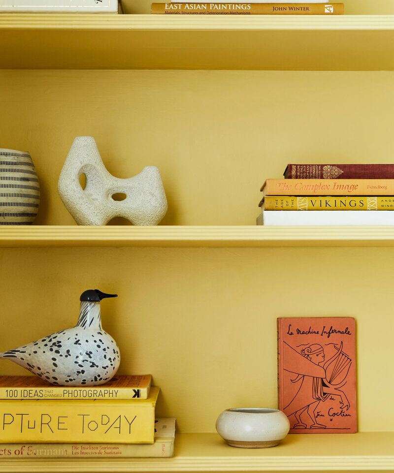
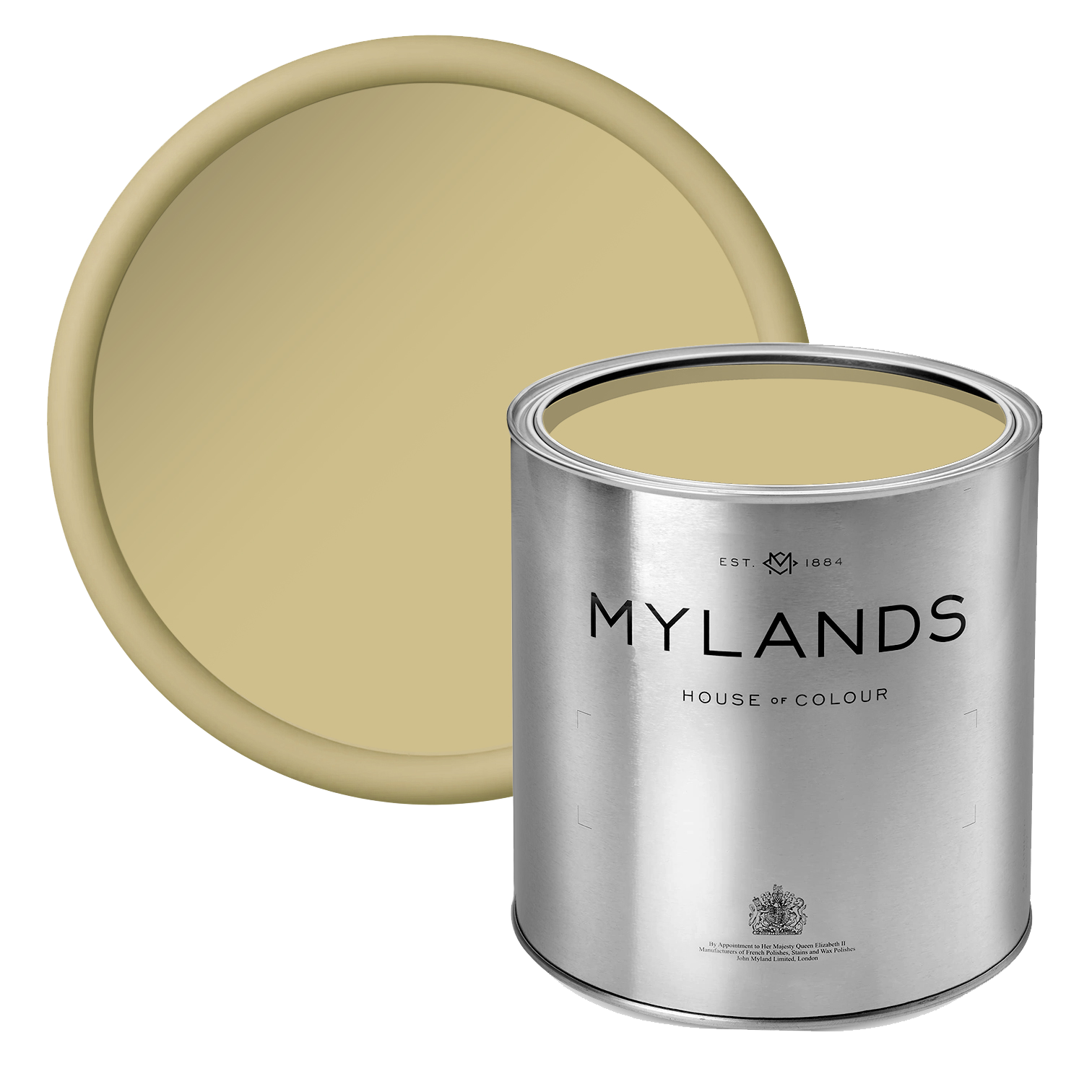
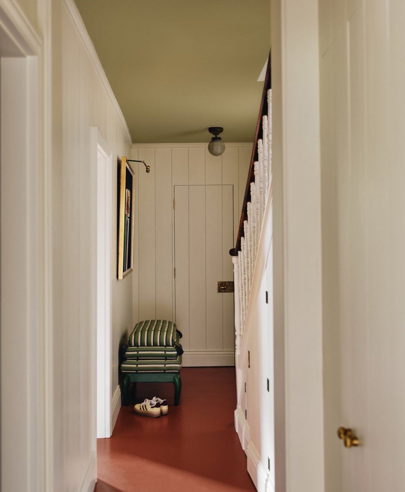
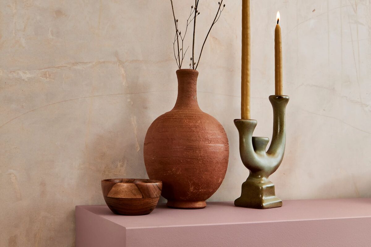
A hint of colour with the beautifully understated Floral Street, a desaturated yellow that will bring freshness to any interior.
Floral Street No.147 Inspired by Nottingham Ochre, a pigment traditionally used by London colourmen before modern paint colours were introduced.
Greenwich Time No.8 A light off-white with blue undertones which takes its name from The Royal Observatory clock face.


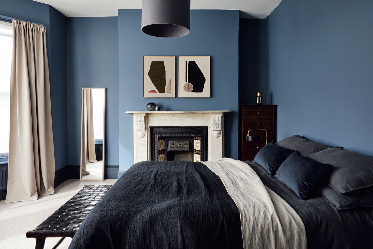
A tonal blue and green palette which feels fresh and modern, and pairs beautifully with simple natural textures. The colours work well together, adding a point of interest without being overbearing.
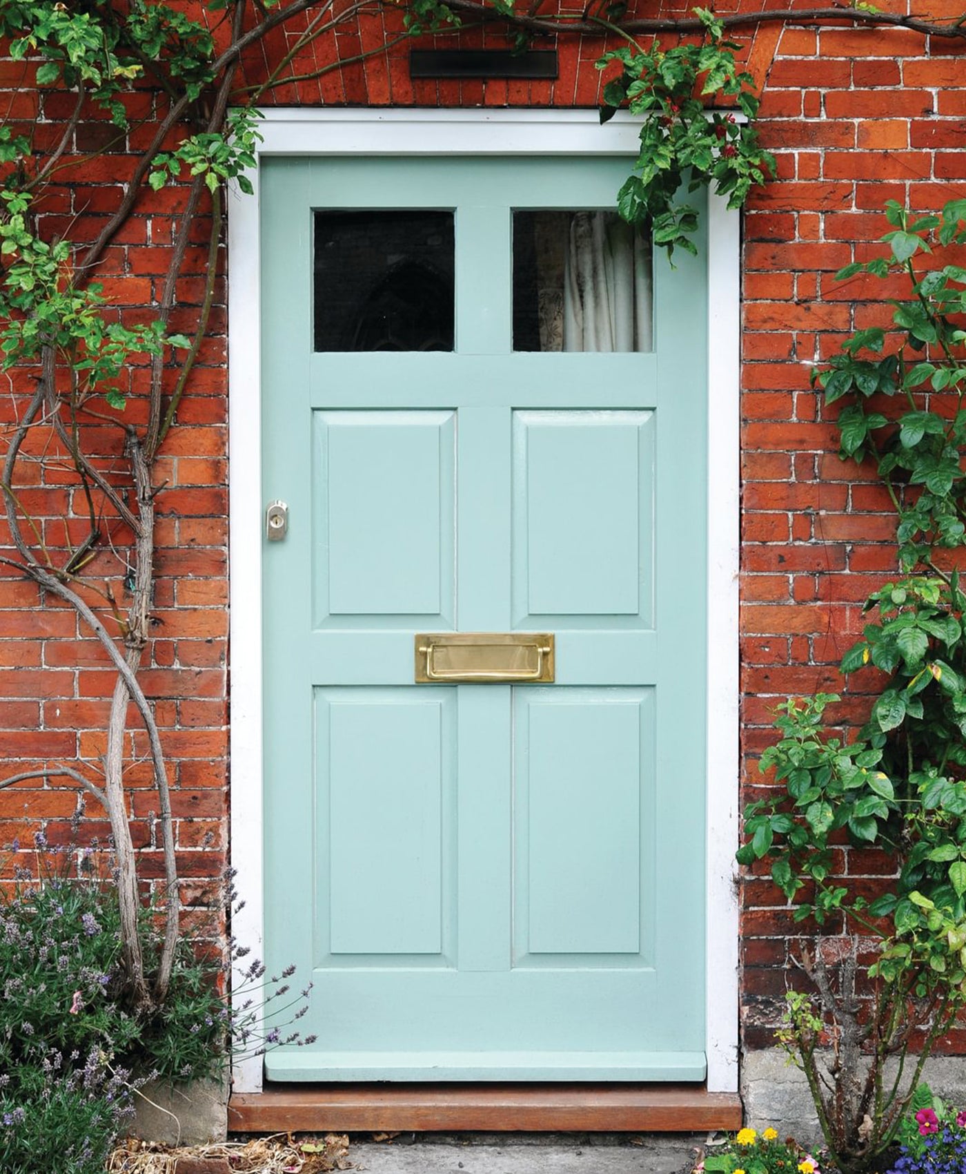
Mint Street No.95 This traditional shade was renamed after this evocative London street name.
Long Acre No.102 This shade is dedicated to one of the earliest recorded sales of blue paint, to a Mrs. Adams of Long Acre in 1777.
