Skip to content
FREE DELIVERY ON ORDERS OVER £150
0

IN CONVERSATION WITH INTERIOR DESIGNER, BEATA HEUMAN

The Dependables Collection was created in collaboration with leading interior designer Beata Heuman.

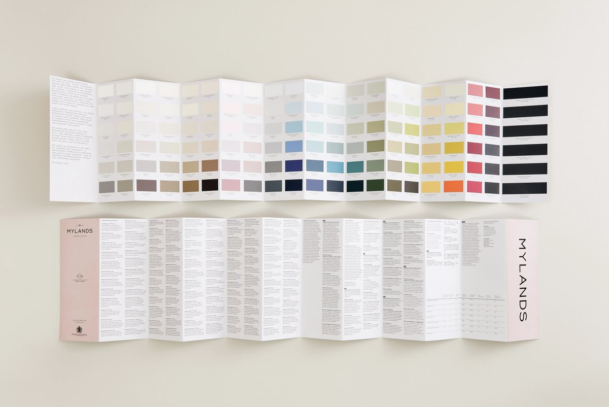
Inspired by Beata’s creative vision and her ability to craft interiors that balance boldness and charm, the collection features 24 dependable shades — from versatile neutrals to uplifting greens, buttery yellows, and a striking pop of red, offering colours for every mood and style.

Please tell us about your personal experience and relationship with colour. What are your earliest memories of creating colour?

Colours and the combination of colours is a powerful way of communicating a mood and creating an atmosphere. Be that uplifting and inspiring or gentle and calming. Whenever I make these choices I feel a thrill of excitement observing how small additions make a huge difference such as the introduction of just a touch of red. I like how everyone stands equal, whether your budget is vast or meagre it is not about spending money bur rather about thinking and careful consideration to help you make good decisions.

I remember the colour of garments being described in stories and how vivid they became in my mind’s eye which compelled me to try and draw it all out on a piece of paper. A frustrating business since I never quite managed to express what I saw in my head!

How did the collaboration with Mylands come about? Why did you want to create a paint collection?

Mylands supplied all the paints used for the restoration of 188 Hammersmith Road, our brand home, which felt like the perfect fit since they have been making paint in our shared home city since 1884. We began picking paints from Mylands brilliant existing collection but we also made a lot of bespoke colours for the space and that was really the starting point for this collaboration. It has been my dream to do my own paint collection, I am very specific about colour and I think about it a lot so it has been thoroughly enjoyable expressing that and now being able to share it with a bigger audience.

Why did you feel Mylands was the right partner to bring your colour collection to life?

Mylands has a lot of integrity as a brand and being a 4th generation family ownedbusiness kind of speaks for itself. Quality and passion for paint is the driver which is how it’s meant to be. Everything happens at their South London site - from the first experiments developing new products in the lab under Anna’s watchful eye until rich thick paint fills the steel tubs before they are neatly stacked in long rows ready to be dispatched to homes all over London in the trusted Mylands van.

Beata_NickTydeman_portraits_2_166_3x4 - Large.jpg__PID:0b3d7df9-b3c0-4b17-ad71-63bbe20c2606

Leading Interior Designer Beata Heuman.

Mylands_Beata Heuman_BH Home_01. Entrance Hall 2_No.11 Stockholm (Radiator Cover).jpg - Large.jpg__PID:48bff572-5350-43f4-9c6e-d0547ccb0aca

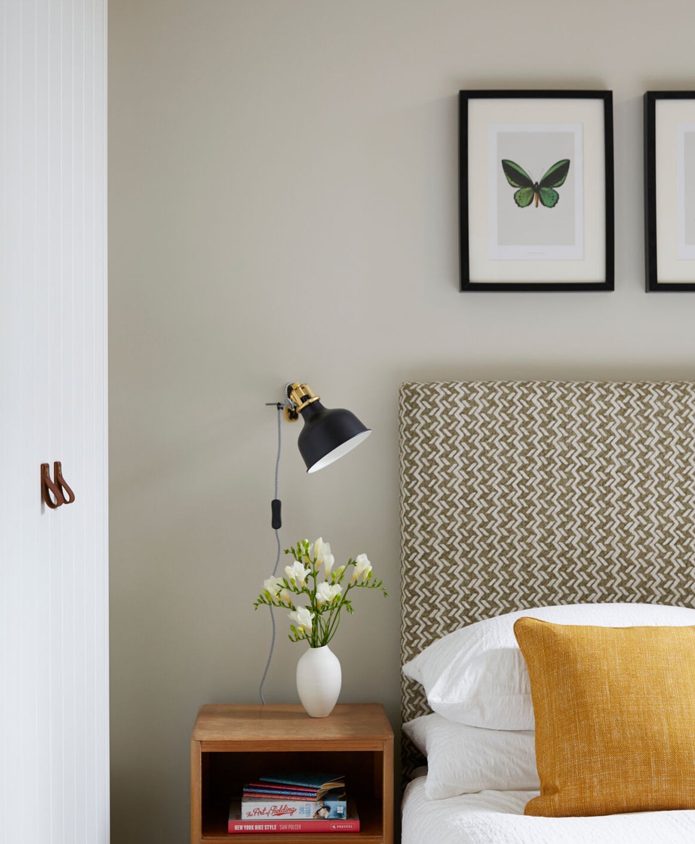
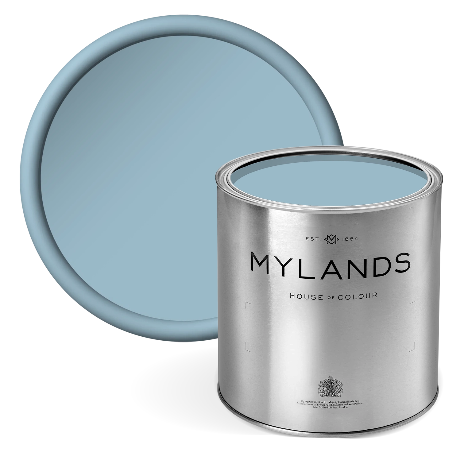
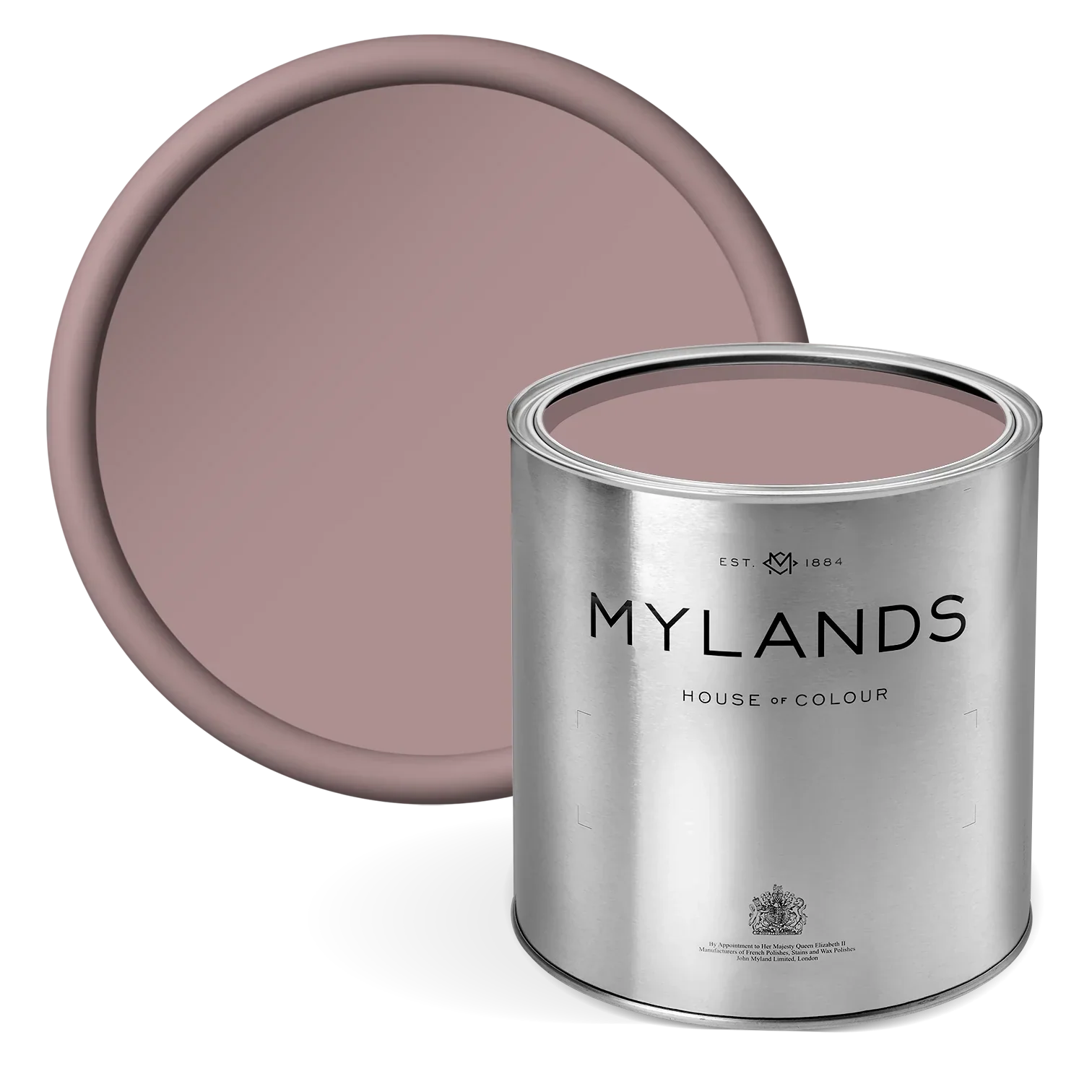
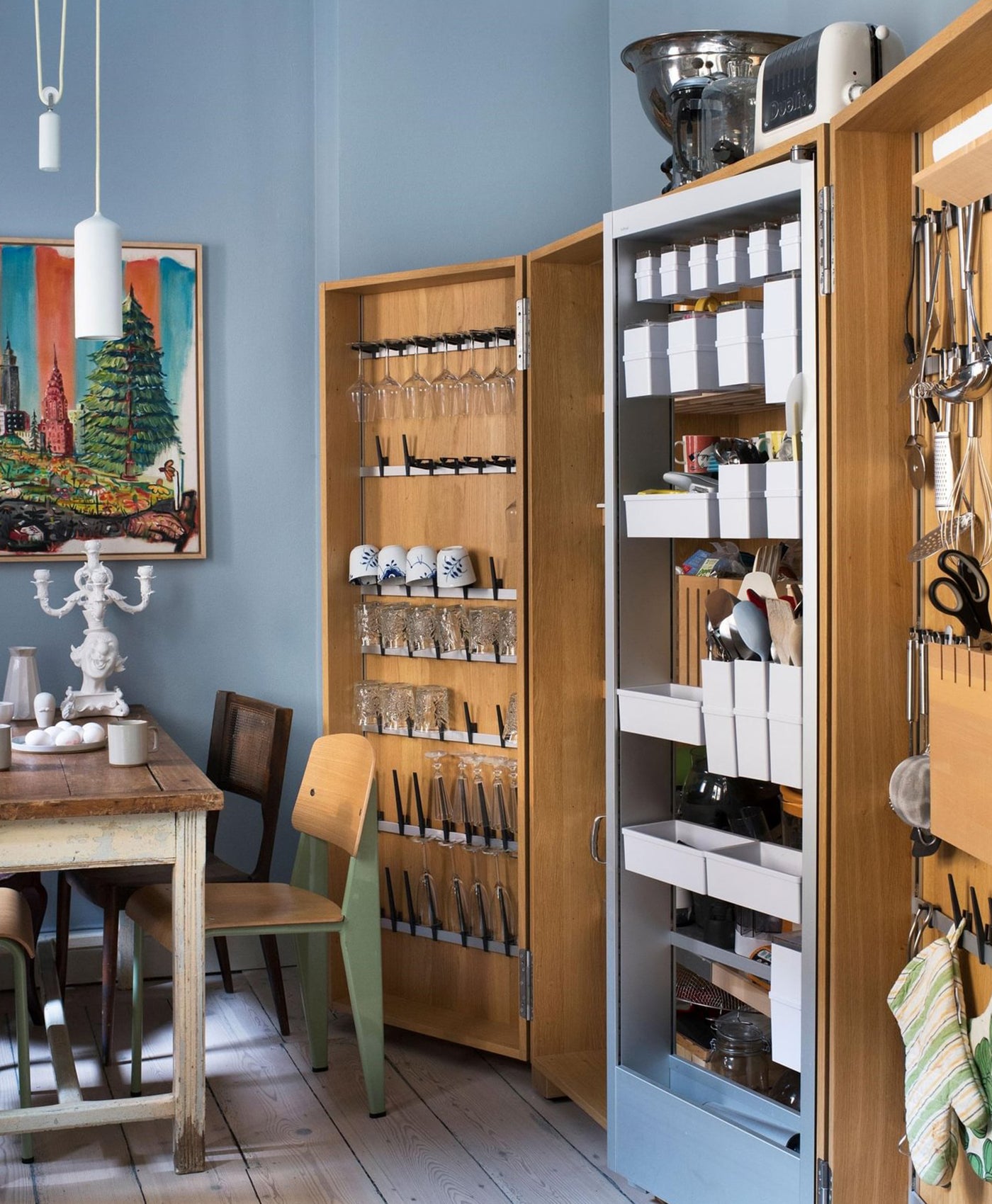
Radiator Cover in Stockholm BH.11 

Talk us through the inspiration/theme behind the collection?

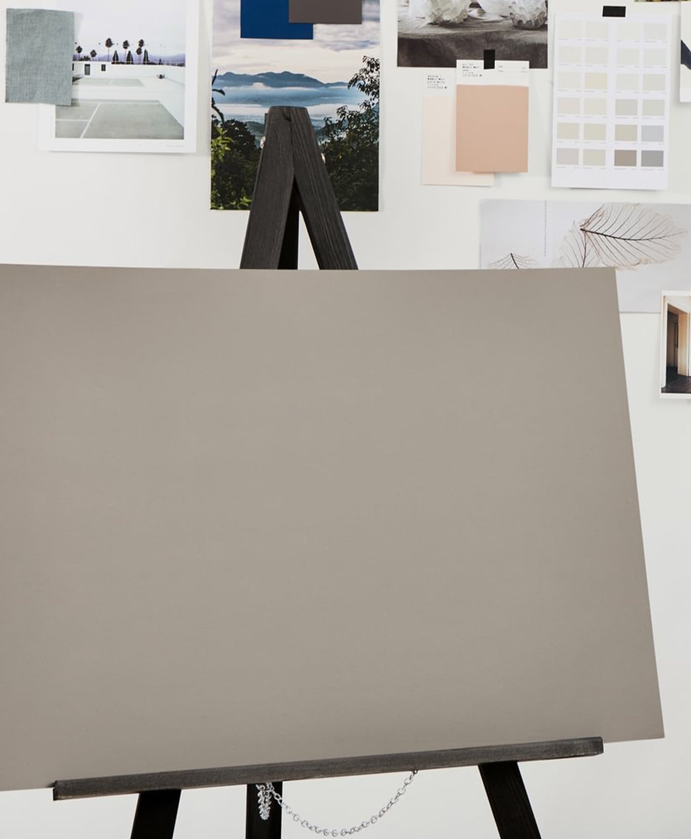
I started thinking about colours that I love and I looked back at photos I’ve taken of beautiful old houses over the years and Swedish ones in particular. In simpler houses before the turn of the last century you can often observe the use of a rich and zesty palette born out of a relatively limited selection of pigments used to create linseed oil paints which, I realised as part of this process, forms the basis of what I’m drawn to and tend to use. I gathered up lots of different references some less esoteric such as the moody dark counter top in a dingy Brighton pub decorated with car key carved phalluses.

How did you create the specific edit of colours?

The challenge was to whittle it down to 24 colours – the Dependables. The idea was to create a capsule collection that ticked a lot of boxes and gave a broad yet concise range which could serve your whole house. They all have their own character but they also work as a whole. It is easy to feel overwhelmed by choice when it comes to colour so it’s a good idea to have a selection of go-tos that you know work and if you want to mix it up you can do that with wallpaper or fabrics. Once I had the initial selection I tested it all out on my own house and in that process I found some gaps and then I tweaked it further.

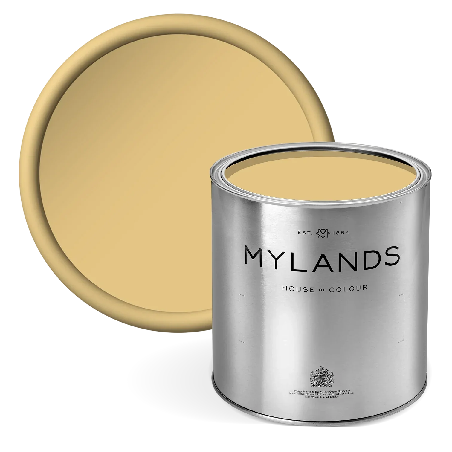
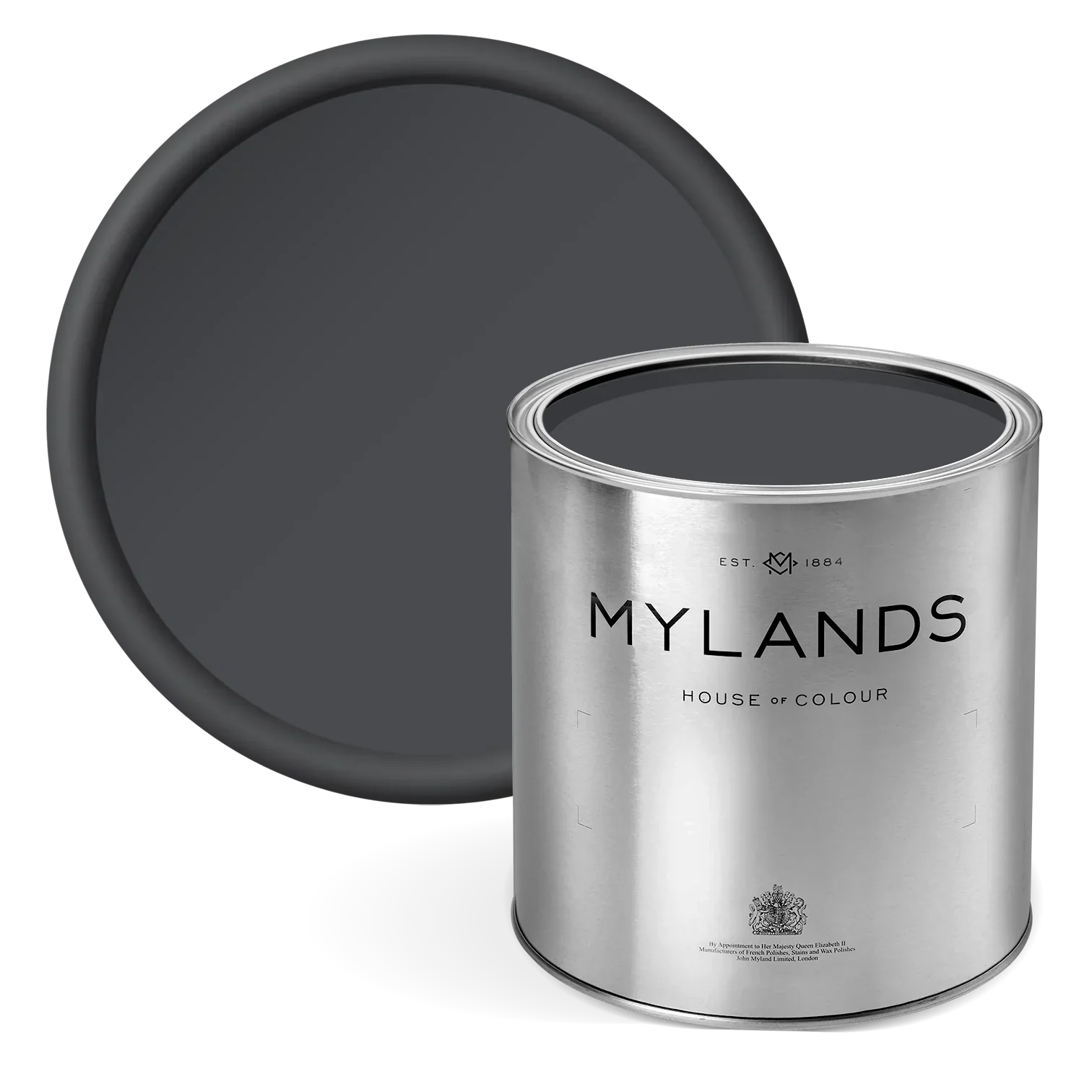
My Dependables are a mix of go-tos such as a good white and other light neutrals, things I struggle to find like a dark yet soft ‘’black’’ (which isn’t actually black atall!) and particular shades of green, and tones that I’m excited about such as the boileddill and crayfish party.

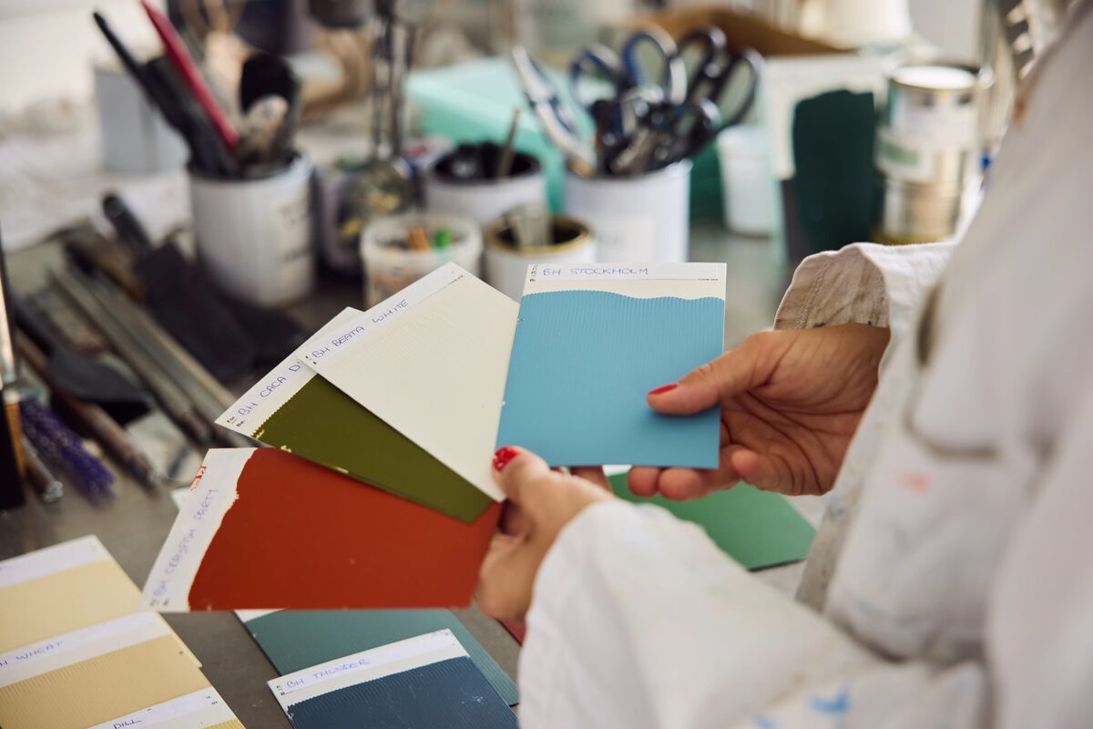
What did you enjoy about the process of creating the colours with Mylands? How did you develop exactly the right shades with Anna, the Head of Mylands’ Colour Lab?

The team are all so enthusiastic about paint and colour and I think really caring about the end product is all you can ever ask for. A few of the shades were perfect the first time around but others took a while to get right such as Mormor Zaza and Glass. It has been a thoroughly enjoyable experience and Anna has been a crucial part of the process. She remained laser focused, positive and extremely patient. When we found ourselves 7 tries down in the sampling process with Cigar and even I was close to giving up she kept pushing and I think that commitment to getting it right really shines through looking at the collection which I couldn’t be happier with.

Three words that encapsulate the collection.

Considered, Vivid & Dependable

Do you have a personal favourite shade (or shades!) from the collection?

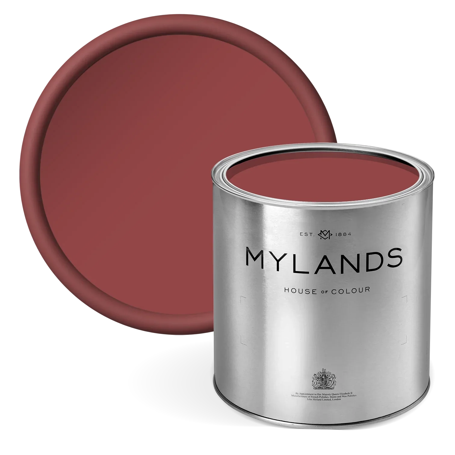
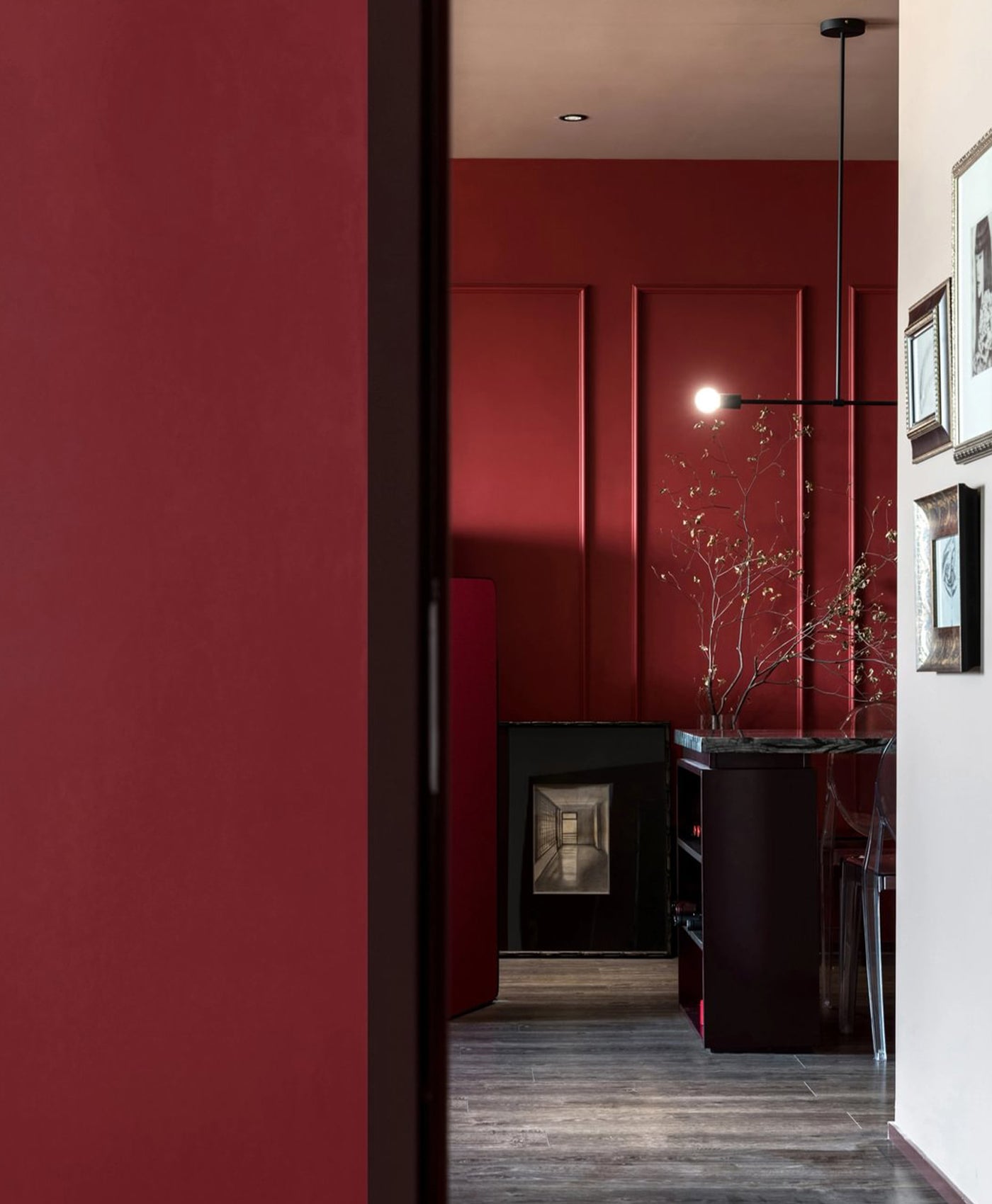
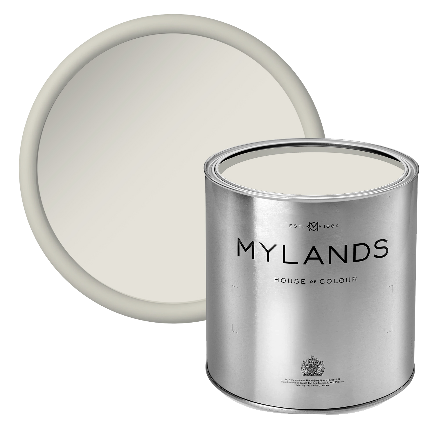
Each one is a favourite but I guess the stand out in terms of which one I use the most is Beata White. Crayfish party is fantastic for accents and wheatsheaf is wonderful forjoinery.

Where have you used colours from the collection?

I have used the entire collection in my house in London and also in lots of places at 188 Hammersmith Road.
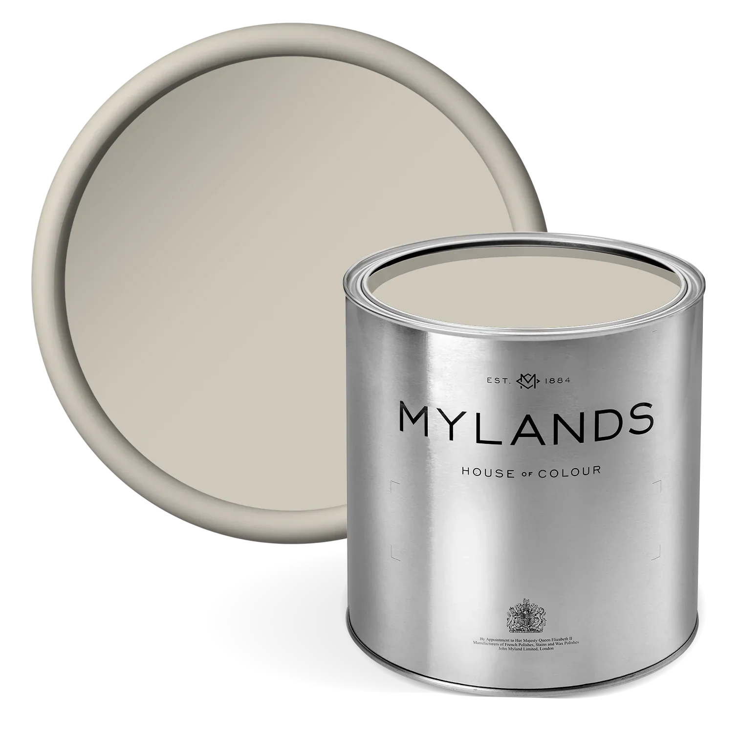
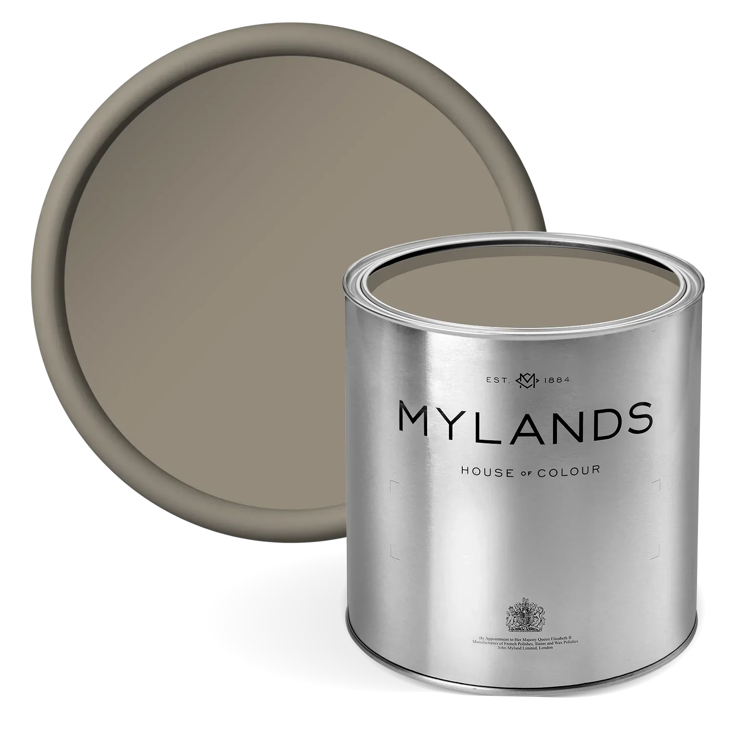
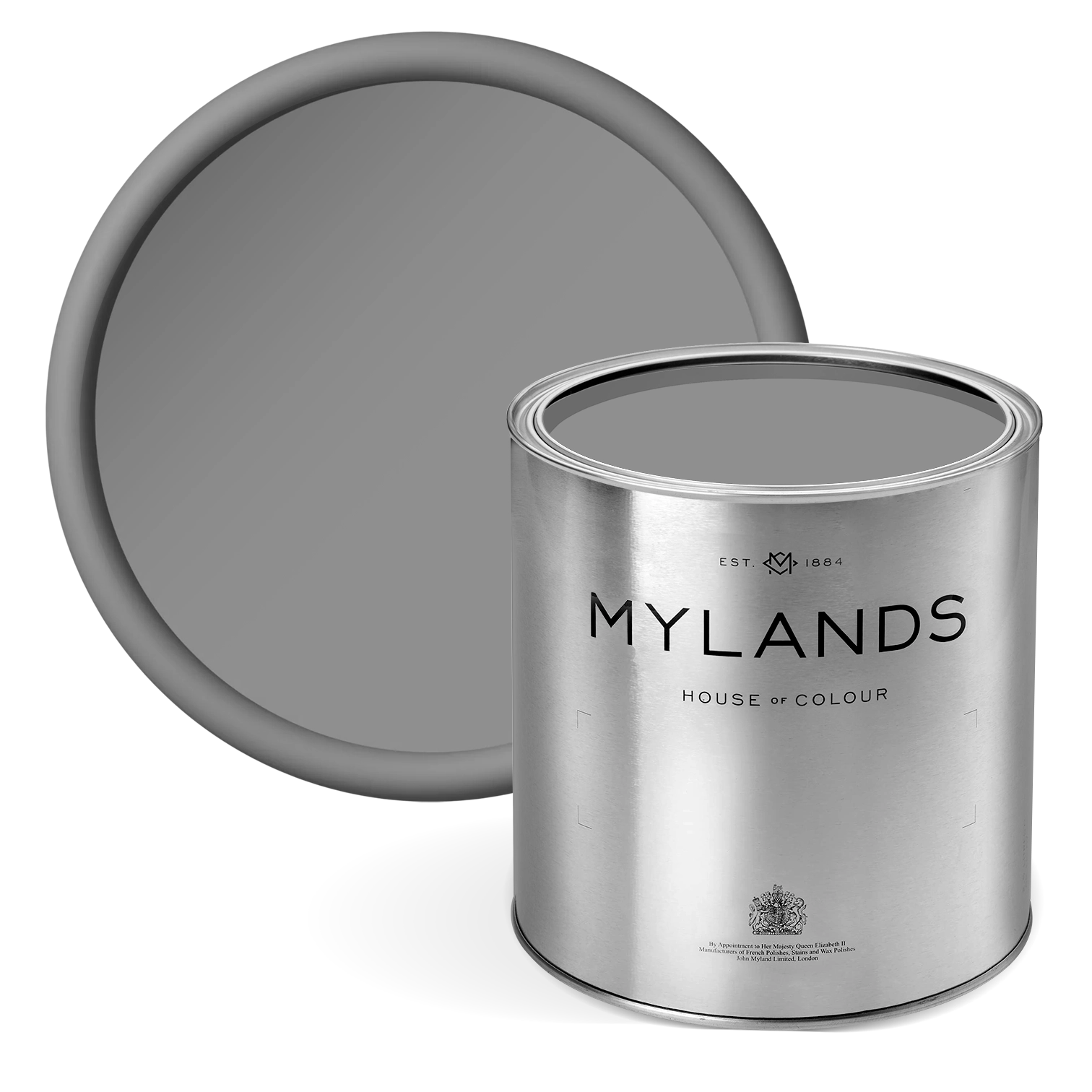
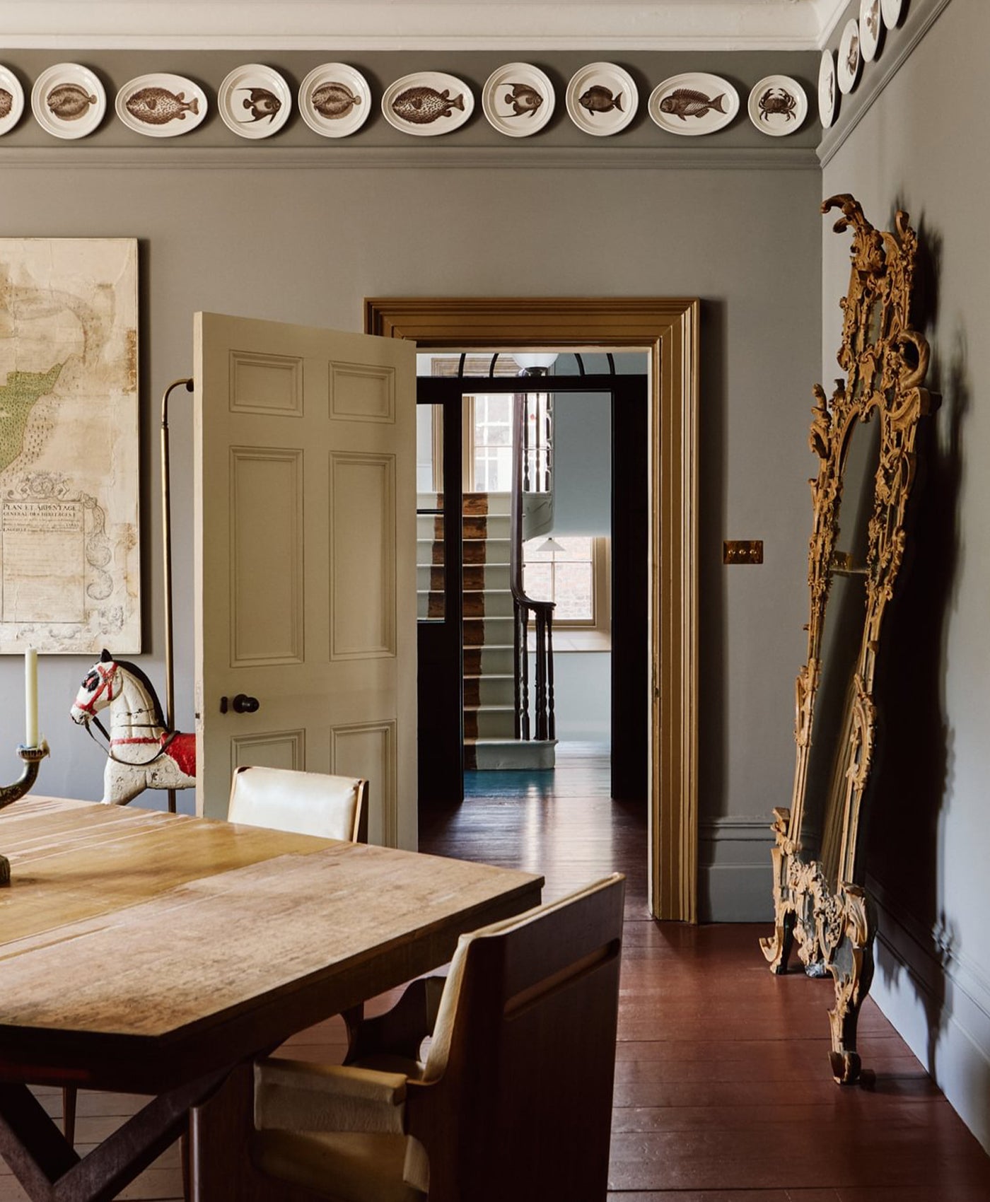
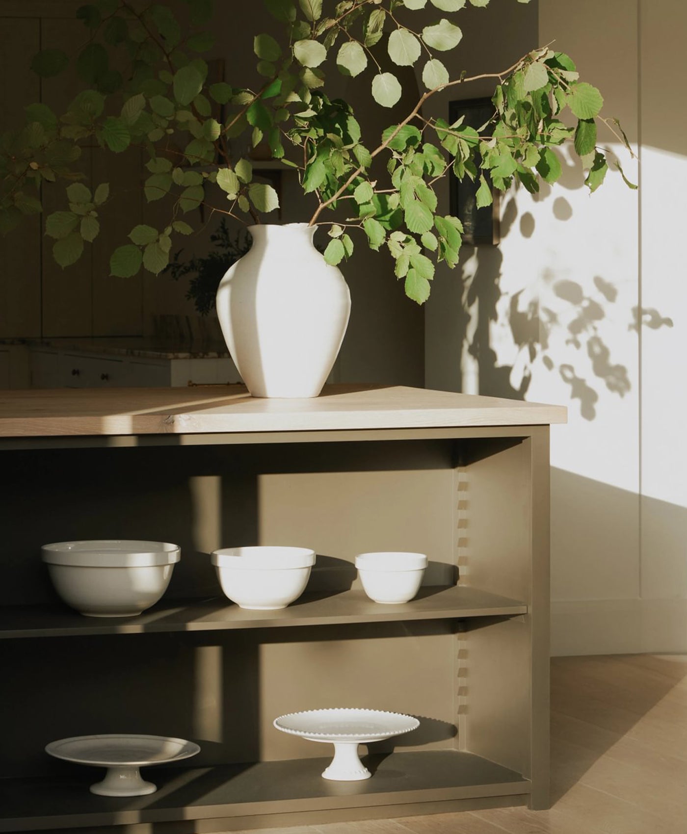
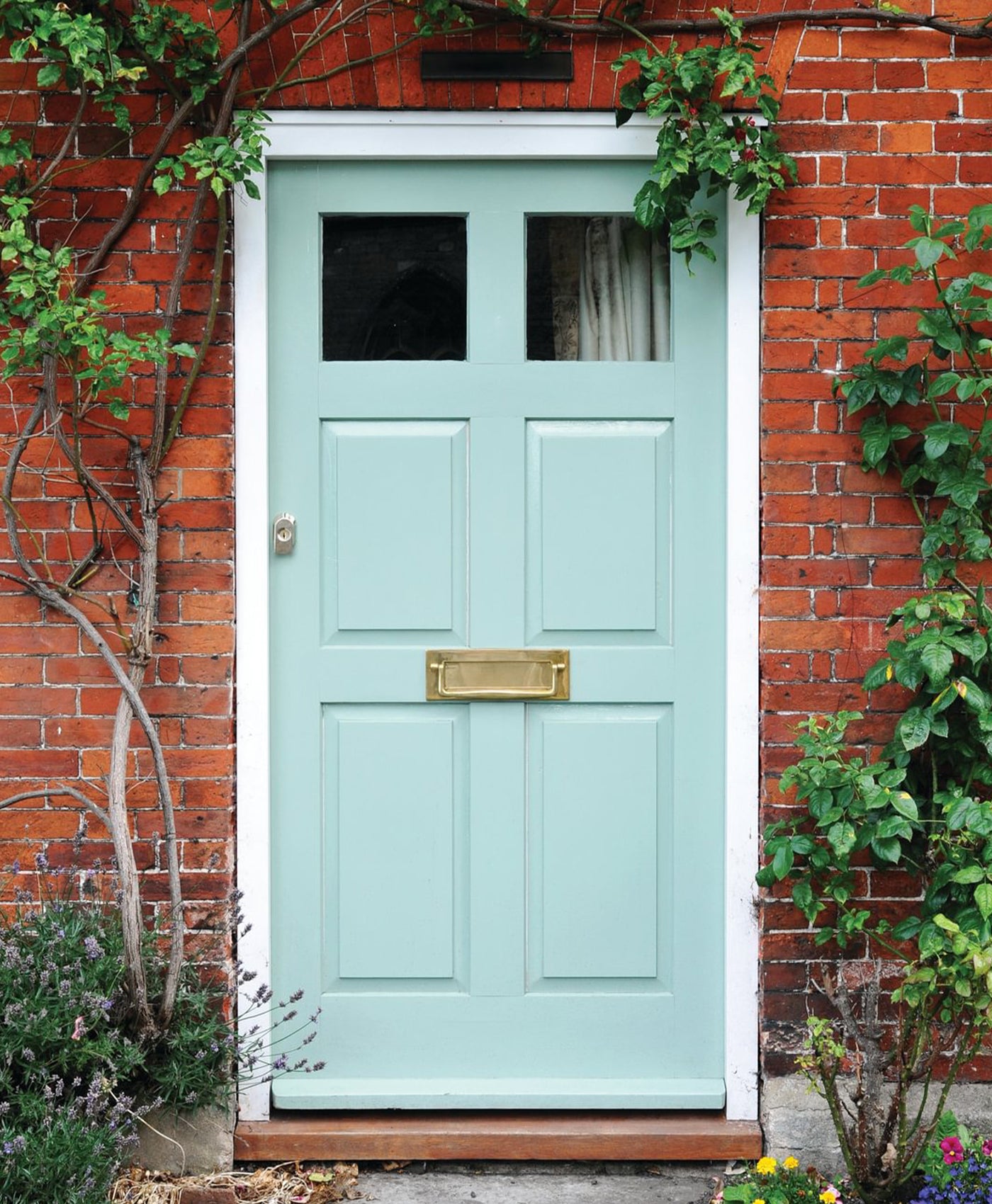
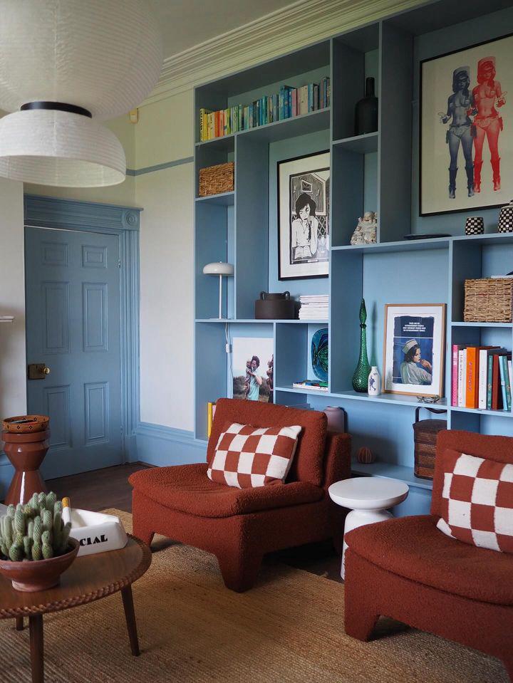
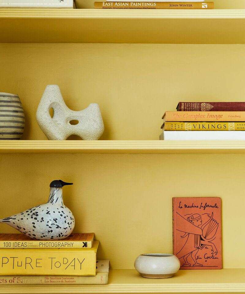
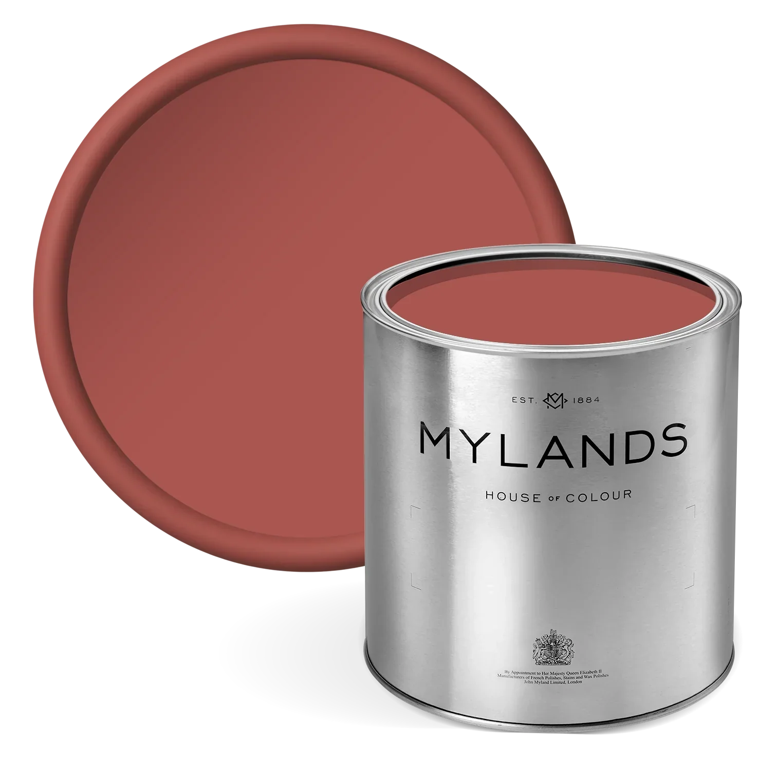
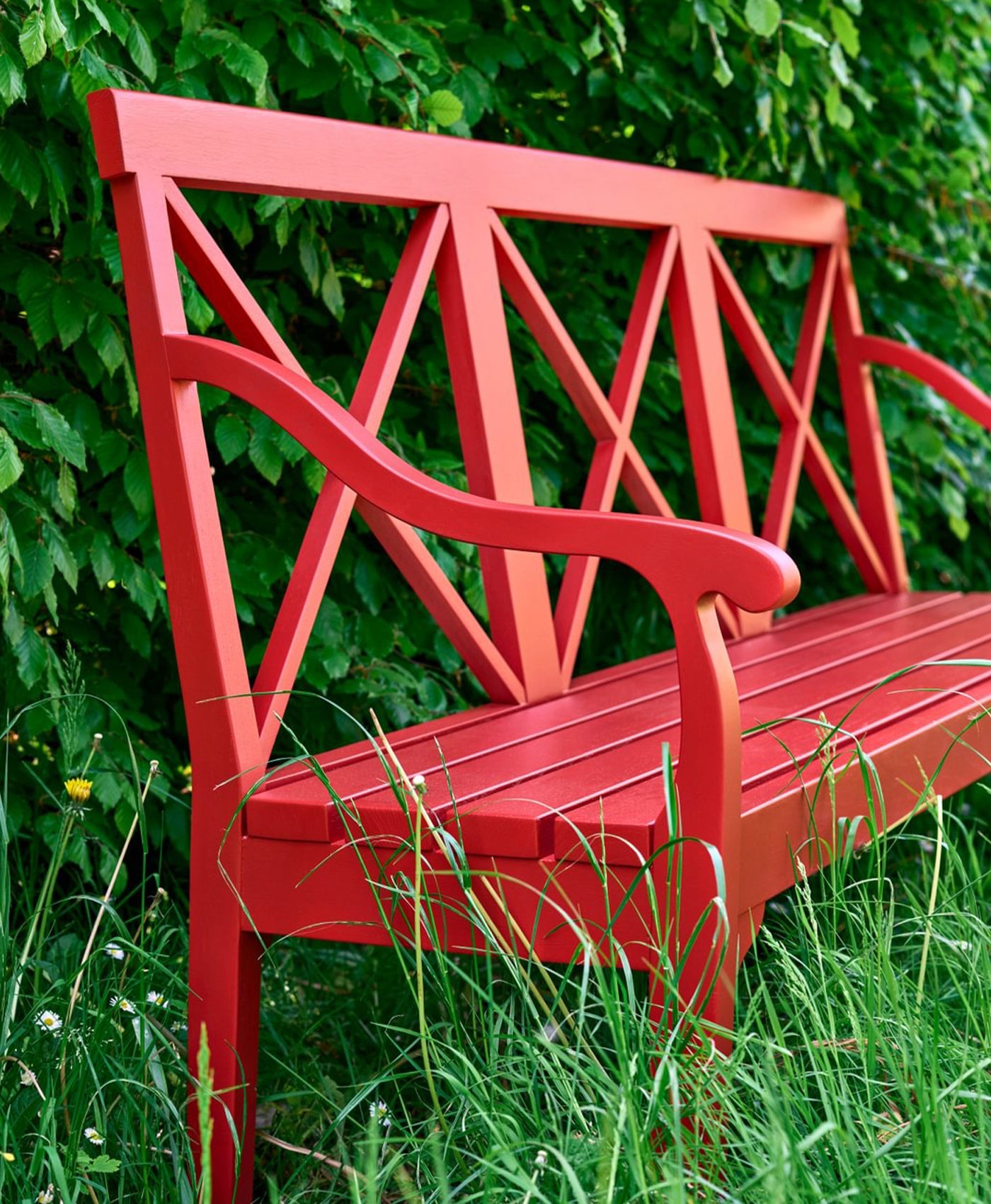
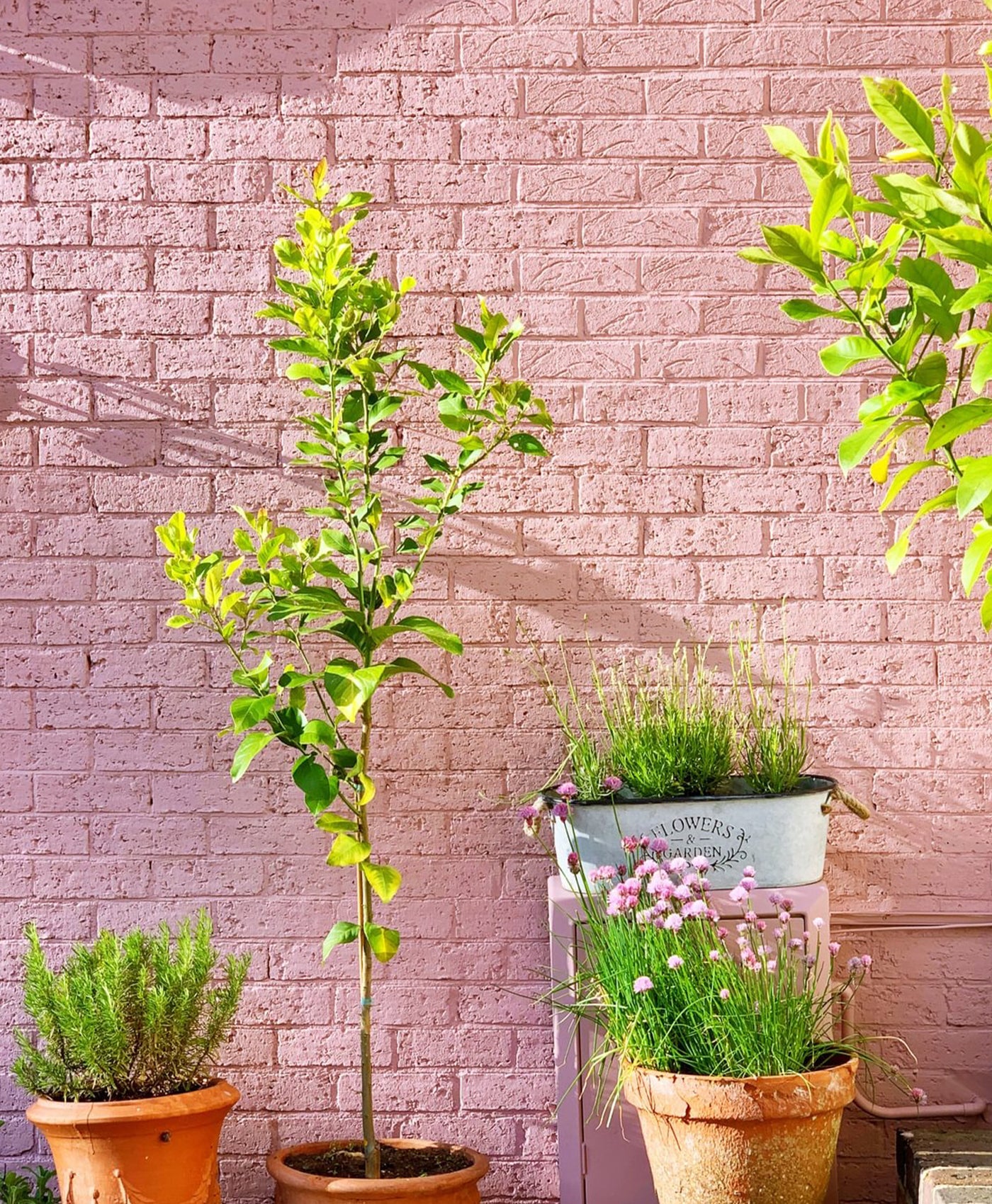
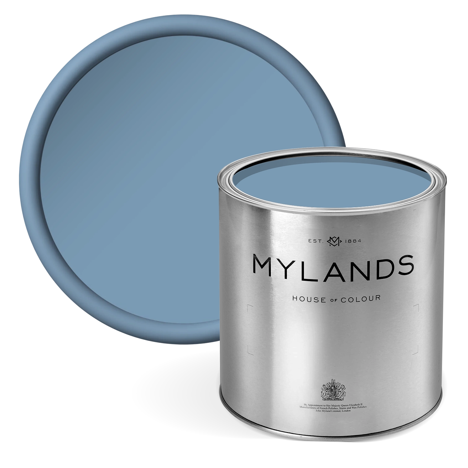
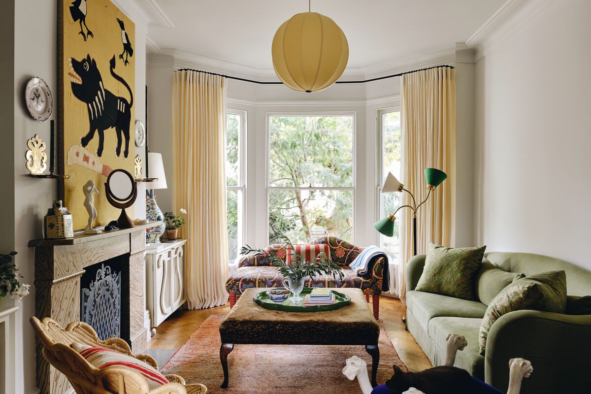
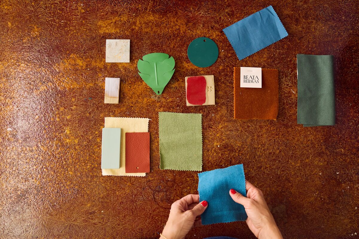
How would you describe the collection to someone who is not familiar with your work?

This collection reflects a palette refined over decades of designing interiors. They are trusted colours you can rely on: versatile light neutrals to cover most walls, mid-tones for shadowy depth in places, darker shades to add edge and contrast, a generous sprinkling of uplifting but calming greens and blues, buttery, irresistible yellows and a sizzling pop of red to add the cherry on the cake.

How do you help clients choose paint colours for their home?

I think the best thing to do when picking colours is to make a plan for the whole house in one go and depending on your approach have something that connects most of the rooms such as the woodwork and ceilings all being in the same tone. I tend to work mostly with light neutrals as an overall palette and introduce colour in smaller doses, be that on individual pieces of furniture or in fabrics. It can be fabulous to do walls in something a bit more punchy but in my opinion that works best if it’s sitting in amongst rooms that are a bit quieter, and also if you cover it up with pictures.

LEARN MORE

"The idea was to create a capsule collection that ticked a lot of boxes and gave a broad yet concise range which could serve your whole house. They all have their own character but they also work as a whole." - Beata Heuman

Beata Heuman - The Dependables - Colour Card

Beata Heuman - The Dependables - Colour Card

£2.00
Beata White BH.01
Beata White BH.01
Beata White BH.01
Beata White BH.01
Beata White BH.01
Beata White BH.01
Beata White BH.01
Beata White BH.01
Beata White BH.01
Beata White BH.01

Beata White BH.01

£8.50
Chalk BH.02
Chalk BH.02
Chalk BH.02
Chalk BH.02
Chalk BH.02
Chalk BH.02

Chalk BH.02

£8.50
Old Man's Beard BH.03

Old Man's Beard BH.03

£8.50
Bone BH.04
Bone BH.04
Bone BH.04
Bone BH.04
Bone BH.04
Bone BH.04
Bone BH.04
Bone BH.04
Bone BH.04
Bone BH.04

Bone BH.04

£8.50
Uncle Maths BH.05
Uncle Maths BH.05
Uncle Maths BH.05
Uncle Maths BH.05
Uncle Maths BH.05
Uncle Maths BH.05
Uncle Maths BH.05
Uncle Maths BH.05

Uncle Maths BH.05

£8.50
Lamb's Ear BH.06
Lamb's Ear BH.06
Lamb's Ear BH.06
Lamb's Ear BH.06
Lamb's Ear BH.06
Lamb's Ear BH.06
Lamb's Ear BH.06
Lamb's Ear BH.06
Lamb's Ear BH.06
Lamb's Ear BH.06

Lamb's Ear BH.06

£8.50
London Brick BH.07
London Brick BH.07
London Brick BH.07
London Brick BH.07
London Brick BH.07
London Brick BH.07
London Brick BH.07
London Brick BH.07

London Brick BH.07

£8.50
Pub BH.08
Pub BH.08
Pub BH.08
Pub BH.08
Pub BH.08
Pub BH.08
Pub BH.08
Pub BH.08
Pub BH.08
Pub BH.08

Pub BH.08

£8.50
Glass BH.09
Glass BH.09
Glass BH.09
Glass BH.09
Glass BH.09
Glass BH.09
Glass BH.09
Glass BH.09

Glass BH.09

£8.50
Overall BH.10
Overall BH.10
Overall BH.10
Overall BH.10
Overall BH.10
Overall BH.10
Overall BH.10
Overall BH.10
Overall BH.10
Overall BH.10

Overall BH.10

£8.50
Stockholm BH.11
Stockholm BH.11
Stockholm BH.11
Stockholm BH.11
Stockholm BH.11
Stockholm BH.11
Stockholm BH.11
Stockholm BH.11

Stockholm BH.11

£8.50
Thunder BH.12
Thunder BH.12
Thunder BH.12
Thunder BH.12
Thunder BH.12
Thunder BH.12
Thunder BH.12
Thunder BH.12
Thunder BH.12
Thunder BH.12

Thunder BH.12

£8.50
Artichoke BH.13
Artichoke BH.13
Artichoke BH.13
Artichoke BH.13
Artichoke BH.13
Artichoke BH.13
Artichoke BH.13
Artichoke BH.13
Artichoke BH.13
Artichoke BH.13

Artichoke BH.13

£8.50
Damp Leaf BH.14
Damp Leaf BH.14
Damp Leaf BH.14
Damp Leaf BH.14
Damp Leaf BH.14
Damp Leaf BH.14
Damp Leaf BH.14
Damp Leaf BH.14
Damp Leaf BH.14
Damp Leaf BH.14

Damp Leaf BH.14

£8.50
Caca d’Oie BH.15
Caca d’Oie BH.15
Caca d’Oie BH.15
Caca d’Oie BH.15
Caca d’Oie BH.15
Caca d’Oie BH.15
Caca d’Oie BH.15
Caca d’Oie BH.15
Caca d’Oie BH.15
Caca d’Oie BH.15

Caca d’Oie BH.15

£8.50
Forest BH.16
Forest BH.16
Forest BH.16
Forest BH.16
Forest BH.16
Forest BH.16
Forest BH.16
Forest BH.16
Forest BH.16
Forest BH.16

Forest BH.16

£8.50
Mormor Zaza BH.17
Mormor Zaza BH.17
Mormor Zaza BH.17
Mormor Zaza BH.17
Mormor Zaza BH.17
Mormor Zaza BH.17
Mormor Zaza BH.17
Mormor Zaza BH.17

Mormor Zaza BH.17

£8.50
Henna BH.18
Henna BH.18
Henna BH.18
Henna BH.18
Henna BH.18
Henna BH.18
Henna BH.18
Henna BH.18

Henna BH.18

£8.50
Crayfish Party BH.19

Crayfish Party BH.19

£8.50
Cigar BH.20
Cigar BH.20
Cigar BH.20
Cigar BH.20
Cigar BH.20
Cigar BH.20
Cigar BH.20
Cigar BH.20
Cigar BH.20
Cigar BH.20

Cigar BH.20

£8.50
Butter BH.21
Butter BH.21
Butter BH.21
Butter BH.21
Butter BH.21
Butter BH.21
Butter BH.21
Butter BH.21
Butter BH.21
Butter BH.21
Butter BH.21
Butter BH.21

Butter BH.21

£8.50
Boiled Dill BH.22
Boiled Dill BH.22
Mylands_Beata Heuman_BH Home_09. Hallway 1_No.4 Bone (Walls and woodwork)No.22 Boiled Dill (Ceiling) No.18 Henna (Floor) - Newsletter and web.jpg__PID:5a01371a-d280-48d5-8aab-a7b3e93f2759
Boiled Dill BH.22
Boiled Dill BH.22
Boiled Dill BH.22
Mylands_Beata Heuman_BH Home_09. Hallway 1_No.4 Bone (Walls and woodwork)No.22 Boiled Dill (Ceiling) No.18 Henna (Floor) - Newsletter and web.jpg__PID:5a01371a-d280-48d5-8aab-a7b3e93f2759
Boiled Dill BH.22

Boiled Dill BH.22

£8.50
Wheatsheaf BH.23
Wheatsheaf BH.23
Wheatsheaf BH.23
Wheatsheaf BH.23
Wheatsheaf BH.23
Wheatsheaf BH.23
Wheatsheaf BH.23
Wheatsheaf BH.23
Wheatsheaf BH.23
Wheatsheaf BH.23

Wheatsheaf BH.23

£8.50
John’s Pantry BH.24
John’s Pantry BH.24
John’s Pantry BH.24
John’s Pantry BH.24
John’s Pantry BH.24
John’s Pantry BH.24
John’s Pantry BH.24
John’s Pantry BH.24
John’s Pantry BH.24
John’s Pantry BH.24

John’s Pantry BH.24

£8.50

Do you think one shade will be particularly popular in 2025? If so, why?

I am personally very into soft yellows and faded buttery tones which I think is a lovely atmospheric alternative to white.

Where do you start when choosing paint colours? Do you have any tips on how to choose colours?

Kind of repeating myself but here you go:

There are no hard and fast rules and rules are there to be broken, but this isbasically what I do and a good fall-back method in most situations: build a relatively neutral palette using colours that you have tried and tested and then stick with it. Pick a good white. Add colour and experiment using accents. Plan the colours for the whole house in one go as opposed to room by room. A successful paint scheme is all about overall balance and while it’s good to add contrast and tension this is better to be done in moderation, especially if you’re starting out and not feeling too confident about what to do. That will then leave you to have a lot more fun with the loose pieces which is easier to experiment with.

What are your tips when choosing paint colours for:

A small space

A good place to go darker and moodier and lean into the cosy atmosphere. It is not true that you should paint small rooms light to make them feel bigger – it’s quite the opposite. It is often a good idea to paint walls and ceilings in the same colour if you have low ceilings. This will help raise the ceiling while white will lower it.

Mylands_Beata_Heuman_BH_Home_10._Guest_Bedroom_3_No.21_Butter_Walls_ceiling_and_woodwork_No.18_Henna_Floors_No.7_London_Brick_Garden_Wall_No.4_Bone_Doors_out_to_garden_-_Large_6e8b9d30-45ff-4962-aa23-11906f8f4a3d.jpg__PID:232e1c6e-6d5c-4d39-a607-7f4095645069


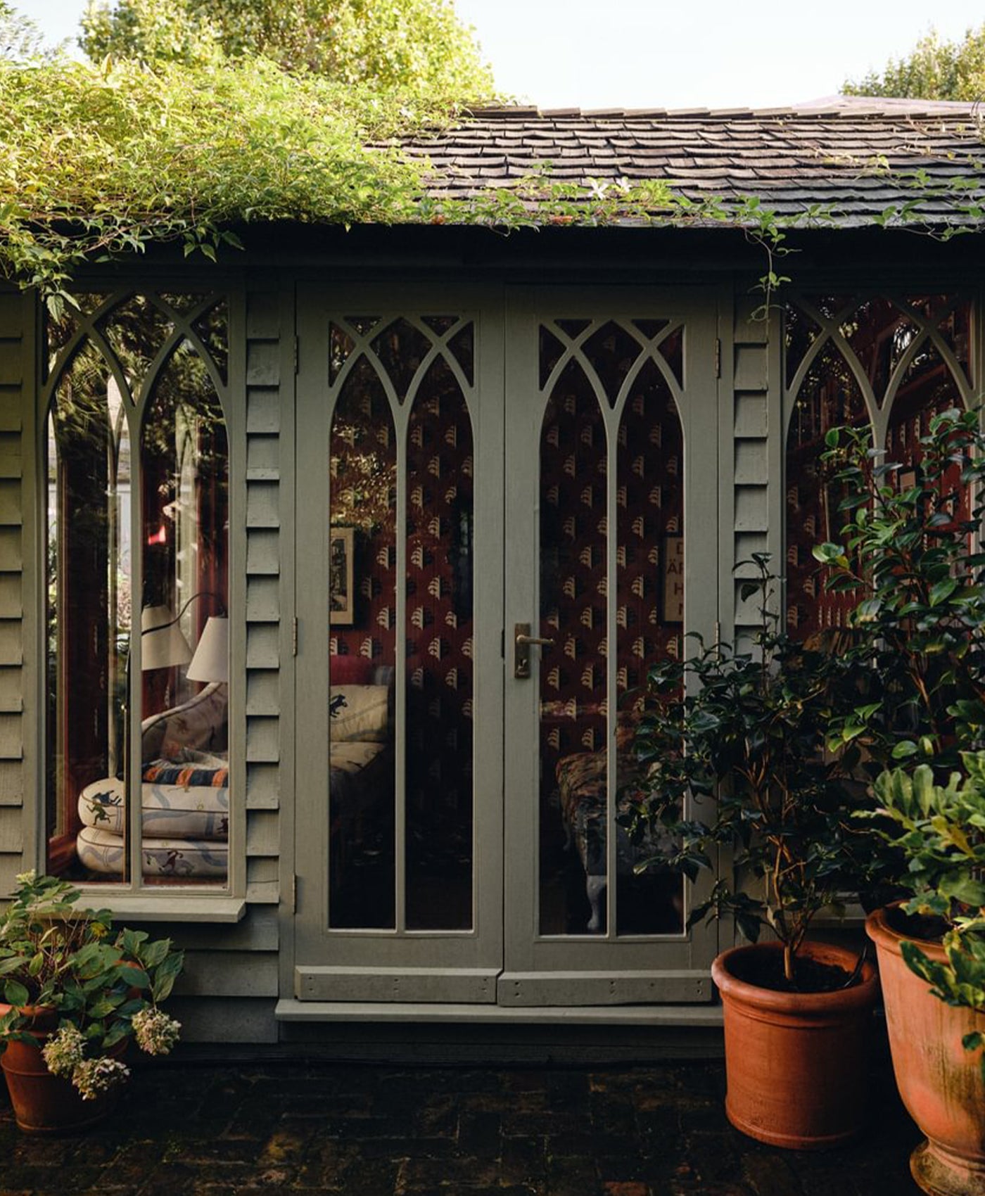
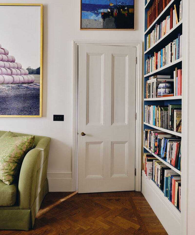
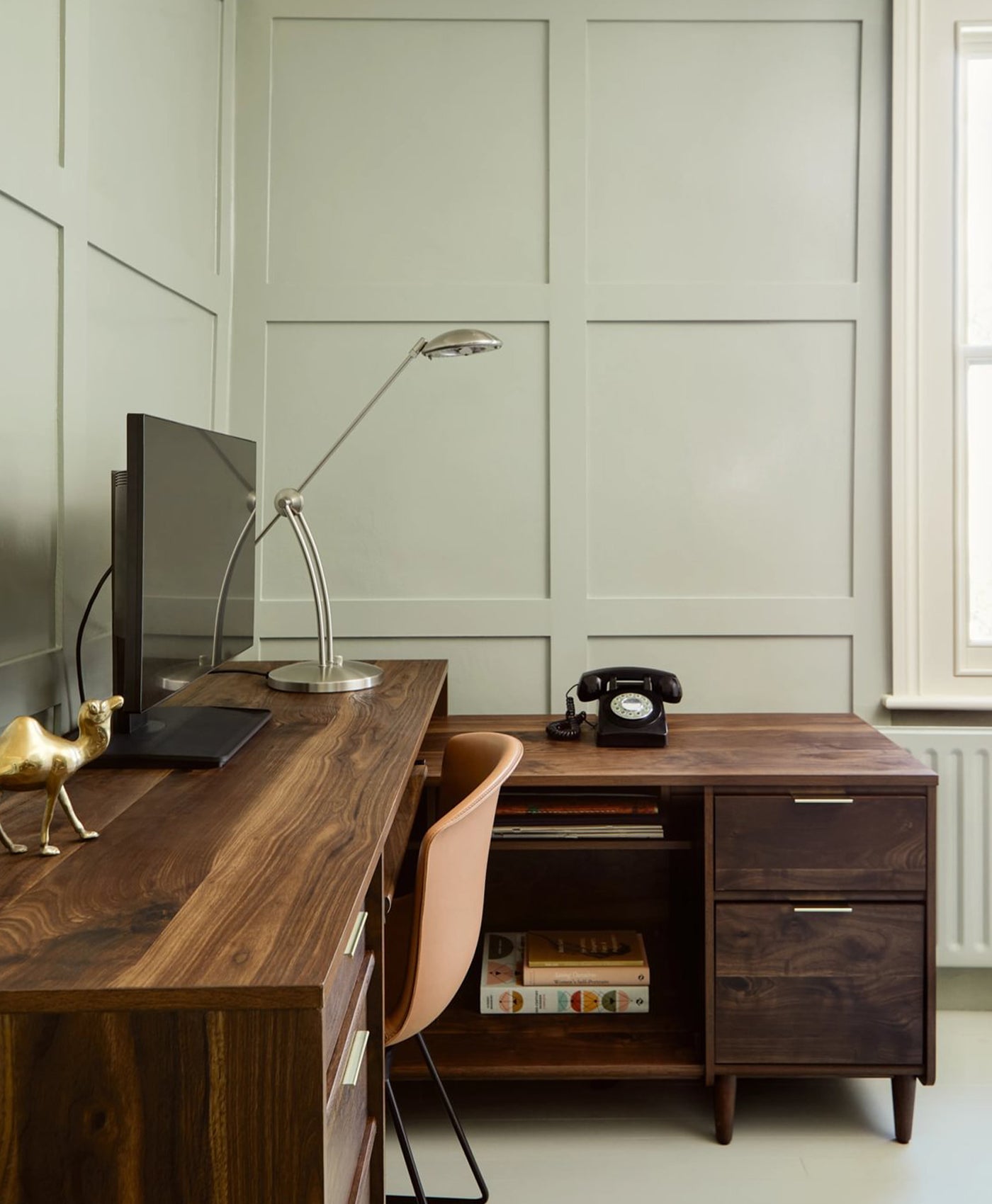
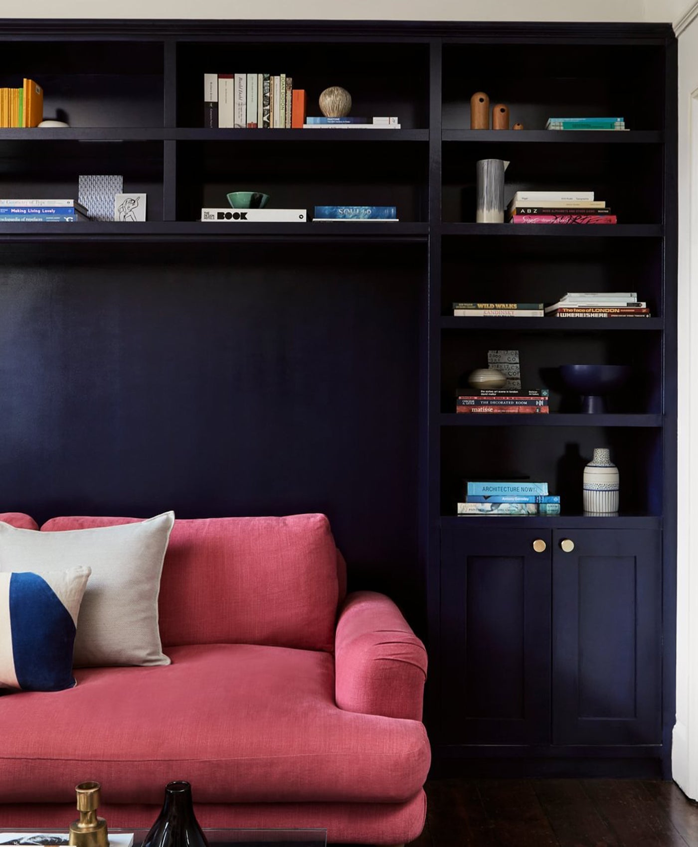
Walls, Ceiling and Woodwork in Beata White BH.01, Interior of Bookshelves in Stockholm BH.11

A living room

If this is the main room you spend time in and one of the bigger rooms in thehouse I tend to go for light walls such as a broken white or softer shadowy version of it. This makes for a more flexible and therefore more pleasant space. You can cover the walls with art and fill it with furniture and colourful upholstery and it will feel vibrant despite the plain walls that just serve as a dependable backdrop for your daily life.

Kitchens

I like to paint most of the joinery in the same or very similar tone to the walls, tomake what is a lot of joinery sit more lightly in the space, in an attempt to make it blend in. If the kitchen is small it can be a good place to add a bit of colour too, such as a soft yellow. Think about mixing it up a bit – can the island, fridge unit or larder be painted in a different colour to make it feel less matchy?

Mylands_Beata_Heuman_BH_Home_04._Kitchen_2_No.3_Old_Man_s_Beard_Walls_woodwork_and_cabinetry_No.23_Wheatsheaf_Fridge__5_-_Large_32433d84-38ad-4b80-a8cf-e200f364df73.jpg__PID:47a035fd-861d-460d-bc22-6dab00f1b04f


Walls, Ceiling and Cabinetry Old Man's Beard BH.03, Fridge in Wheatsheaf BH.23

Mylands_Beata_Heuman_BH_Home_05._Landing_1_No.3_Old_Man_s_Beard_Doors_and_woodwork_No.8_Pub_Window_No.17_Mormor_Zaza_Ceiling_-_Large_3a58f4c9-7dd6-4d01-8feb-dcba4010dda2.jpg__PID:d64676f7-7d09-4c8b-be12-5a753b35421c


Doors and woodwork in Old Man's Beard BH.03, ceiling in Mormor Zaza BH.17 

Hallways

Hallways, especially narrow London ones are actually quite a good place to usewallpaper.

These types of spaces normally don’t have a lot room for pieces of furniture so even if you go for paint on the walls you might want to consider not going for your default white but rather something a little moodier and don’t forget to layer artwork on top to add character.

Doors and woodwork

My normal approach, especially for smaller spaces, is to paint doors andwoodwork the same as the walls and cornices as I think it makes the space feelbigger and more cohesive.

That said, if you are using quite a lot of white throughout for walls painting doors and woodwork in a colour such as a greeny blue is a good way to add a bit of character in places. But overall, it works to pick a sort of theme throughout the house where all the woodwork is connected by being painted in the same colour.

Mylands_Beata_Heuman_BH_Home_11._Guest_Bathroom_4_No.6_Lamb_s_Ear_Walls_and_ceiling_No.13_Artichoke_Door_and_woodwork__1_-_Large_43a2c021-7fc5-4853-b5fa-4f7a99a98feb.jpg__PID:82b83097-444c-44ae-997c-20ab210709bb


Walls and Ceiling Lamb's Ear BH.06, Door and woodwork in Artichoke BH.13

Discover more about the collection below.

JINNY BLOM'S TOP COLOUR PICKS