Tirzah Garwood: Beyond Ravilious
Mylands is delighted to support the the first major exhibition devoted to British artist and designer Tirzah Garwood, held at Dulwich Picture Gallery. Launched on November 19th, the exhibiton has received impressive reviews: Garwood takes the spotlight in an exhibition that reveals the full extent of her talent and output.
Mylands colours adorn the latest exhibition, Tirzah Garwood: Beyond Ravilious at Dulwich Picture Gallery. In autumn 2024, ten years after its critically acclaimed show Ravilious, Dulwich Picture Gallery welcomes guest Curator James Russell to present the first major exhibition devoted to British artist and designer Tirzah Garwood (1908 – 1951). Known for her autobiography Long Live Great Bardfield and as the wife of Eric Ravilious (1903 – 1942), Garwood excelled as a fine artist and printmaker. Tirzah Garwood: Beyond Ravilious is the first time the full extent of her output will be shown, giving the artist’s captivating works the critical examination and public showcase they deserve as gems of the mid-20th century.
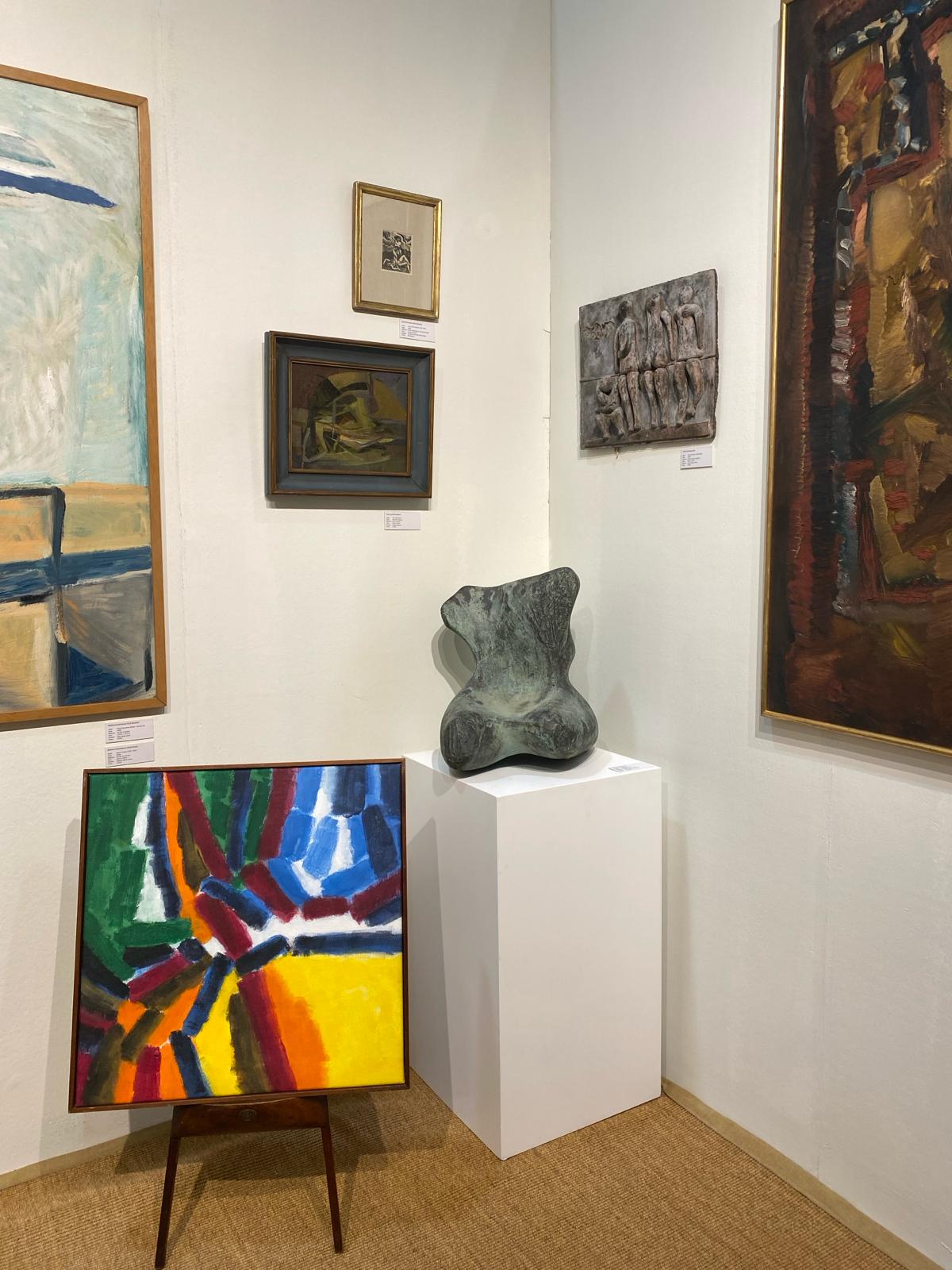
Against a backdrop of both subtle and striking Mylands colours, the retrospective offers a rare opportunity to view more than eighty of Garwood’s works, including most of her existing oil paintings, almost exclusively from private collections. The exhibition introduces an artist whose creativity flourished in the face of adversity, unveiling Garwood’s ‘sophisticated naïve’ approach that allowed her to infuse apparently innocent or straightforward subjects with deeper meanings.
The exhibition presents a series of Garwood’s experimental marbled papers, which were ordered by publishers, interior design shops and private clients. Juggling the demands of motherhood and her creative practice, she pioneered a distinctive decorative style, layering delicate repeat patterns to create harmonious designs that were unlike anything being made in Europe. Representing all areas of her practice, the exhibition includes Garwood’s tender pencil sketches also created during this period, which depict her children John, James, and Anne.
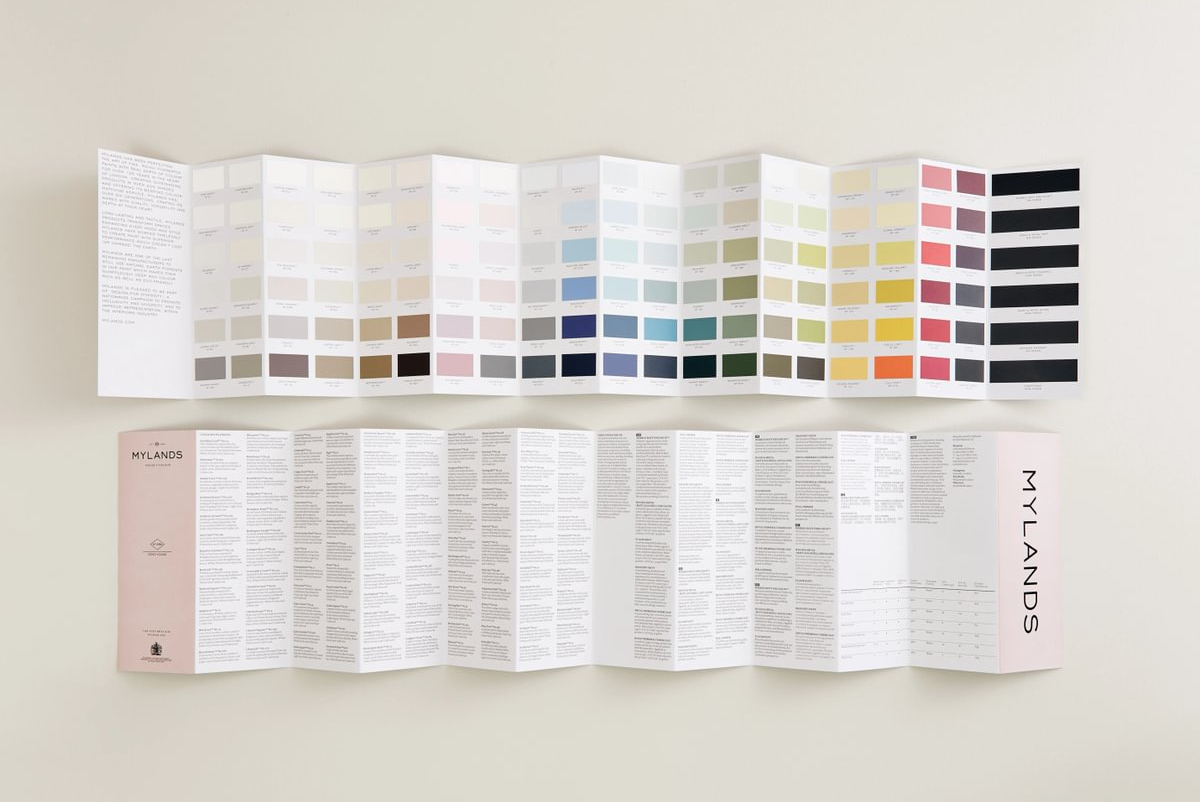
To compliment these beautiful artworks, Mylands supplied exquisite colours from subtle blush pinks and natural hued green to dramatic deep red. Discover the palette below and how you can bring these colours into your own interiors.

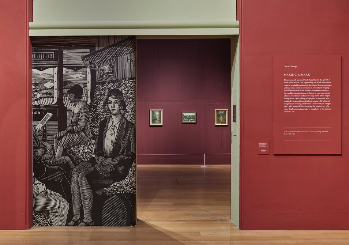
Front Room Walls in Bloomsbury™ No.267; Second Room Walls in Greenstone™ No.190; Third Room Walls in Bloomsbury™ No.267; Fourth Room Walls in Rothschild Street™ No.296
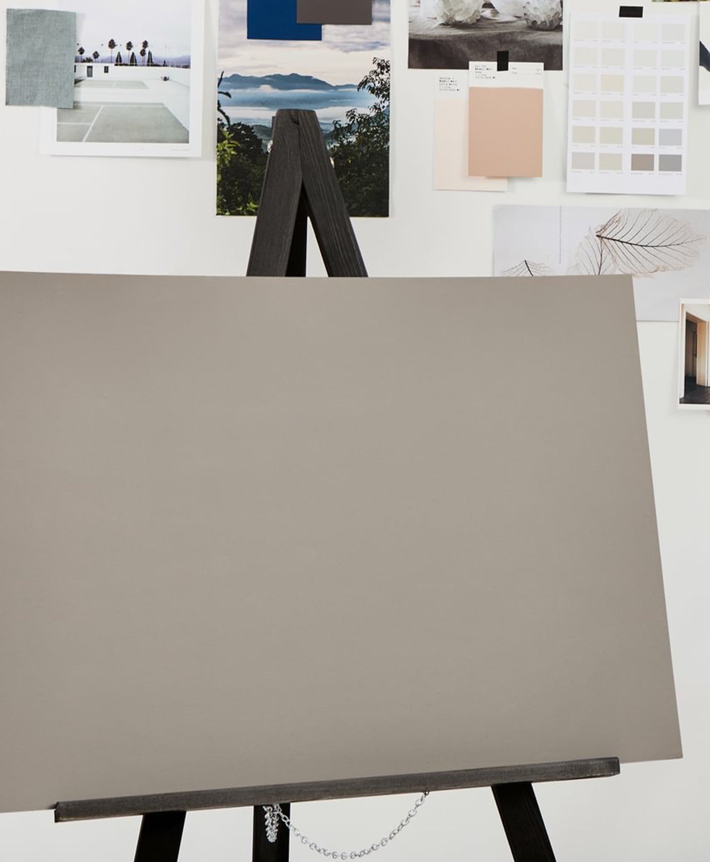
Decorate Your Projects with the Dedicated Tirzah Garwood: Beyond Ravilious Palette

Walls in Bloomsbury™ No.267 and Pale Lilac™ No.246

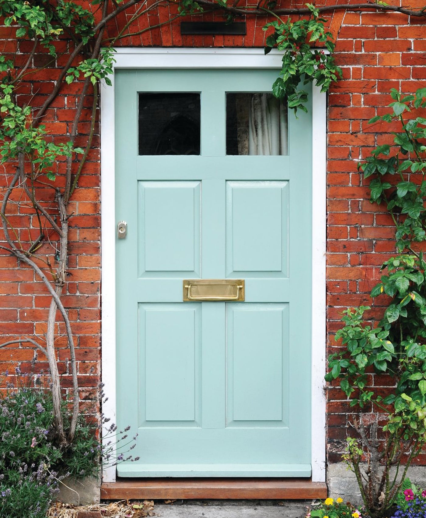
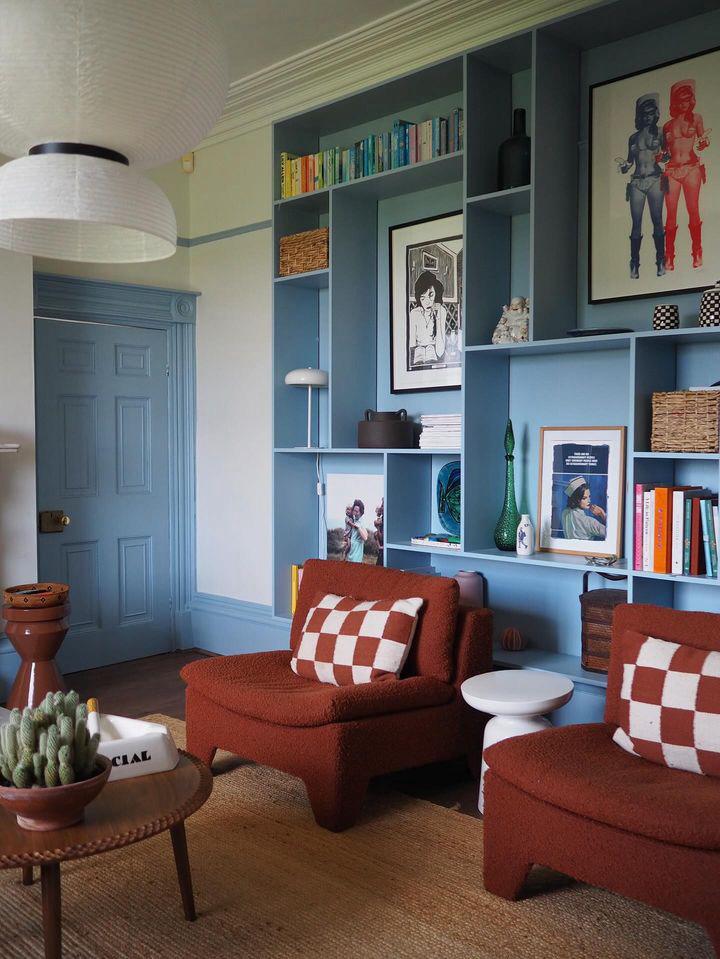
Walls in Pale Lilac™ No.246 and Theatre Land™ No.282
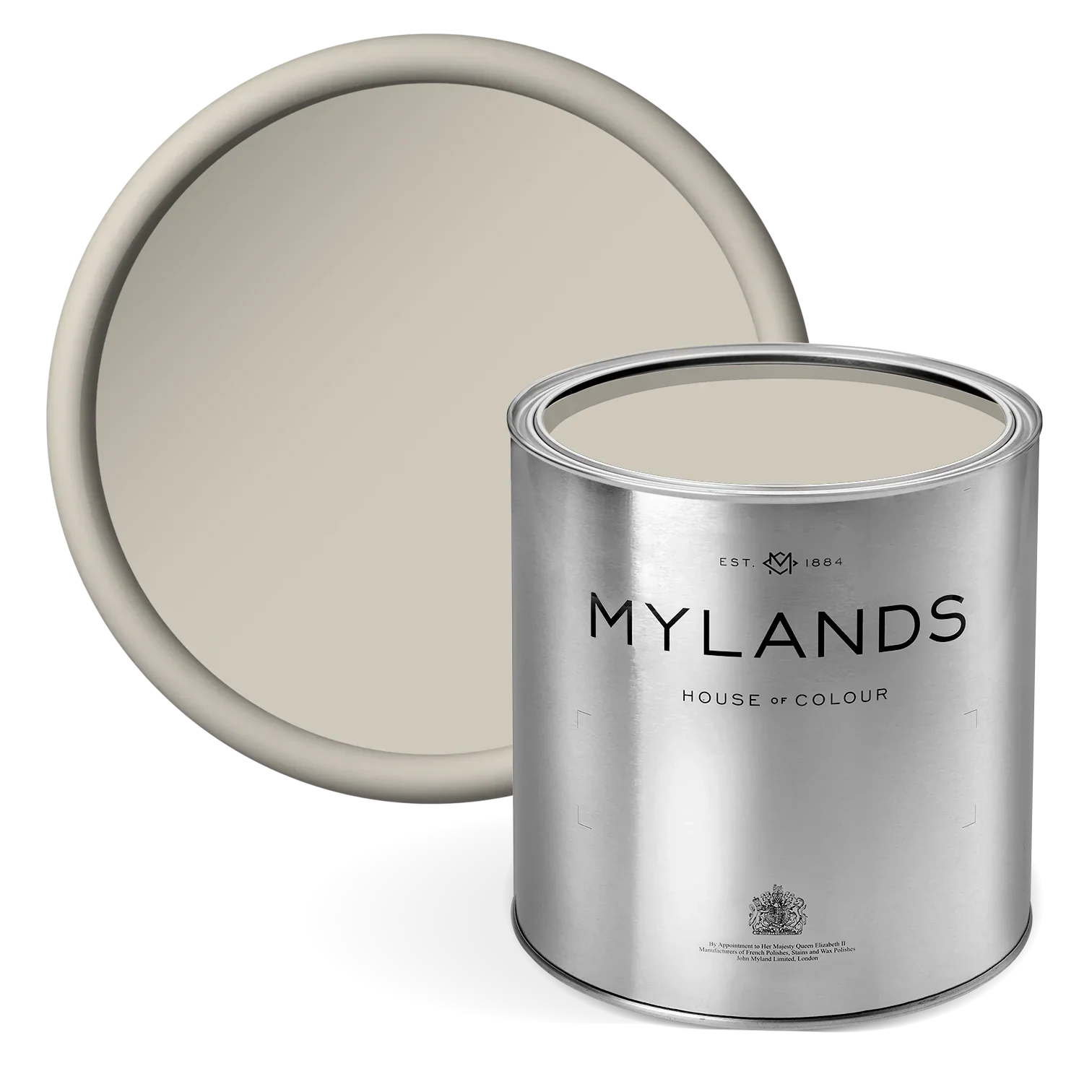
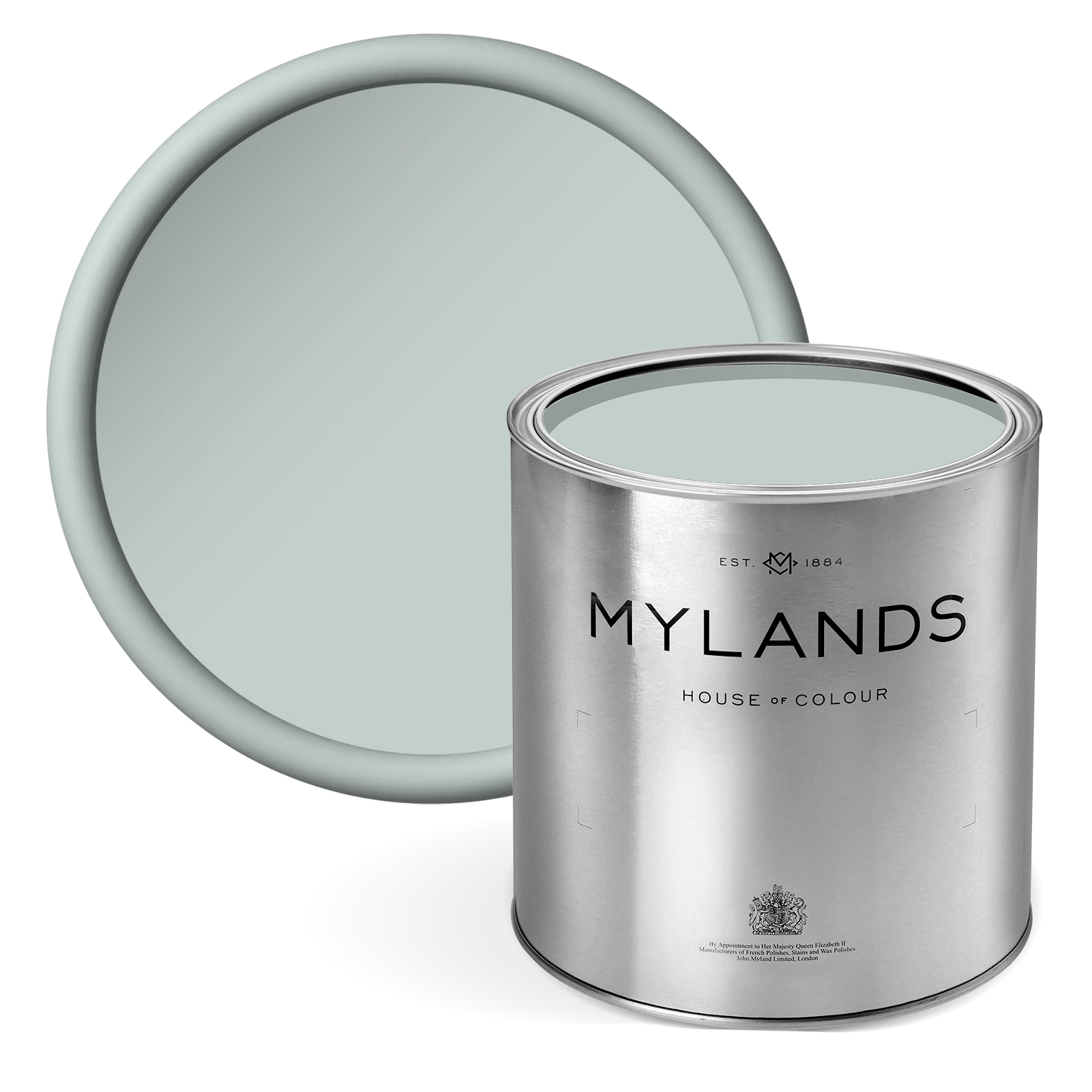
Pale Lilac™ No.246
This delicate hue is a versatile and elegant shade that combines soft lilac and muted pink tones with subtle grey undertones. This carefully blended hue makes it an excellent choice for creating tranquil, welcoming interiors. Its gentle, dusty lilac quality evokes serenity, making it particularly well-suited for spaces where relaxation is key, such as bedrooms or living areas. The grey undertones in Pale Lilac™ add a sophisticated balance, preventing the colour from becoming overly sweet or saccharine. This restraint ensures the shade feels fresh, modern, and versatile enough to harmonise with both traditional and contemporary design styles. Pale Lilac™ No.246 can create a soothing monochromatic look when paired with other pastel or muted tones, or it can be offset with darker accents like charcoal greys, deep plums, or navy blues for a more dramatic contrast. In entryways, Pale Lilac™ No.246 can introduce an inviting warmth while maintaining a light and airy feel, especially when paired with white or a cream trim. The colour also works beautifully in nurseries, adding a delicate charm that feels calm and nurturing without being overly childish. For more formal spaces, its subtle elegance can bring a sense of refinement, especially when used with polished finishes or complementary metallic accents like FTT-001™ Rich Gold or FTT-003™ Pale Bronze.
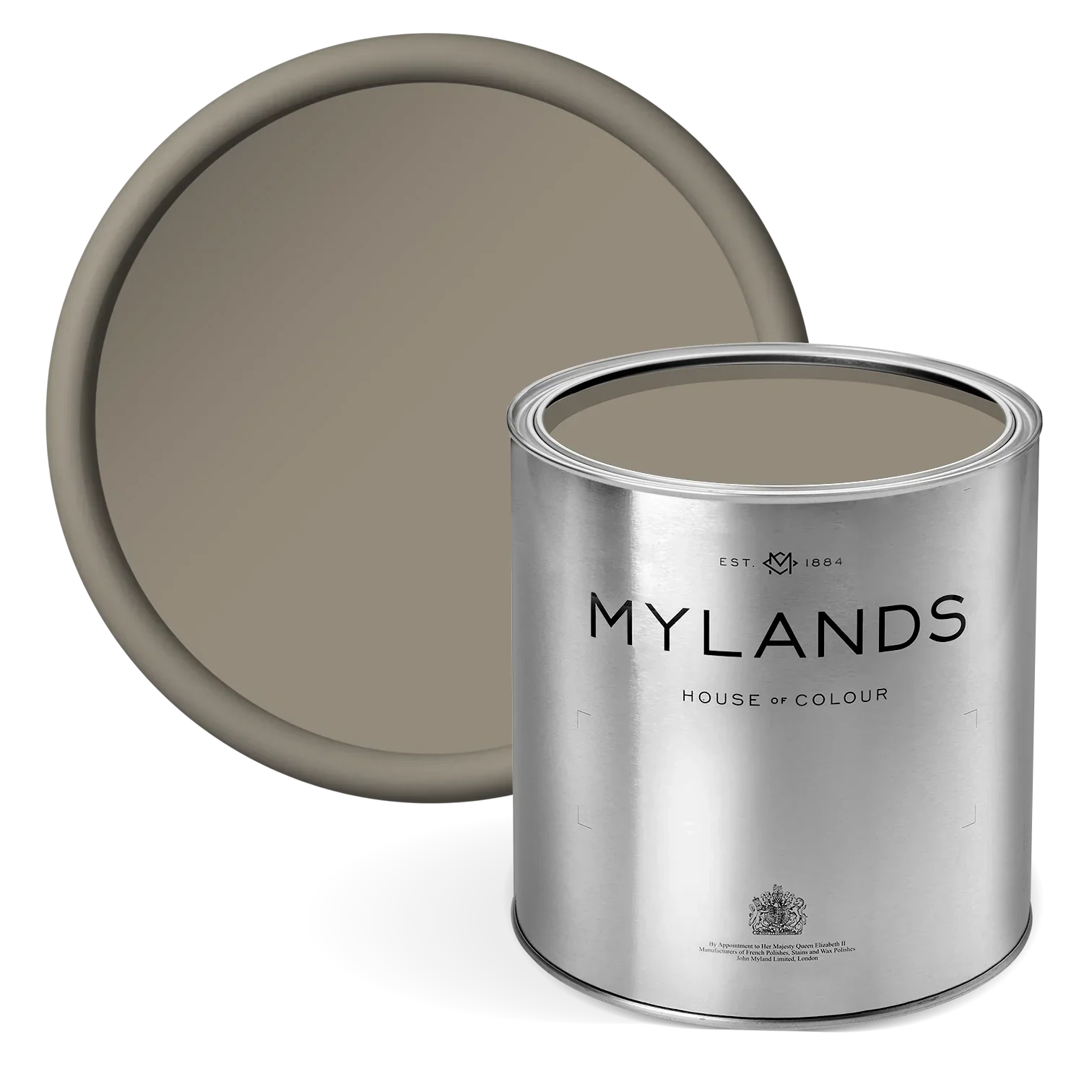
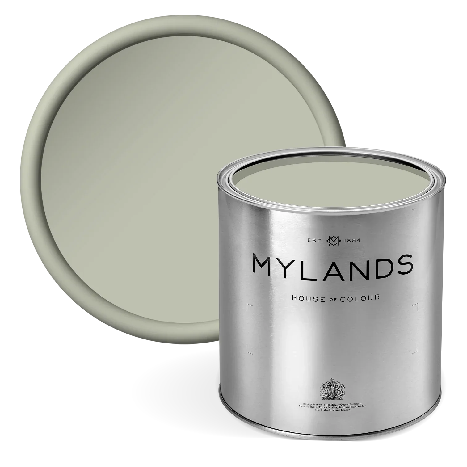
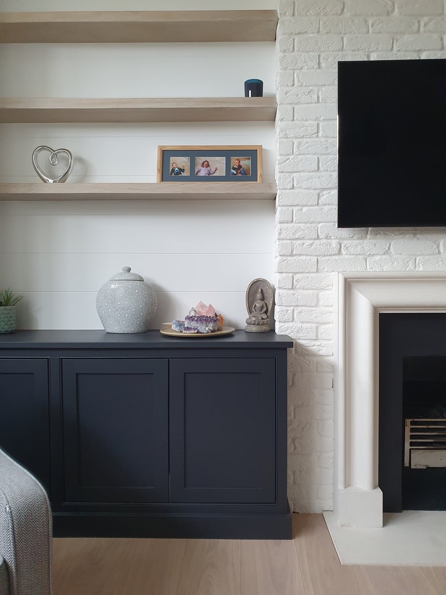
Greenstone™ No.190
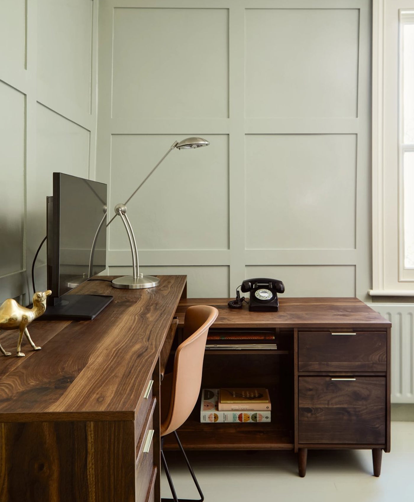
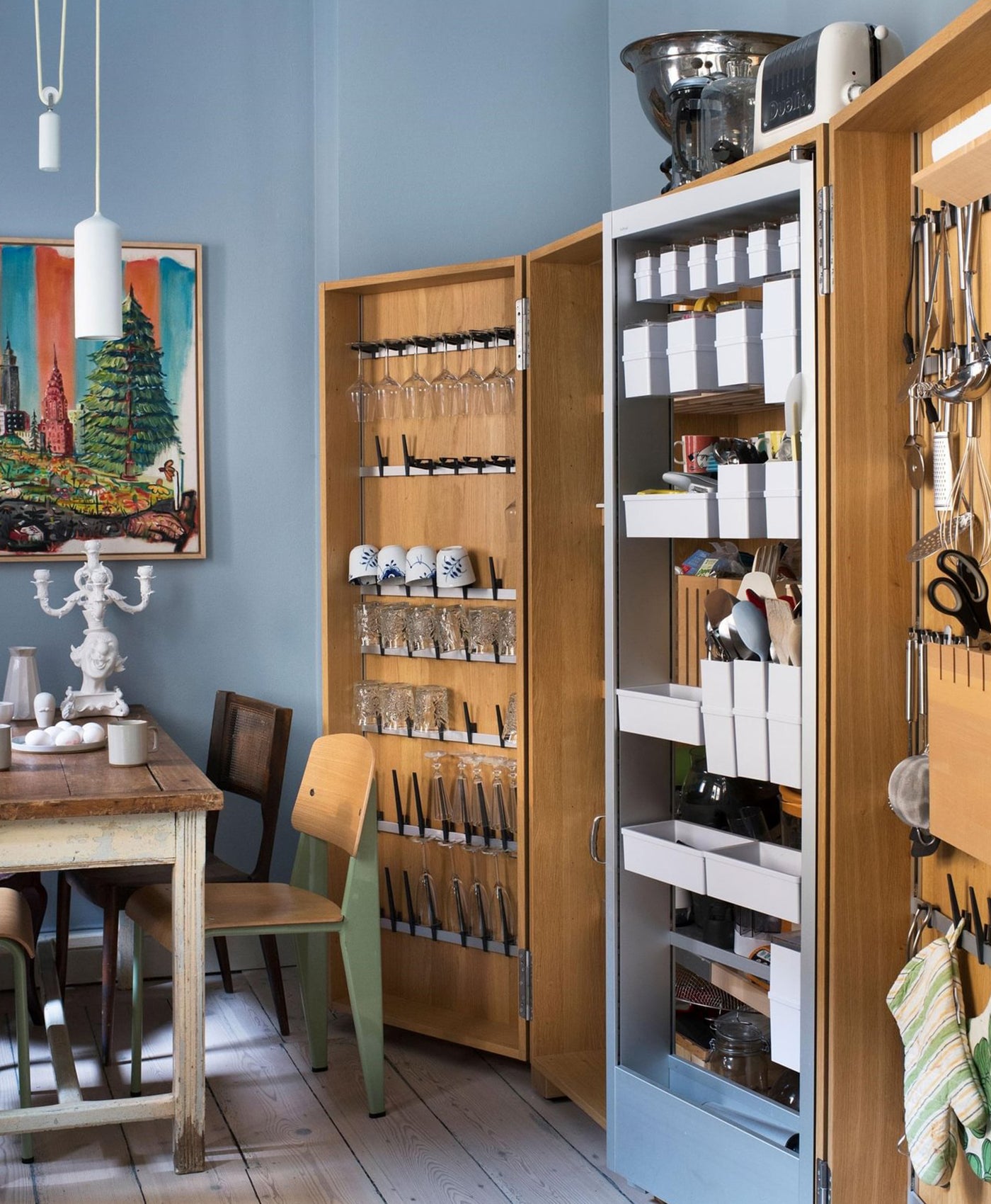
A timeless shade of sage green that embodies tranquility and sophistication. Its soft, muted tone makes it a versatile choice for various interiors, lending itself beautifully to both traditional and contemporary spaces. Evoking a sense of calm and connection to nature, Greenstone™ No.190 is perfect for creating serene and inviting environments.This earthy green works especially well in spaces where balance and comfort are key. In living rooms, its gentle hue complements natural materials like wood and stone, offering an organic aesthetic. For bedrooms, it creates a restful backdrop, pairing seamlessly with neutral tones like crisp whites, soft beiges, or creamy greys. In bathrooms or kitchens, Greenstone™ No.190's understated elegance can be enhanced with metallic accents such as brushed gold or matte black for a modern twist. Greenstone™ No.190's versatility extends to its compatibility with other colors. Pair it with fresh whites like Maugham White™ No.2 for a crisp, clean contrast, or combine it with alternative greens like Chester Square™ No.199 for a layered, natural look. For a bolder statement, consider adding elements in soft pinks or sky blues to highlight its subtle vibrancy.

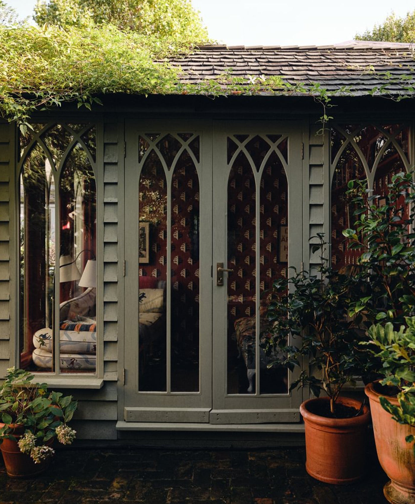
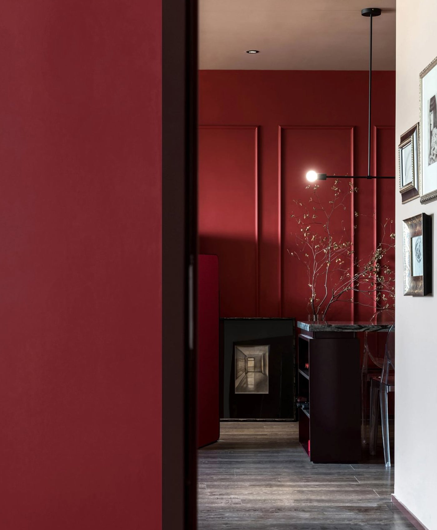
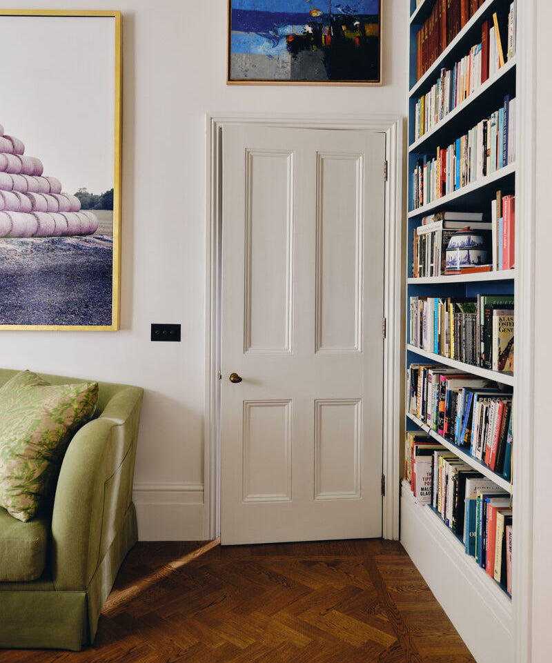
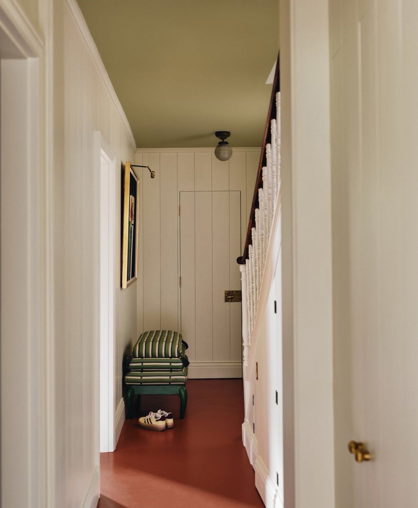
Back Wall in Rothschild Street™ No.296; Door and Upper Panelling in Greenstone™ No.190; and Front Walls in Dulwich Red

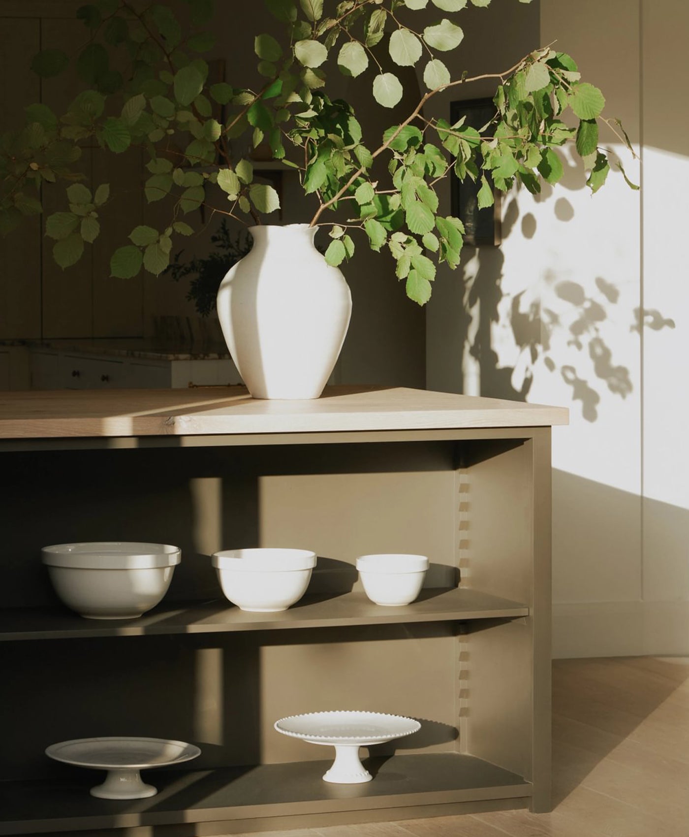
Walls in Honest John™ No.58 and Cabinets in Greenstone™ No.190

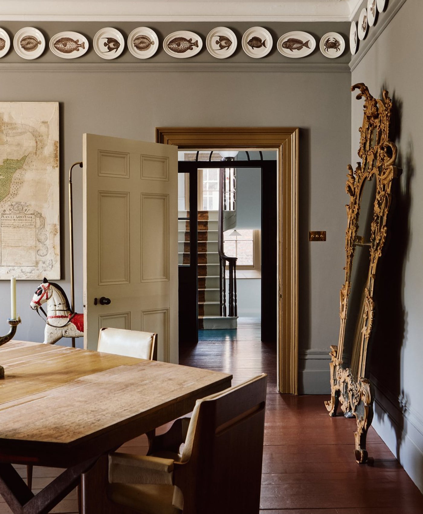
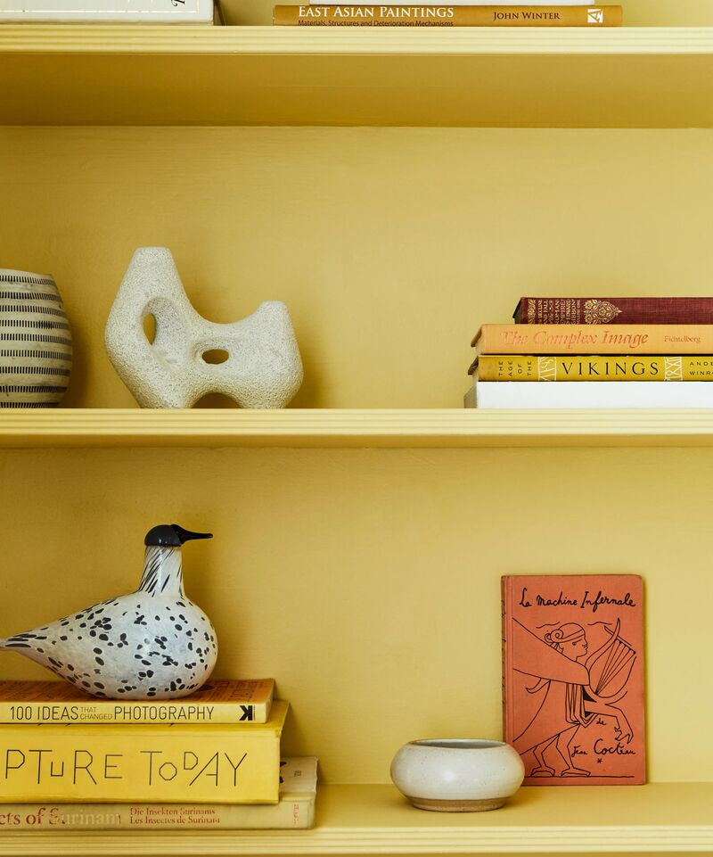
Walls in Bloomsbury™ No.267

Ladder in Bloomsbury™ No.267
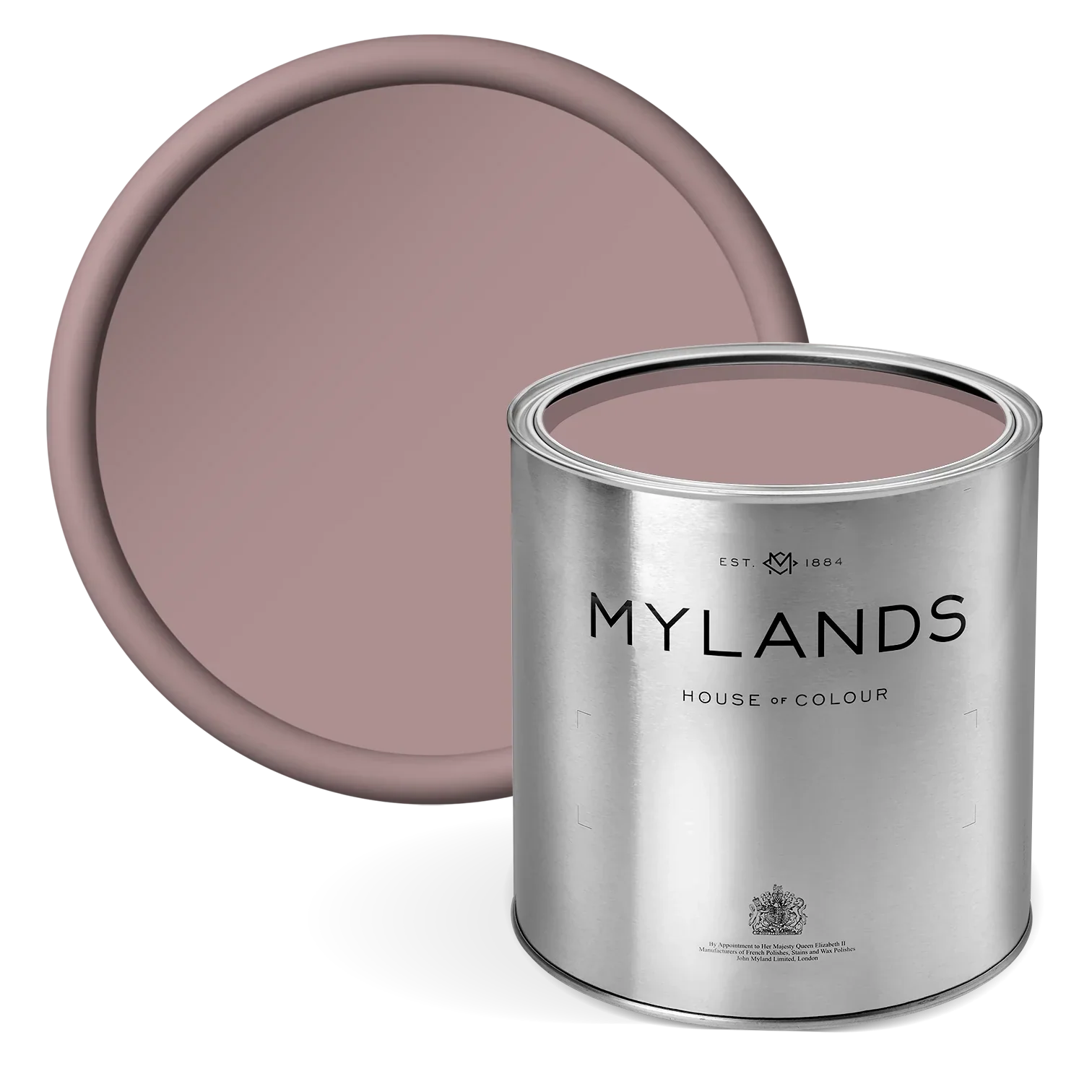
Bloomsbury™ No.267
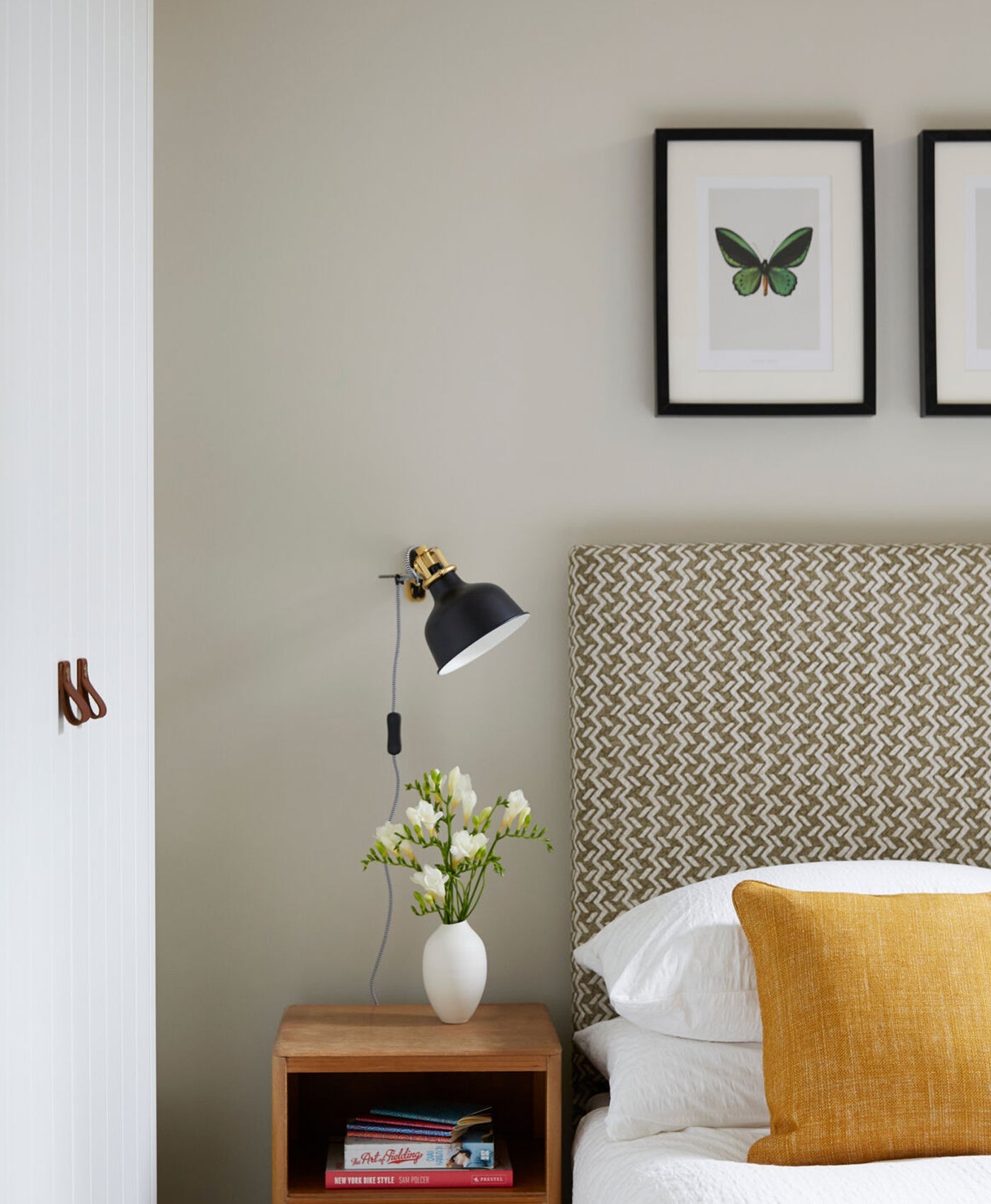
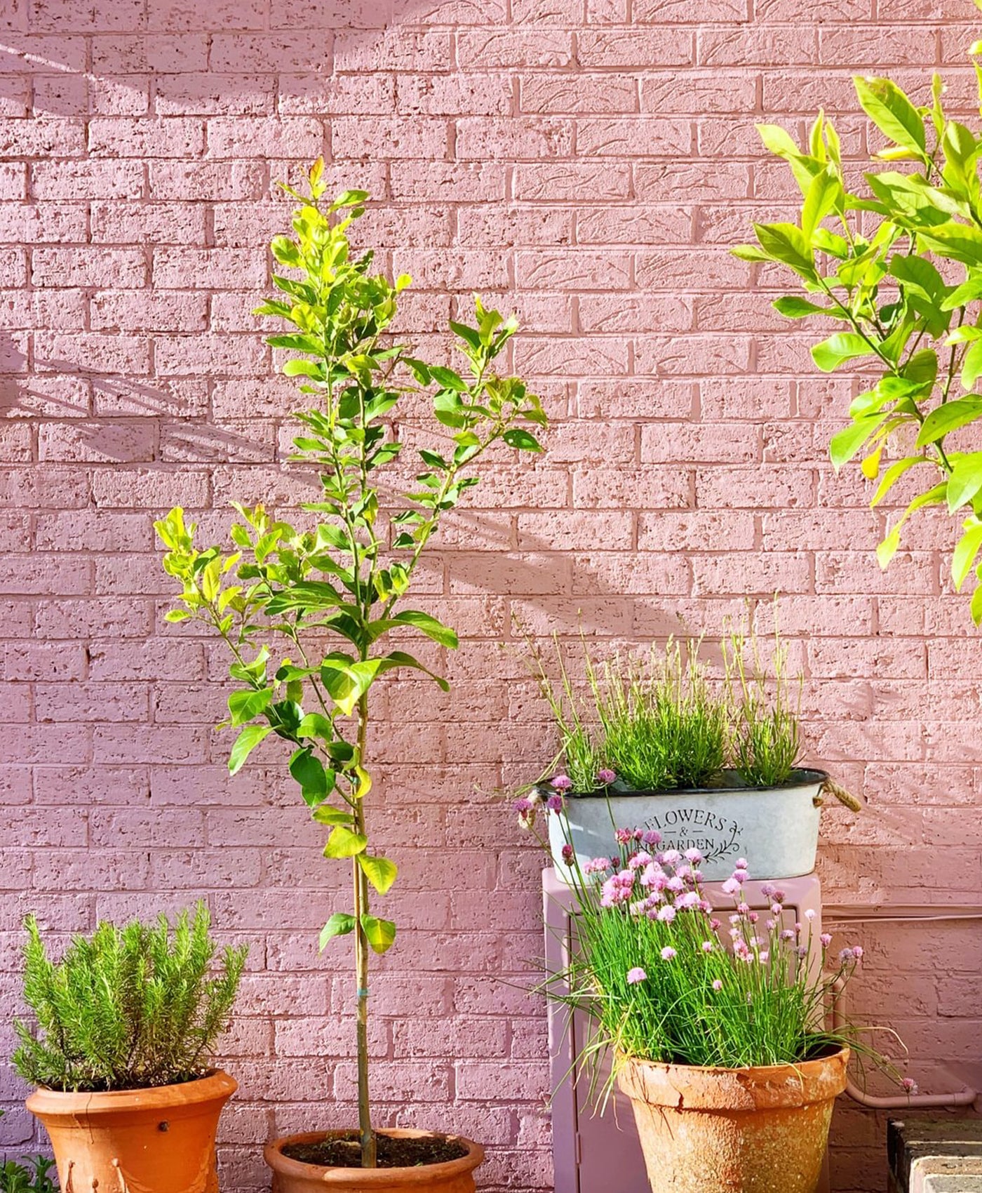
A dusty pink shade that captures a timeless elegance. Inspired by the artistic heritage of London’s Bloomsbury district, this sophisticated shade blends gentle warmth with understated charm, evoking the refined interiors of Georgian and Edwardian homes. Its muted, vintage quality makes it an ideal choice for spaces seeking a serene yet luxurious ambiance. This versatile pink works beautifully as a feature wall, offering a subtle yet eye-catching backdrop. Paired with complementary neutrals such as Pure White™ No.1 or Maugham White™ No.2, Bloomsbury™ No.267 creates a light and airy feel. For a bolder aesthetic, it pairs wonderfully with deep greens, earthy browns, or even charcoal accents to add contrast and depth. Its adaptability makes it suitable for bedrooms, living spaces, or even kitchens and dining areas, where it can create an inviting and relaxed atmosphere.
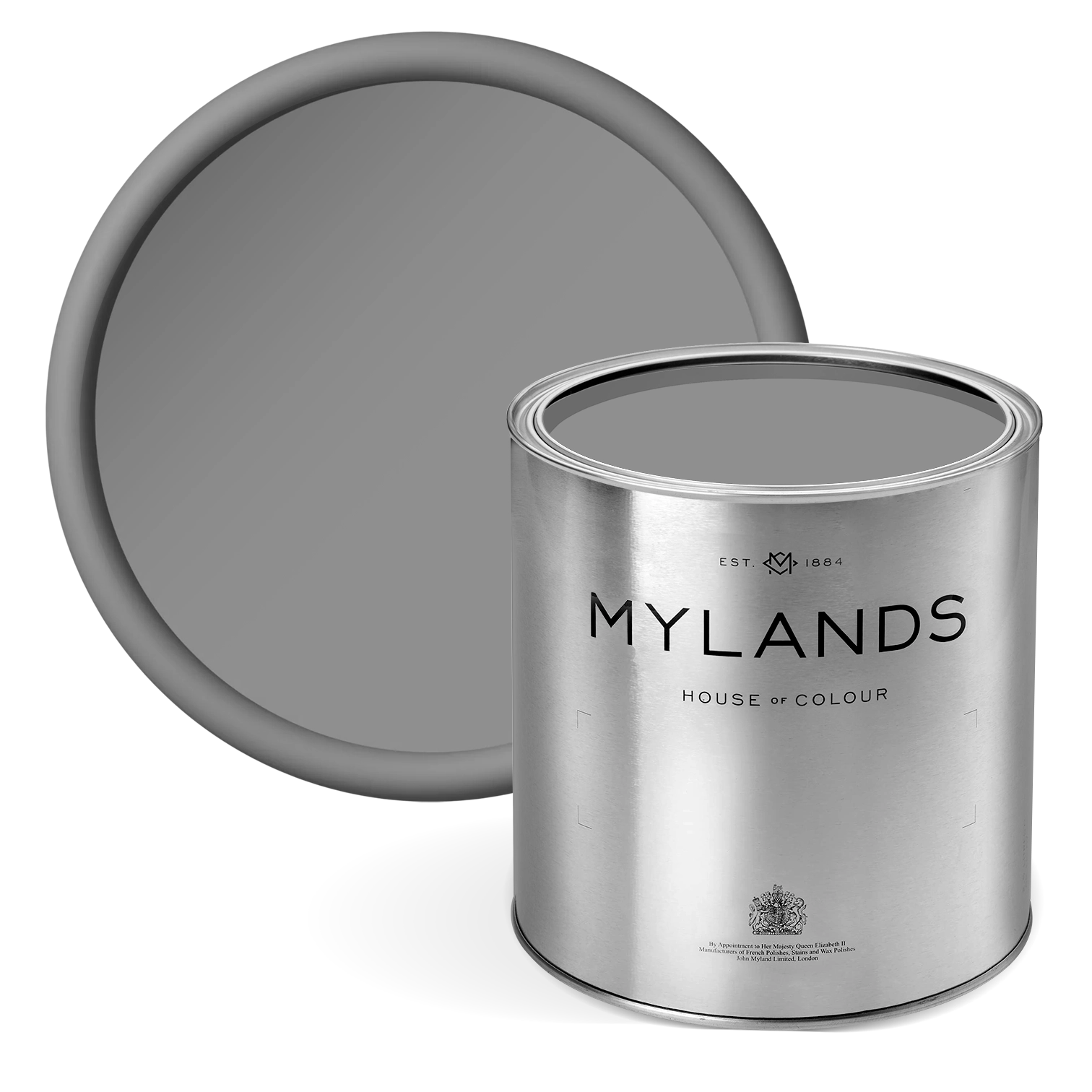
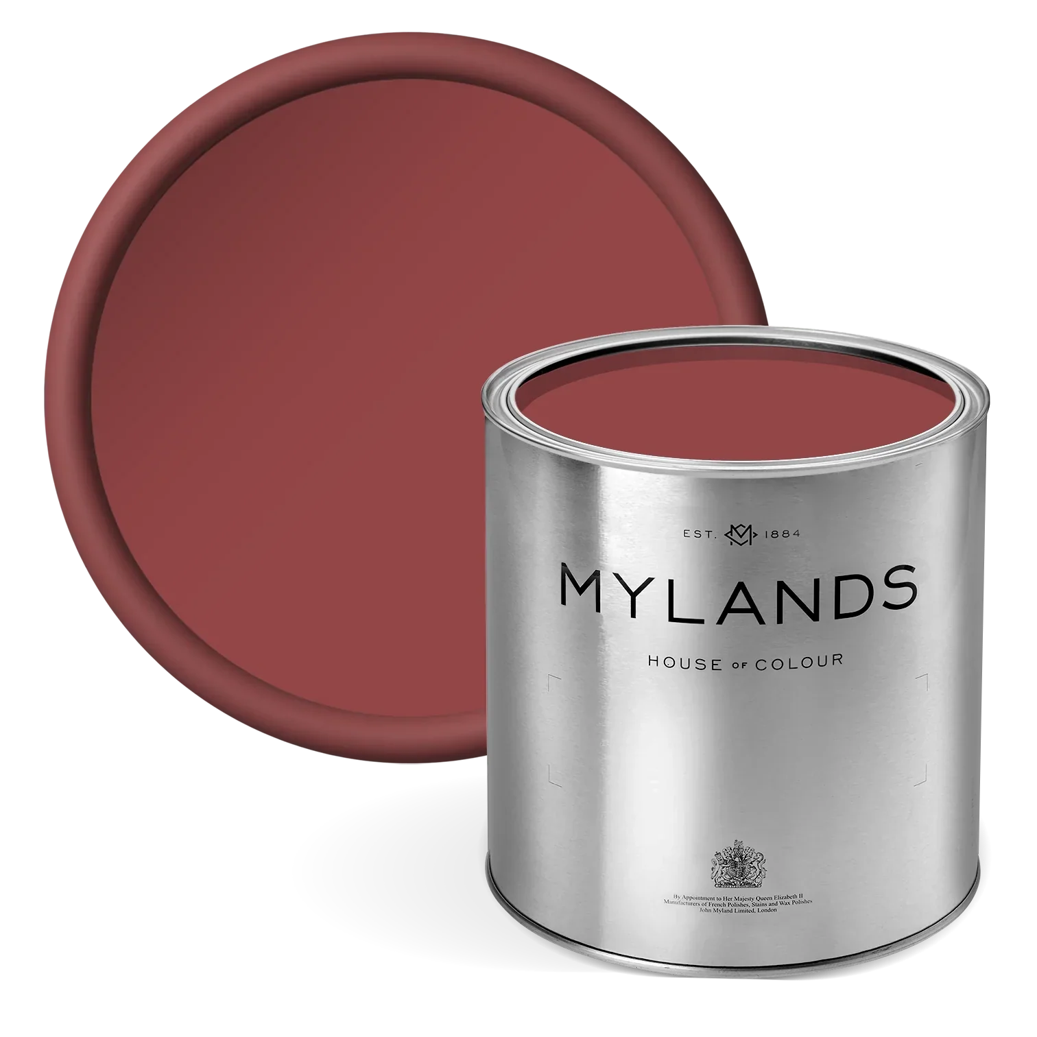
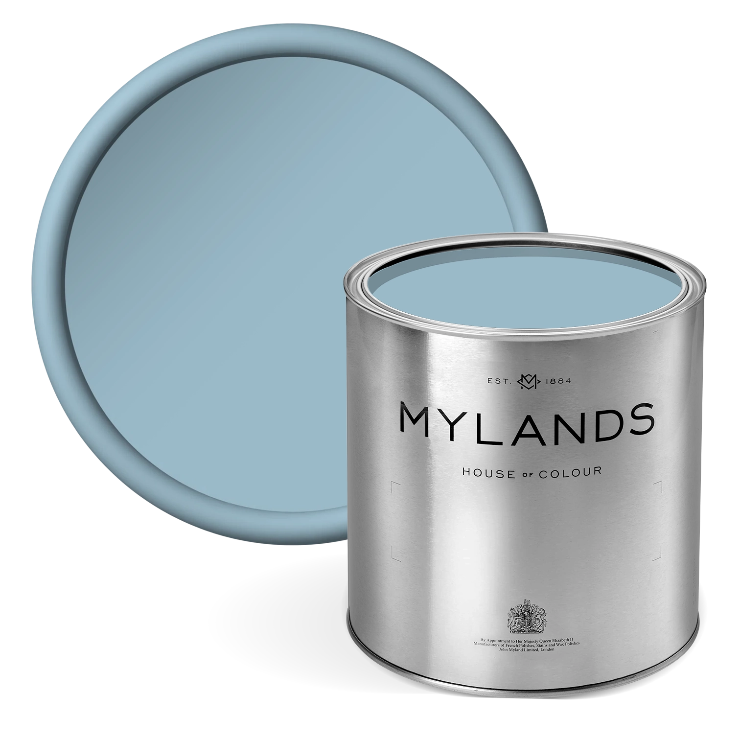
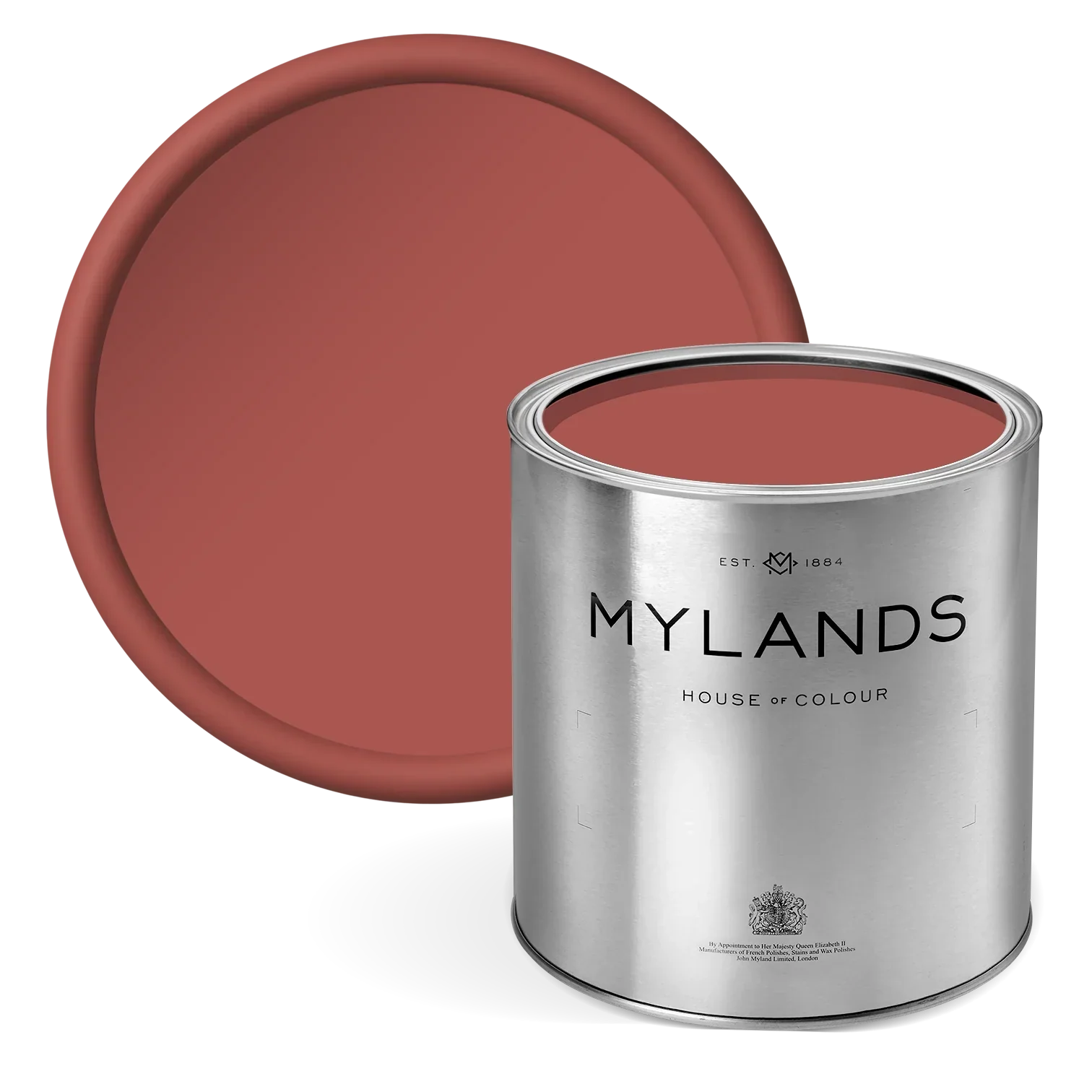
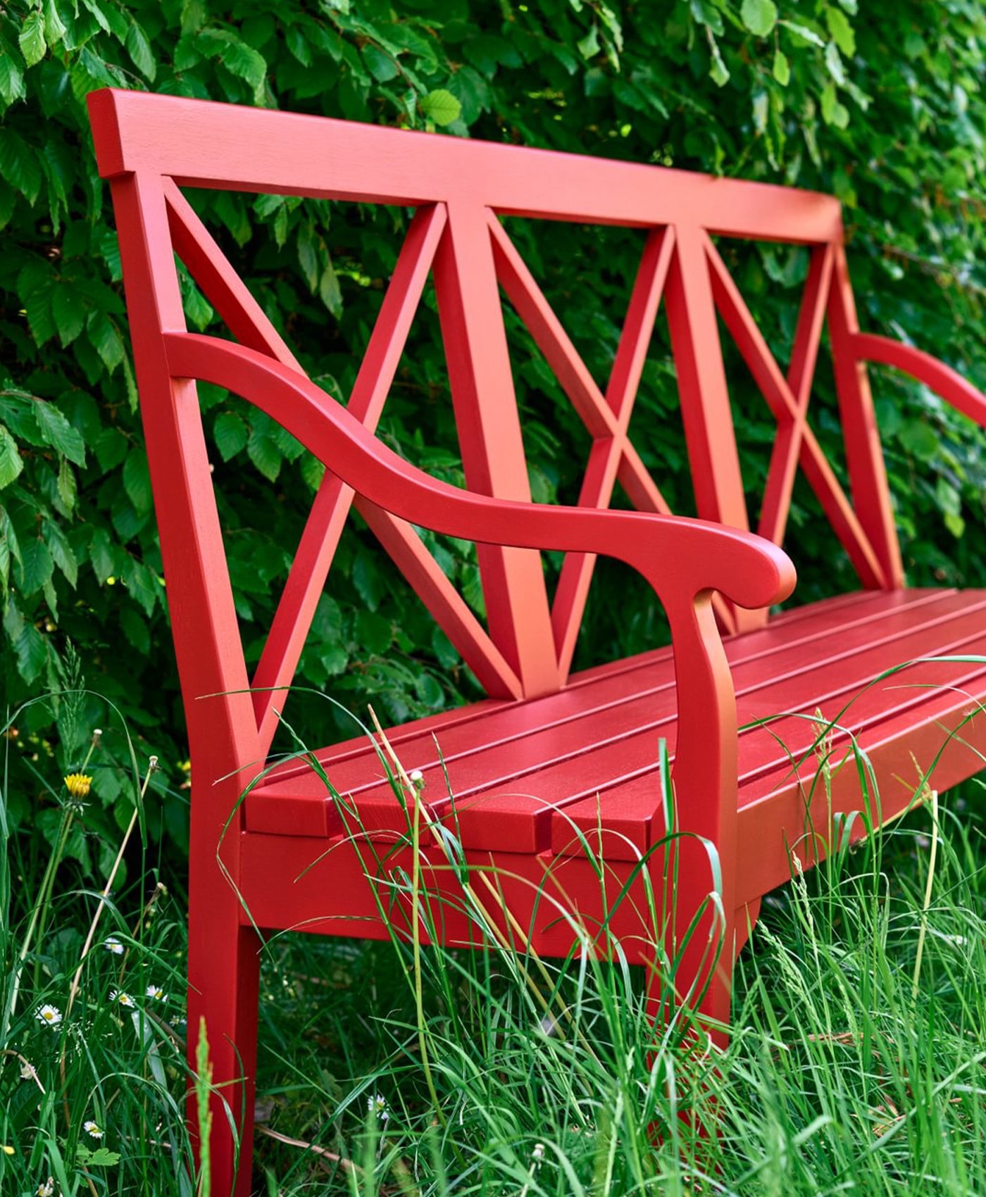
Rothschild Street™ No.296
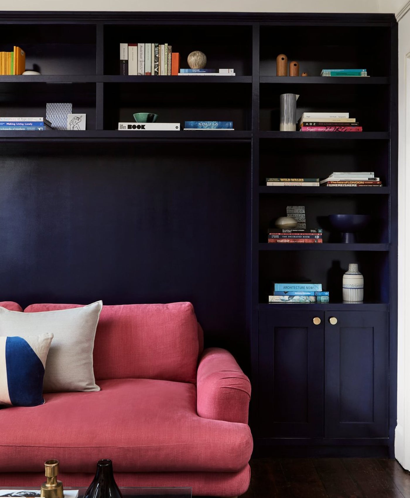
This rich, deep red is infused with warm undertones of orange, yellow, and subtle magenta, making it an intensely dramatic yet inviting hue. Named after the street in West Norwood, London, where Mylands has been headquartered for over a century, this shade embodies the brand's deep connection to its heritage and craftsmanship. The complexity of Rothschild Street™ No.296 allows it to adapt beautifully to various interior design styles. When used on walls, it creates a bold, cocooning effect, perfect for creating warmth and intimacy in dining rooms, libraries, or sitting areas. Alternatively, it serves as a striking accent colour for doors, trims, or cabinetry, pairing effortlessly with neutral tones or complementary greens and blues to add depth and character.

Front Walls in Bloomsbury™ No.267; Back Walls in Rothschild Street™ No.296; Door in Greenstone™ No.190

Walls in Rothschild Street™ No.296