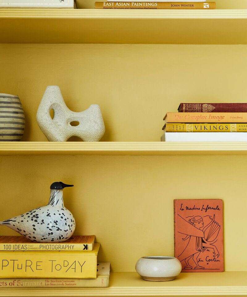
8 Favourite Shades Of Purple Paint For Bedrooms
Did you know that purple is now very much on-trend? Banish thoughts of Parma Violet sweets and Disney princesses. Modern purple shades are interesting and versatile, varying in tone from soft lilacs to rich, deep aubergine. Pantone named periwinkle the colour of 2022, endorsing purple as the colour of the moment.
Use dark purple to create a cosy, dark bedroom. On the other end of the scale, light purple will be soft and calming. Both are ideal attributes for a bedroom. You may not want a completely purple bedroom. A purple feature wall behind the bedhead can look striking. Contrast the purple wall with a light grey, white or even yellow.
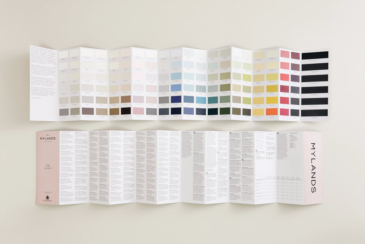
Here we outline our favourite Mylands purple paint colours for bedrooms.

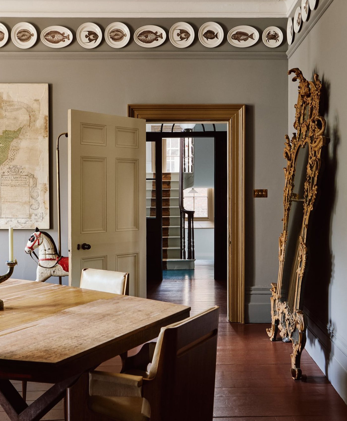
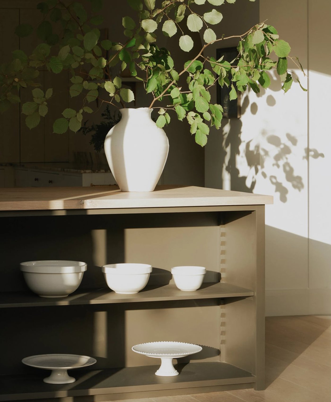
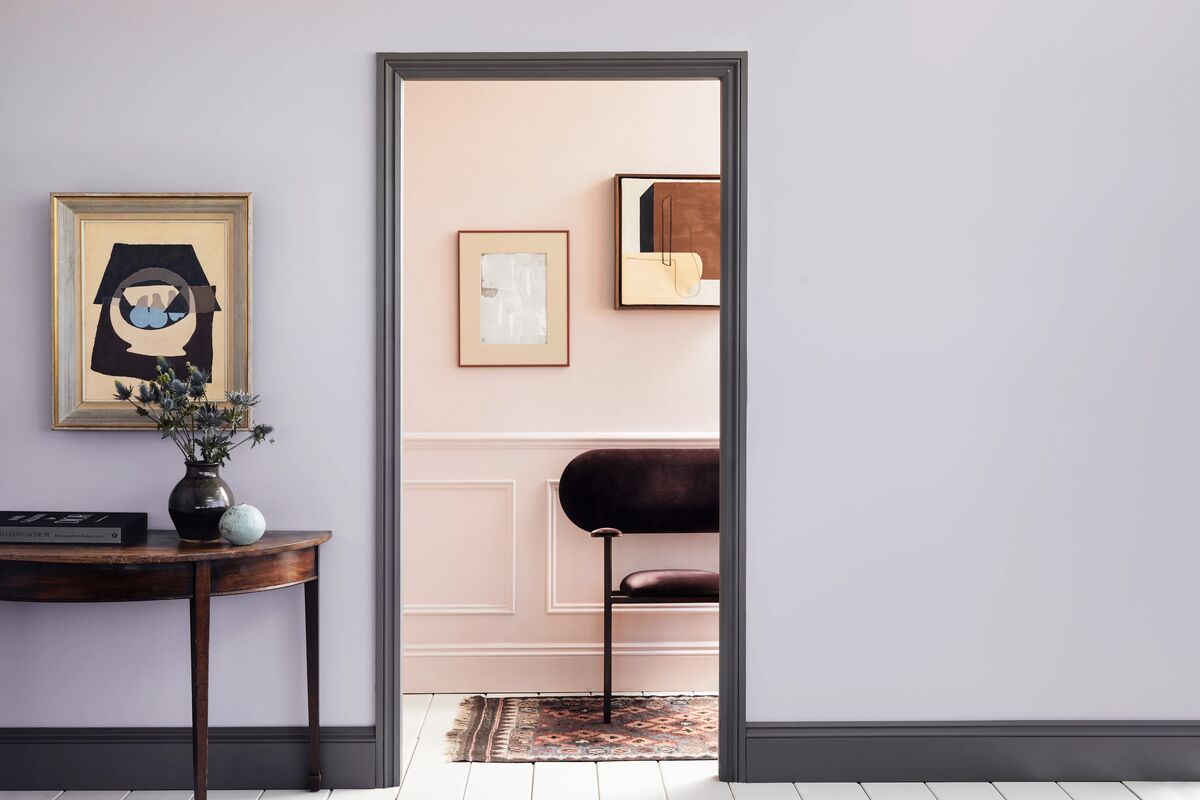
Front Wall in Lavender Garden™ No.30, Rear Wall in Pale Lilac™ No.246 (Wood & Metal Matt), Woodwork in Rose Taupe™ No.292 (Wood & Metal Matt), Floorboards in Cadogan Stone™ No.59
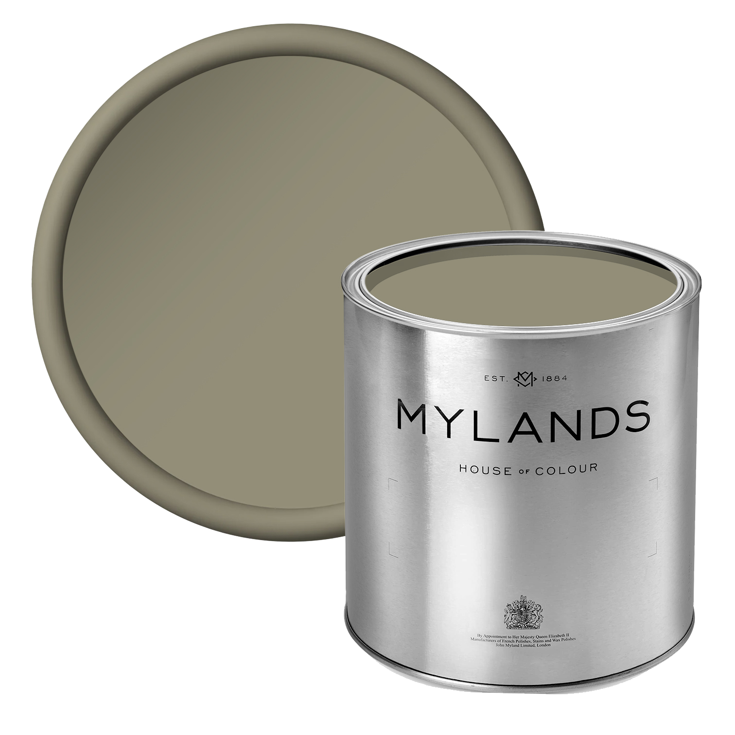
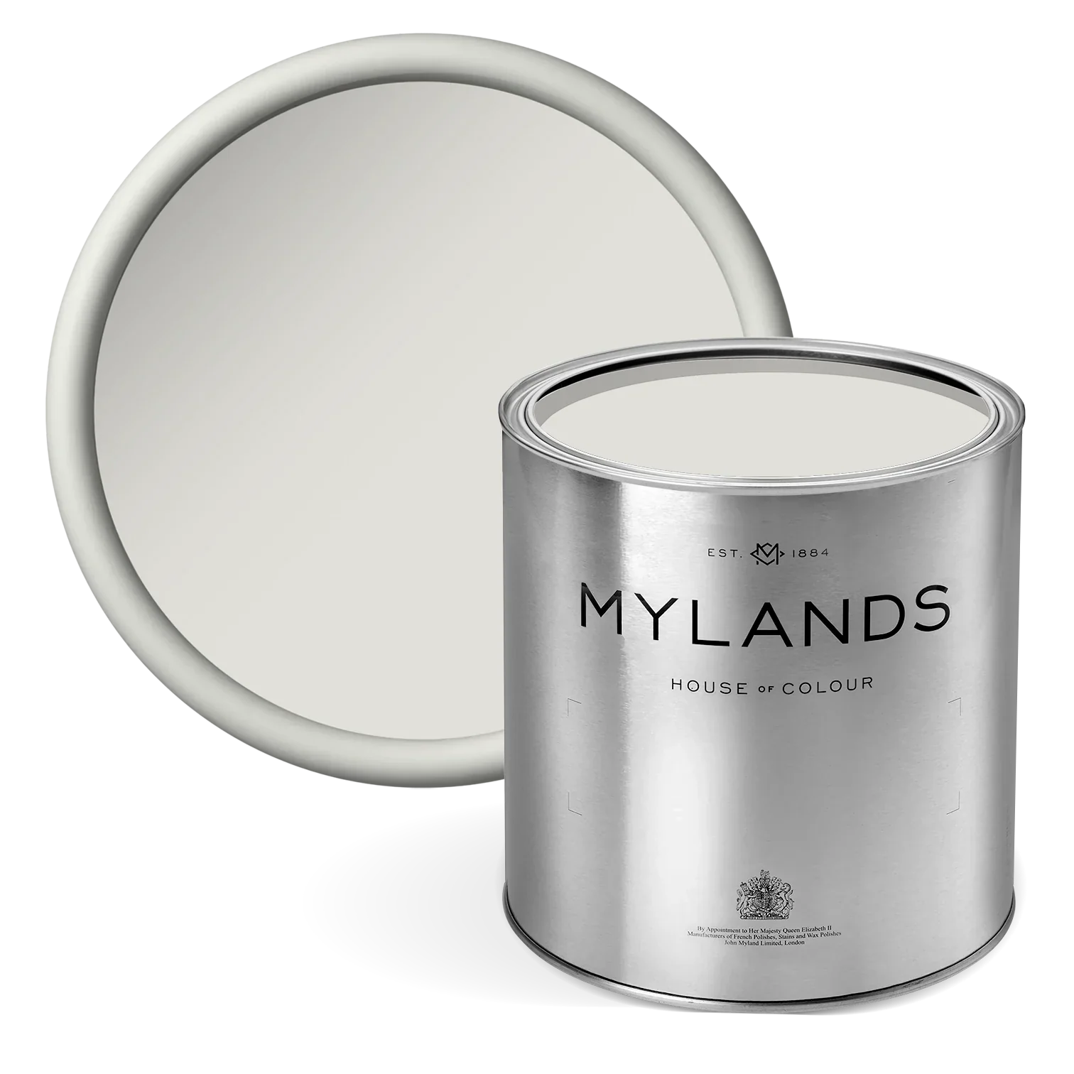
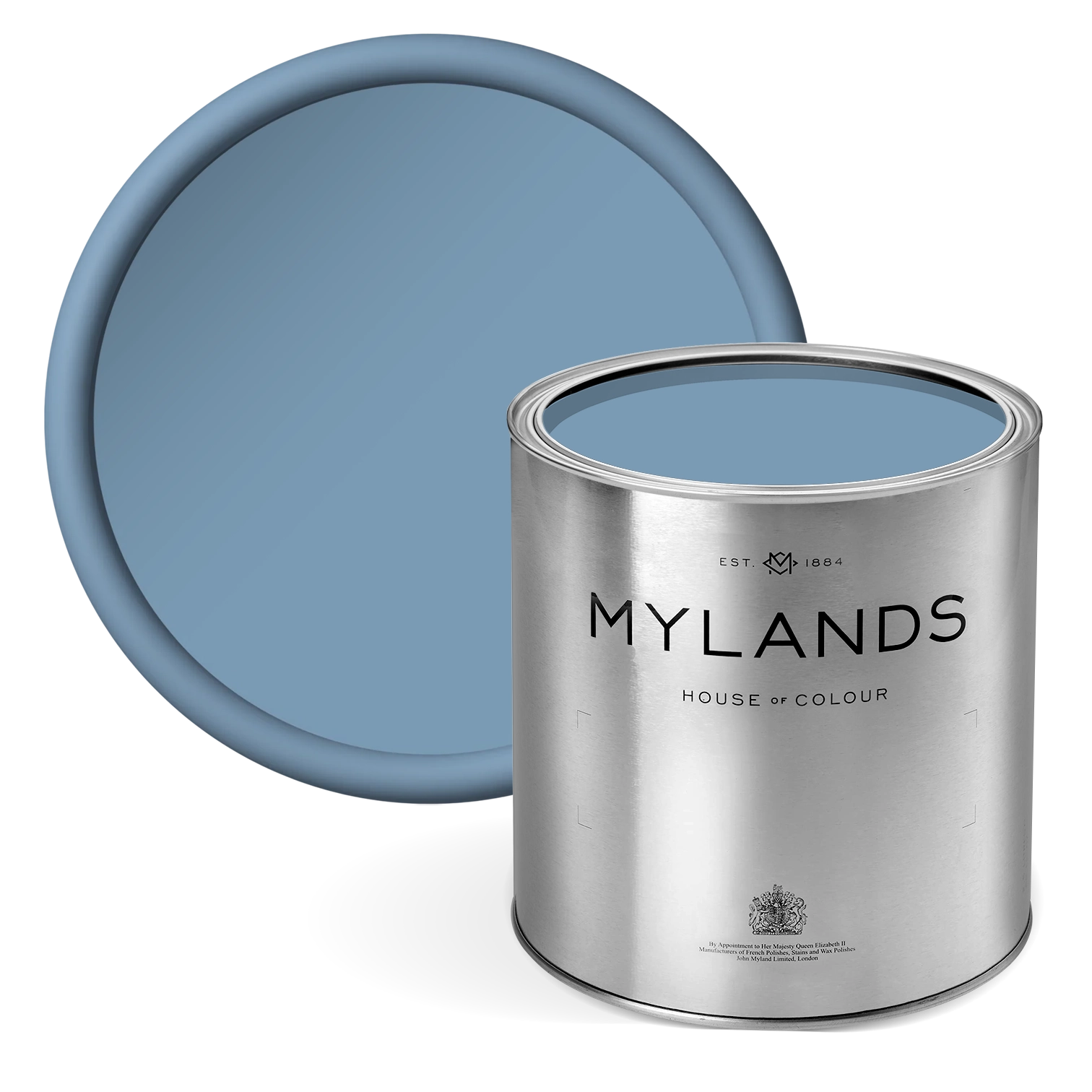
1. Lavender Garden™ No.30 - a grey-lilac colour
Lavender is known for its therapeutic, relaxing qualities. We often associate that with the plant’s scent, but the same is true of the colour. Grey is another calming, restful colour. So the combination of the two shades makes a wonderfully serene ambience in a bedroom.
It’s a delicate colour. As such it can work well as a backdrop to some striking contrast colours. That could be in the form of wall art, soft furnishing or richly-coloured bed linen. You could add pops of warmth and depth with jewel tones like amethyst or ruby.
In a child’s room, you could have some fun with the addition of a mural or adhesive wall art in a complementary colour scheme.


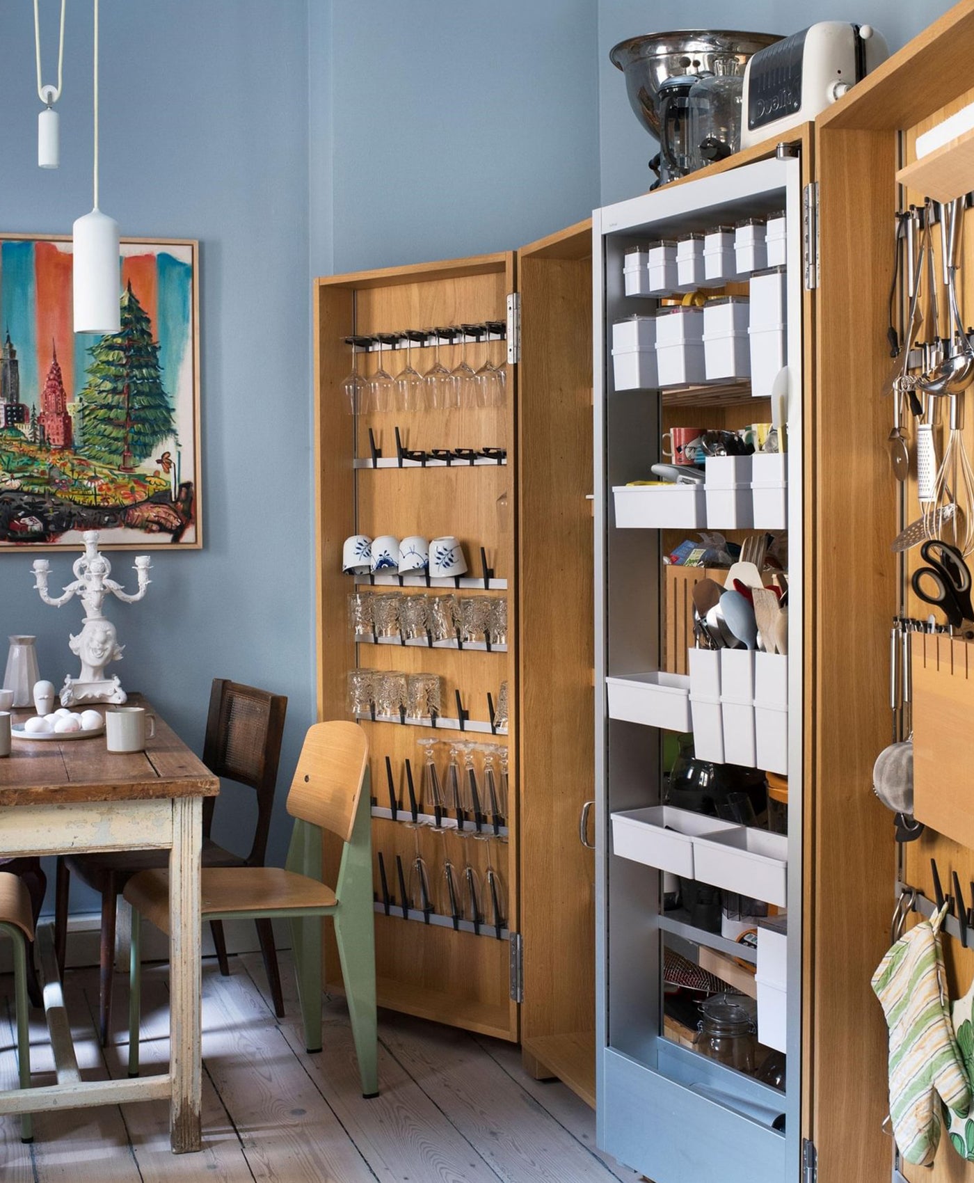
Walls and Shelves in Lavender Garden™ No.30
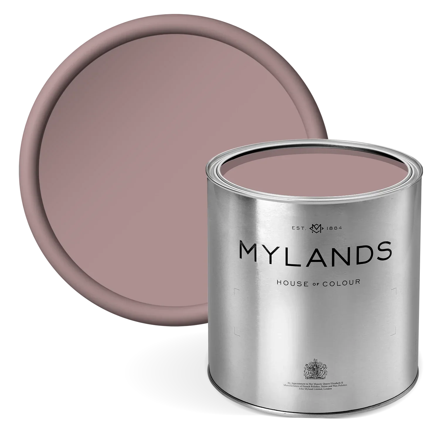
2. Early Lavender™ No.260 - a purple-pink colour
Delicate, soft and oh-so-pretty, lavender is a light pastel tone. The traditional, natural colour is popular with designers and it pairs well with white. It’s very gentle and easy on the eye. This light purple-pink tone adds joy and warmth.
In this photo, Mylands Early Lavender™ No.260 furniture paint transforms the table. The soft purple colour sits comfortably next to white wall paint. It’s a beautiful, calming colour which would work in a grown-up master bedroom or in a baby’s nursery.

Table in Early Lavender™ No.260, Walls in Pure White™ No.1
3. Pale Lilac™ No.246 - a dusty lilac colour
Soft lilac is friendly and comforting. It creates a gentle environment, inviting you to relax in peace. What better feeling for the haven that is your bedroom?
Like lavender, lilac tones are derived from nature. Mylands Pale Lilac™ is actually a combination of dusty lilac and pink with grey undertones. This clever mix of tones keeps the lilac colour delicate, fresh and subdued. Welcoming and light, it would be an inviting tone for an entryway as well.


Upper Walls in Pale Lilac™ No.246, Lower Panelling in Theatre Land™ No.282
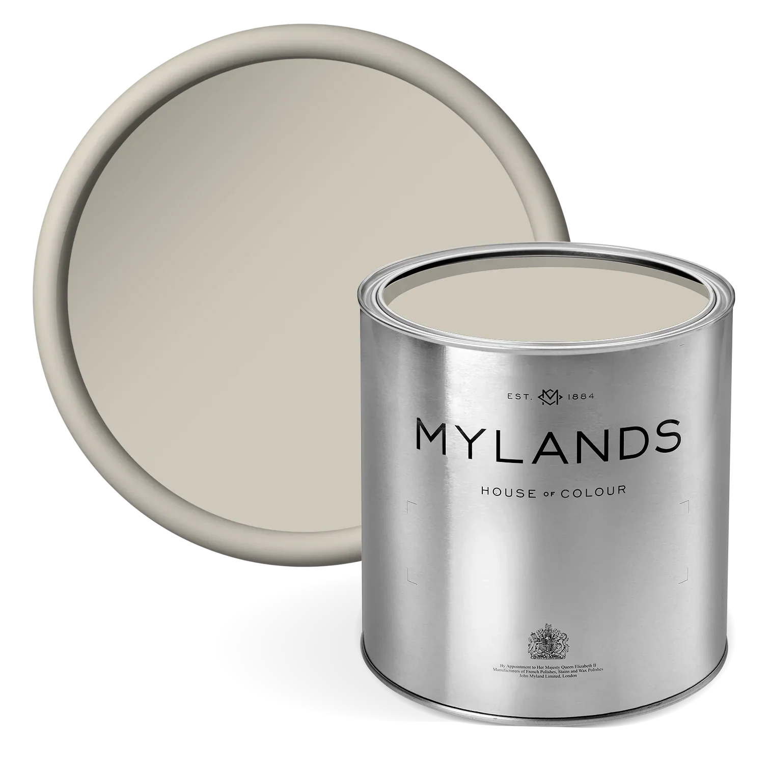
4. Smithfield™ No.19 - a grey-lavender colour
If the thought of purple feels a bit daring, try a subtle shade with plenty of grey. Dusty lilac is basically a warm neutral paint colour. It’s a more modern way to paint with grey, which has been the neutral of choice for a while now.
This pastel shade is an interesting and versatile home decor choice. The grey colour is warmed by the addition of the purple-lavender tones. More grey than mauve, it’s a tranquil shade. This colour pairing is very balanced. The grey tones down the purple, and the purple lifts the grey.

Wall in Smithfield™ No.19
Use Smithfield™ No.19 in eggshell paint in the bedroom for a finish that’s somewhere between matt emulsion paint and silk emulsion paint. It’s a good interior paint finish for walls. However, ceiling paint needs a flatter sheen.
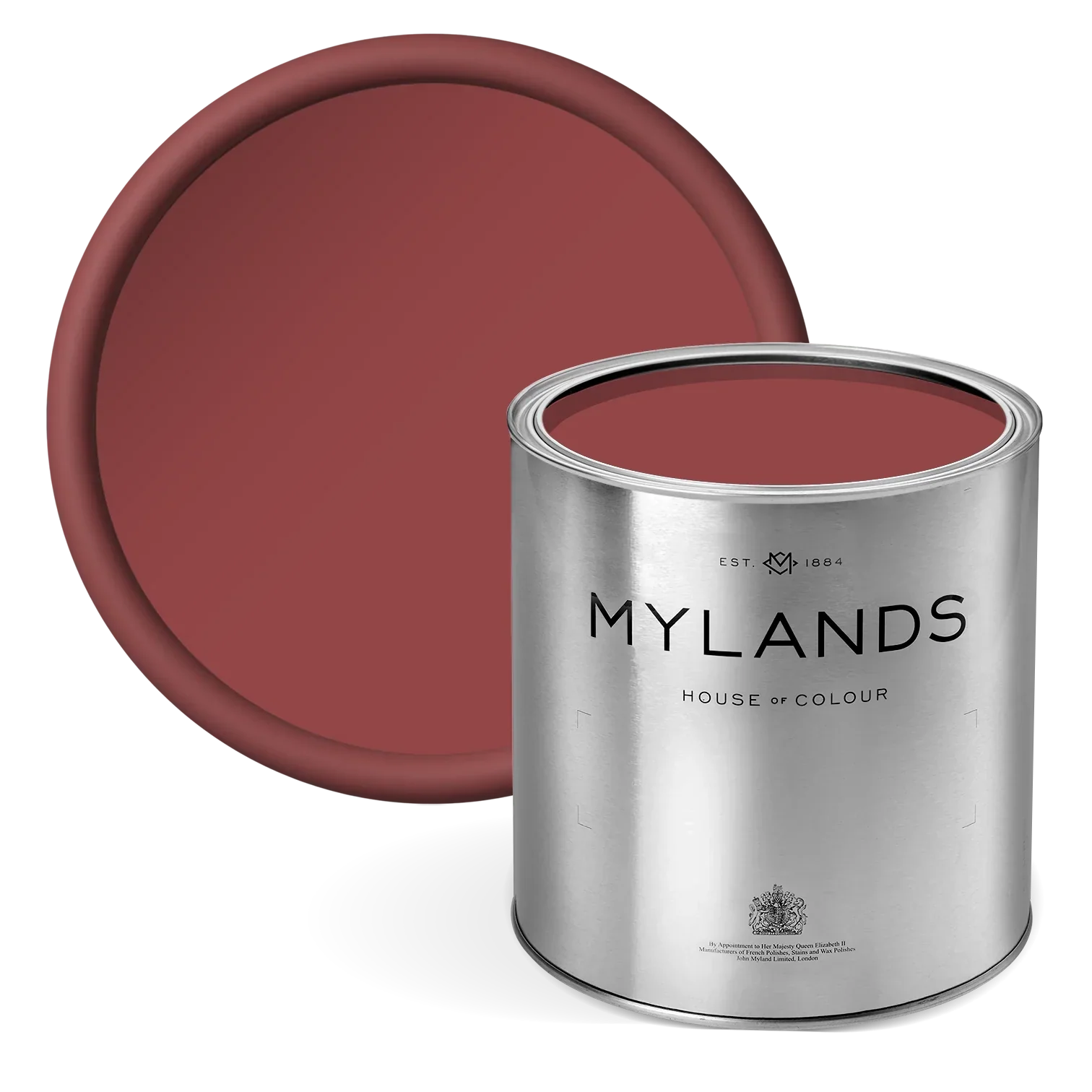
5. Soho House No.266 - a muted magenta colour
Warmer than lilac and lavender, Soho House No.266 is a richer purple colour. It combines red, blue and umber with hints of beautiful magenta.
It’s a good colour to be paired with a soft green or white on bedroom walls. You could also use it as a contrast wall colour to a bolder, floral wallpaper for example. That’s a hot interior design trend right now, and brings wonderful, natural vibes indoors.


6. Empire Violet™ No.80 - a regal purple colour
If you’re looking for something bolder and more dramatic, try Empire Violet™ No.80. It’s rich, opulent and theatrical. It certainly creates a statement look. Violet is a very regal shade and oozes luxury and grandeur. Pair it with metallic gold or bronze to accentuate this further.
This warm, striking tone of purple works well in a living room too. Yes, it’s bold and impactful, but it can also feel cosy and intimate as a colour scheme. Make an impact by using this as exterior paint colour on your front door.

Walls in Empire Violet™ No.80
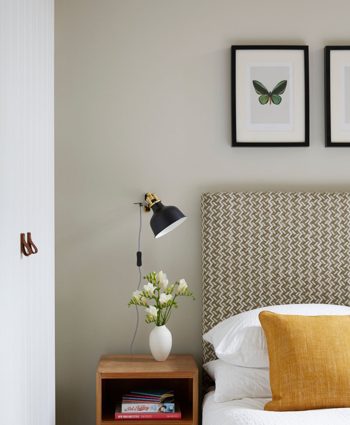
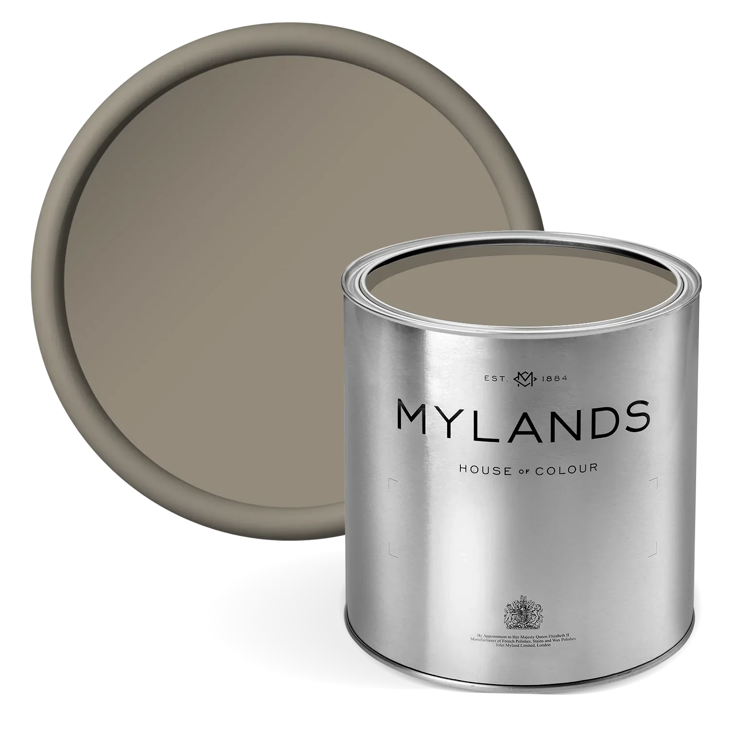
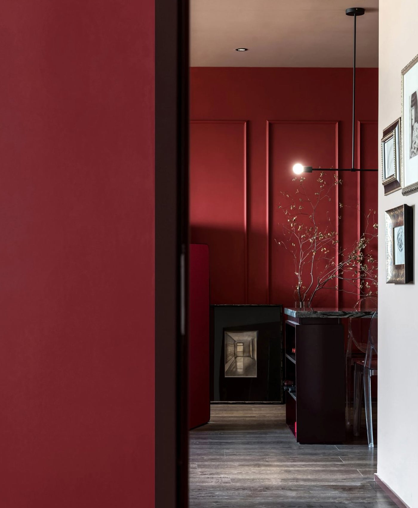
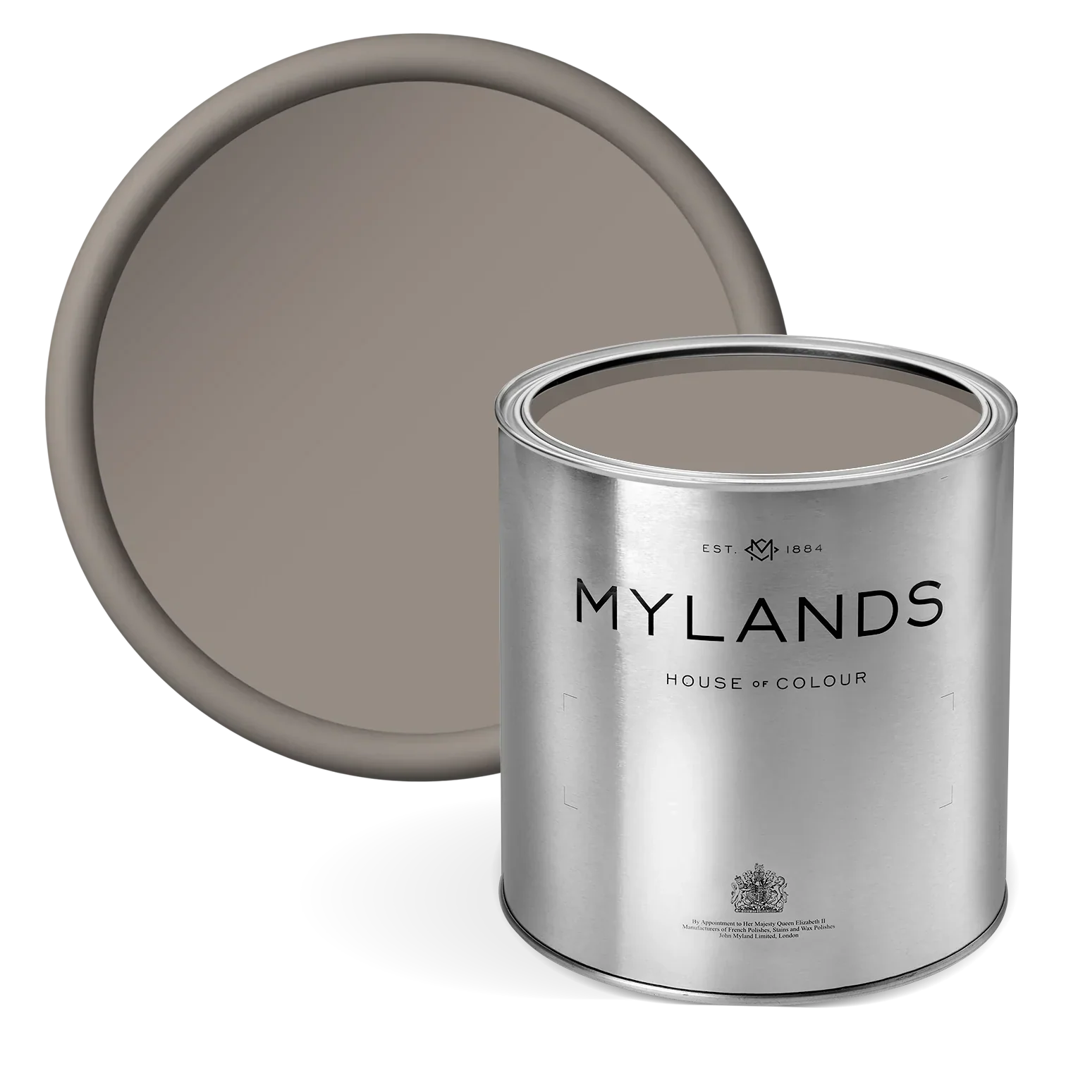
7. Plum Tree™ No.283 - an earthy plum colour
This sophisticated purple colour is sumptuous and warming. It’s earthy and natural, reminiscent of fresh plums and fruity jam. As a bedroom wall colour, it’s comforting and reassuring. It’s a very familiar shade of purple.
Plum paint colour looks sophisticated and refined. In this photo, Plum Tree™ No.283 creates a strong accent colour behind the bed. It’s paired with pale blue and white to avoid the room becoming too dark. This is a particularly good shade for a dining room too.

Walls in Notting Hill™ No.213 and Plum Tree™ No.283, Ceiling in Whitehall™ No.9 - @Claudiainteriors
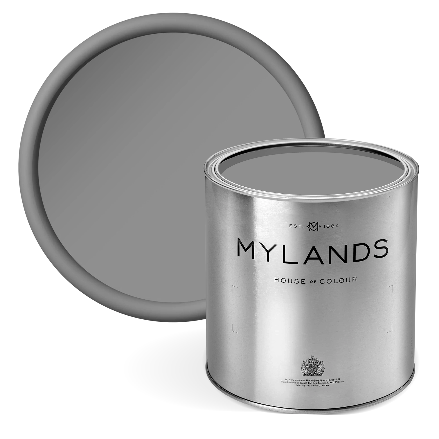
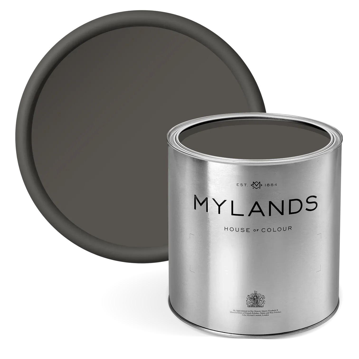
8. Duke’s House™ No.44 - a deep purple colour
The deepest of our purple shades, Duke’s House™ No.44 is a showstopper. It’s dark and makes an impact. It comprises magenta, black and dark blue which results in a deep, complex shade. For best results, use a grey primer and undercoat before applying this paint colour.
In a bedroom, this deep purple can create an enveloping ambience. That can feel like a lovely hug, especially in the room in which you want to relax and wind down.

Upper Wall in St Clement™ No.11, Panelling in Duke’s House™ No.44
Ready to load up your paintbrush and start DIY? Shop our paints and head to the checkout!