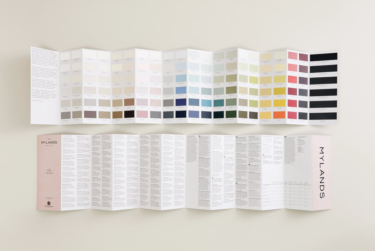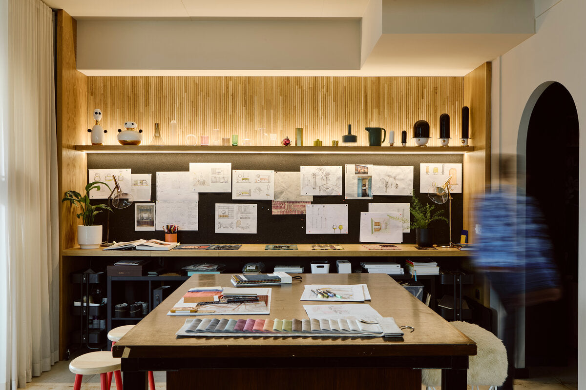
The Mylands Summer 2024 Palette
Mylands is delighted to introduce the Summer Colour Palette for 2024 that has been specially curated by Darcy Myland, one of the family members contributing to the heritage business.
Darcy's curated palette is a selection of the sunny season's most captivating hues, inspired by sun-drenched landscapes, warm summer days, and the trends that are currently prevalent within the world of interiors. Each shade evokes the essence of summertime, from the soft blush pinks of blooming flowers to the soothing powder blues of clear summer skies. Each shade promises to flood your living space with joy, light, and vibrancy that only the summer can bring. Celebrate the season with colours that are as lively and refreshing as a sunny day, and let your interiors shine with the brilliance of summer all year round.
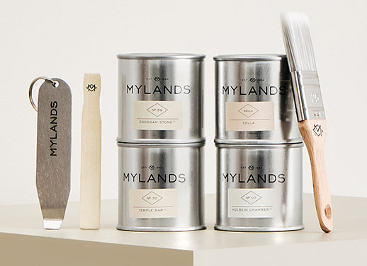
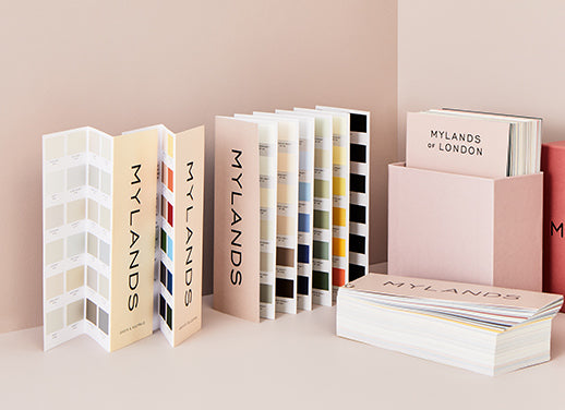
Colours featuring in the palette are:
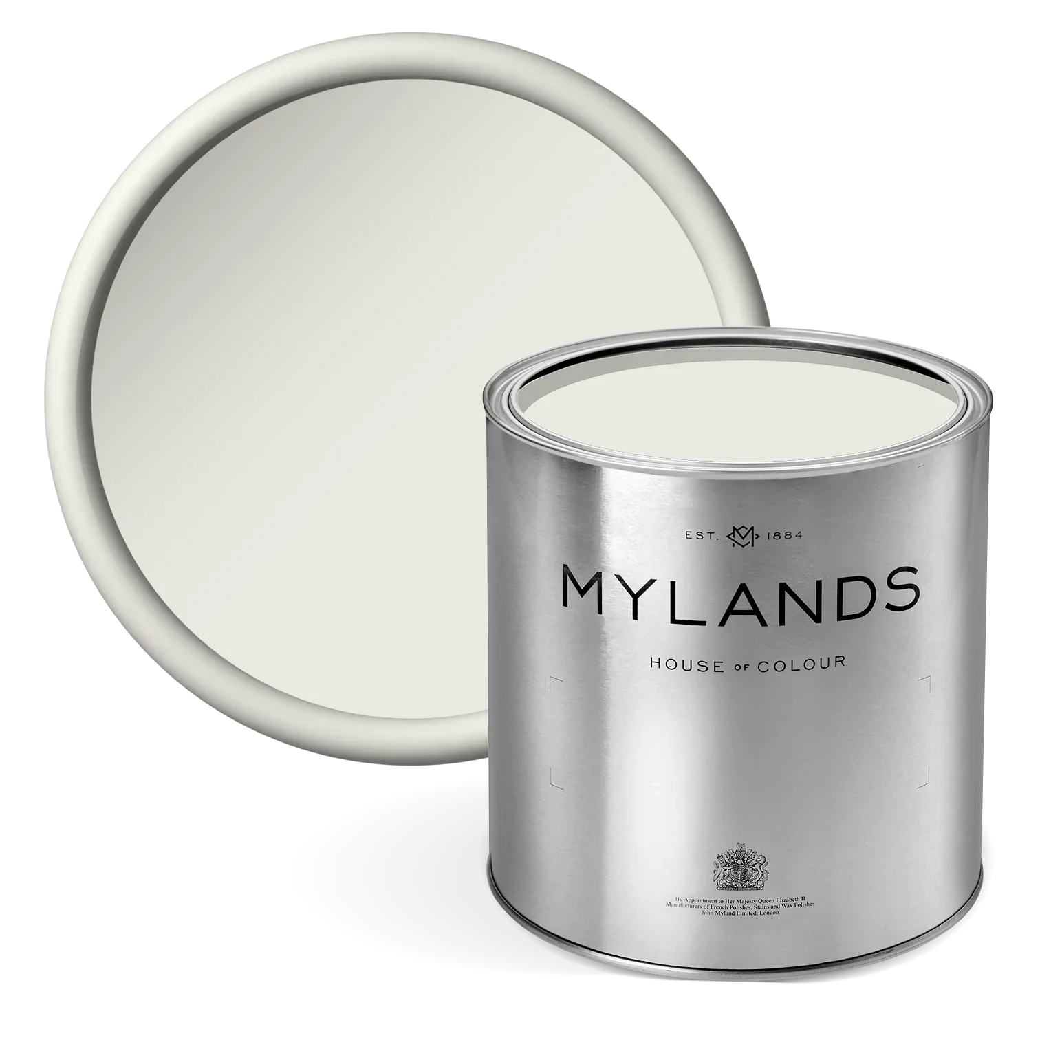
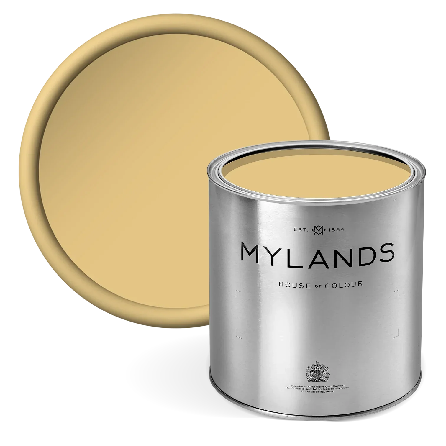
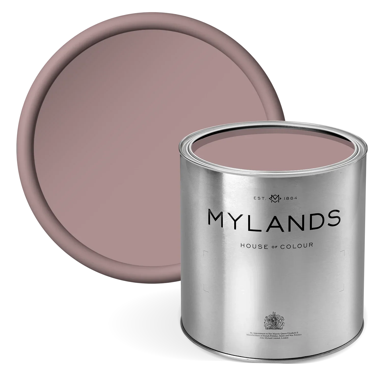
Floris™ No.27
Bring the essence of summer into your home with blush pink decor, a perfect nod to the floral patterns that define the season. This delicate hue effortlessly channels a summery feeling indoors, creating a warm and inviting atmosphere. Floris™ No.27 is a pretty and sophisticated paint. Its blush tone is perfect for creating an appealingly romantic environment. This paint uses an absorbing umber shade to bring depth and beauty, creating a soft hue that is not at all overpowering. The soft nature of blush-pink tones avoids an overly saturated look whilst still creating fresh and vibrant interiors.
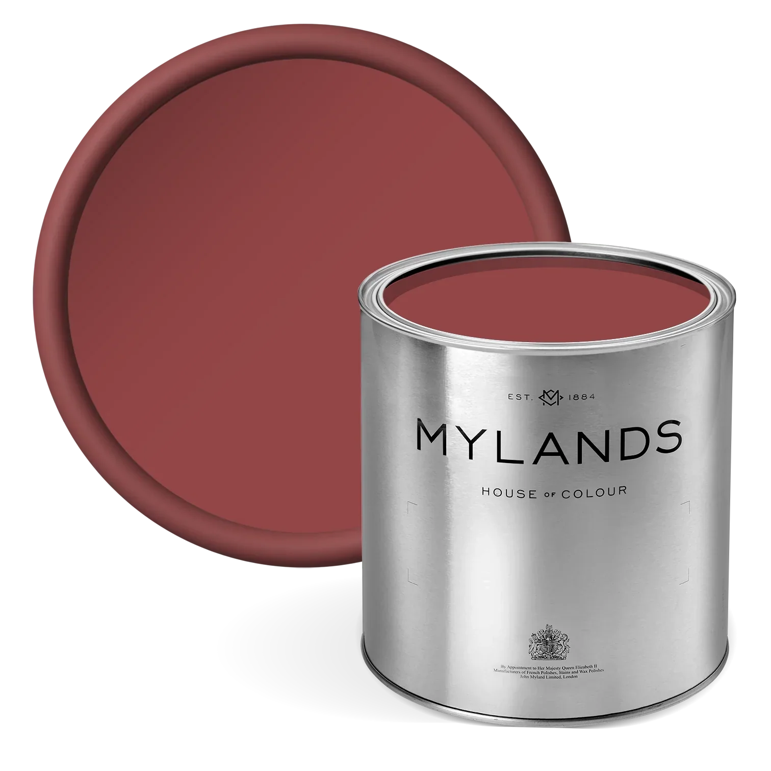
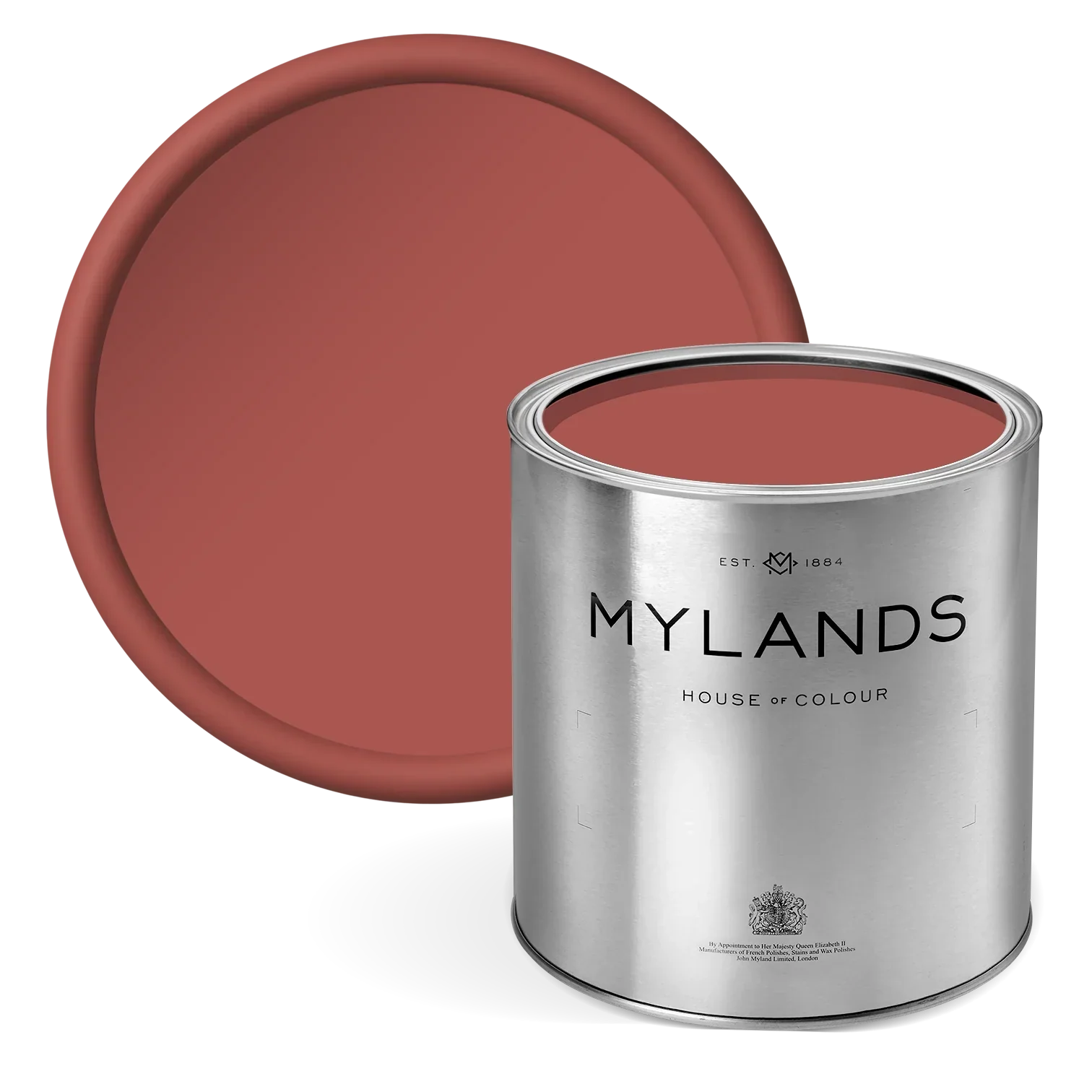
Egerton Place™ No.297
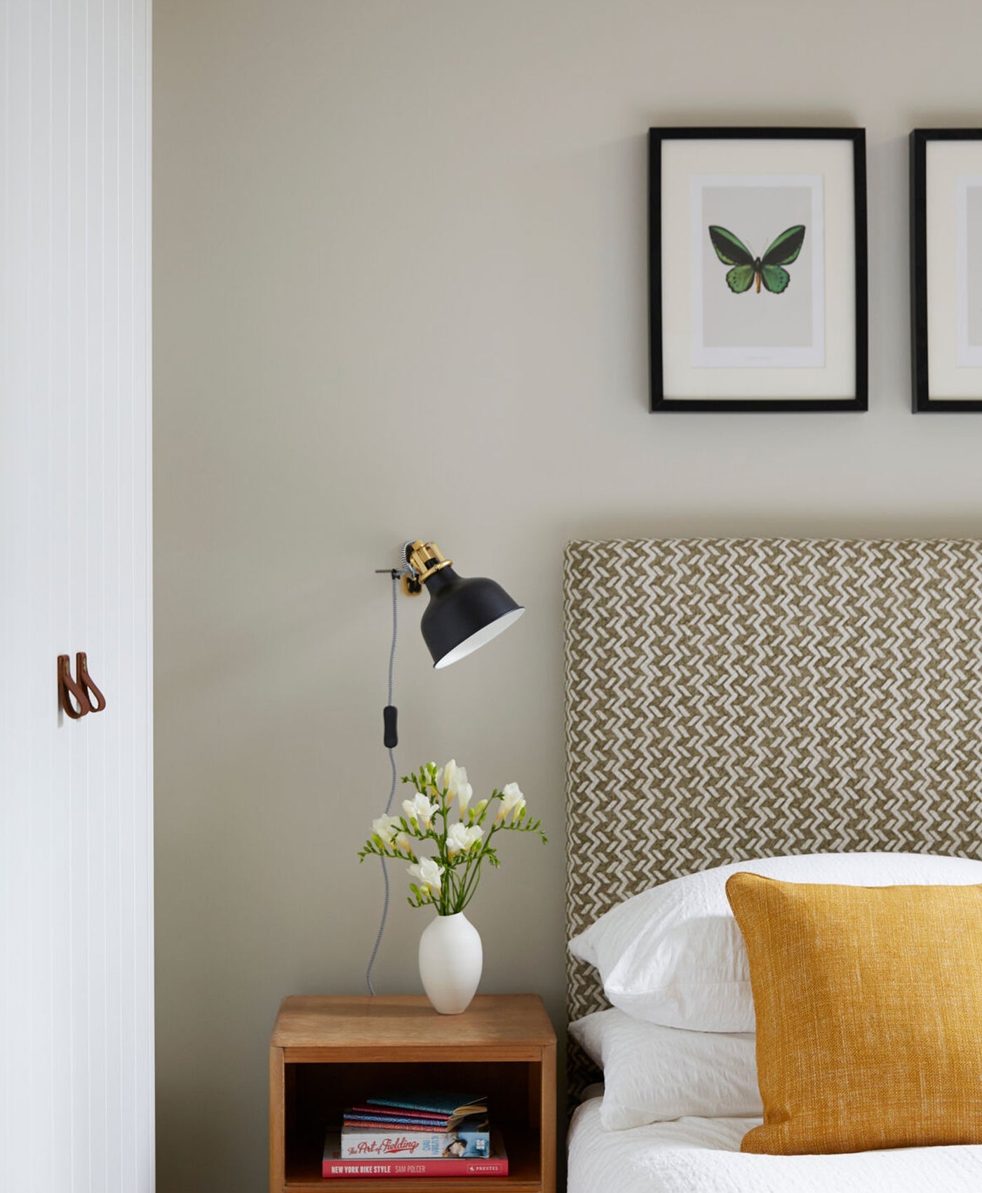
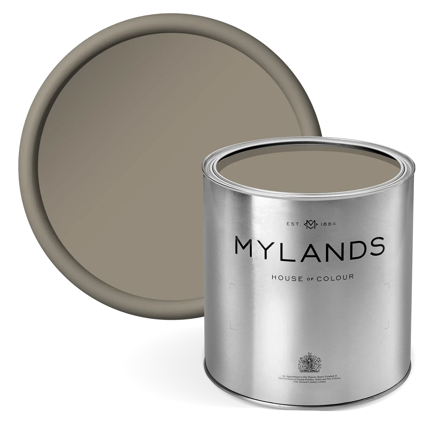
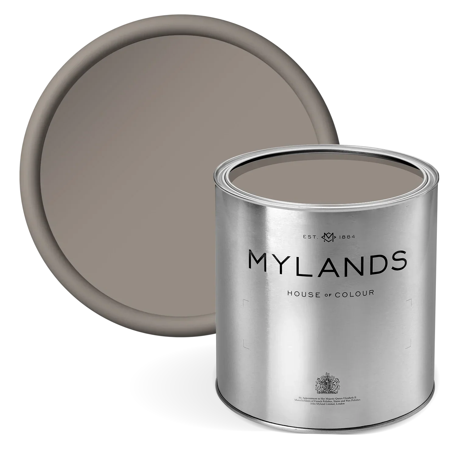
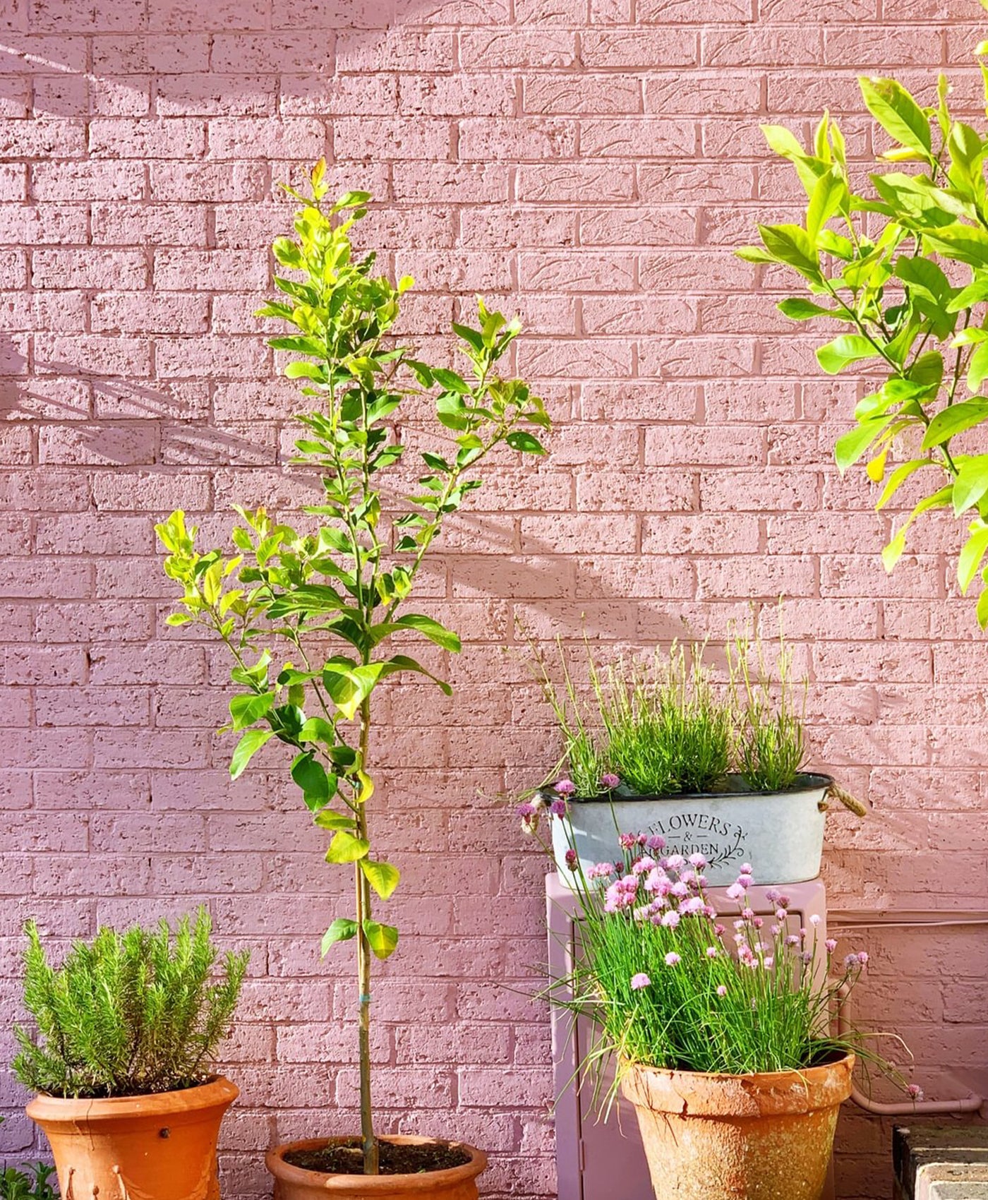
Infuse your home with the warmth and subtle elegance of summer by using earthy pink paint tones. These hues, inspired by natural elements, provide a sophisticated and soothing ambience that perfectly complements the sunny season. Egerton Place™ No.297 is a deep, earthy mushroom pink of umber and red with a touch of black. Earthy pinks, with their muted and natural undertones, offer a grounded yet vibrant feel. They bring a touch of nature indoors, creating a warm and inviting atmosphere that feels both fresh and timeless. Use an earthy pink paint on the walls to create a cozy and welcoming space. Complement it with neutral furniture and natural textures like wood and linen for a harmonious look.

Walls in Floris™ No.27

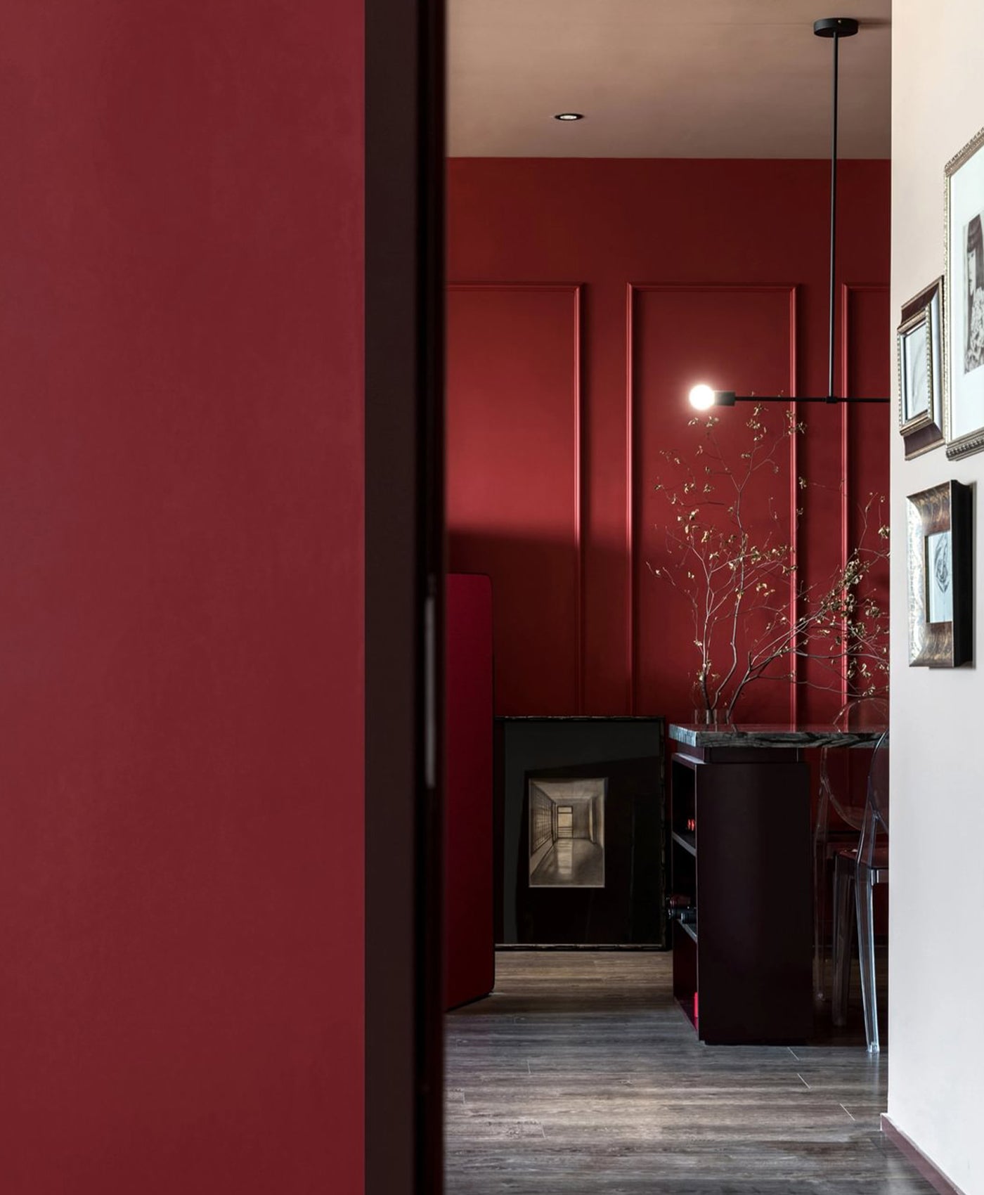
Walls in Egerton Place™ No.297
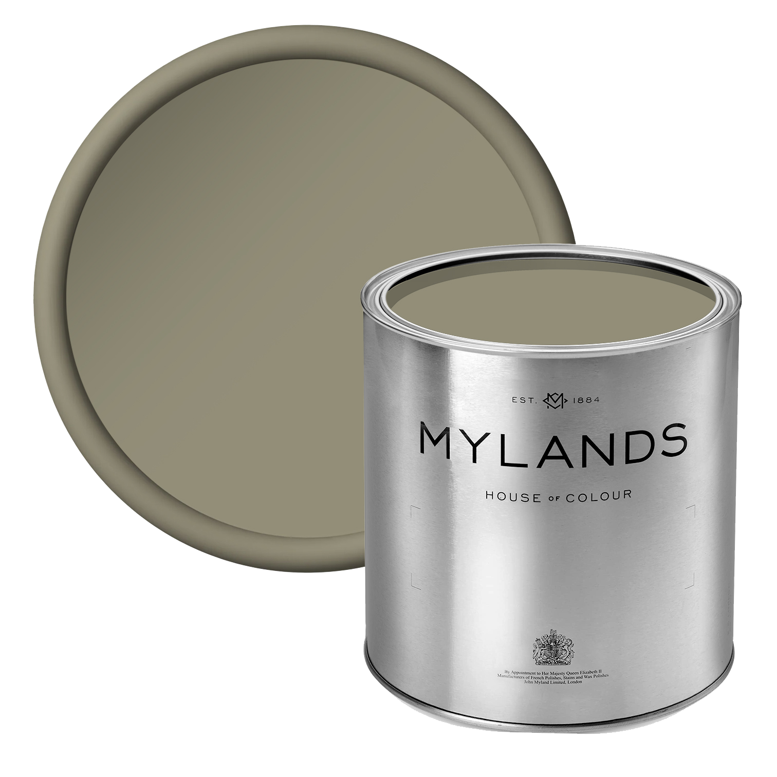
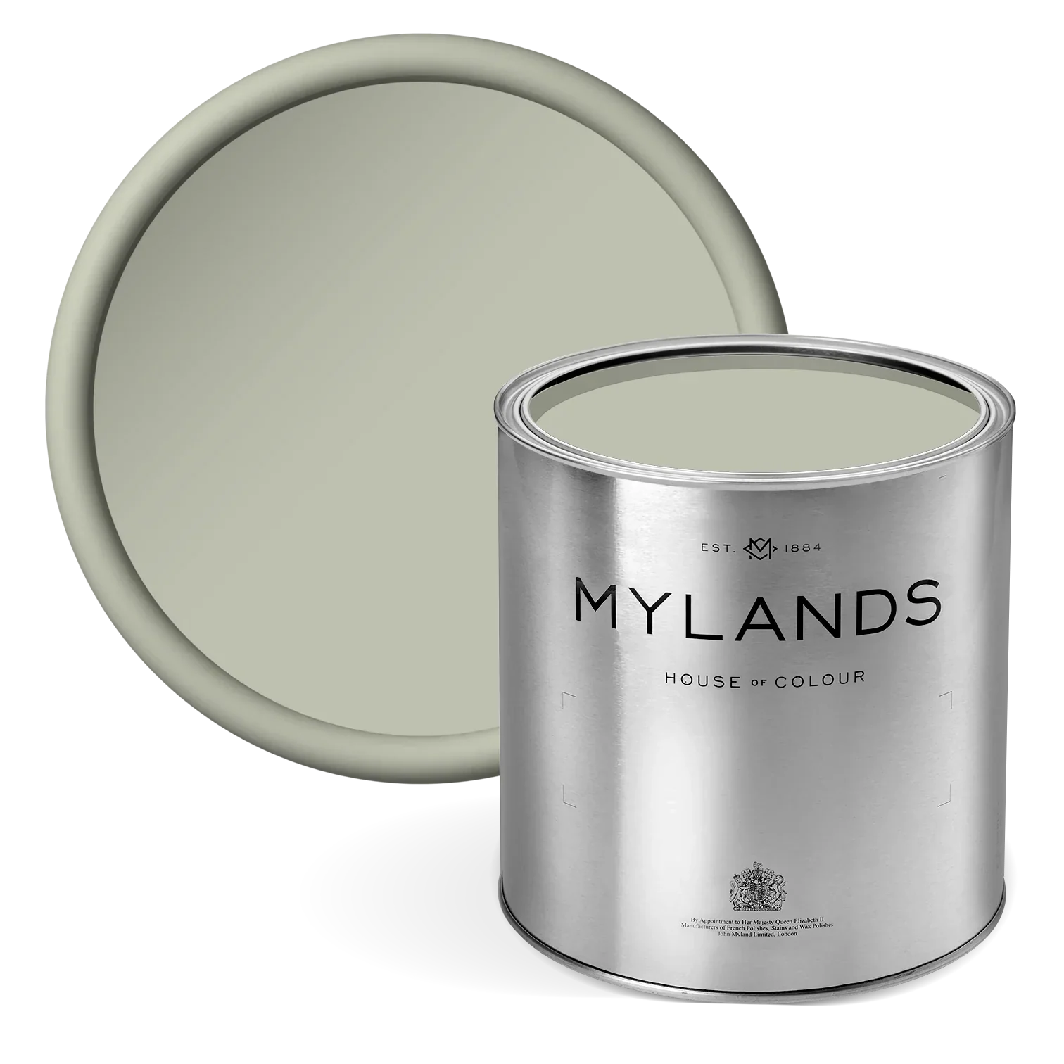
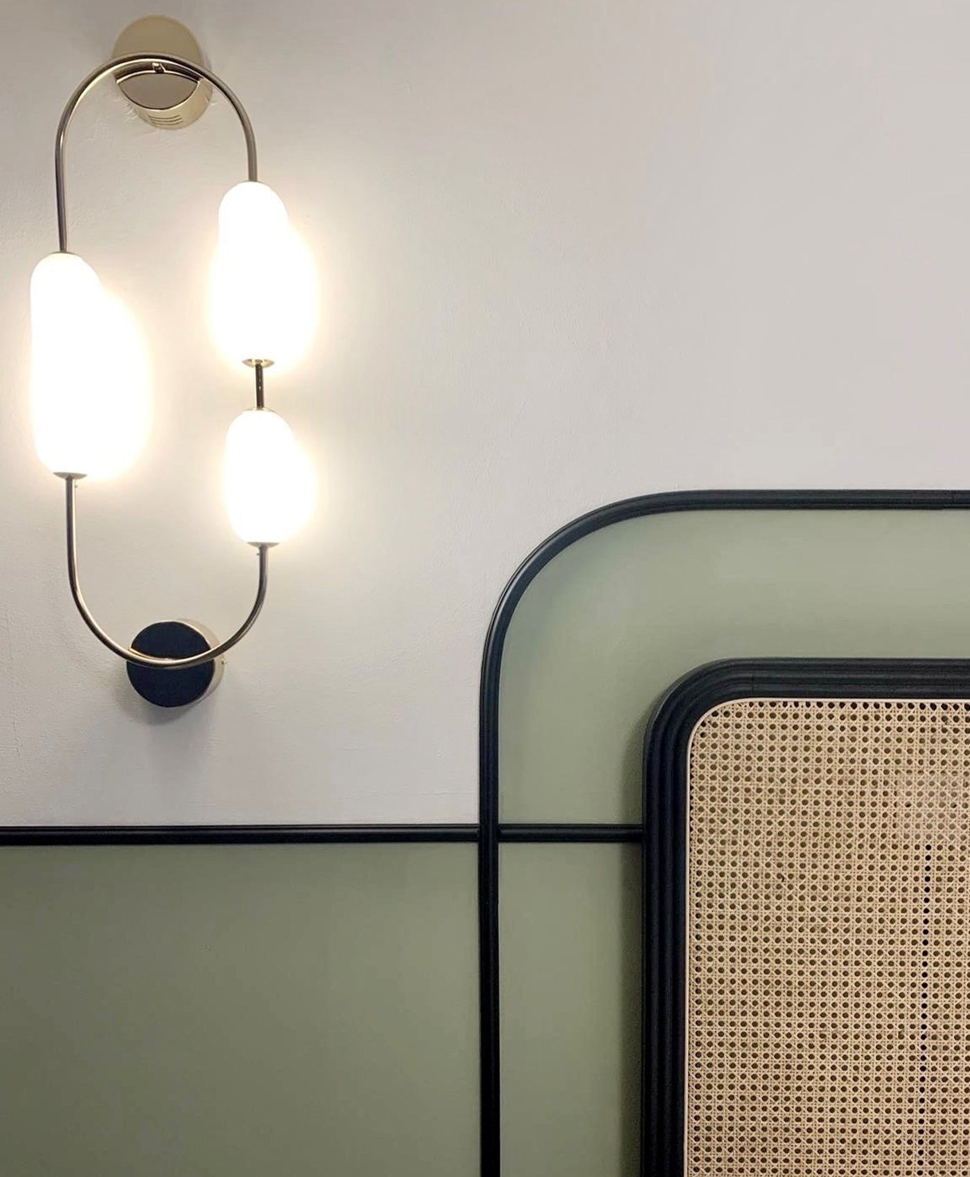
Greenstone™ No.190
Grey-green hues exude a calming effect that is perfect for creating a serene and tranquil atmosphere in your home. This zen-like quality helps to foster relaxation and peace, which are ideal for the leisurely days of summer. Greenstone No.190 is a truly modern grey-green paint that has an intensely calming effect. This paint is natural and unique with turquoise undertones. This grey-green paint reflects natural light beautifully, making rooms feel brighter and more spacious. The interplay of light with its soft, calming tones creates a soothing and inviting environment that is perfect for summer.
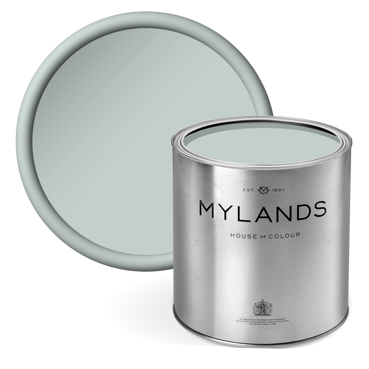
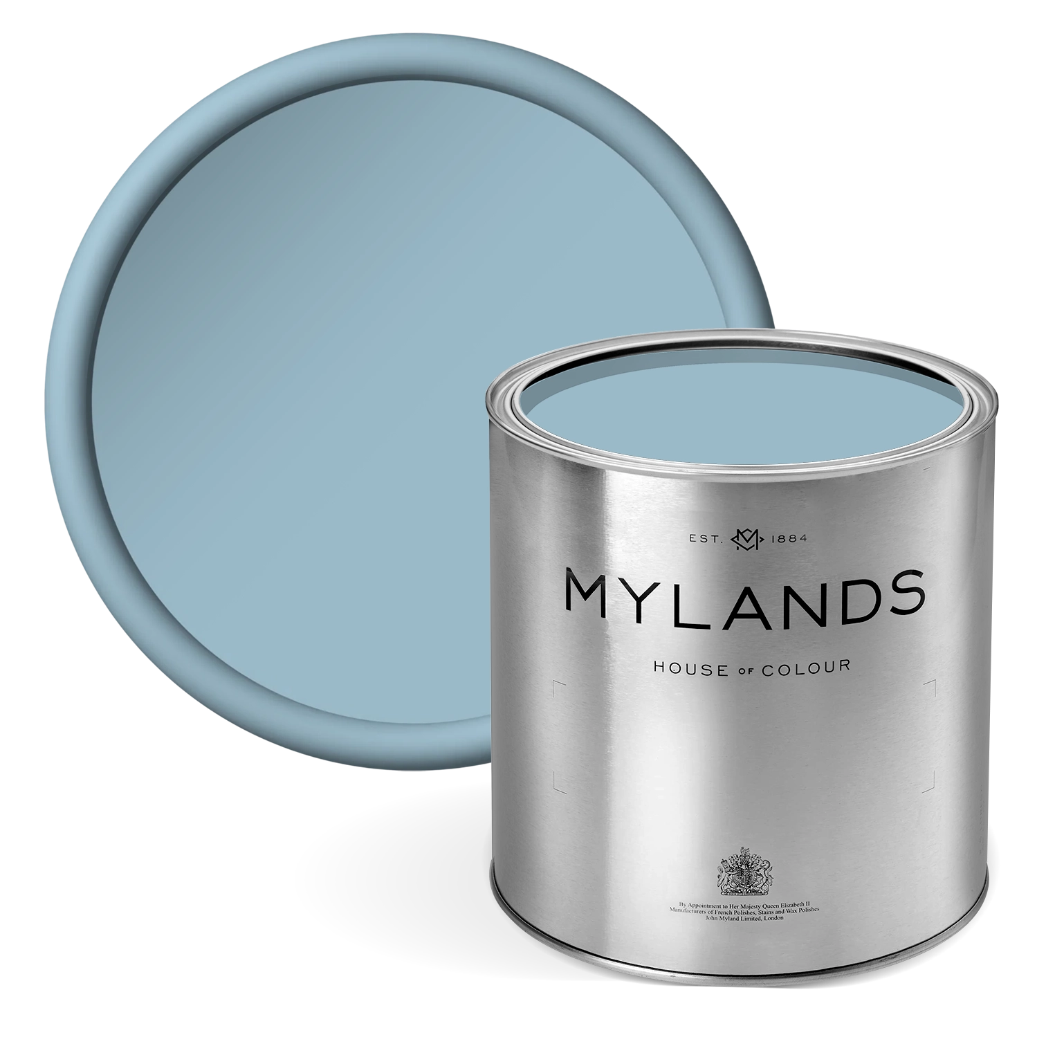
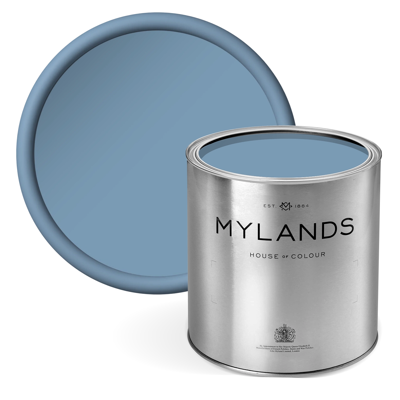
Morning Blue™ No.32
Powder blue shades are ever-growing in popularity. The tone of these shades can be paired with many other colours, shifting the personality of the room between pairings. Morning Blue No.32 is a calming light blue colour, resembling morning light. This pale blue paint has a cheerful, tranquil quality, with its light appearance creating a comforting ambience when paired with a white. The hint of magenta and umber give this paint an alluring depth and make it great for use in a wide variety of settings. Powder blue shades have a light and airy quality that makes spaces feel open and spacious. This is particularly beneficial during the summer months when you want to maximize natural light and create a cool, breezy environment.

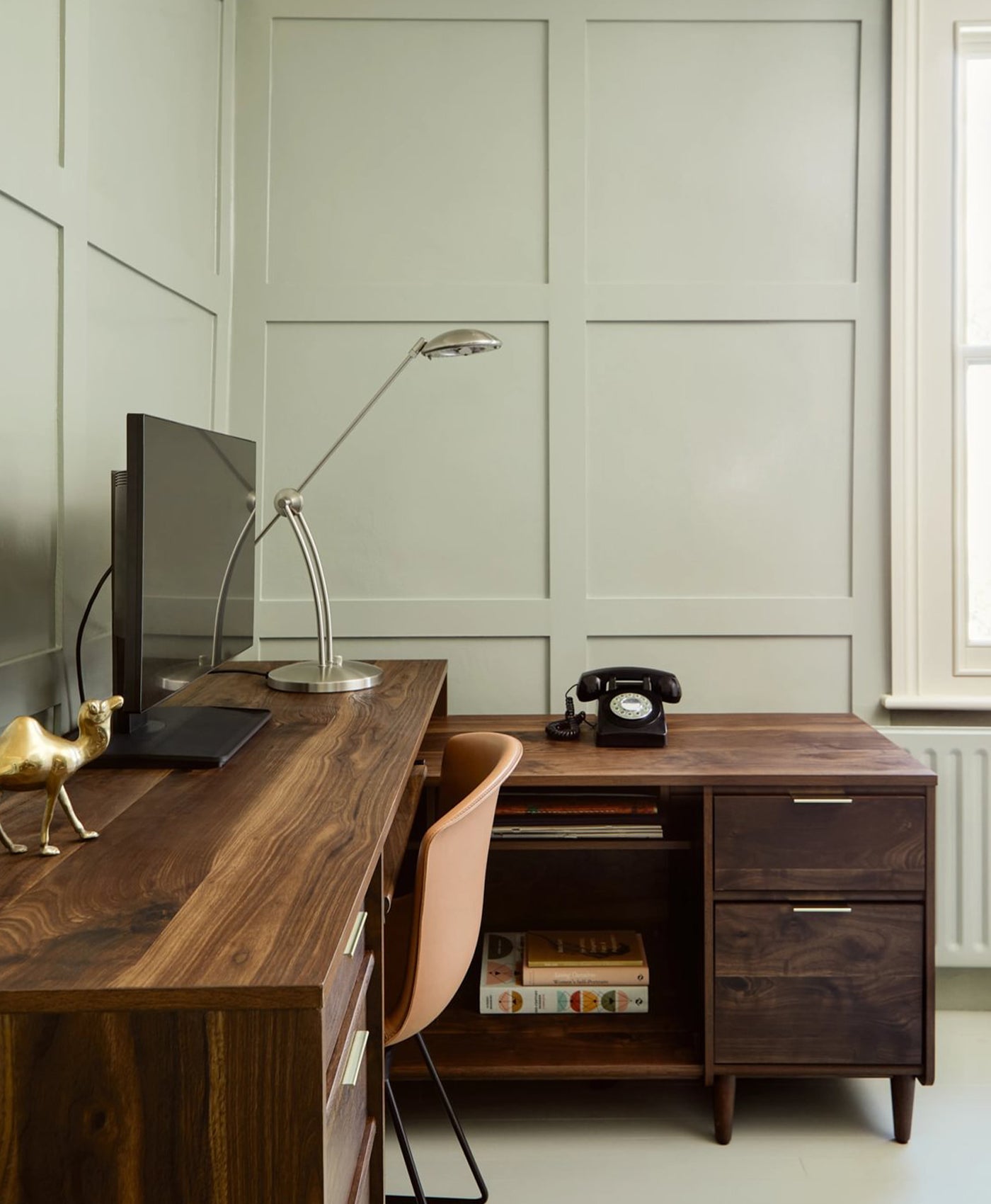
Walls in Greenstone™ No.190

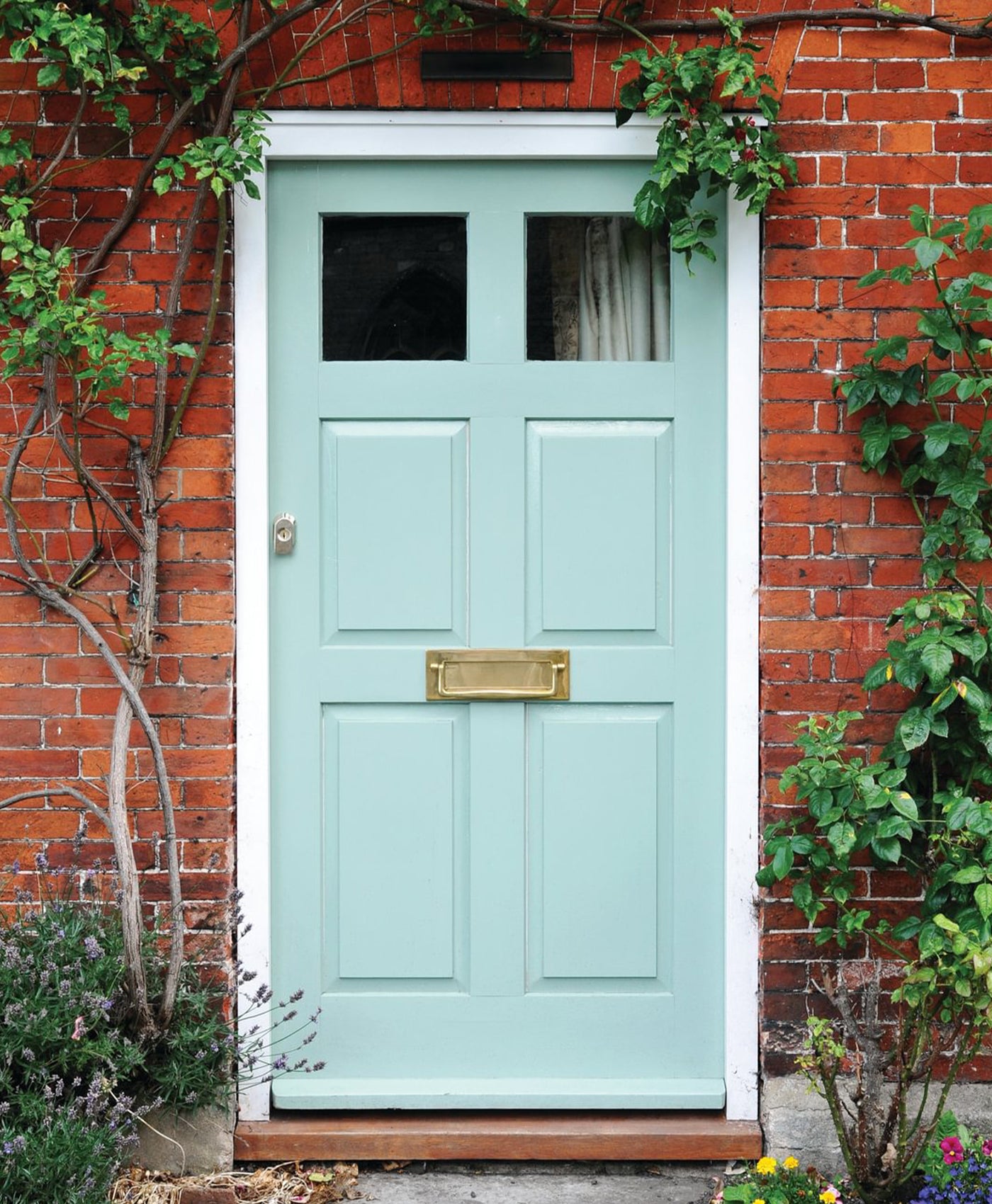
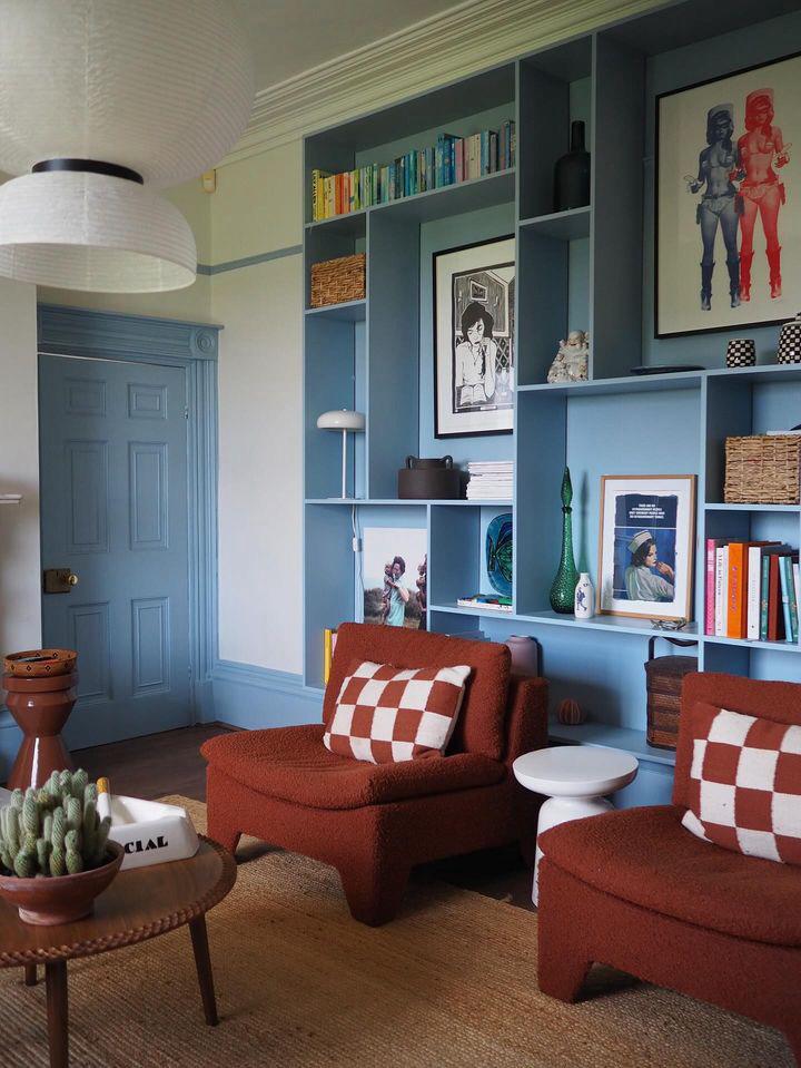
Walls in Morning Blue™ No.32
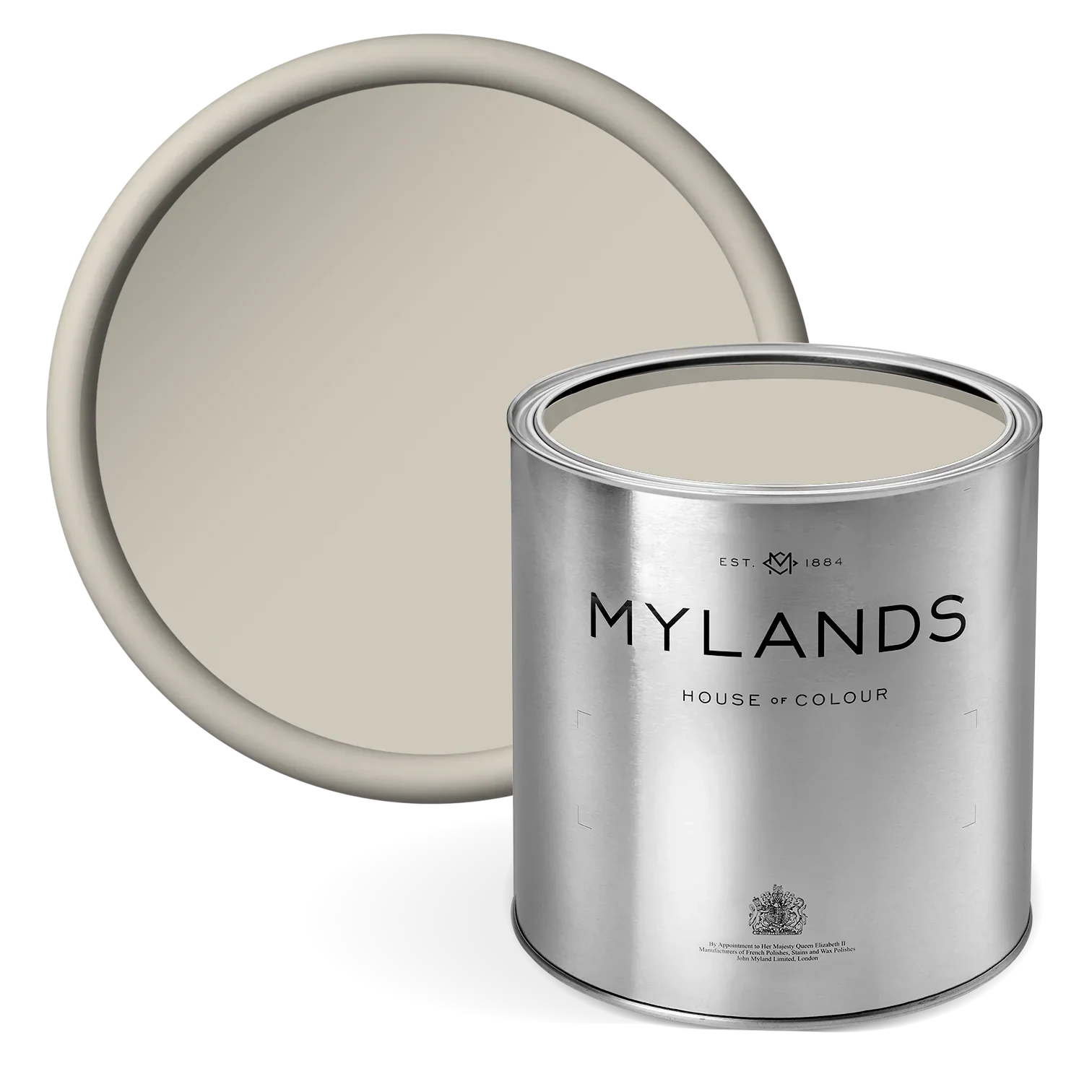
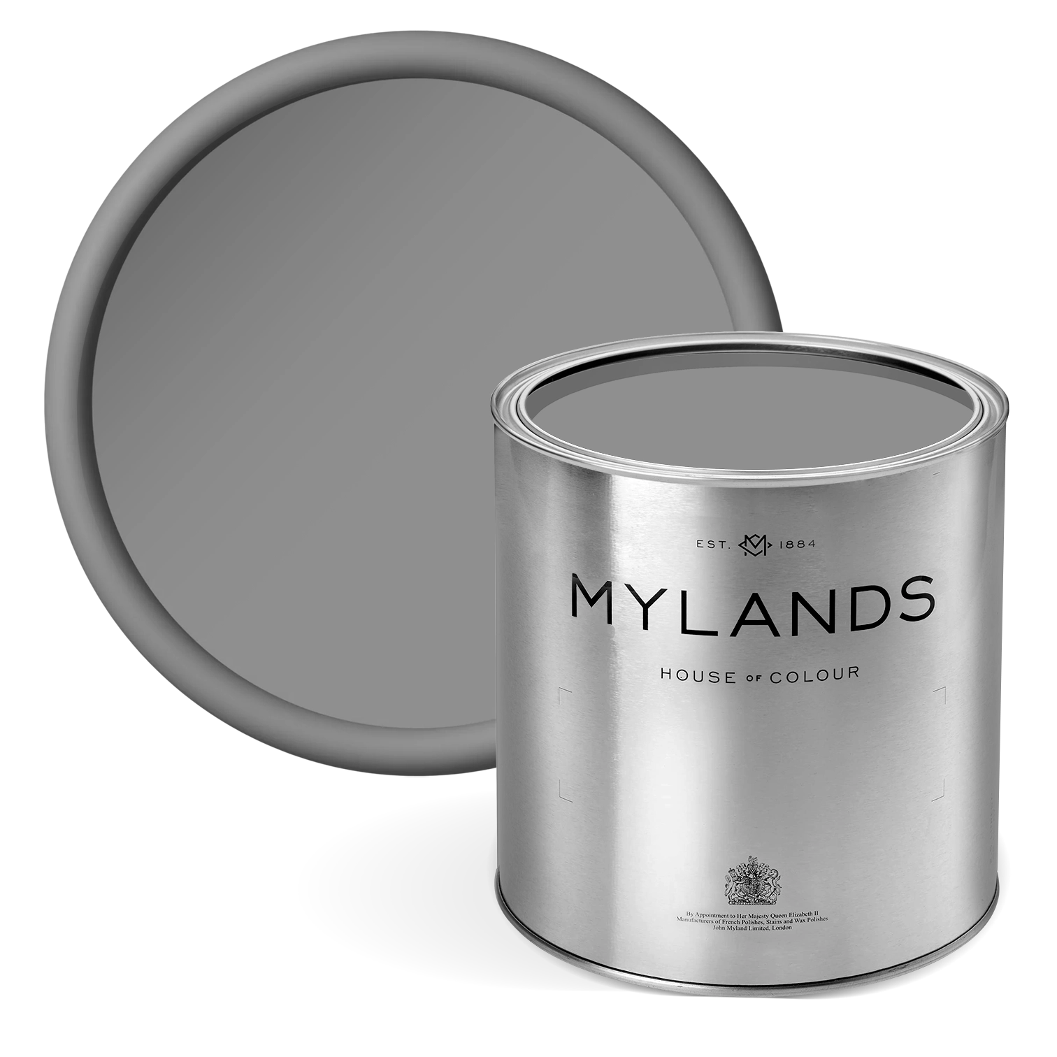
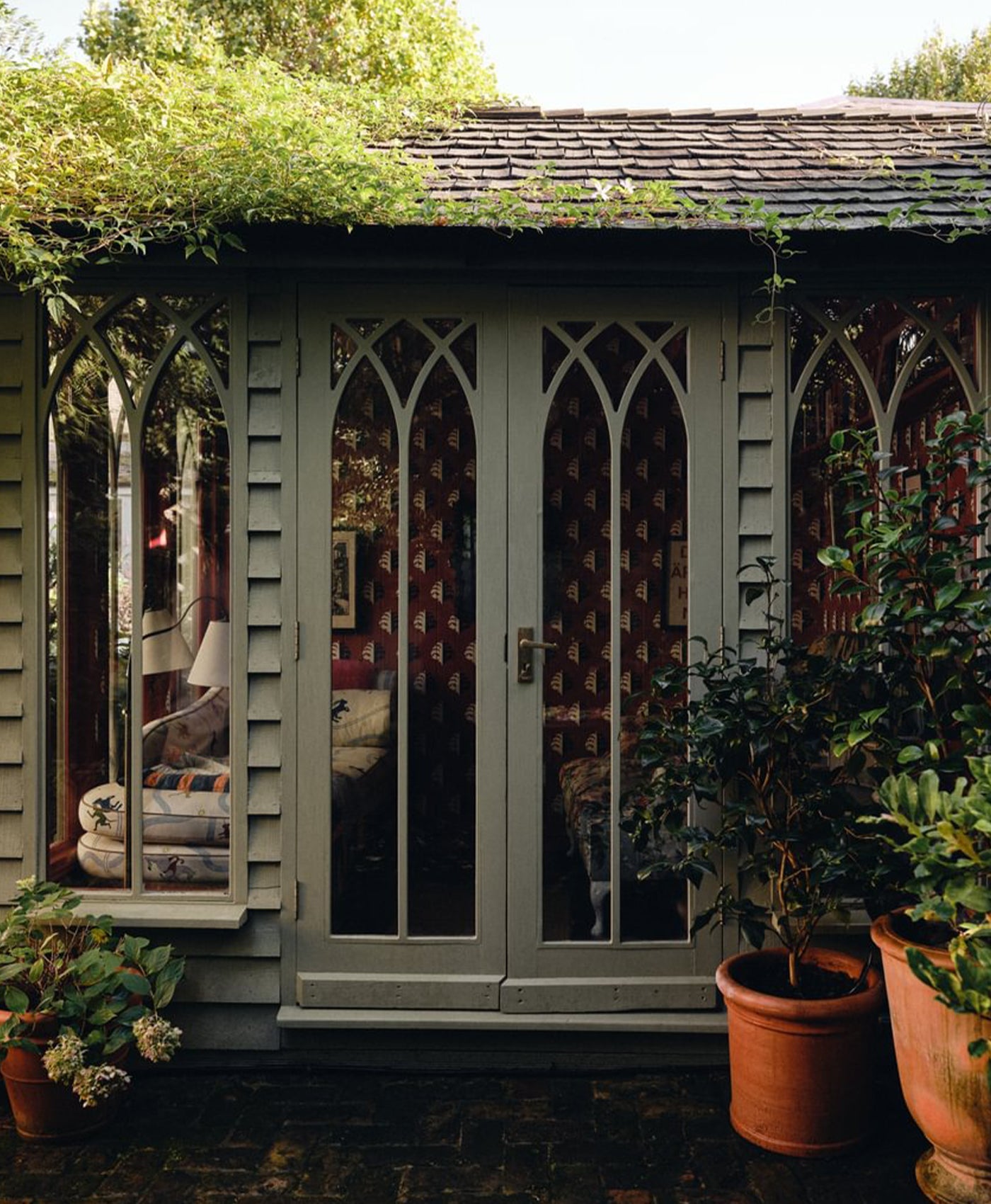
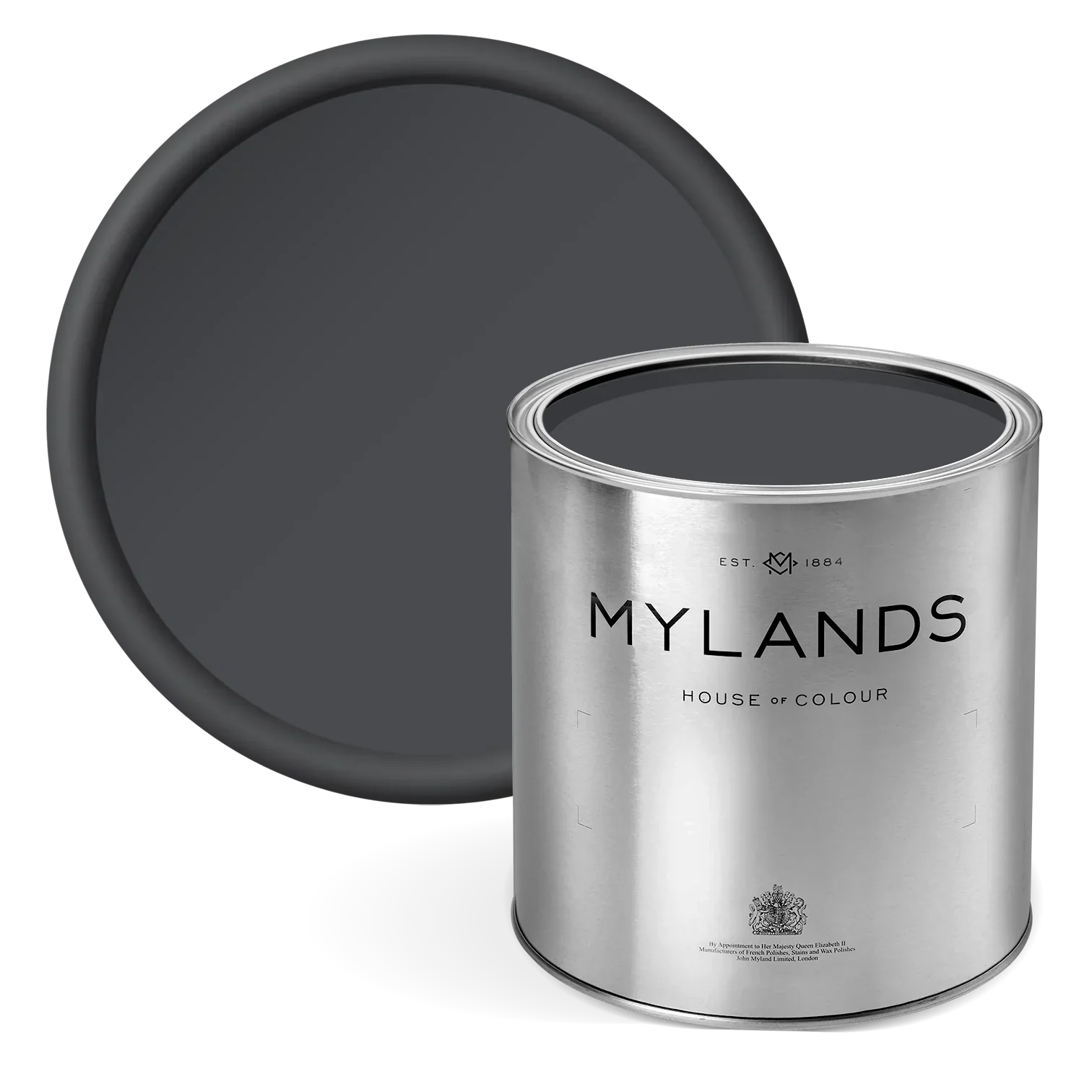
Hoxton Grey™ No.72
No summer palette would be complete without a soft, warm, timeless neutral. During the summer, earthy warm neutrals provide the perfect backdrop, creating a light and airy feel, and bringing the outdoors in. Hoxton grey has deep, warm umber and brown undertones. this pale neutral grey paint has a warming and calming aura. It is a mid-grey with a lot of depth and hints of violet. The blend of umber and brown undertones in this grey paint creates a warm and soothing atmosphere. This warmth is essential for maintaining a cozy and inviting feel during summer months when interiors can sometimes feel too stark or overly bright.
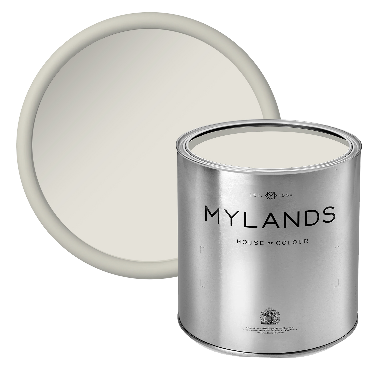
Belgravia™ No.6
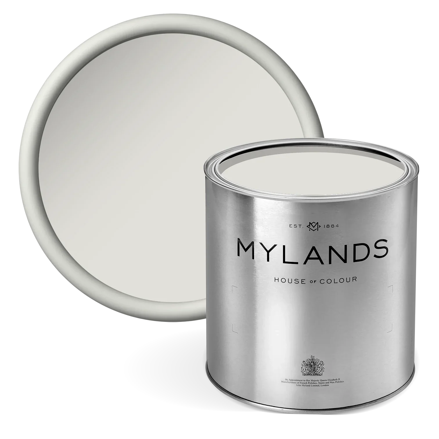
Warm off-whites have become one of 2024's biggest interior trends, not too stark to contrast against other colours and to allow for a welcoming atmosphere. Belgravia™ No.6 is a crisp white that holds a warmth reflective of the summer sun-rays on your face as you step outdoors. Perfectly light and airy, using warm off-whites helps to brighten spaces. These tones not only evoke the sunny, cheerful essence of the season but also create a fresh and inviting environment indoors, without being too overpowering.

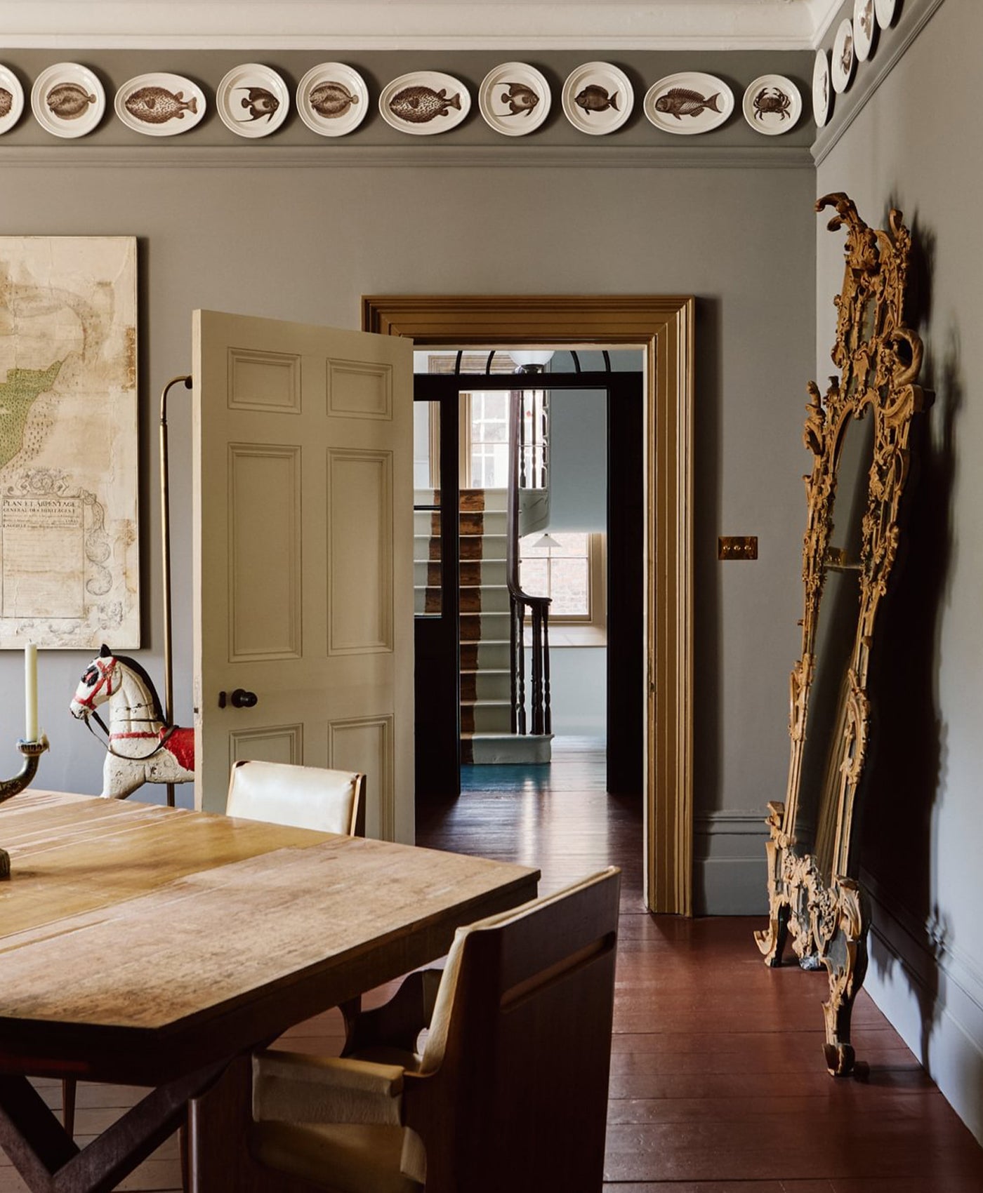
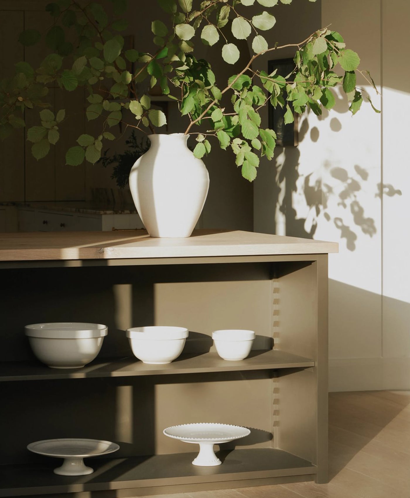
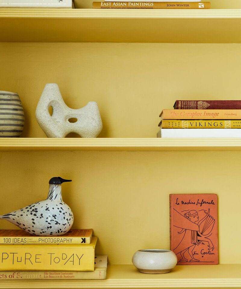
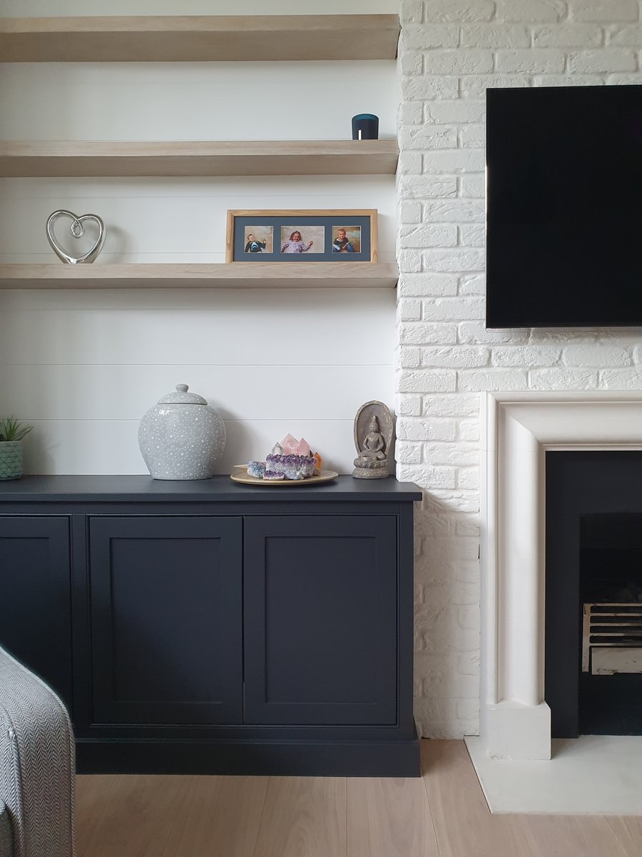
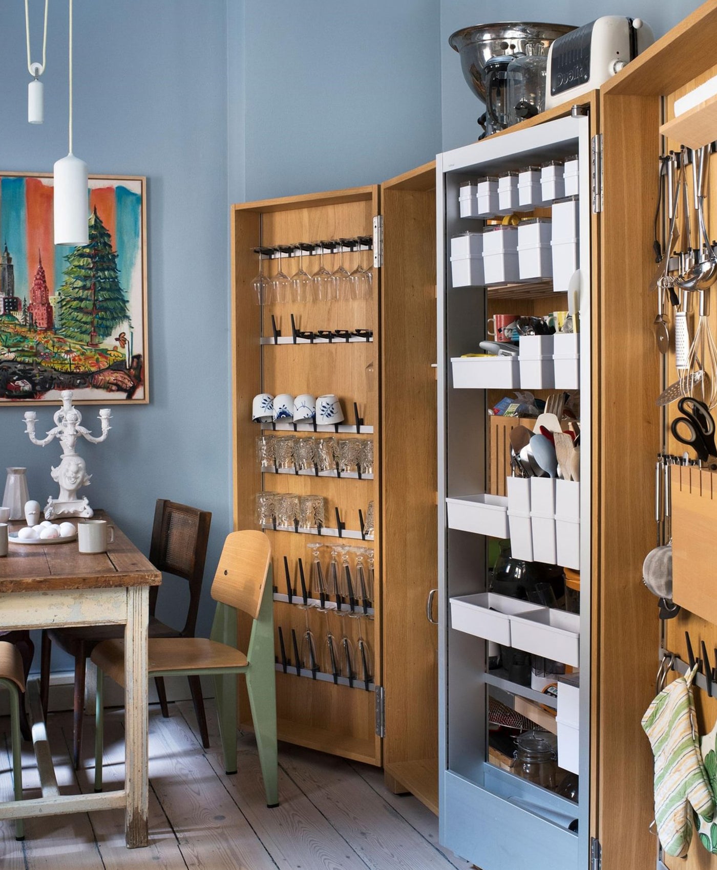
Kitchen cabinets in Hoxton Grey™ No.72; Wall and shelf in Whitehall™ No.9

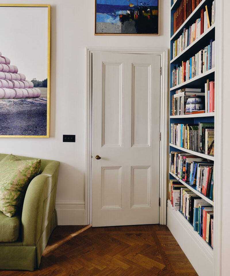
Walls in Belgravia™ No.6