Our Top 10 Kitchen Colour Combinations
Our kitchens have to work hard for us. We need them to be functional spaces in which to prepare meals. We need them to be family spaces where we relax and spend time together. It could also be the area in which we entertain friends and family or encourage kids to play. These days, kitchens incorporate the dining room and living room as well. So it’s important to get your kitchen design right.
Our choice of kitchen paint colour is important too. Are you looking for a timeless, traditional kitchen paint colour or something more contemporary and striking? Think how you want to make this multi-functional space feel.
Here, we share our top 10 kitchen colour schemes. Move over white kitchens, it’s time to add a combination of colours to your kitchen cabinets and kitchen walls. An injection of colours will transform your kitchen look and feel instantly. If you’re looking for inspiration, you’ll get some great kitchen colour ideas. It’s time to plan your dream kitchen.

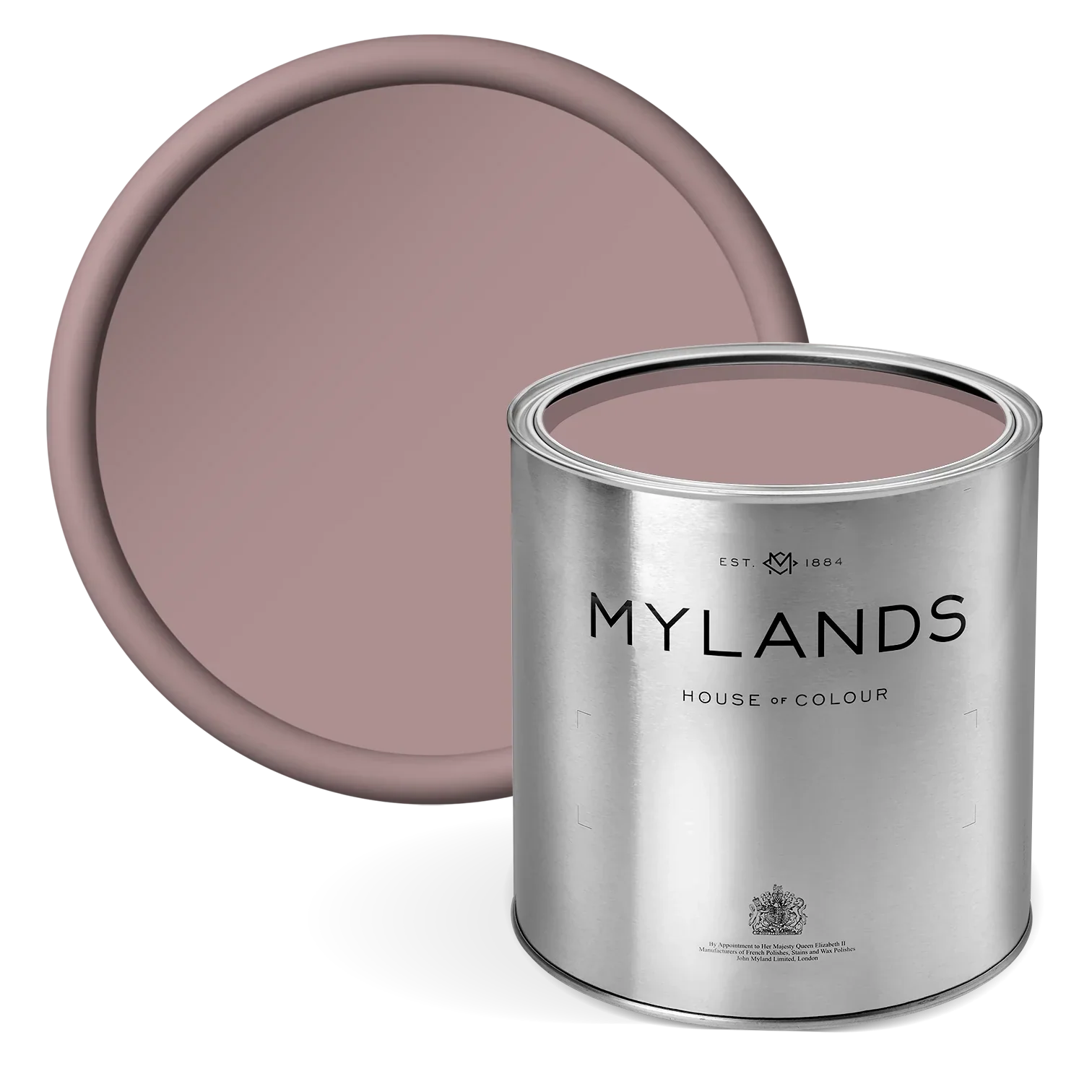
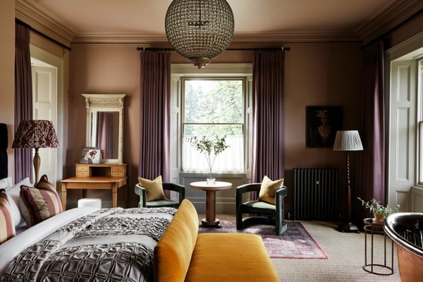
Top wall in Rose Taupe™ No.292, Lower wall in Gentleman’s Pink™ No.221
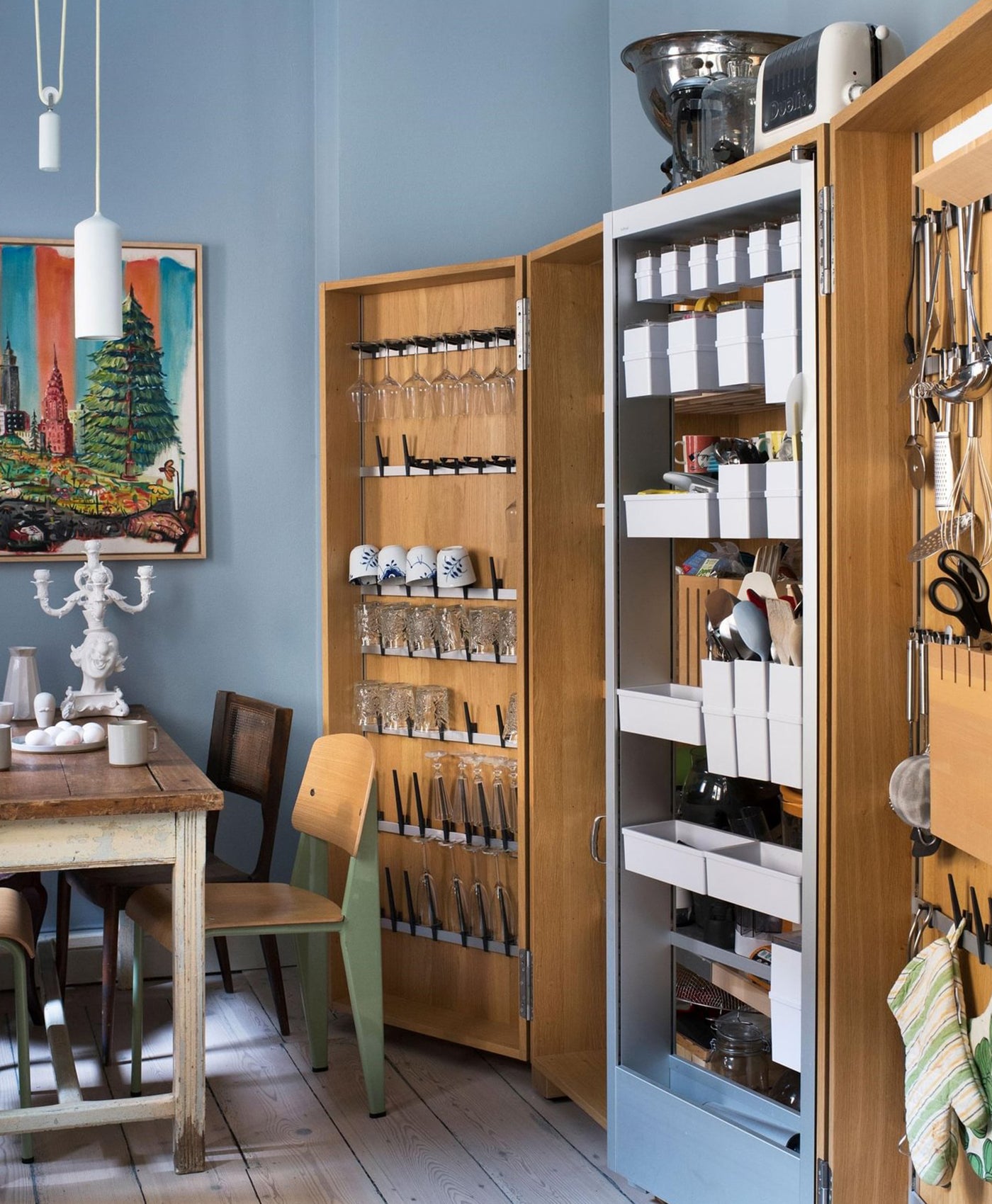
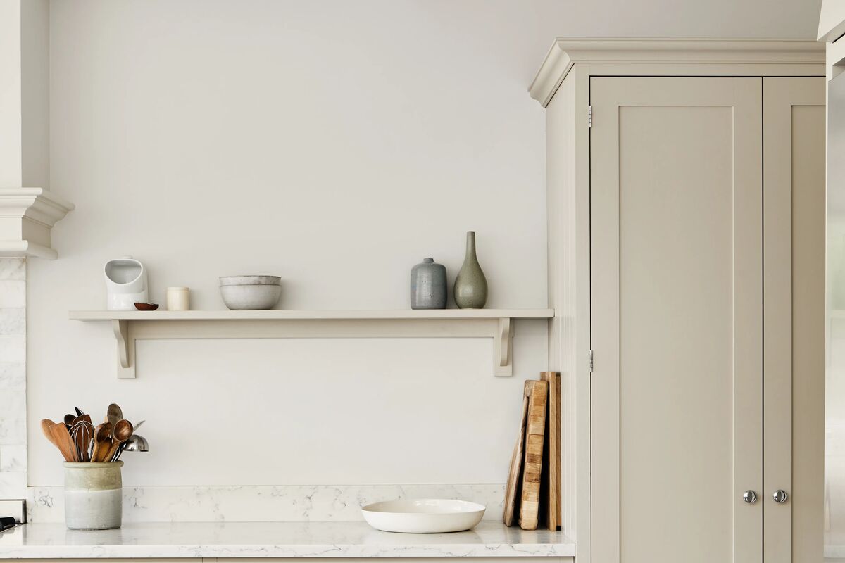
1. White and Neutral
A white kitchen makes sense. It’s a room that needs to be associated with cleanliness and hygiene. White ticks that box. Using white is also an interior design trick to make a small kitchen feel larger.
But a stark white kitchen can feel clinical and slightly harsh. Adding neutral tones will bring some warmth, whilst keeping that simplistic style. Here, Mylands Hoxton Grey™ - a warm mix of light grey and umber undertones - provides contrast to the white wall, shelving and countertop whilst remaining within a natural, neutral colour palette. A white and grey kitchen is becoming a popular neutral shade combination of choice.

Cupboard in Hoxton Grey™ No.72, Walls in Whitehall™ No.9 - @OttoTiles

Cabinetry in Bond Street™ No.219 - @middletonbespoke
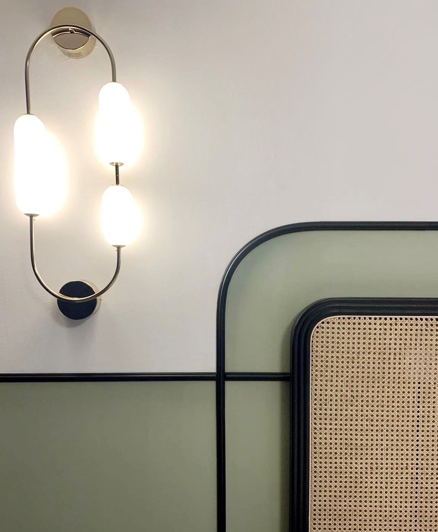
2. Navy Blue and Pastel Pink
Navy blue is a popular choice for contemporary kitchens, especially on cabinetry. For example blue kitchen islands can become the focal point with a bold, navy finish such as in Mylands Bond Street™ No.219. Instead of a classic white contrasting colour, pale pink can be used as a soft, warm partner on the walls. Pink can liven up a largely neutral kitchen with the injection of dark colour on the kitchen island. Confining the navy blue to a small area is a good way of introducing bold colour without it feeling too dramatic or scary.
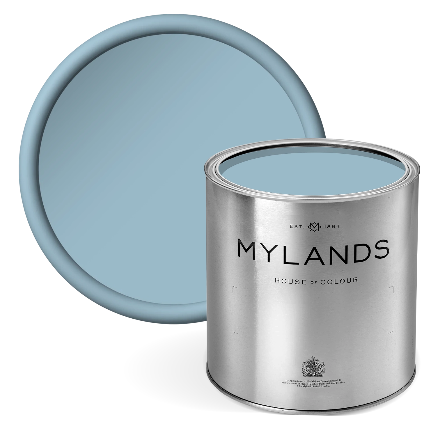
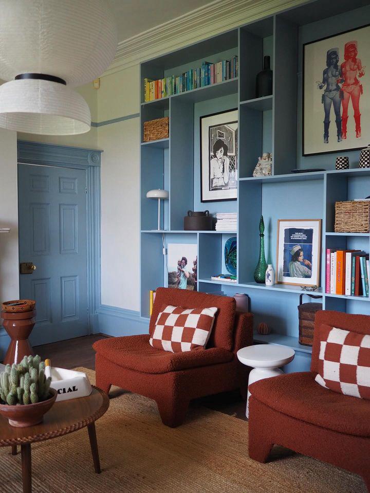
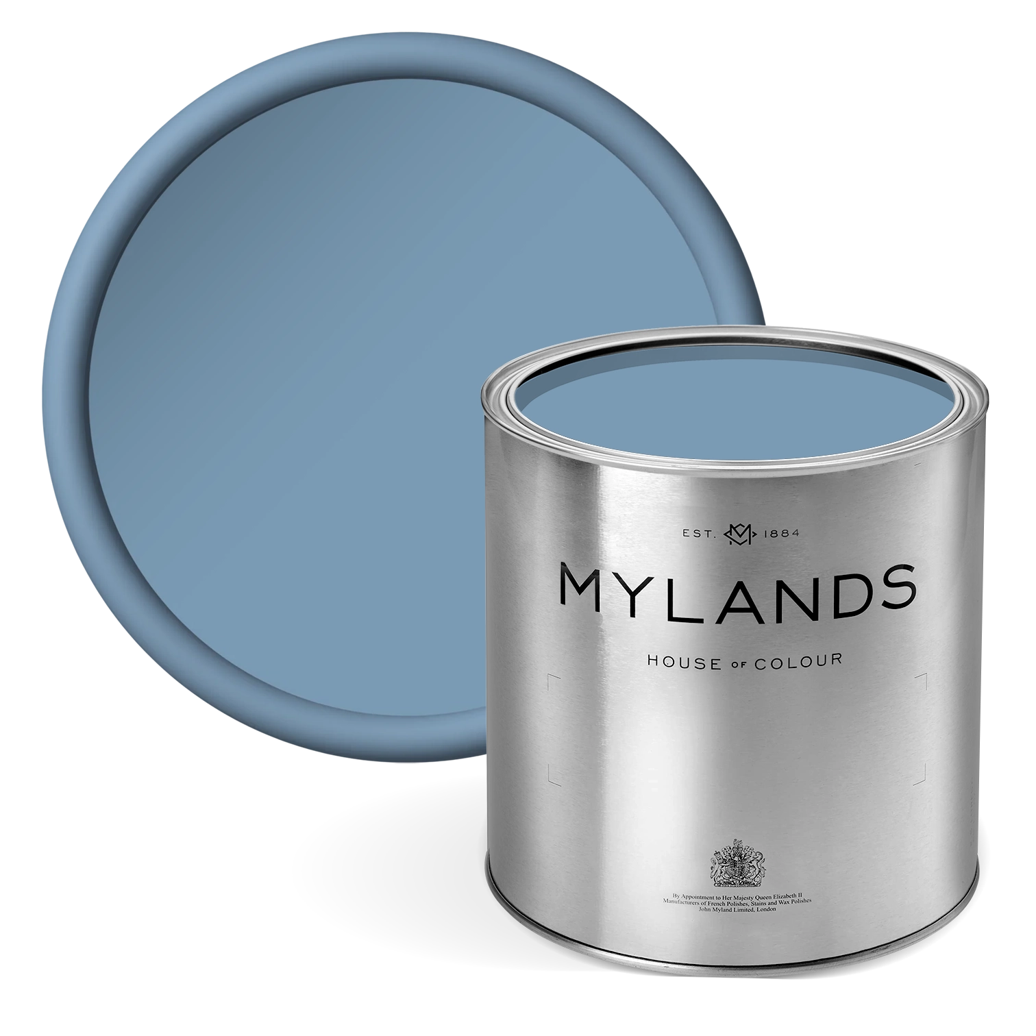
3. Dark Blue and White
A classic combination, dark blue and white feels clean and fresh. It works well in coastal interior design schemes, as well as a contemporary take on monochrome. Dark shades of blue range from midnight to navy, cornflower to cobalt. White brings much needed light and contrast against the intense deep blues. In this photo, warm wood on the island adds texture and depth against the Mayfair Dark™ blue cabinetry and Charterhouse™ white walls. The combination echoes the natural, coastal colours - think driftwood by a turbulent sea.

Cabinetry in Mayfair Dark™ No.218, Walls in Charterhouse™ No.4 - @hartswoodworking
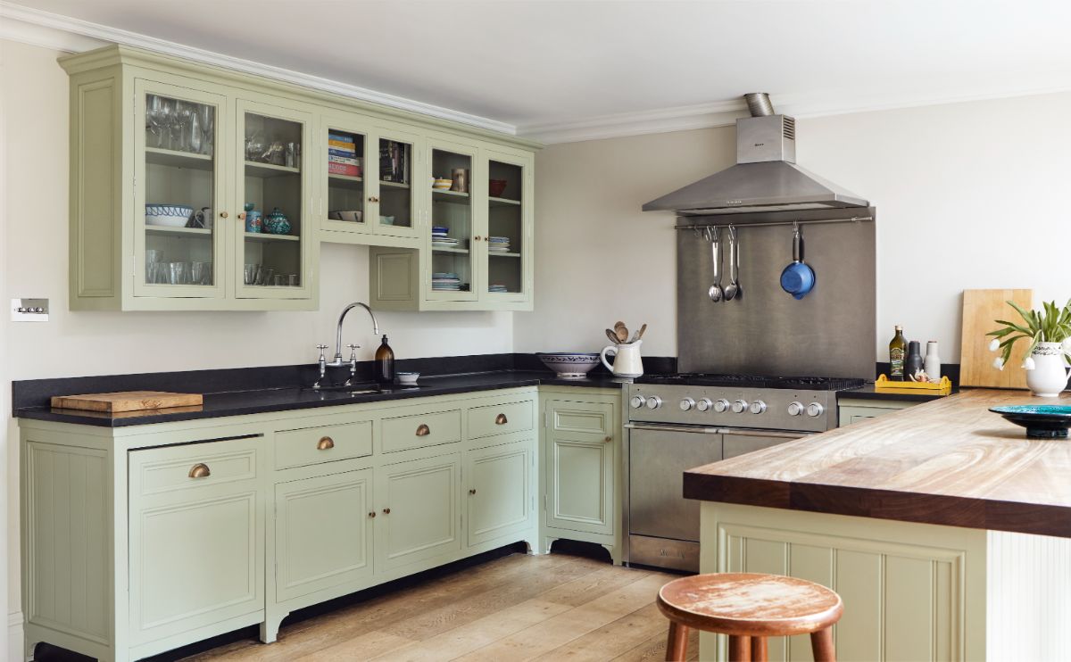
4. Olive Green and Off-White
Earthy and organic, olive green and off-white is a familiar and grounding combination. It reinforces our connection to nature which provides reassurance. As such, it pairs well with natural materials like wooden flooring and stone or marble worktops.
The deep olive green of Mylands Messel™ No.39 paint looks sophisticated and captivating, particularly on wood cabinets. Metallic accessories like gold or brass handles or taps, elevate the interior design further.

Cupboard in Messel™ No.39, Walls in St James™ No.40
5. Soft Green and Off-White
Green kitchens are right on trend, as is biophilia. These home decor styles help to restore balance and stability within the home. Often the kitchen leads out onto the garden, so using similar colours can encourage that flow between indoors and outdoors. Houseplants add further green elements and biophilic aspects to the kitchen space and help to bring the outside in.
Pairing the green with off-white echoes colour combinations seen in nature - on plants, flowers and trees in bloom. Look for soft, natural shades like myrtle or sage green. Off-white is softer than pure white. As such, it adds an air of comfort and wellbeing alongside the light green decor and pale natural wood flooring.
Cabinetry in Greenstone™ No.190, Walls in Honest John™ No.58, Ceiling in Charterhouse™ No.4
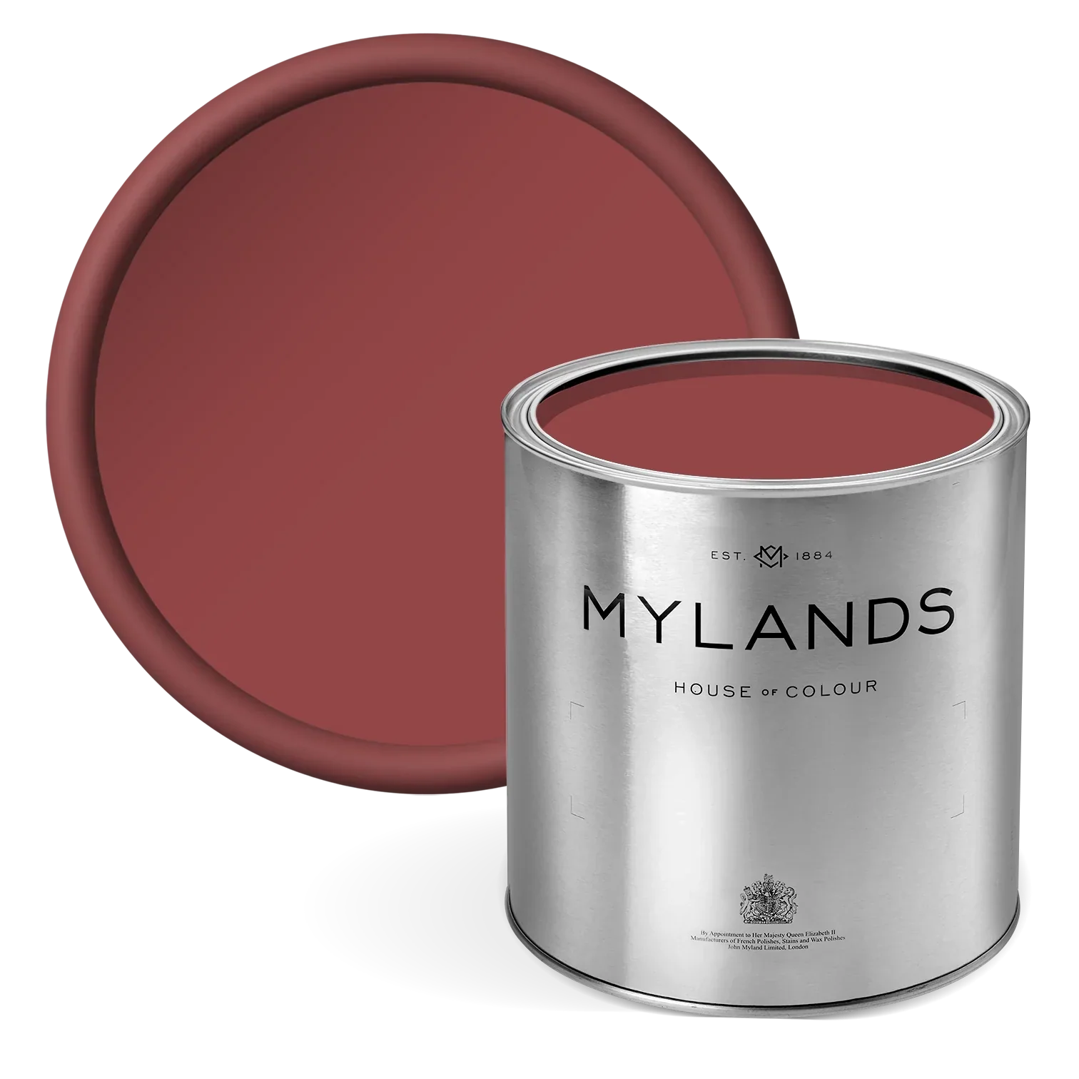
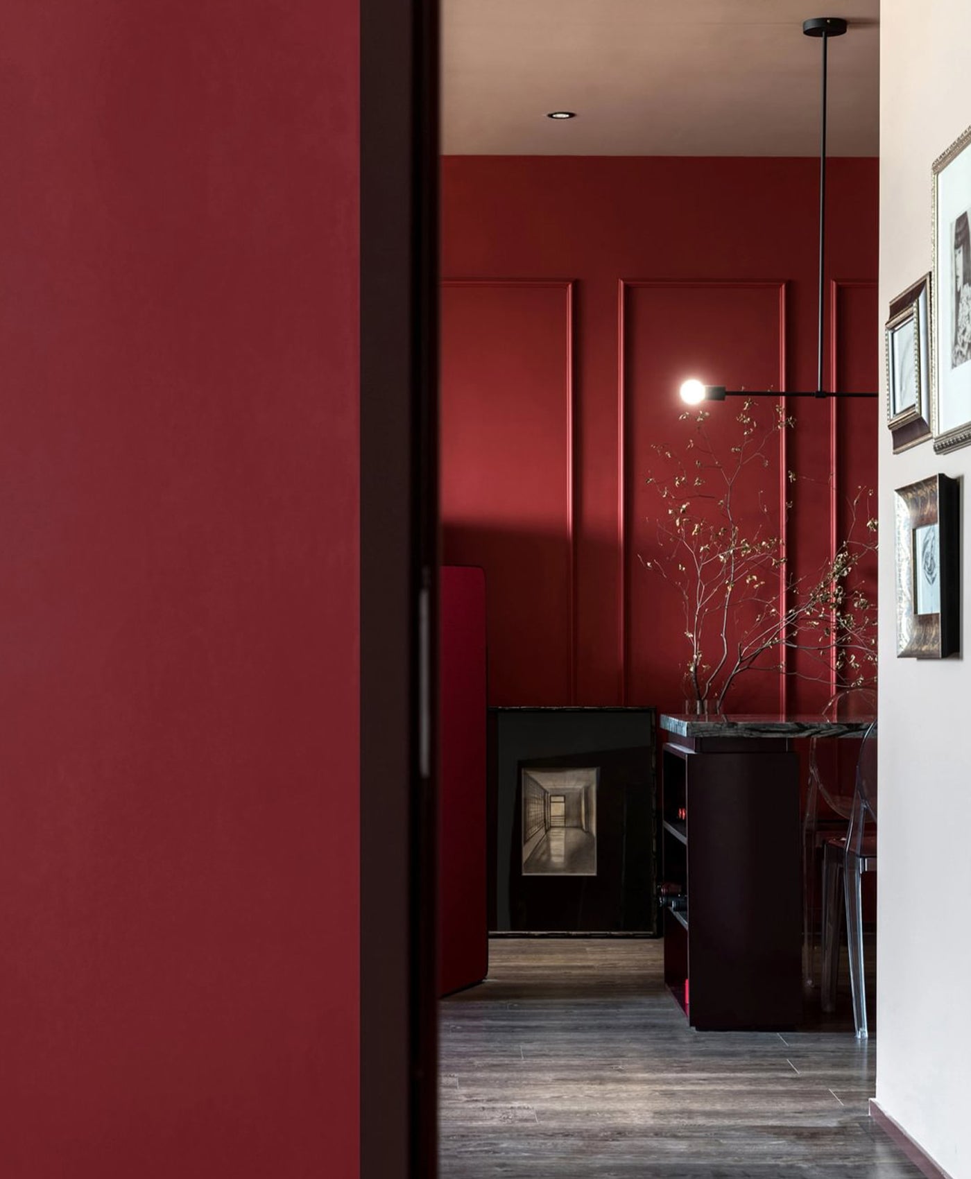
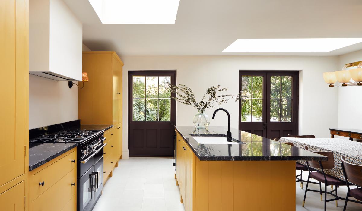
6. Vibrant Yellow and Burgundy Red
Mature cheddar and red wine. Berries smothered in thick custard. There’s something warming and comforting about the mellow combination of earthy yellow and burgundy red. And that’s the key to making this bold colour scheme work, keep it mellow and muted. Bright red and yellow in primary colours would look zany rather than sophisticated. But warming terracotta or a burnt orange colour would work if burgundy feels too dark and rich.
In this kitchen, the yellow shaker-style cabinets are in a mustard tone and offset the deep, dark burgundy red used on the shelving in the alcove. It would also work well as a feature wall. The rich, matte colours contrast yet compliment each other. The pops of white on the tiled backsplash, sink and ceiling help to add light and uplift.

Cabinetry & Walls in Haymarket™ No.47, Shelves in Huguenot™ No.49, Ceiling in Charterhouse™ No.4
CABINETRY IN FREEGROVE MUSTARD™, WALLS IN HONEST JOHN™ NO.58, CEILING IN WHITEHALL™ NO.9, DOORS IN ROTHSCHILD STREET™ NO.296
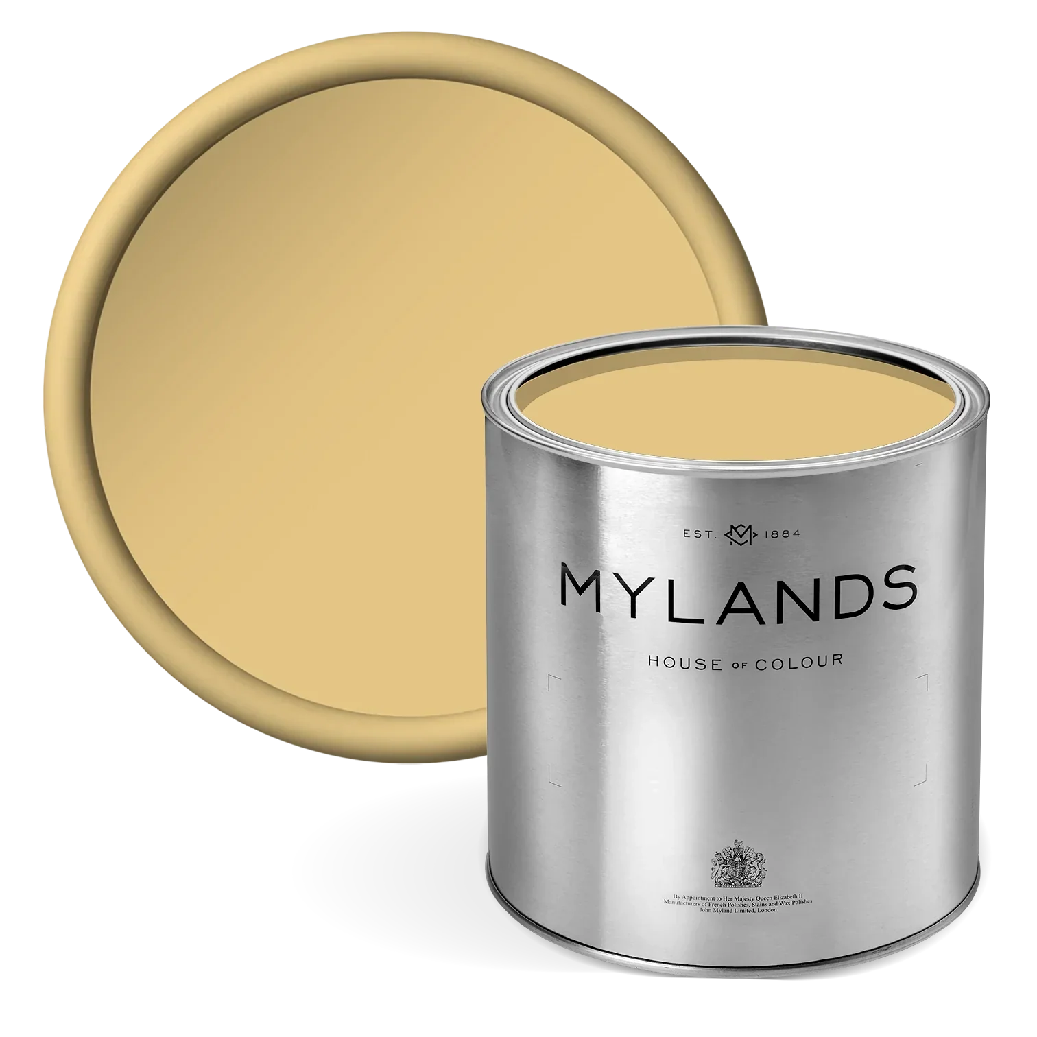
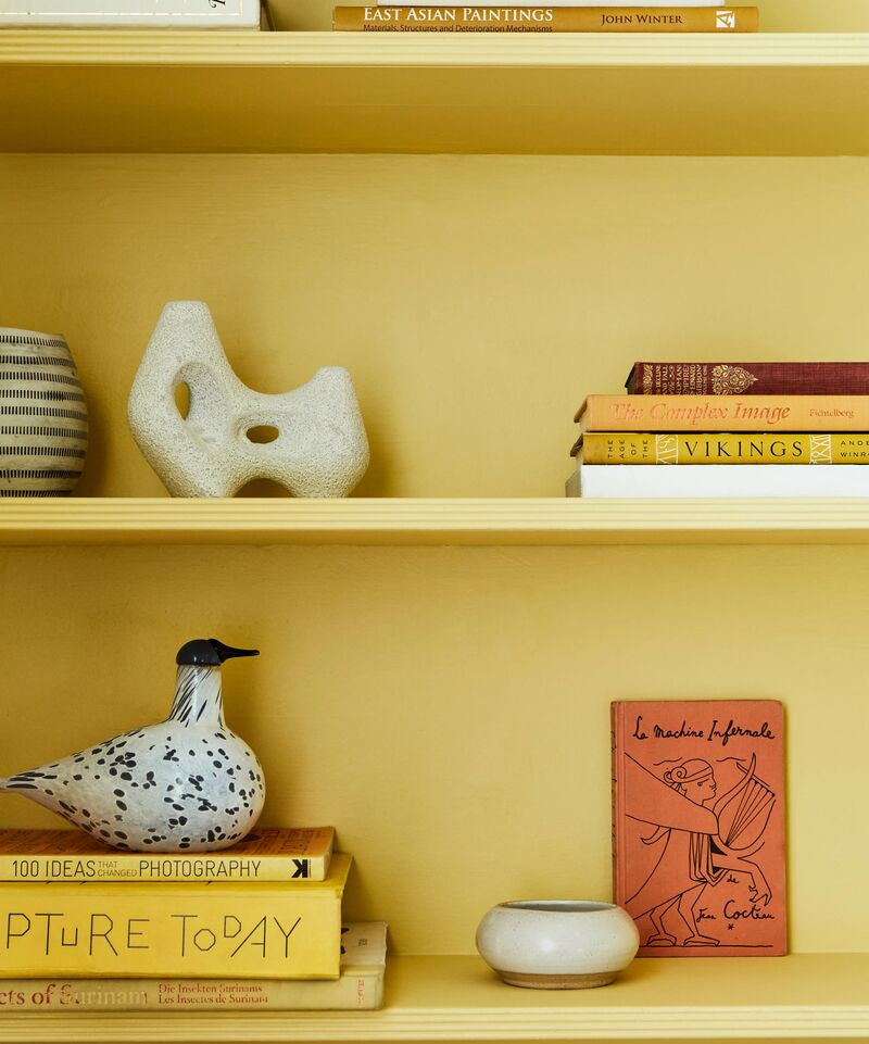
7. Golden Yellow and Soft Pink
Is there anything more cheerful than golden, sunshine yellow? It can’t fail to lift the spirits and add energy to a room. Team that with a soft pink for a warm, vibrant look.
The pastel pink tile backsplash used in this photo, combined with the sunny yellow walls, is reminiscent of a Mediterranean style kitchen. The uplifting colours on the accessories on the open shelving accentuate this further. The warm colour scheme encourages natural light to bounce around the room. It gives a summertime feel all year round.

WALLS IN PIMLICO™ NO.136 - @THEHOUSETHATCOLOURBUILT
8. Pastel Pink and Zesty Green
Green and pink make a really fresh combination. The soft pink complements and enhances the zesty lime green. This vibrant green injects a burst of bright colour and energy to the room. The striking shade is ideal as a contrast colour against the more neutral tone that is pastel pink. That said, pink is a friendly and welcoming colour - wonderful attributes for the space in which you spend dedicated time with loved ones.
This picture shows Mylands New Lime™ No.149 on the cabinetry. Outlining the white cabinet in the yellow-green paint is an effective way to update and upcycle the piece - a relatively simple DIY project.

Walls in Palmerton Pink™ No.243, Cupboard in New Lime™ No.149 & Clerkenwell™ No.21
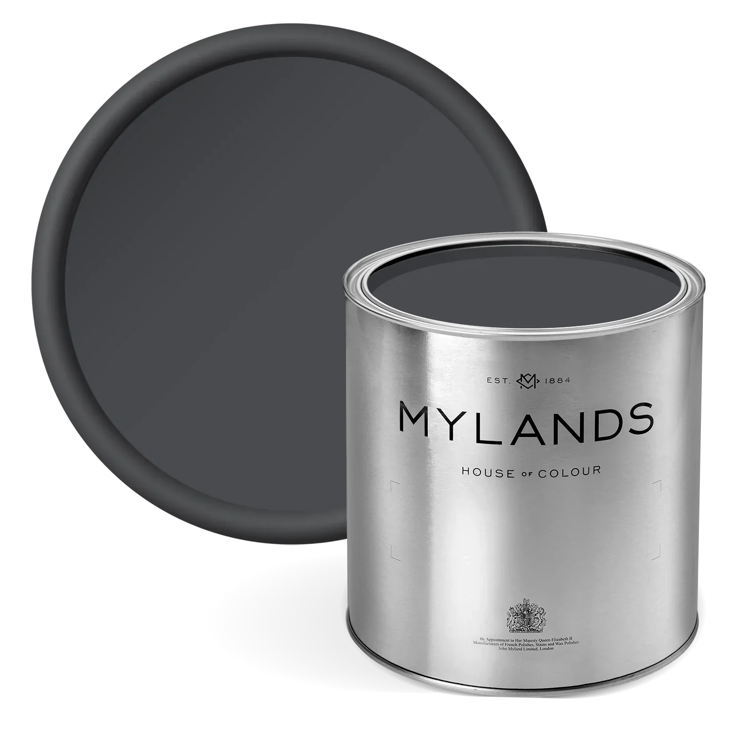
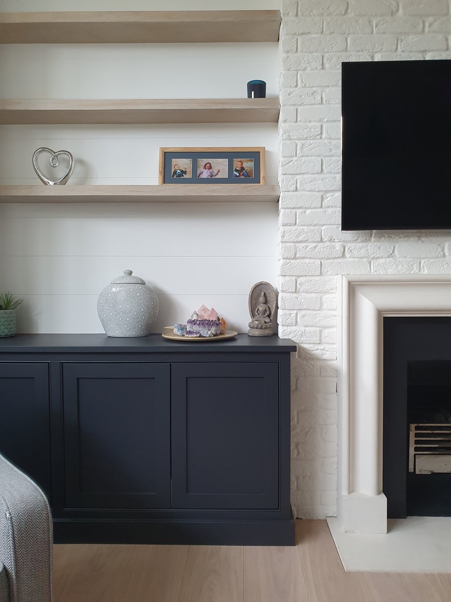
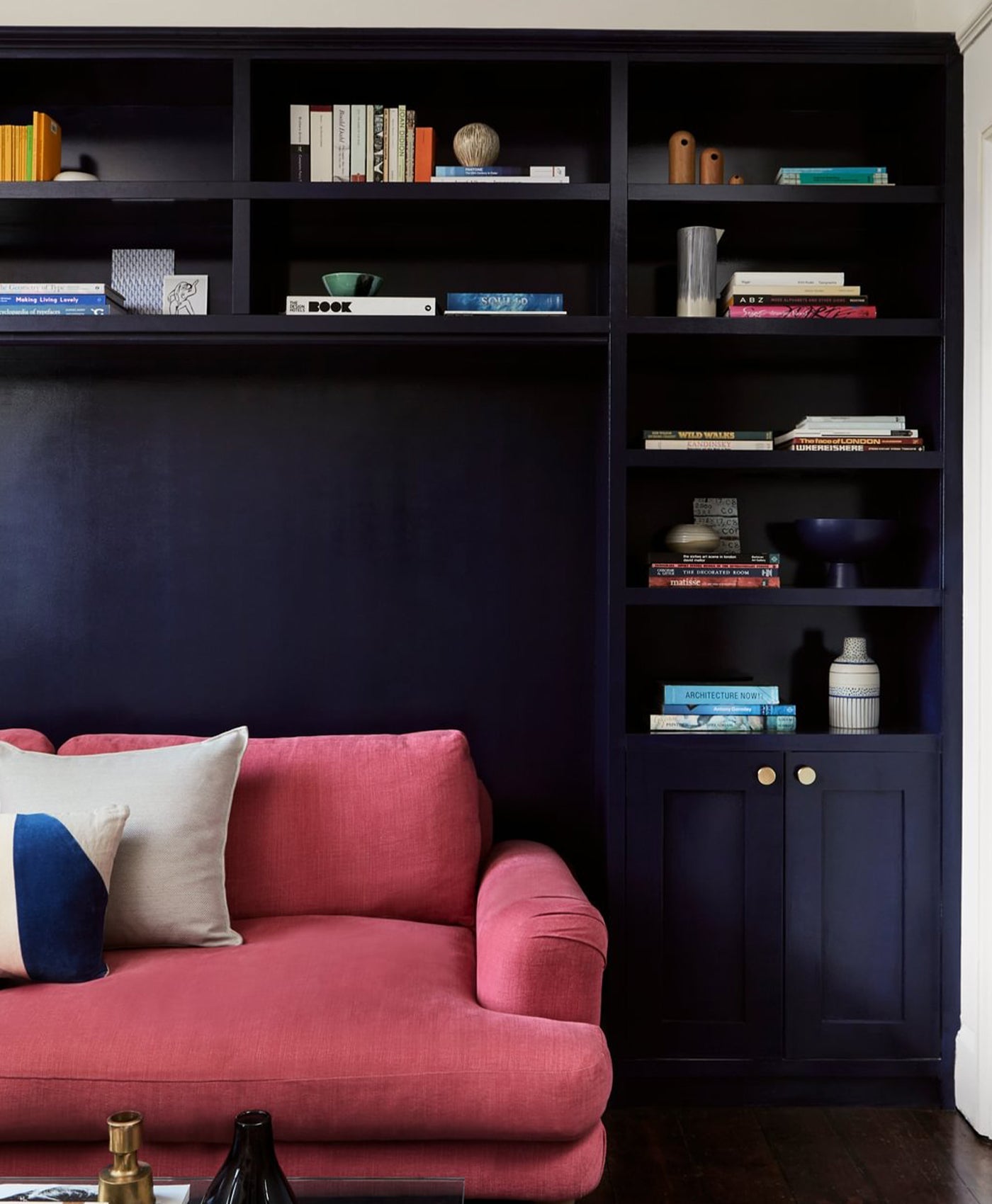
9. Black and white monochrome
If you love timeless, minimalist home decor, then monochrome is the style for you. A classic two-colour combination, black and white is perfect for a modern kitchen.
Sleek matte black kitchen cabinets are very now. Finished off with a metallic flourish in the form of a gold or brass handle, or stainless steel splashback, they are the height of sophistication. But they need a light contrast colour to prevent them making the room oppressive. That’s where white walls, ceilings or countertops play their part. Black and white work like yin and yang - complementary forces that provide a balance together.
Walls in Maugham White™ No.2

Walls in Alderman™ No.60 - @Claudiainteriors
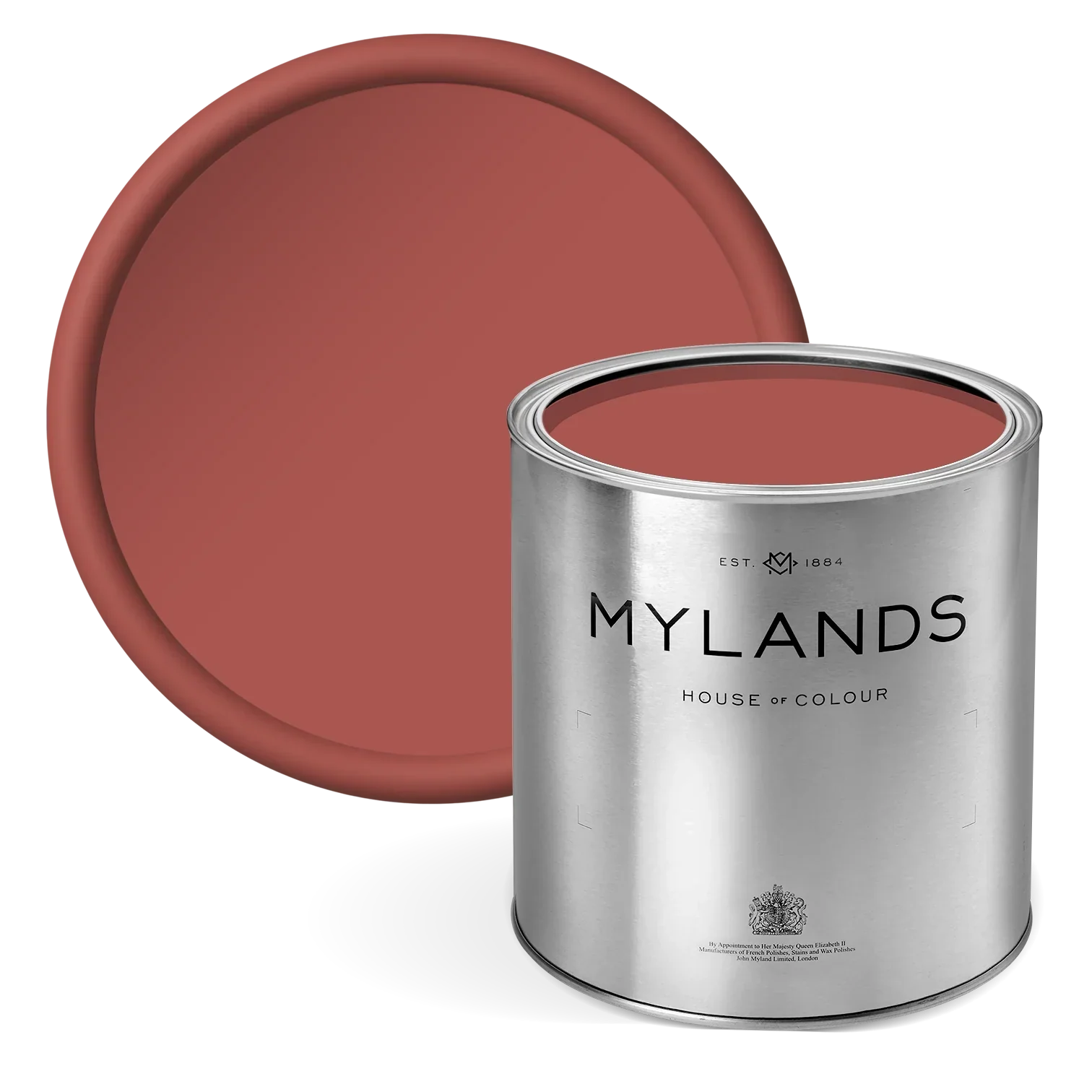
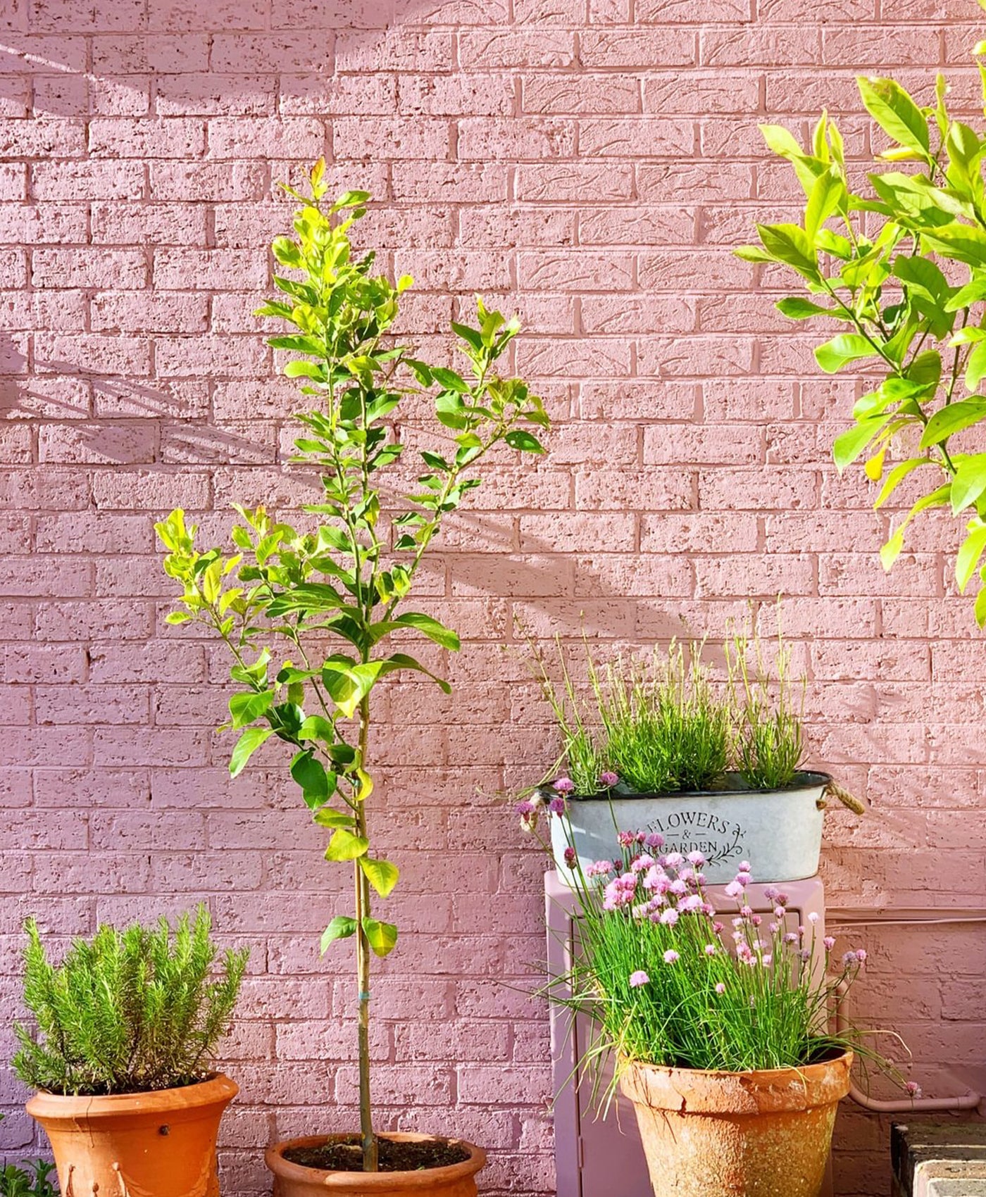
10. Soft white and floral pink
Pink may not be the first colour that comes to mind for kitchen decor, but it provides welcome relief in an otherwise white kitchen. Pretty pink is a subtle way to lift a white kitchen adding refined sophistication. Whilst light blue would feel cold against white, light pink adds warmth.
Think of pale pink as a new neutral which is gentle, serene and calming. Used on the matte kitchen wall, Mylands Kensington Rose™ No.22 brings a pretty elegance to the room. It provides softness against the sleek marble countertops; a subtle contrast against the Holland Park™ No.5 white walls.

Walls in Kensington Rose™ No.22, Woodwork in Holland Park™ No.5 - @laurabutlermadden
When planning your new kitchen colour scheme, it’s important to think about how you use the room and how you want to make the space feel. Do you crave a traditional shaker kitchen in natural tones, a vibrant Mediterranean aesthetic or super modern space?
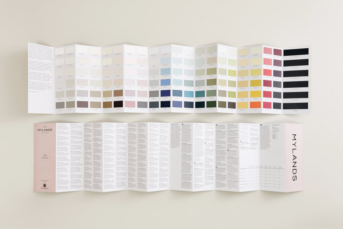
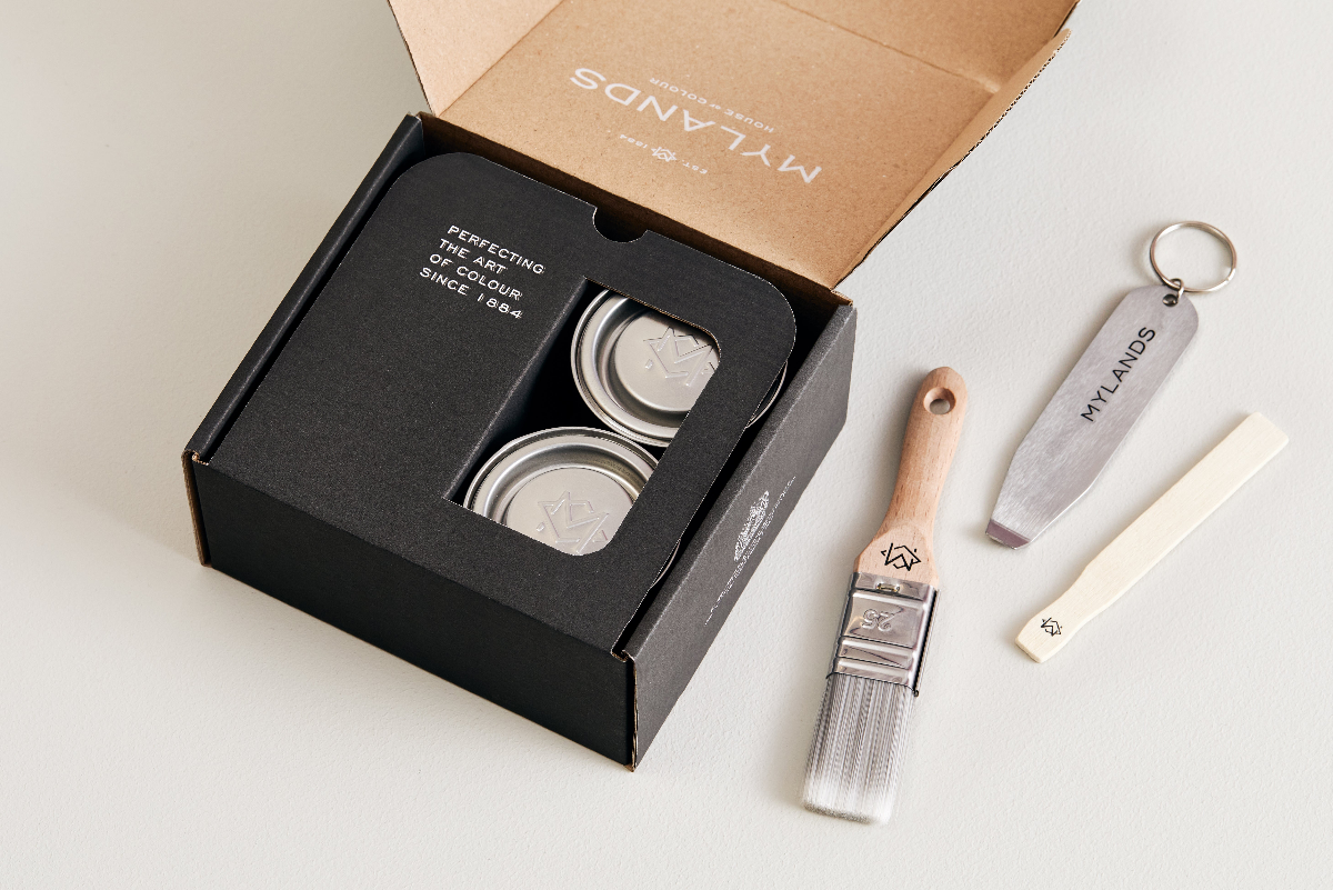
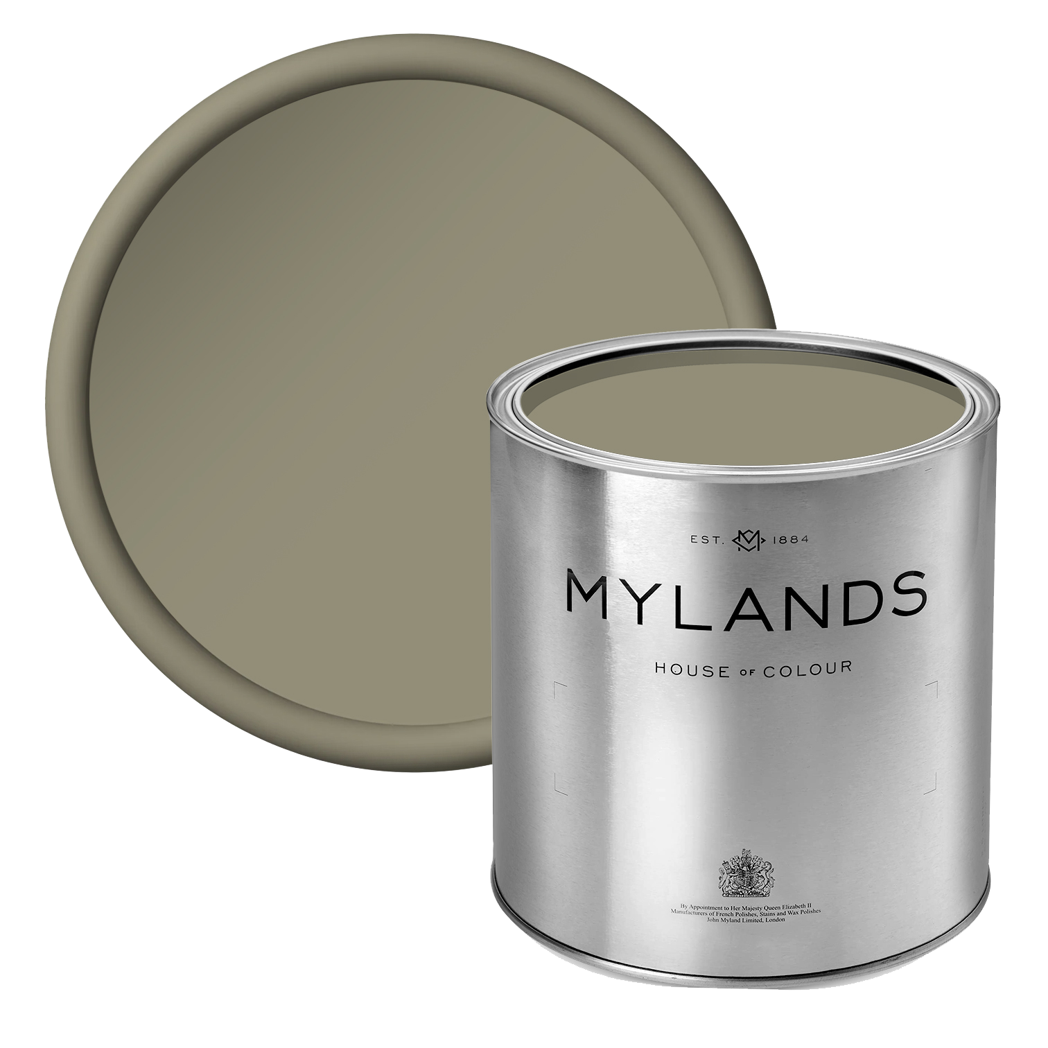
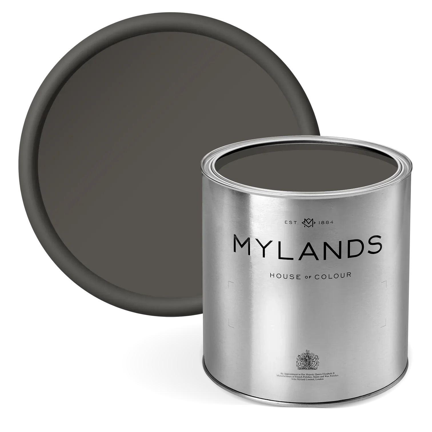
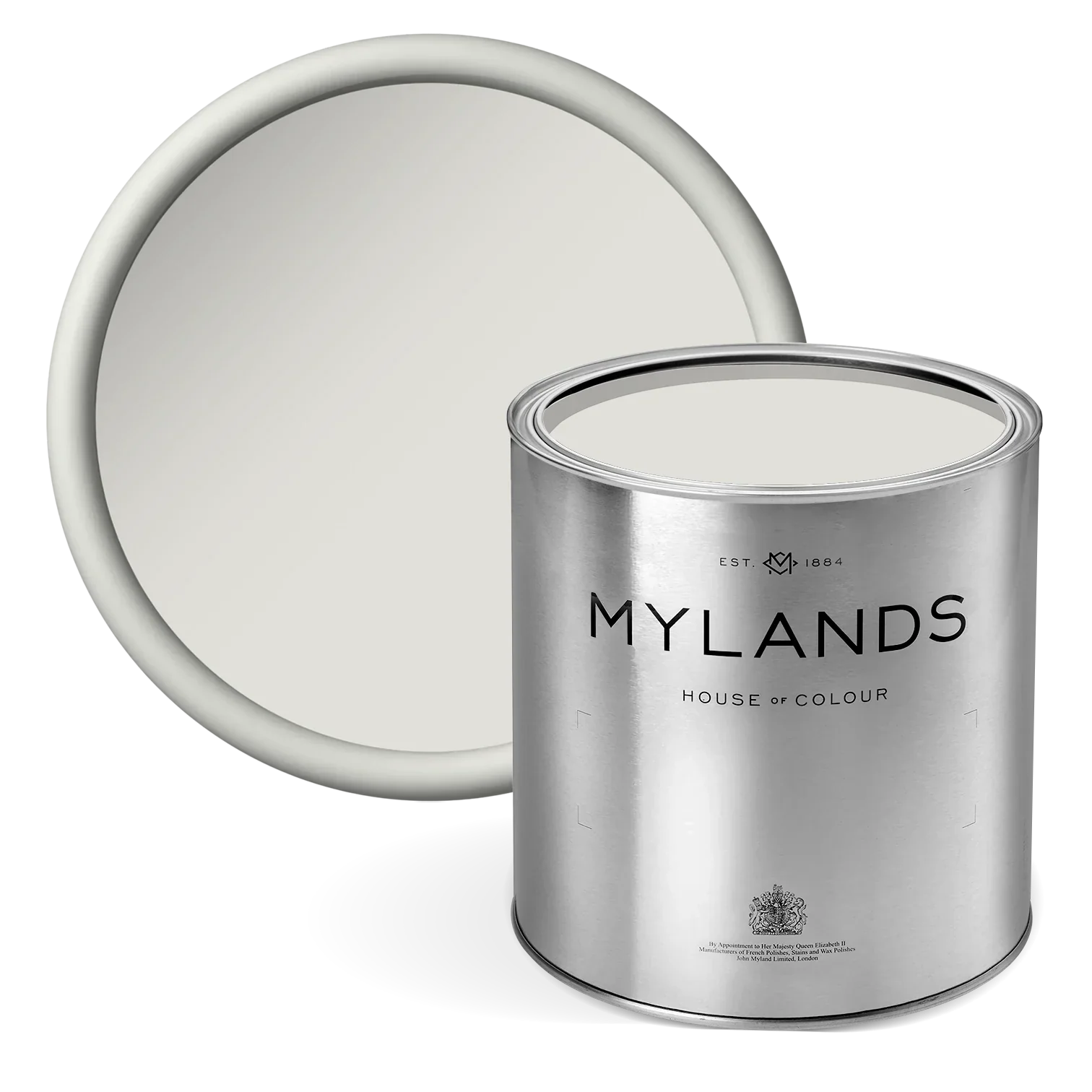
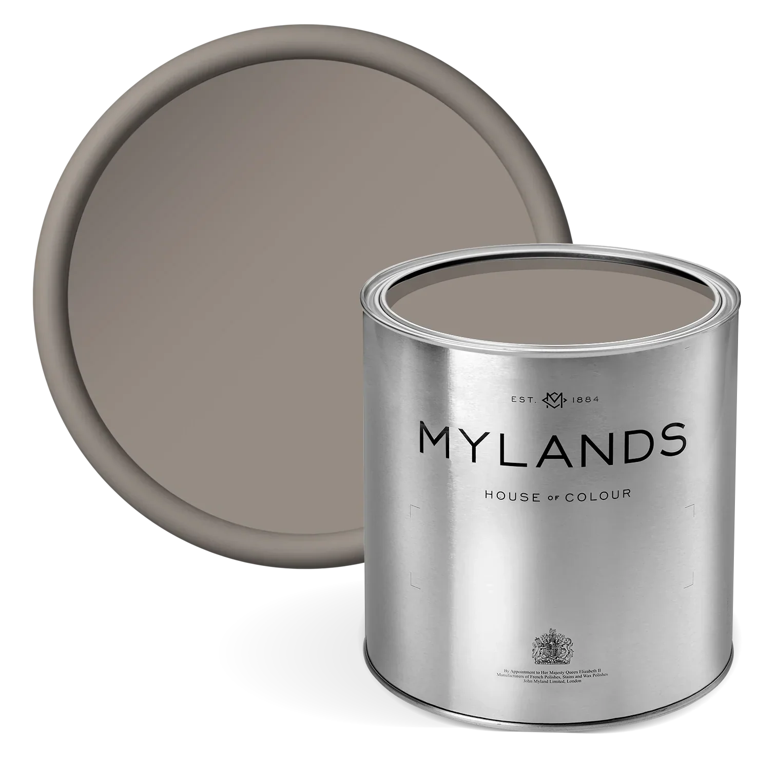
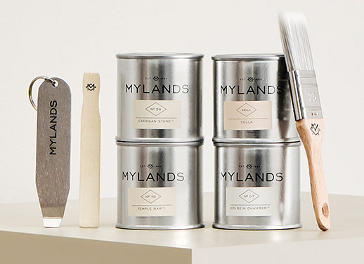
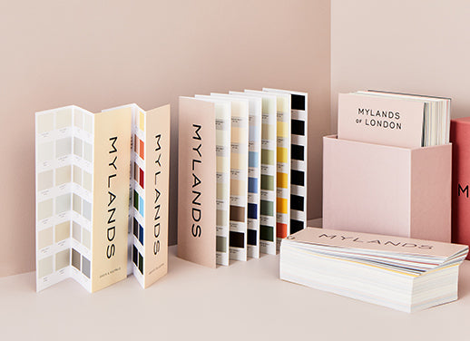
Why not try out some of our paint colours before committing to your final choice? Consult our colour cards or order a sample pot of paint colour.
Discover more kitchen ideas and trends or shop our extensive range of quality paint colours.