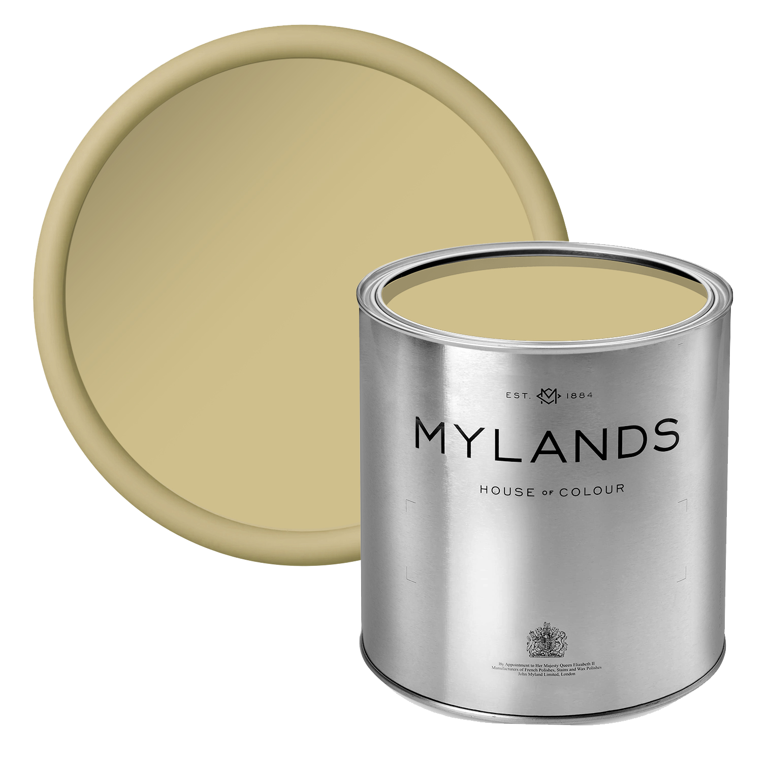
How To Choose A Warm Neutral Paint Colour
With so much talk of bold paint colours, the thought of neutrals might seem boring in comparison. But we’re not talking 1980s and 90s magnolia here. Today’s new neutrals are more versatile, varied and interesting. They can bring warmth to a cool room, complement a sunny room and provide contrast to a strong colour.

Walls in Grouse™ No.75, Ceiling in Pediment™ No.73 - @no2hastings
Here, we’ll share our expert tips on how to choose a warm neutral paint colour. There’s so much more to it than beige and greige!
What is a warm neutral?
All neutrals have an undertone. It could comprise yellow, brown, red/pink or even green undertones. Those components will add different levels of warmth. Warm neutrals can make a room feel toasty and inviting. They can make a living room feel friendly and cosy or a bedroom feel comforting.
For a long while, grey has been the neutral colour of choice. But we’re slowly seeing that cool neutral tones are waining in popularity. Instead, warm neutrals are moving up the ranks. So if you want to be ahead of the trend, step away from the cool grey and towards other warmer hues like stone, cream, beige, off-white and warm white.
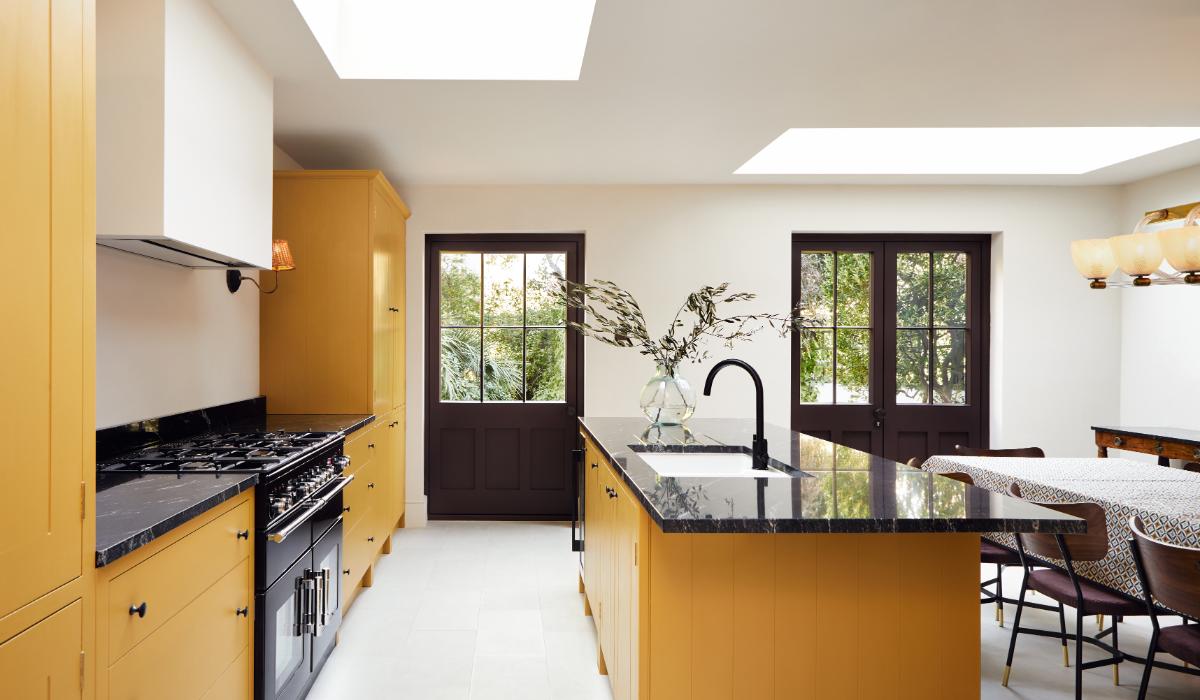

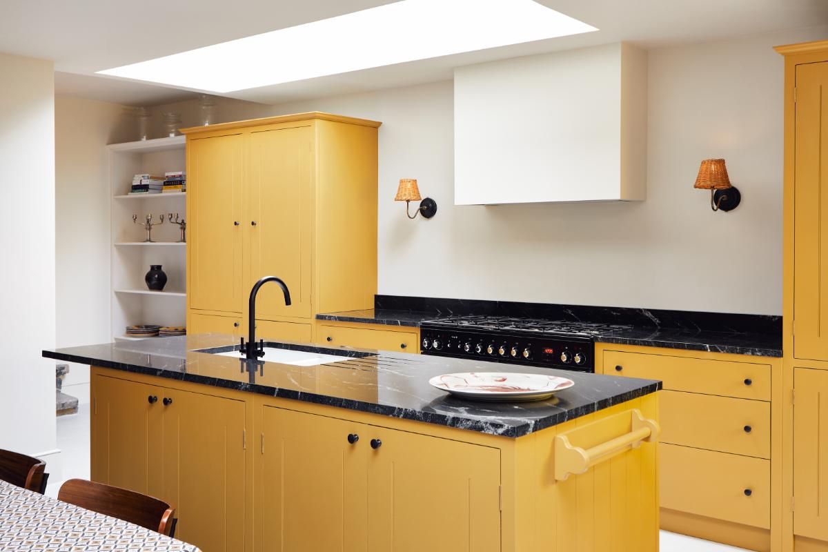
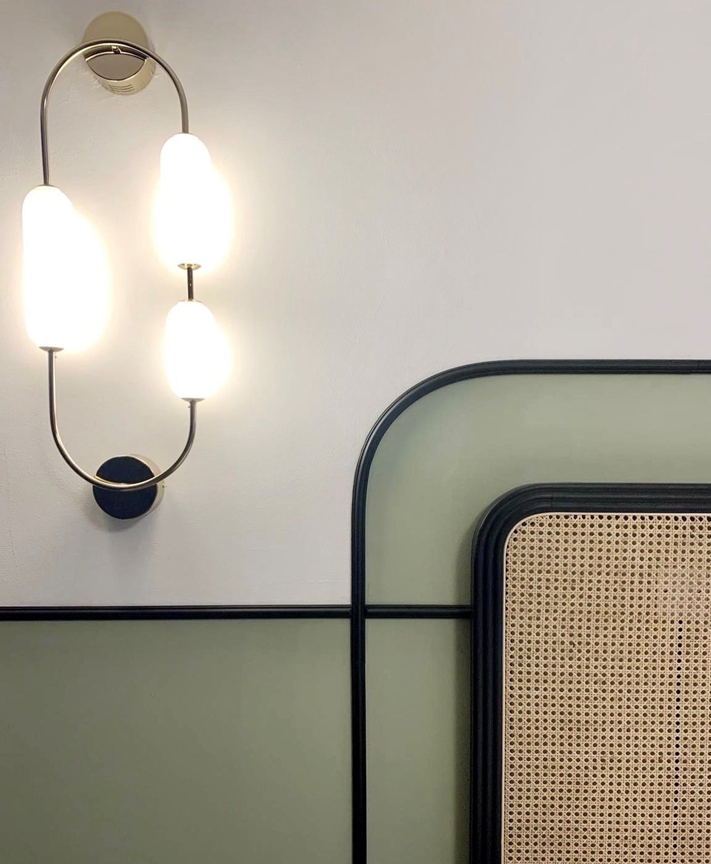
CABINETRY in Freegrove MUSTARD, WITH WALLS IN HONEST JOHN™ NO.58
Tips on using warm neutral paint colours
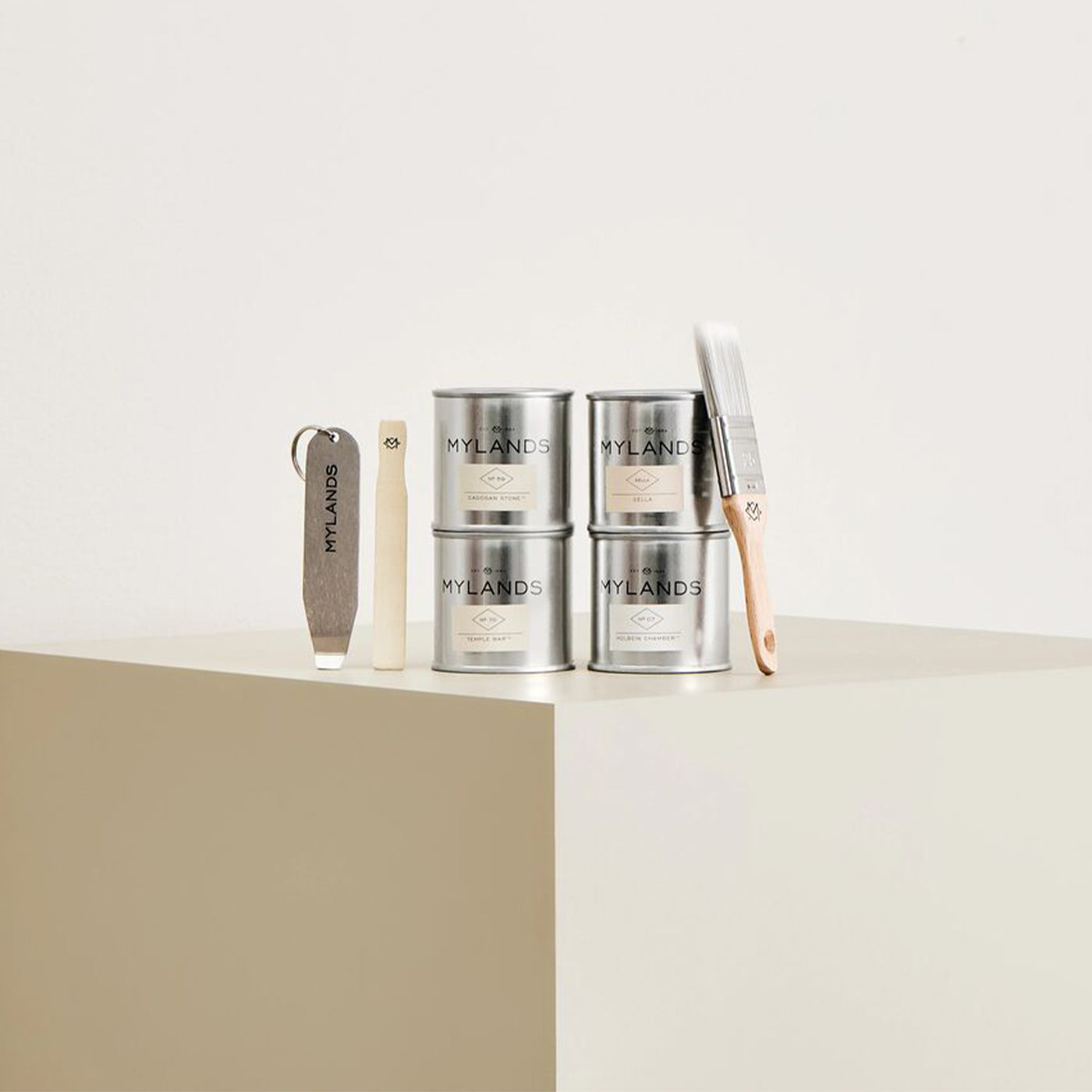
The main thing to consider when choosing a neutral is the amount of natural light in that room. We recommend using sample pots to test out the shade before you paint an entire living space. Neutral tones can look different with varying amounts of light. Check it at different times of day and with artificial light too. All of those factors will affect its appearance and will help you to decide which neutral shade works best.
Also consider the furniture and furnishings in the room. How does the neutral colour look next to the woodwork, the sofa, the textiles and the flooring? Will it provide the perfect backdrop to your artwork? Warm neutrals can act like chameleons, adjusting their colour according to their surroundings!


Walls and Ceilings in Sella - @sella.concept
What are the best warm neutral paints for a warm room?
Painting a warm room with a warm paint colour can equal scorching point! Whilst streams of natural sunlight can feel wonderful, you need to offset it with the right neutral palette. Opt for a warm neutral that is on the less toasty end of the scale.
Yellow undertones can bring too much sunshine to an already sunny, warm room. These hues can look more brown than yellow in warm rooms. Balance the room’s interior design with off-white or a neutral with green or stone undertones.
The warm and light living space pictured uses Mylands' Alderman™ No.60. It’s a soft, earthy neutral paint colour with a green undertone. It feels calming and gentle.

Walls in Alderman™ No.60 - @Claudiainteriors
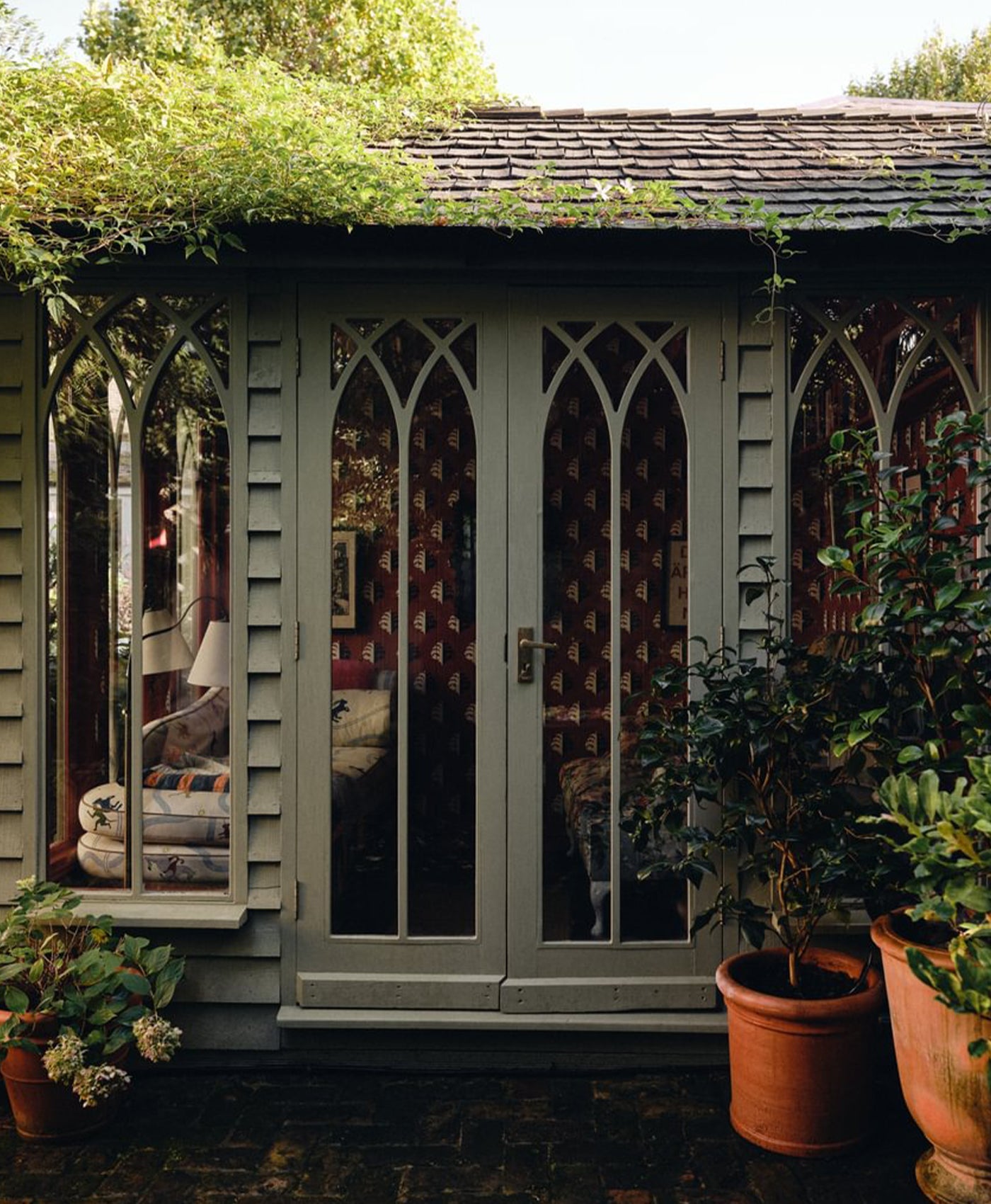
Which warm neutral paints work best in a cool room?
If you’re decorating a naturally cool room, avoid bright white or neutrals with blue or green undertones. They can exaggerate the feeling of coldness. They may look more dull and lifeless too. Try warmer neutrals with red, pink or yellow notes to lift the room. The coolness could come from a north-facing aspect or perhaps a shaded entryway, devoid of much natural light.
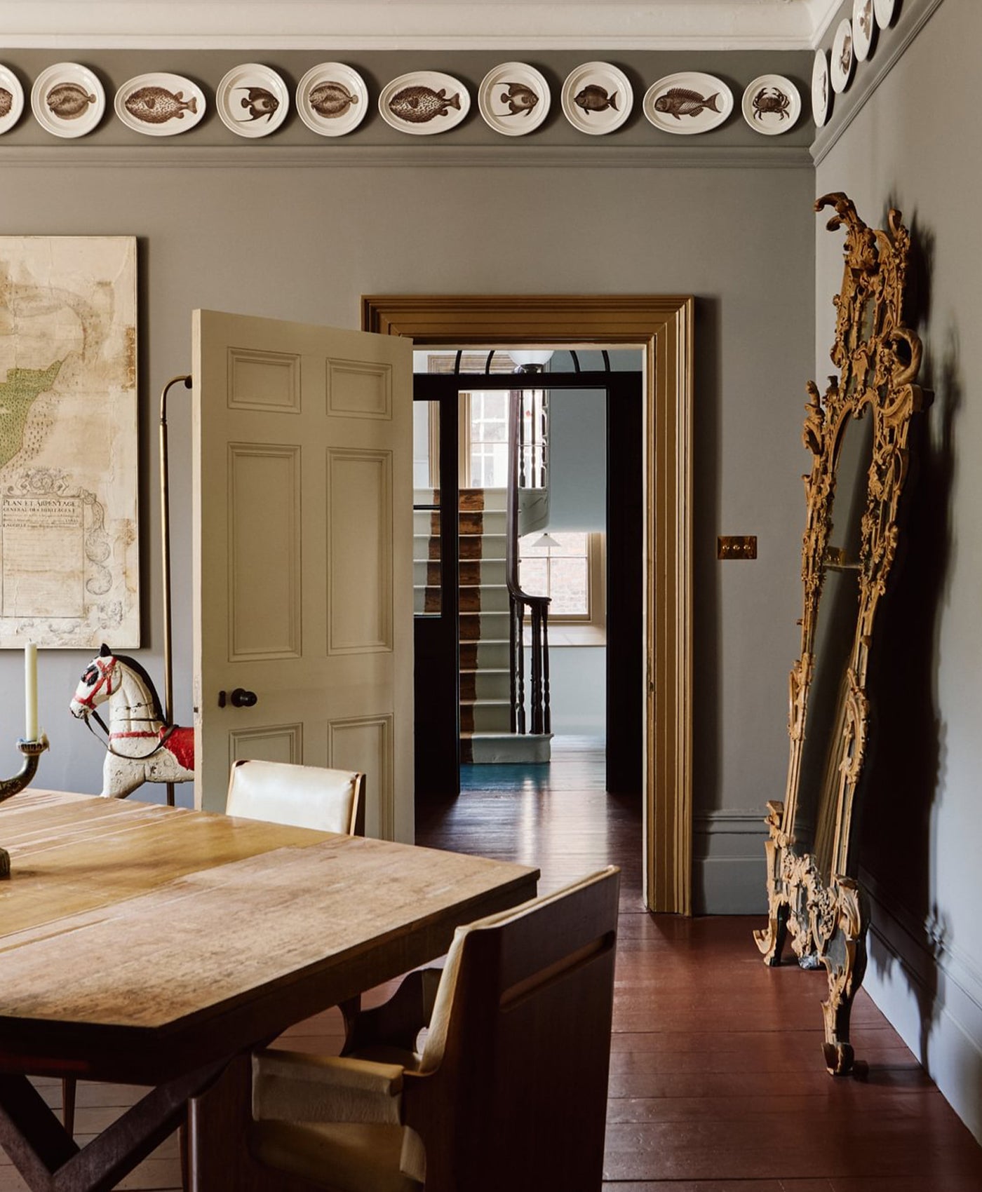
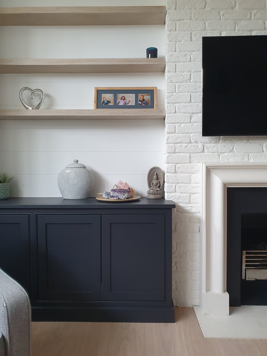
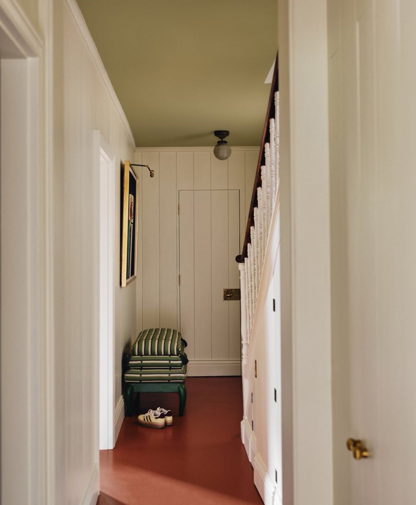
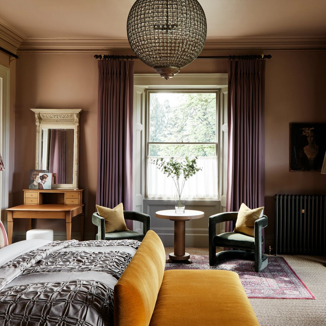
In the cool, shaded living room pictured, the wall colour is Mylands' Honest John™ No.58. It’s a warm, stone colour which is far less stark than the pure white used on the ceilings and woodwork.

Walls in Honest John™ No.58, Skirting in Temple Bar™ No.70, Ceiling in Charterhouse™ No.4, French Doors in Hoxton Grey™ No.72
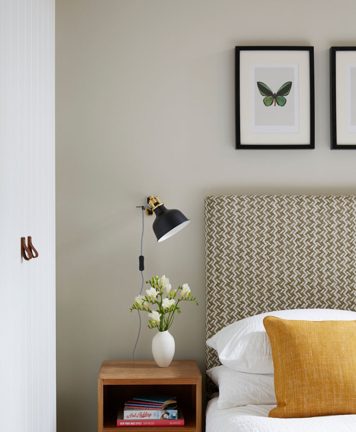
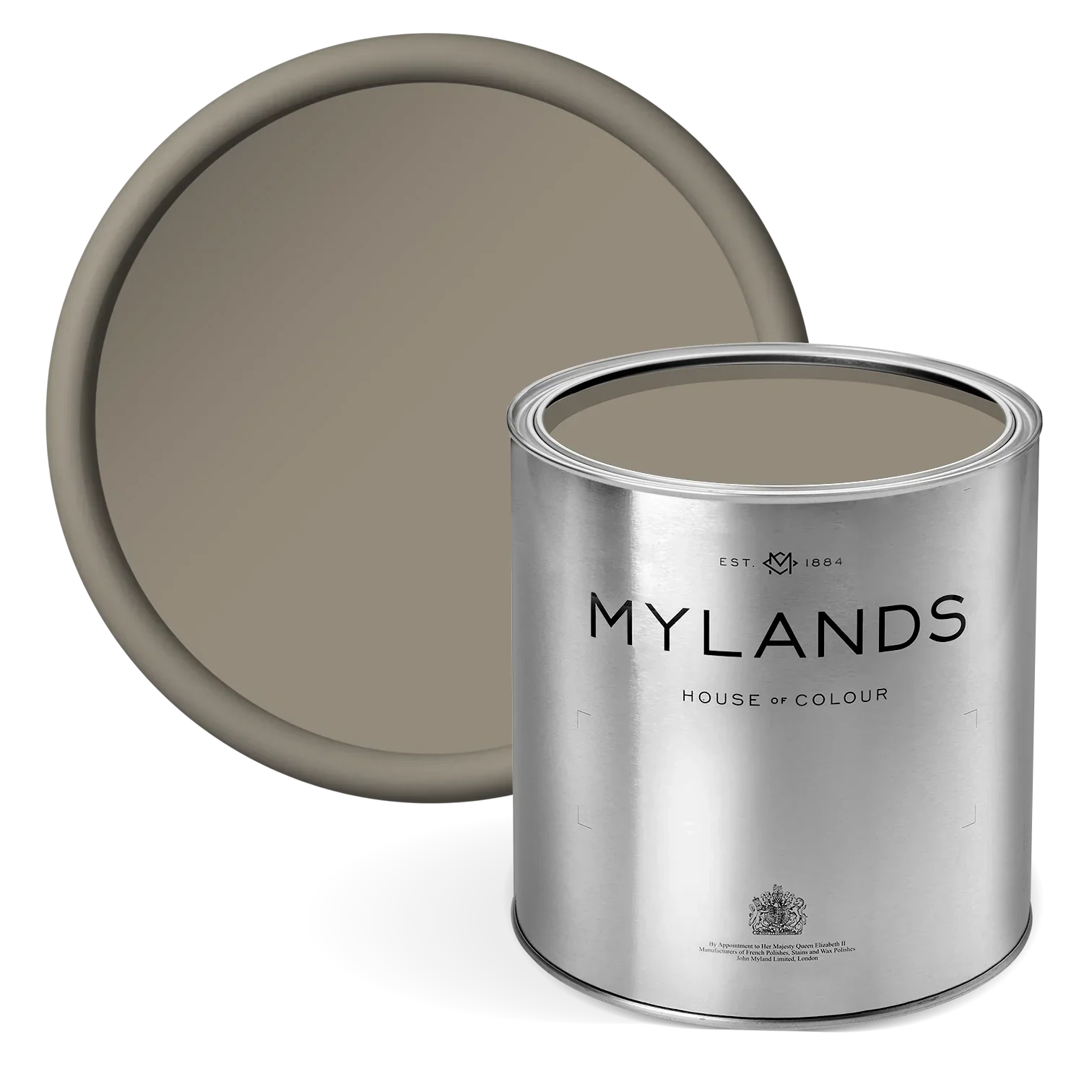
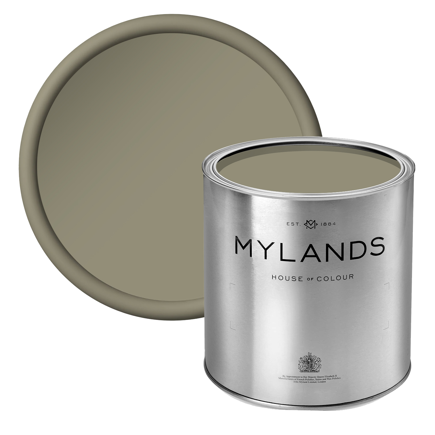
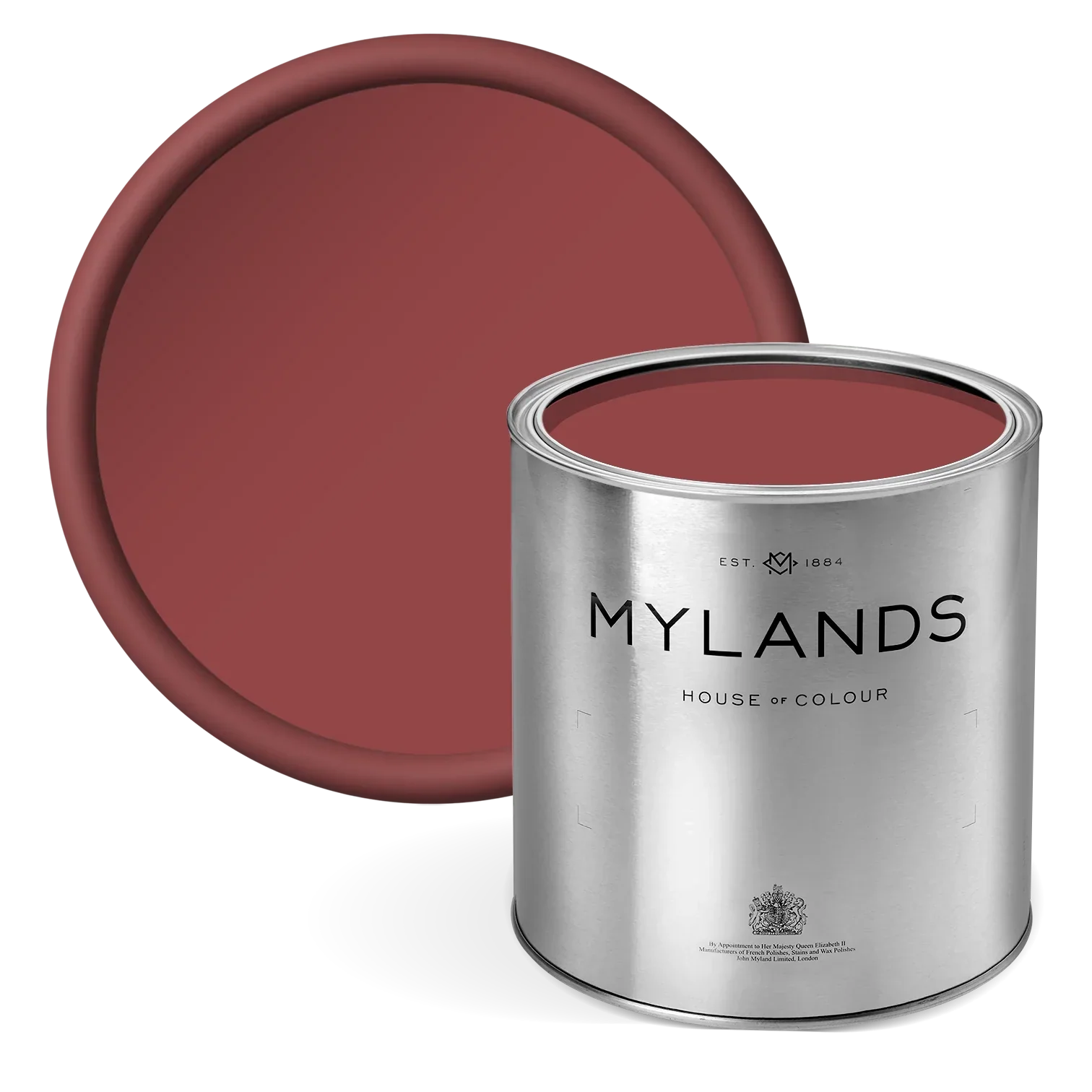
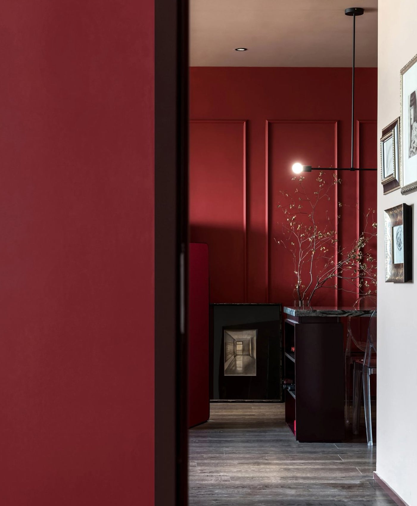
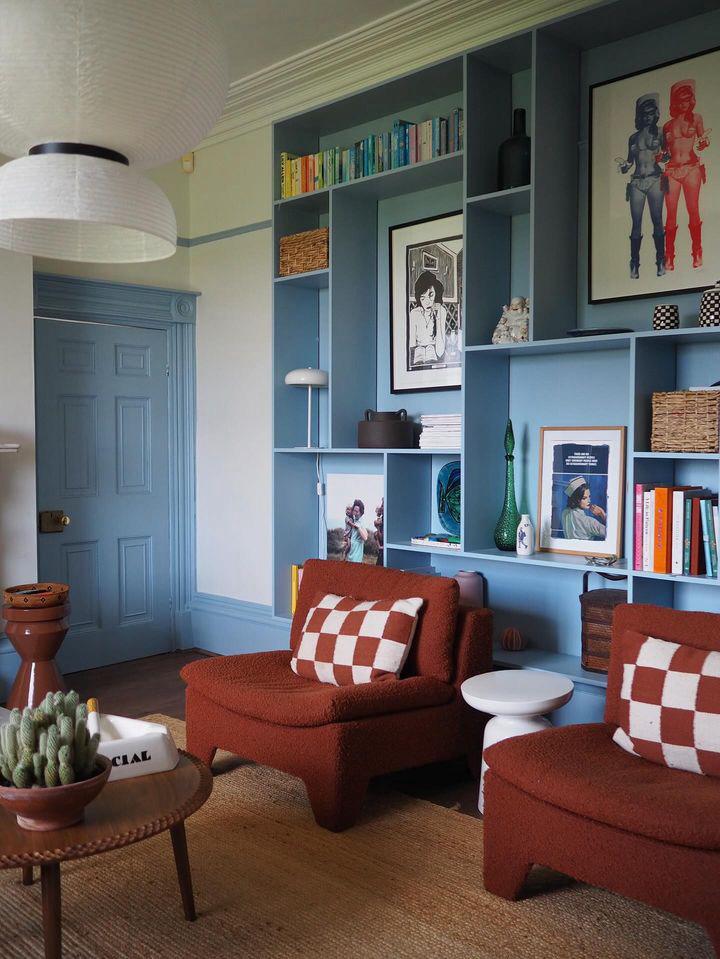
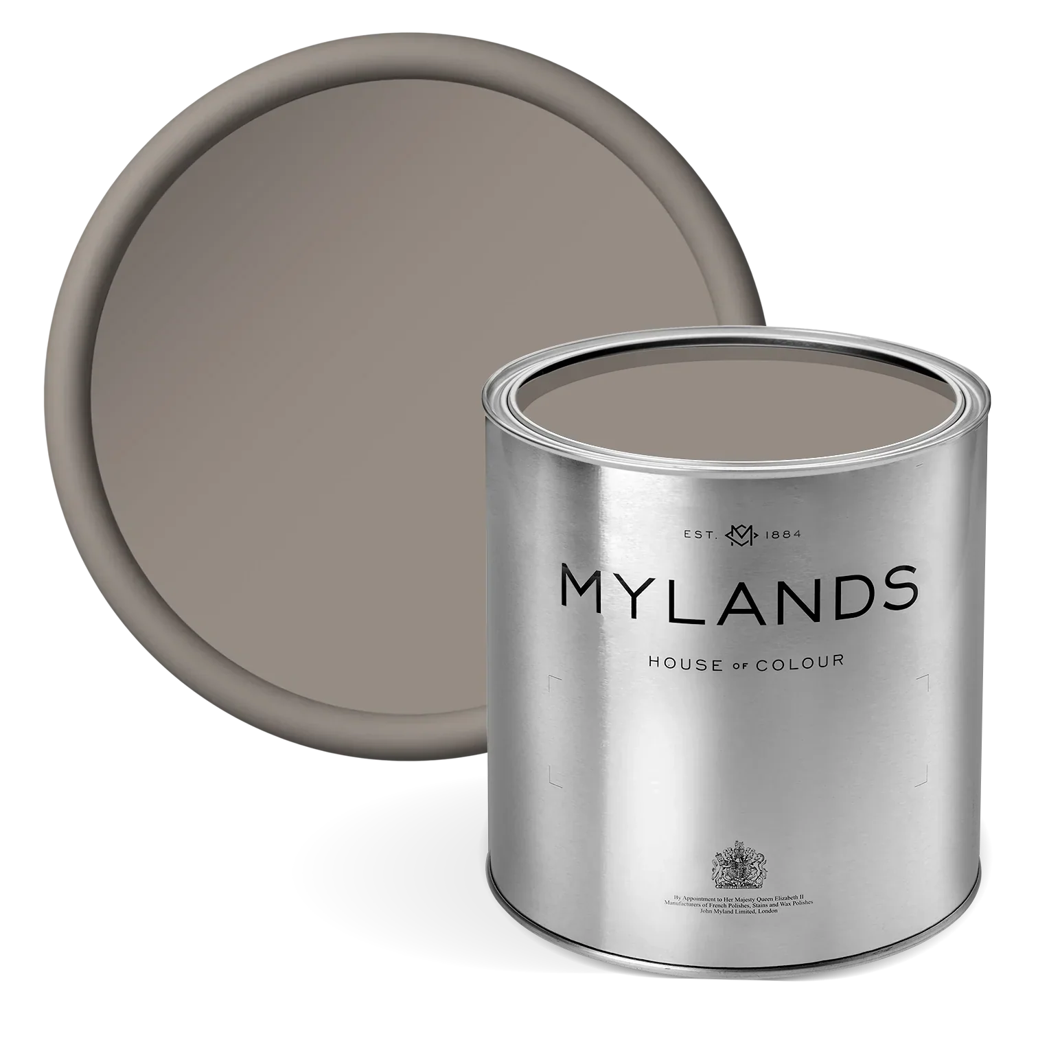
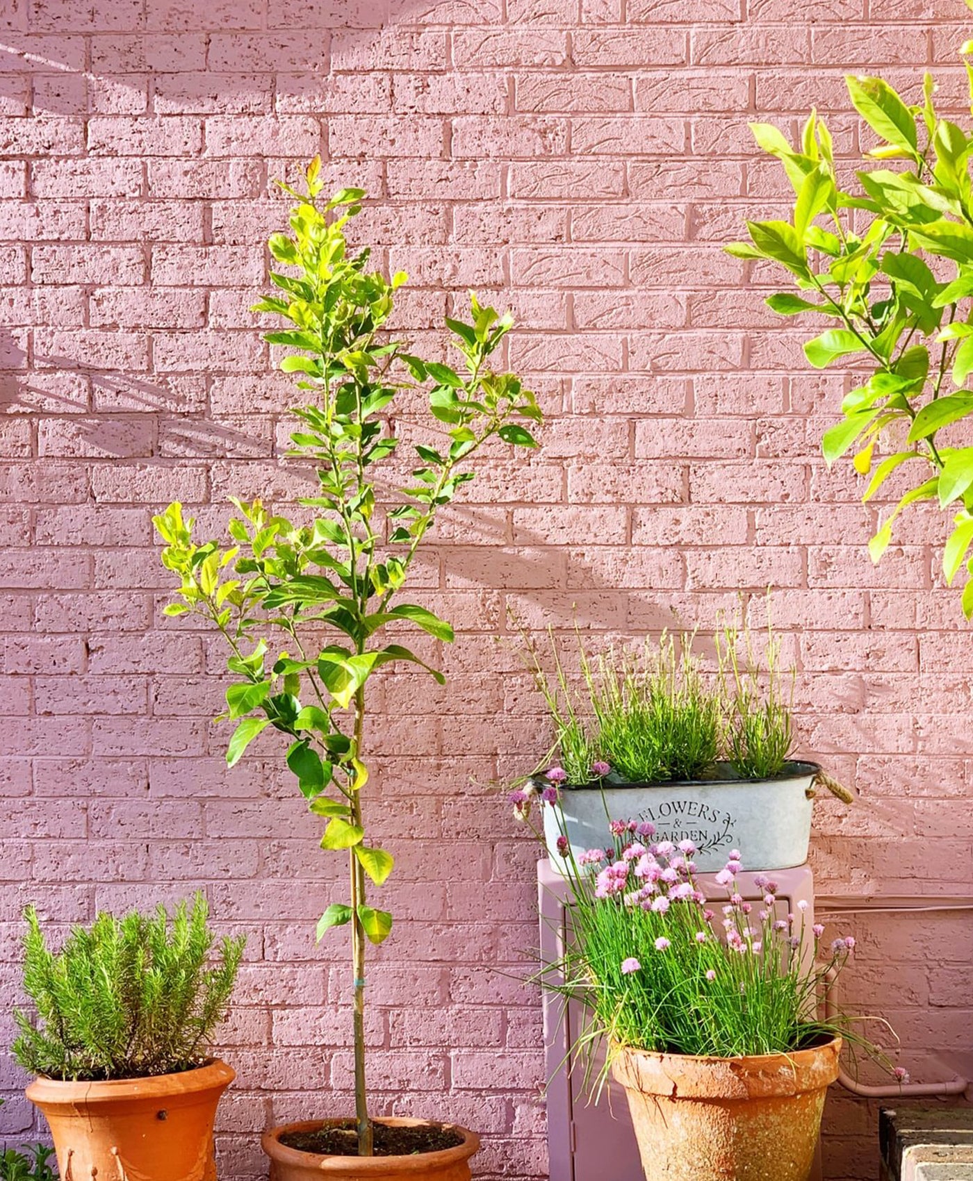
This kitchen is not flooded in natural sunlight, so the warm neutral works perfectly as the wall colour. It’s Mylands Grouse™ No.75 which has red and umber tones. In this picture it appears almost blush, yet in other lights it looks more taupe. Hence the tip to test the colour swatch before applying.

Walls in Grouse™ No.75, Upper walls in Pediment™ No.73 - @Design_Soda_Ruthie
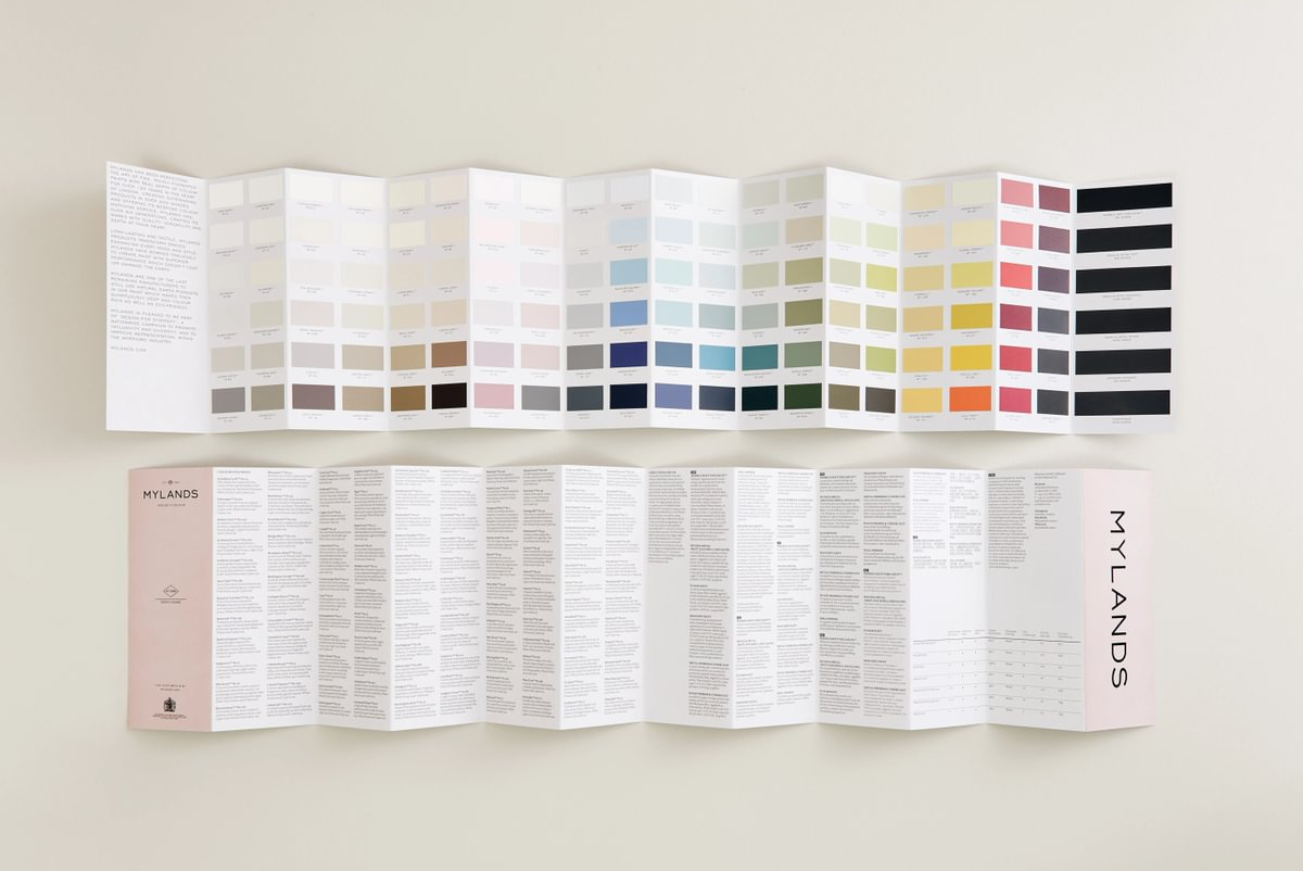
Some of our favourite neutral paint colours
Which undertone do you lean towards? Which neutral tone would work best in your room? We’ll help you find your perfect neutral colour palette with these suggestions and expert tips.
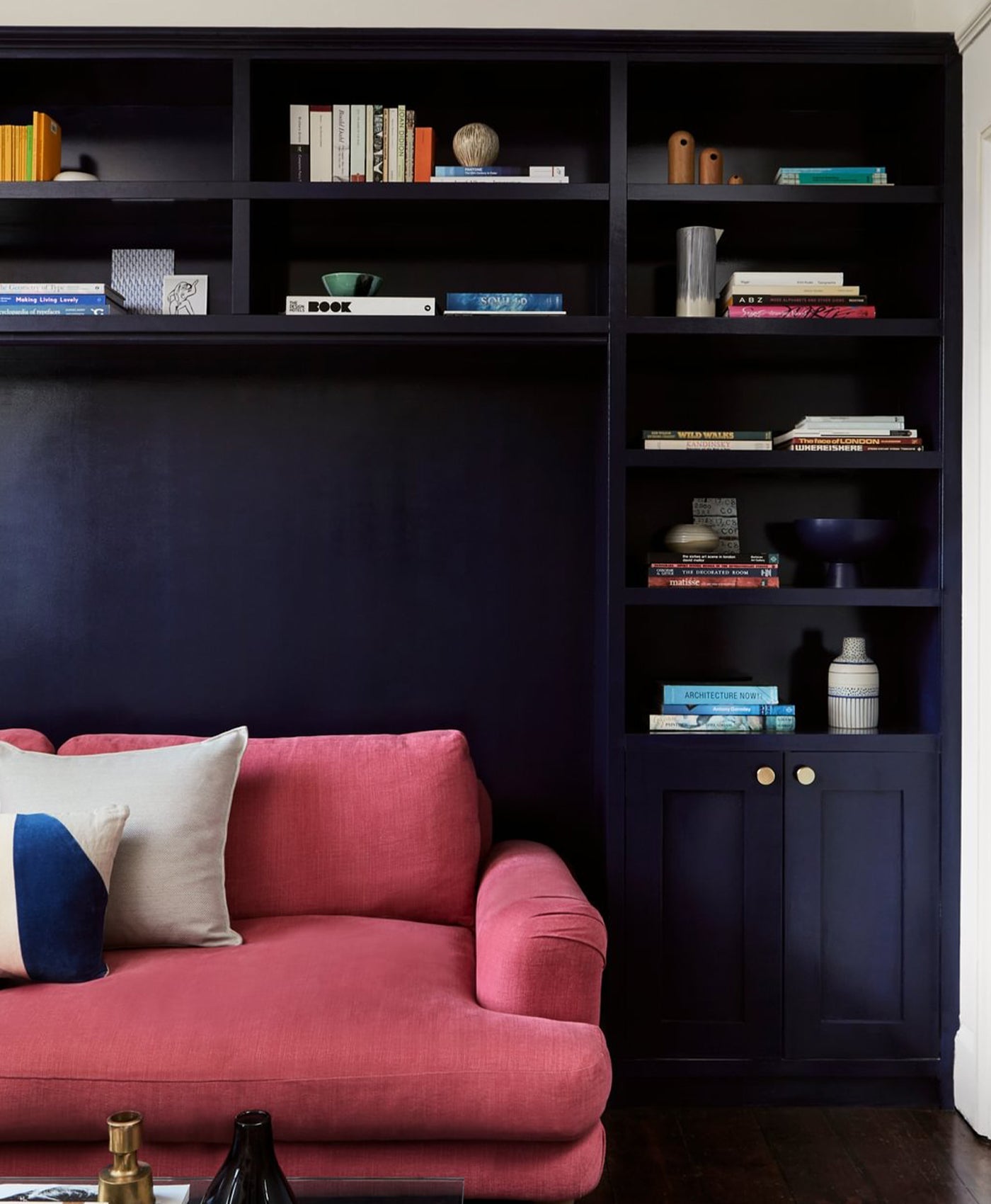
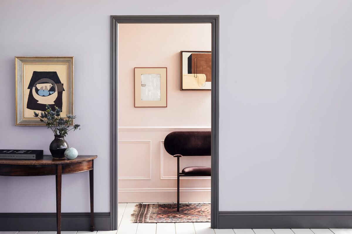
Pink undertone
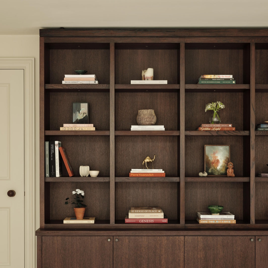
We’re not talking pastel pink here. A warm neutral with pink is more muted. Mylands Threadneedle™ No.262 is a subtle, blush pink. In some lights, it can appear slightly grey. Here it lifts the feeling of the room, providing a contrast to the other neutral tones in the home decor.

Walls in Threadneedle™ No.262, Bookshelves in Soho House™ No.266, Skirting in Temple Bar™ No.70
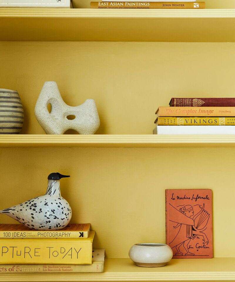
Yellow undertone
Yellow is such a positive, uplifting colour. Here, it adds a hint of soft, warming yellow. Think natural, organic straw or sand colours rather than bright sunflower yellow.
Wall in Lots Road™ No.24
Grey undertone
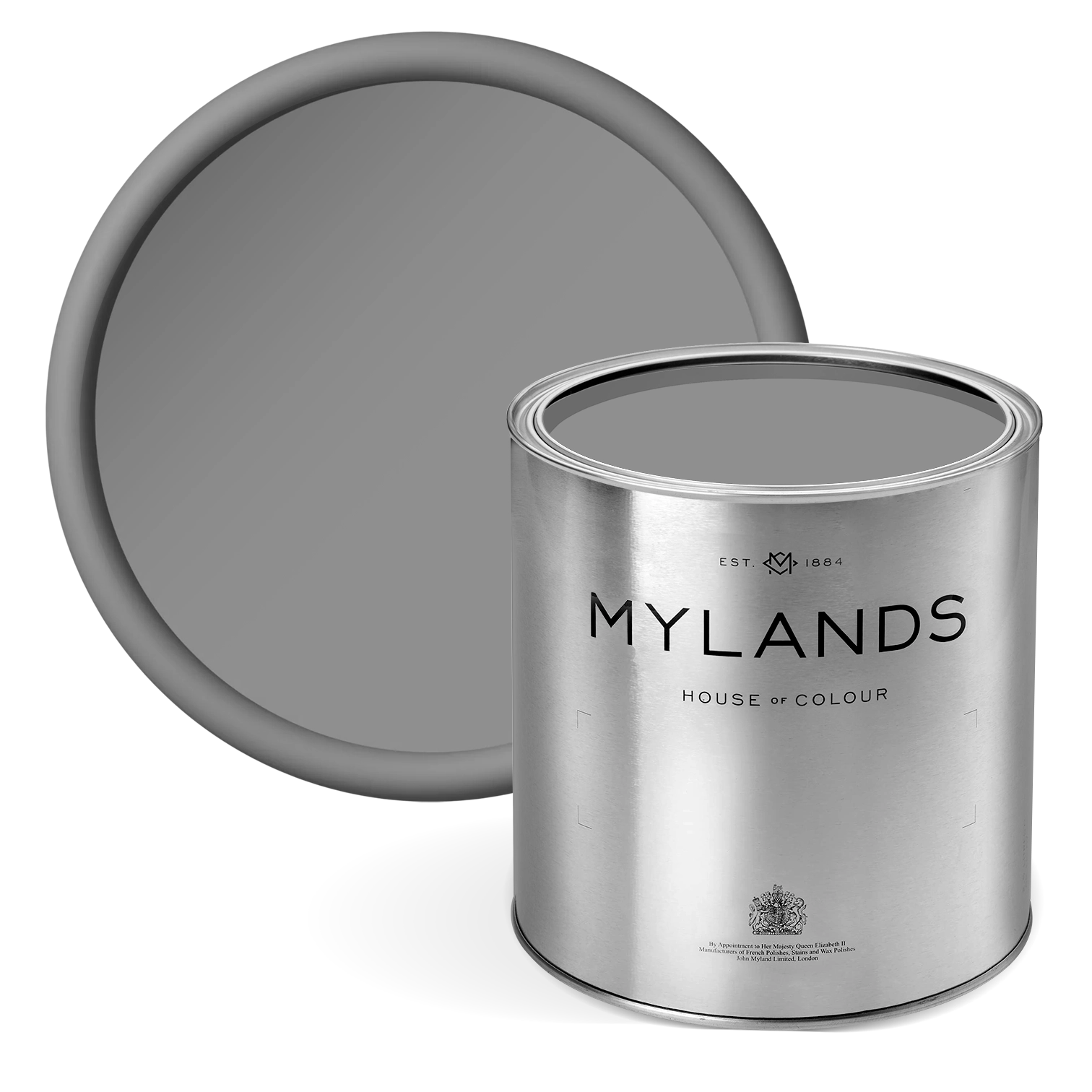
You may think that grey would be a cool neutral, and you’d be right. But a grey with umber or brown undertones will add a degree of warmth. It can create a very calming mood, and a classic, refined sophistication. Mylands Hoxton Grey™ No.72 ticks all of those boxes. It combines grey with the warmth of brown and umber to create a perfect warm neutral.

Walls in Hoxton Grey™ No.72 - @violetandgeorge
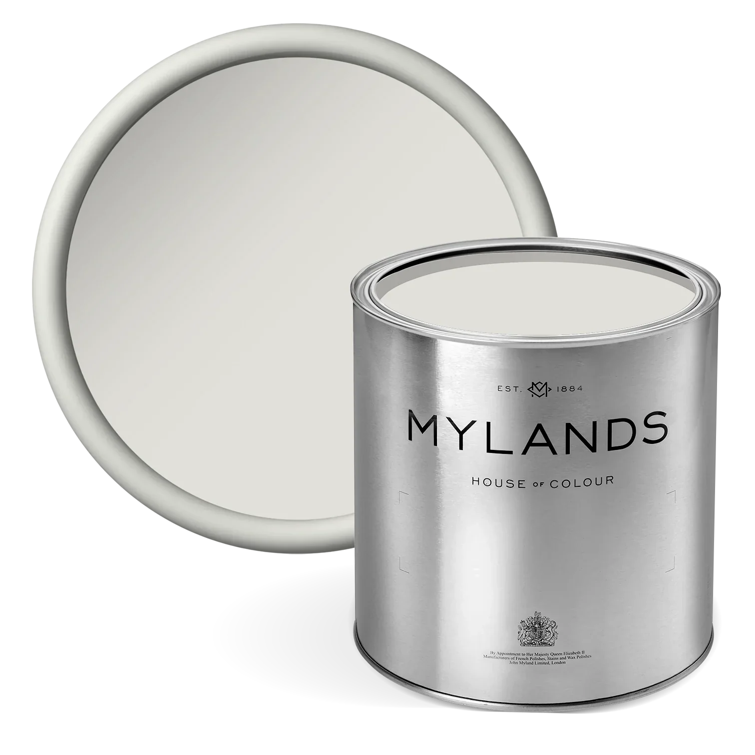
Stone neutral colour
This warm and earthy neutral fits into a natural colour scheme. It works well with organic features and textures like wooden floors and furniture, plants and brick or earthy tiling. In this photo, Mylands Temple Bar™ No.70 paint brings a cashmere-soft feel. It’s less harsh and bright than pure white, benefiting from a chalky finish. It’s a perfect colour for this living space, flowing from kitchen to dining room.

Island in Brompton Road No.205, Cabinetry in Temple Bar No.70 - @whistablefurniturepaintingco
Look through our range of neutral paint colours. If you’re choosing a white paint for your home, don’t miss our guide on what to consider.