Which colours go well with pink? - Mylands
Using pink colours has increased in popularity as a home decor trend in recent years. No longer the preserve of little girls’ bedrooms, pink is a wonderfully versatile colour to decorate with. It can be a really grown-up, sophisticated choice. It’s a warm, welcoming and cheerful colour and we all need more of those qualities in our lives.
There’s such a range of pink hues to choose from, and consequently, lots of colours to pair with pink. Pink ranges from vibrant, warm colours like bubblegum pink to cool lilac tones.
Here are our top ten colours to match with pink. Plus, we share our tips on how to style your rooms with these gorgeous pink looks.

Walls in Threadneedle™ No.262, Bookshelves in Soho House™ No.266, Skirting in Temple Bar™ No.70
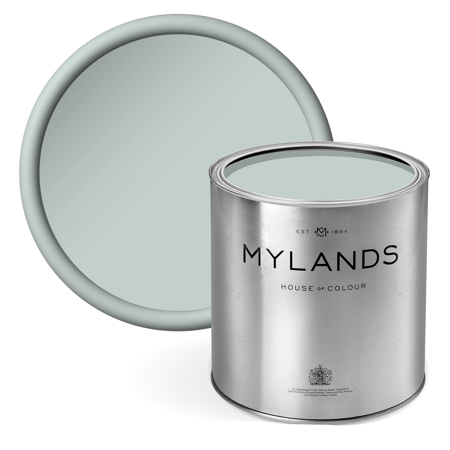
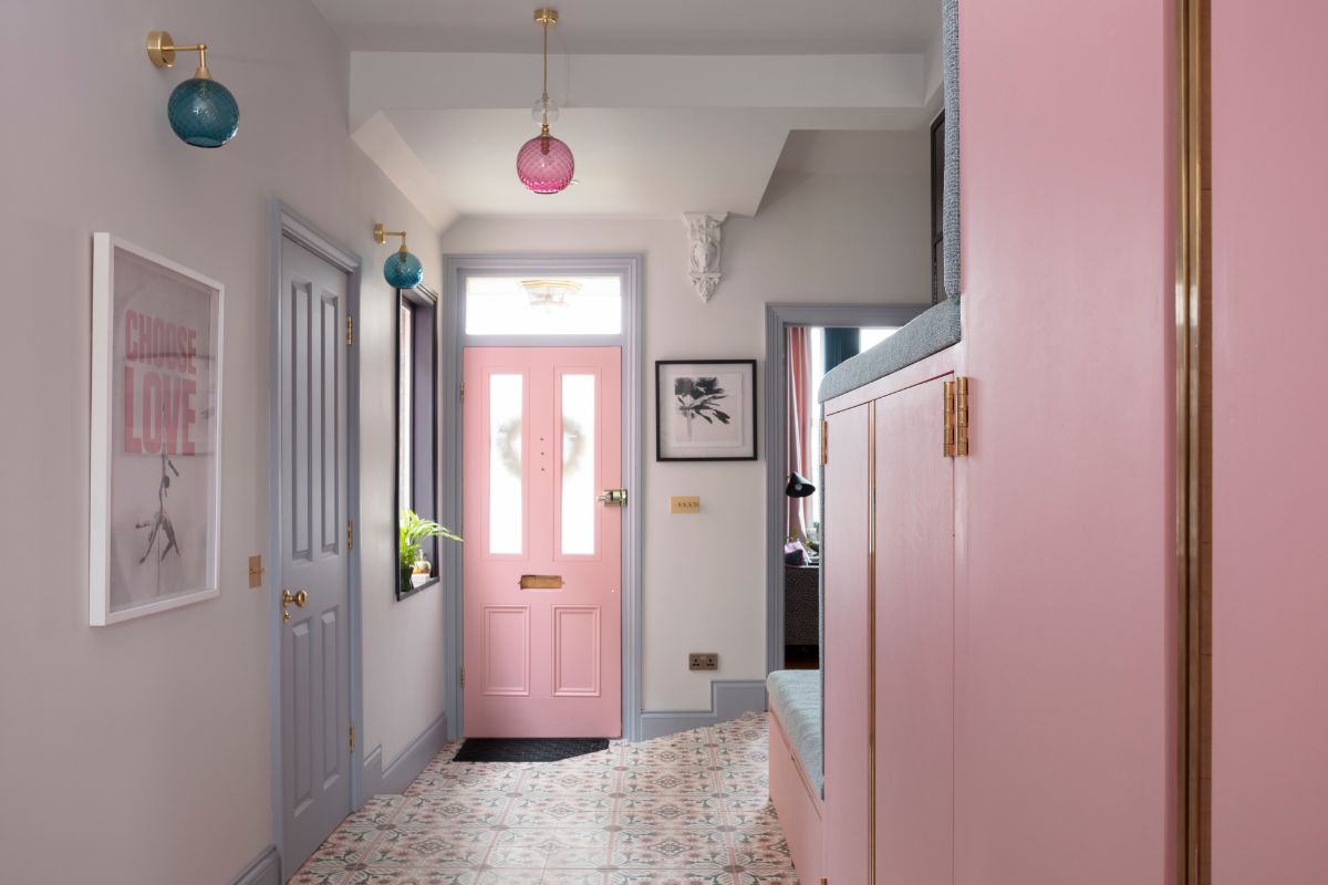
Pastel pink and pale blue
You may think pastel pinks and blues are only colour choices for baby clothes and nurseries. But this colour combination is cool, clean and light.
Pastel pink works beautifully with its opposite on the colour wheel. Clearly, opposites attract and play nicely, even though you may think they’d clash.
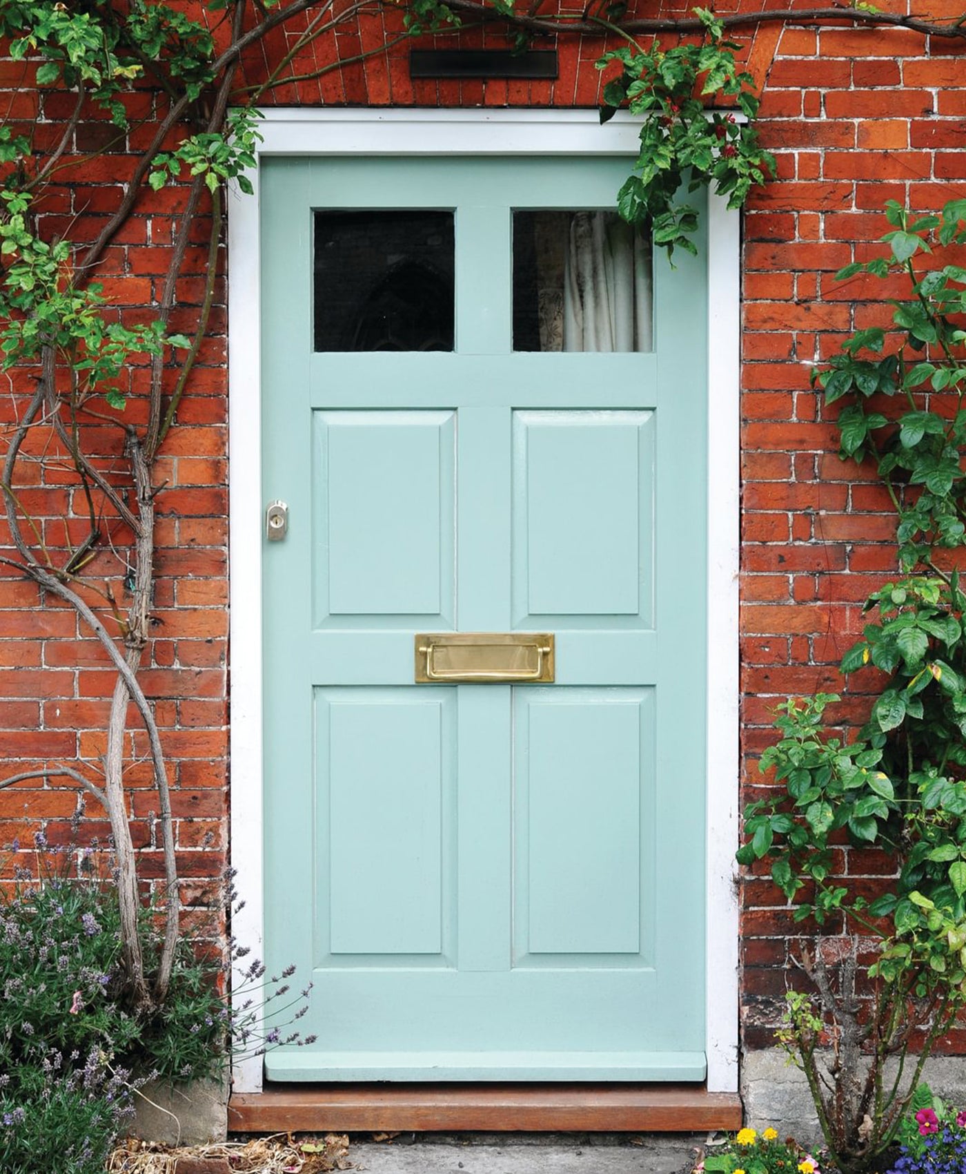
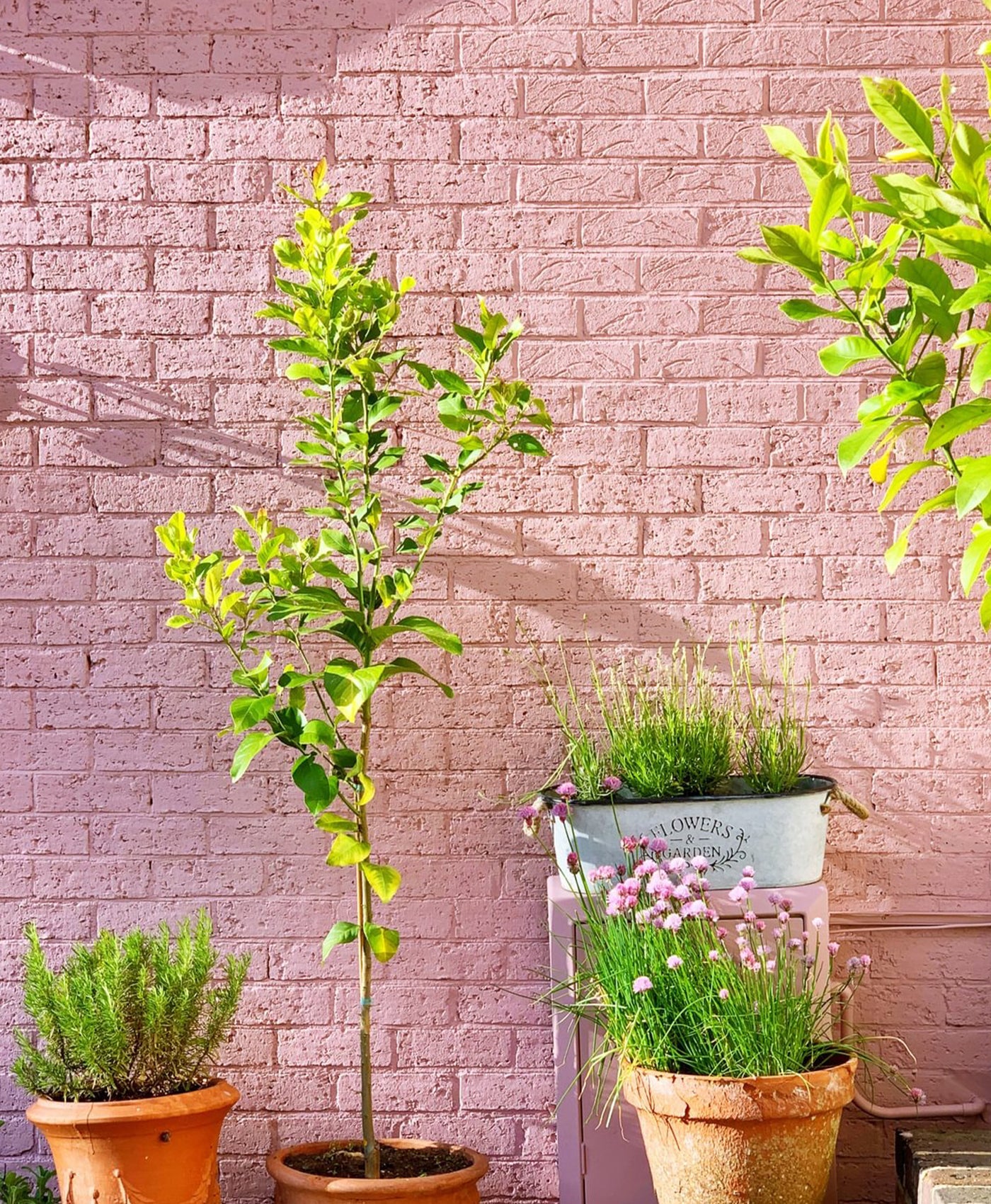
Baby pink and blue can create a calming and serene environment. These pale tones make a fresh and inviting entrance way as shown in the photo below. Here, Mylands' Pink House Pink paint adds a cheeriness to the room. What better feeling to evoke when friends and family come to visit?
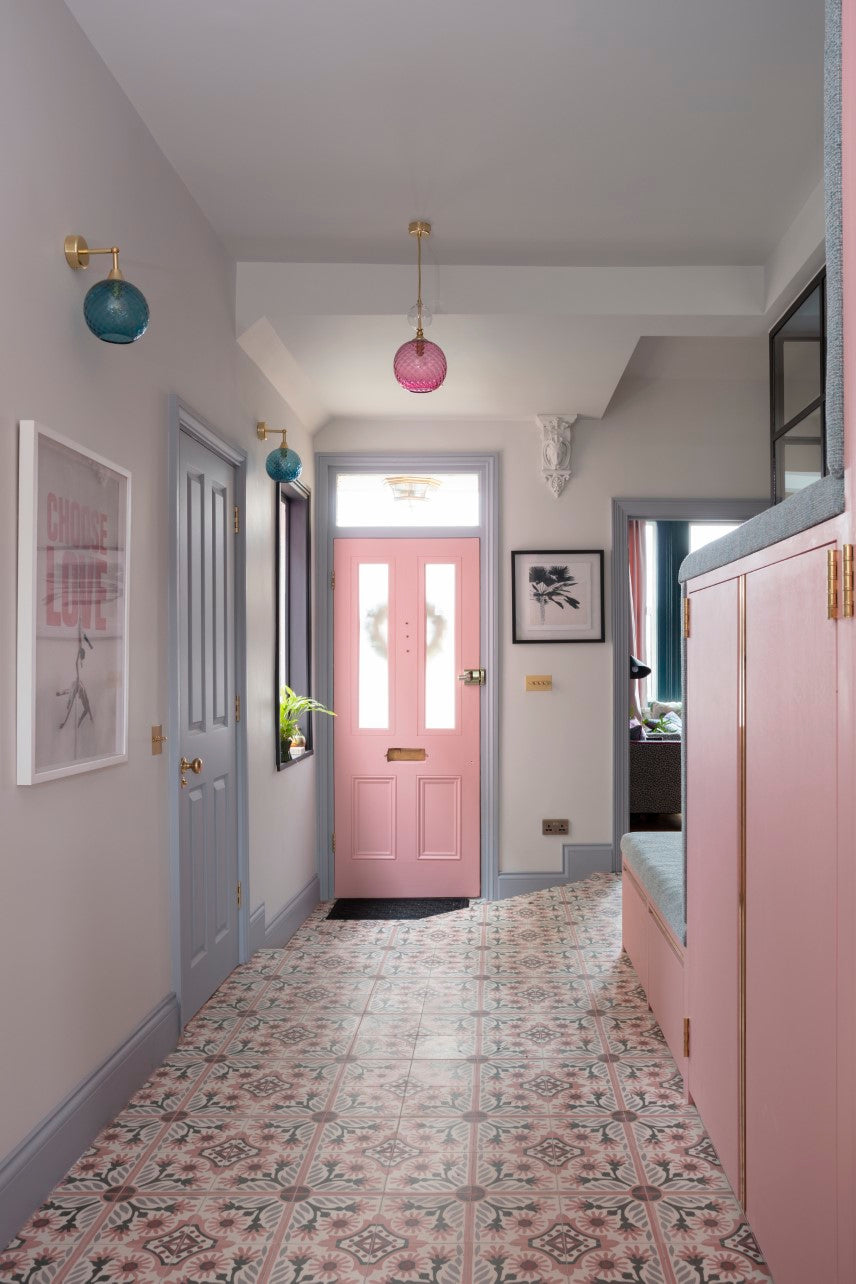
Woodwork in Pink House Pink and Mid Wedgwood™ No.113, Walls in Belgravia™ No.6 - @pinkhouseliving @susielowestudio

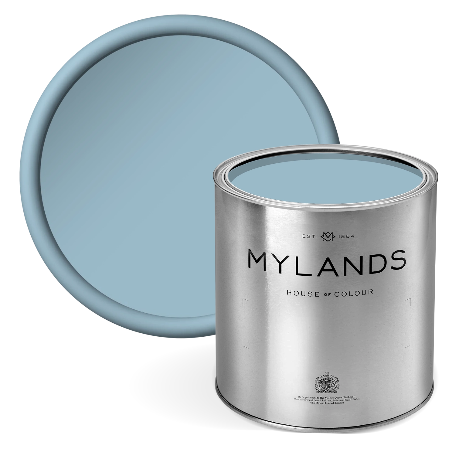
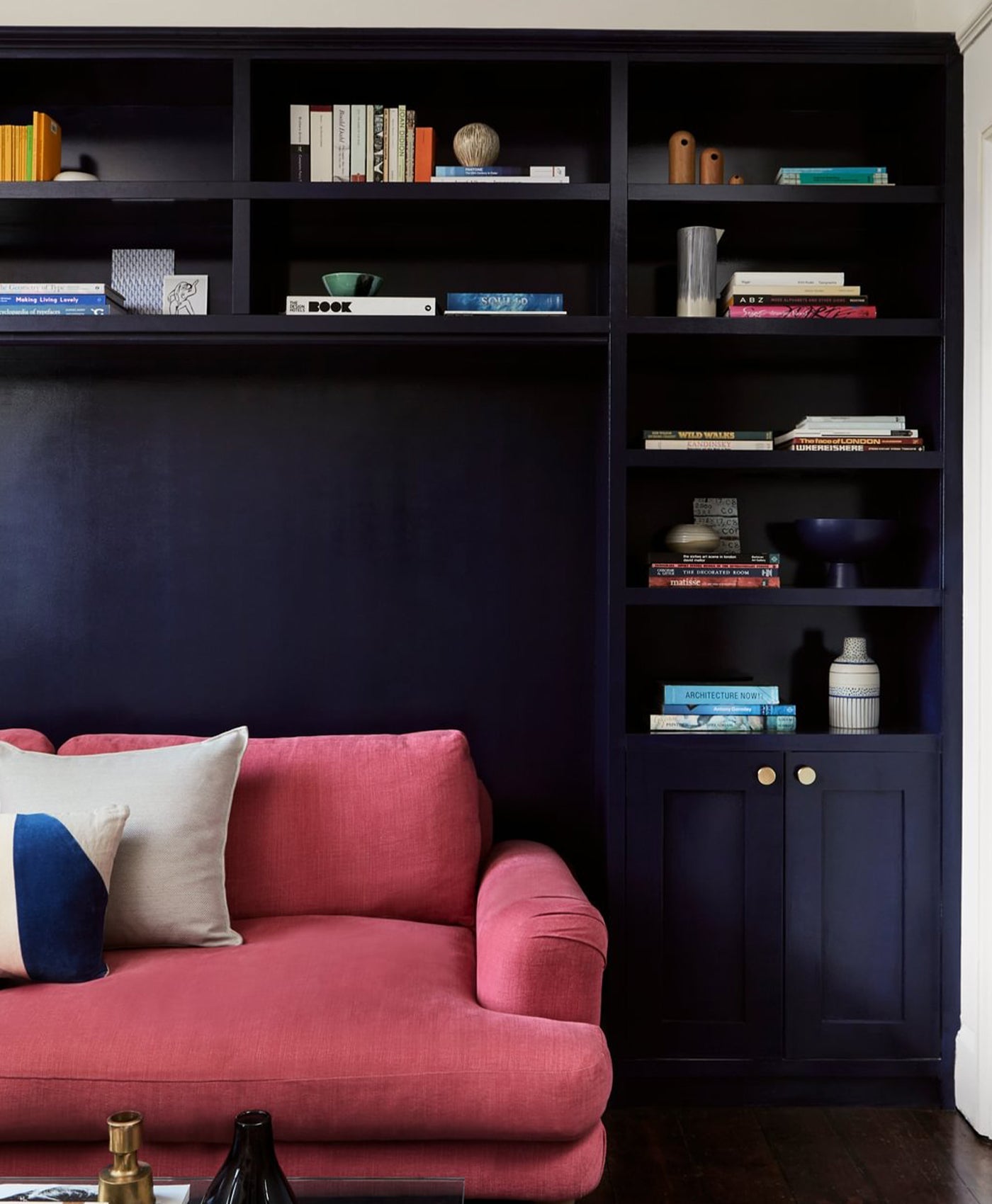
Pale pink and dark blue
Pale pink is one of the more neutral pink colours. It’s subtle and soft. As such, it lends itself to having an accent colour which adds some depth.
Dark blue adds a bit of punch to a pale, neutral colour scheme. It’s a striking combination. It works really well in kitchens with navy blue such as on cabinetry or shelving that adds strength and impact against muted, soft pink walls.
Blush pink and teal
It’s a colour combination that shouldn’t go together, but it really does. The strong teal colour contrasts with the pretty shade of pink and ensures it doesn’t feel sickly sweet. Teal is an ideal accent colour to use on furniture or even just soft furnishings like cushions, throws and throw pillows.
Teal is definitely having its moment. It works in retro, mid-century style rooms or as a contemporary look. In this photo, the teal accent chair adds a pop of strong colour against the warm, blush pink walls painted in Mylands' Floris™ No.27 pink paint.
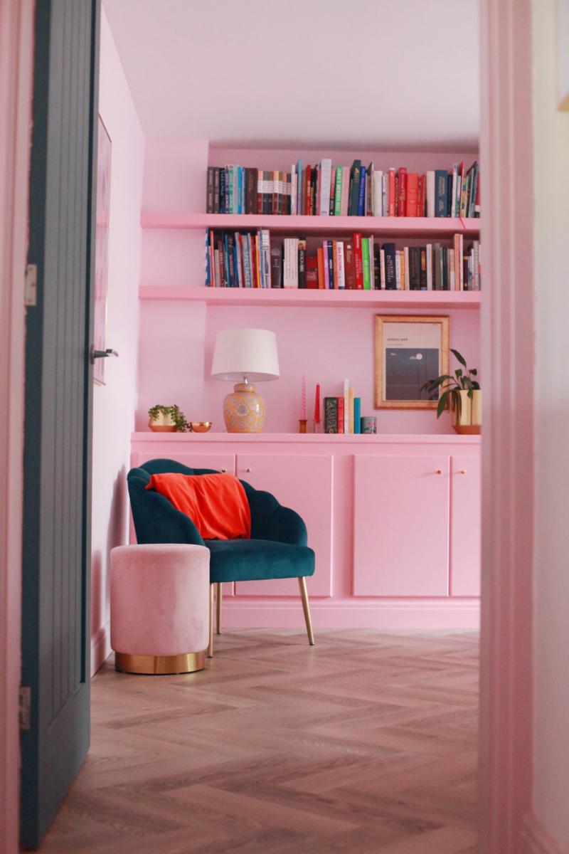
Walls in Floris™ No.27, woodwork in Pink House Pink - @halfpaintedhouse
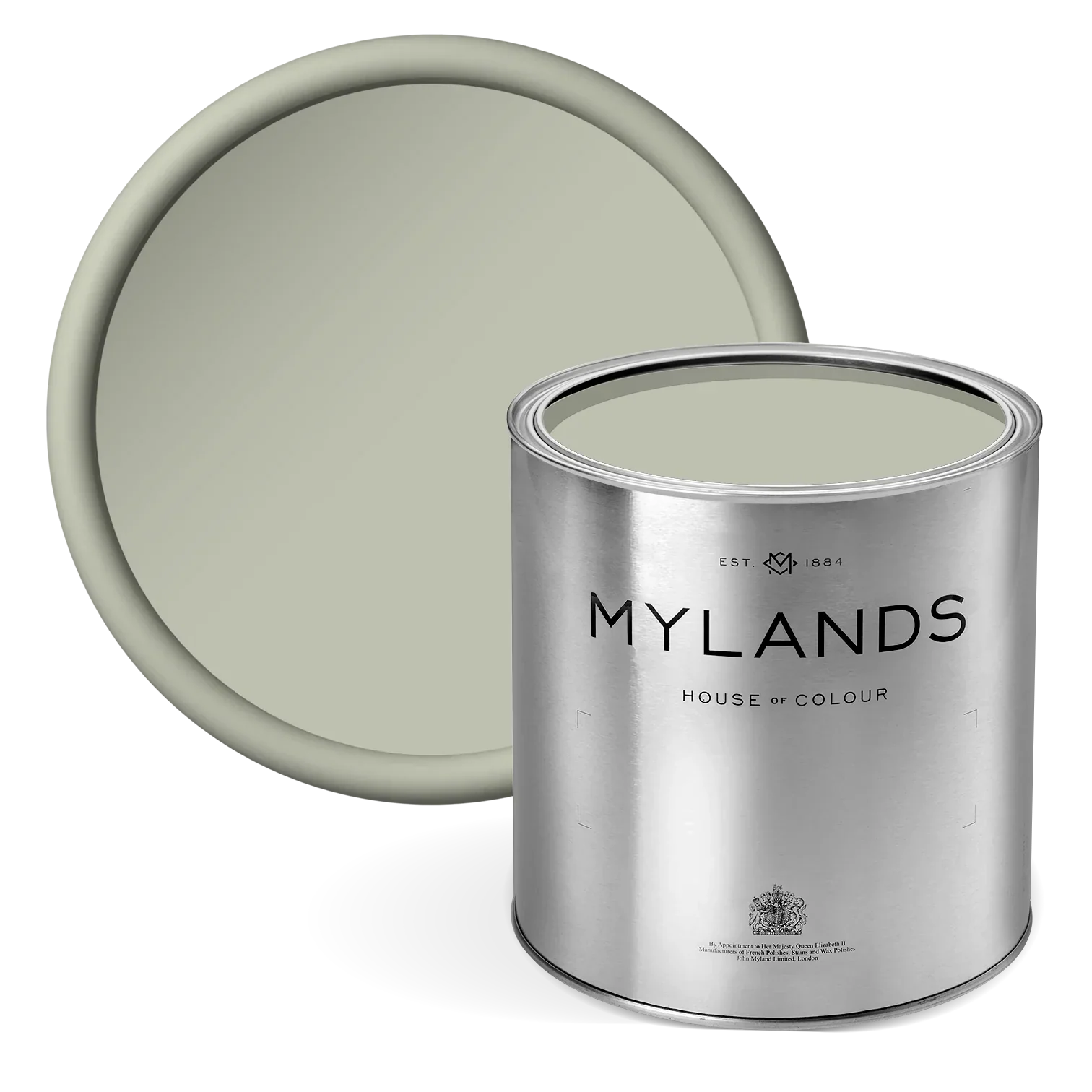
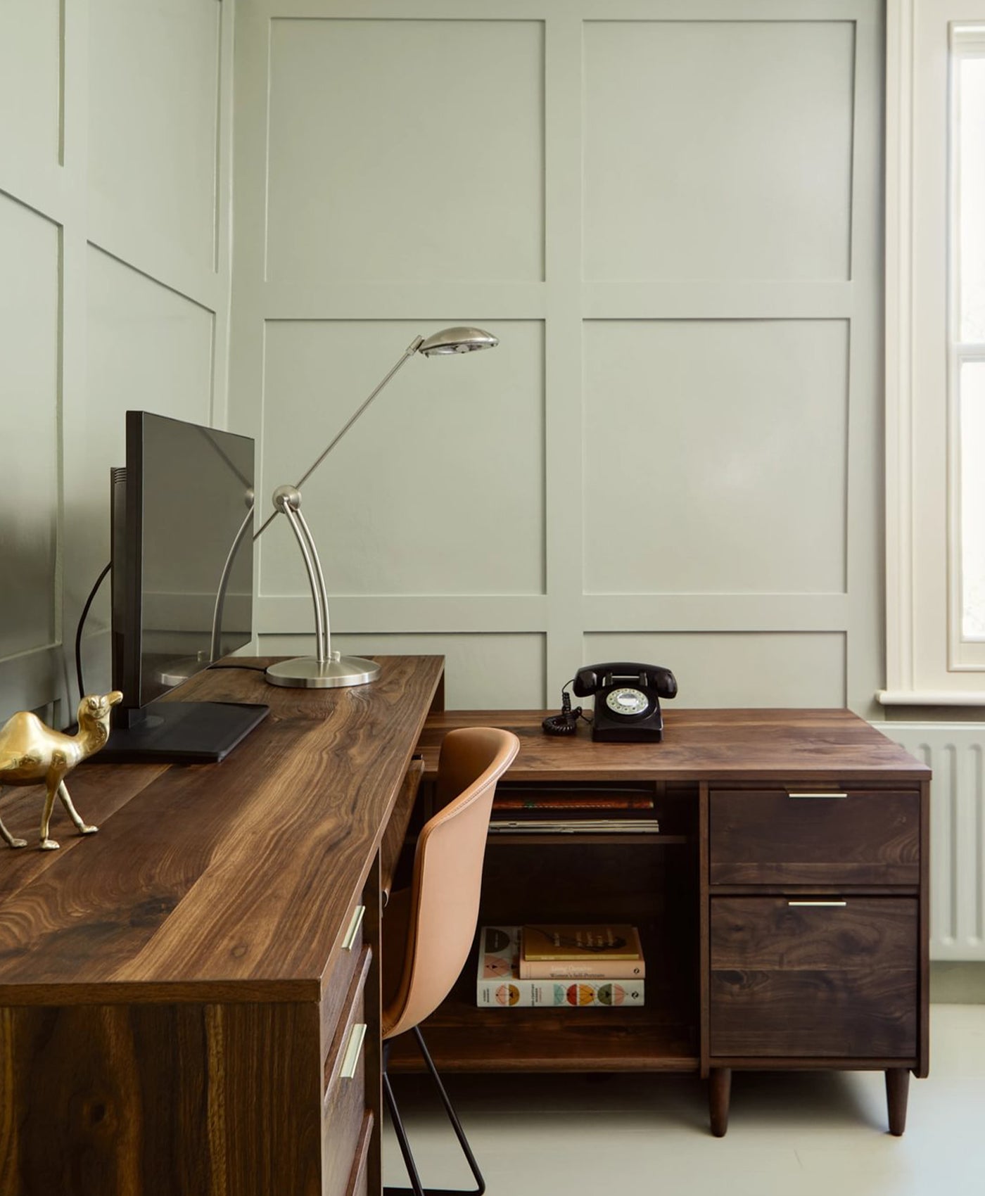
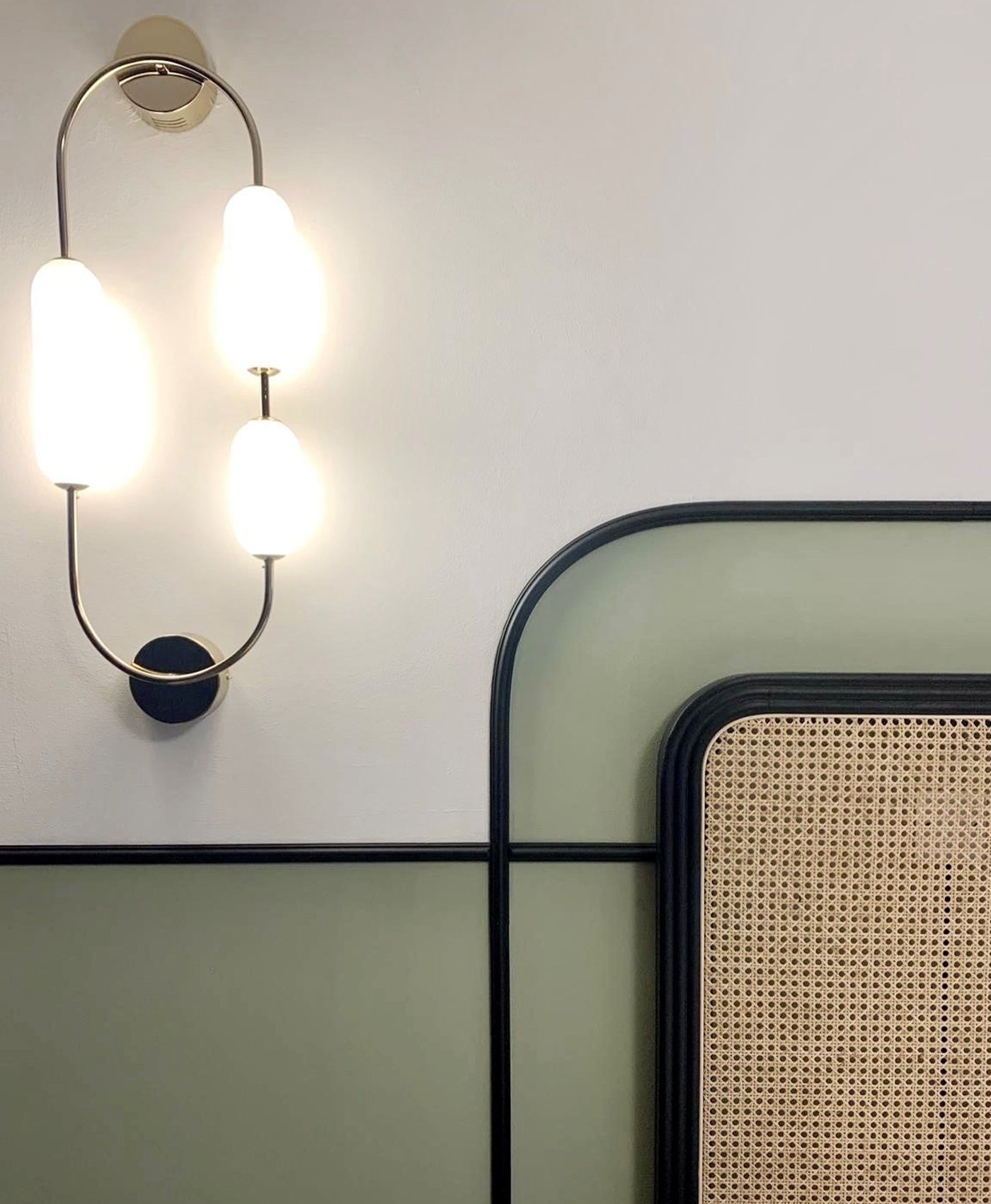
Dusty pink and natural green
Muted tones of sage green and pale pink make an absolutely beautiful colour combination. It reminds us of the natural world. Think of blossom on trees in Springtime or a fresh peony or rose in Summer.
Relaxing and calming green, with gentle, dreamy pink is an ideal choice for a bedroom. It also works well in bathrooms for the same reason. A pink bathroom may feel like a throwback to the 1960s and 70s. However, using pink and green on the walls rather than the bathroom suite will conjure up a more contemporary scheme.
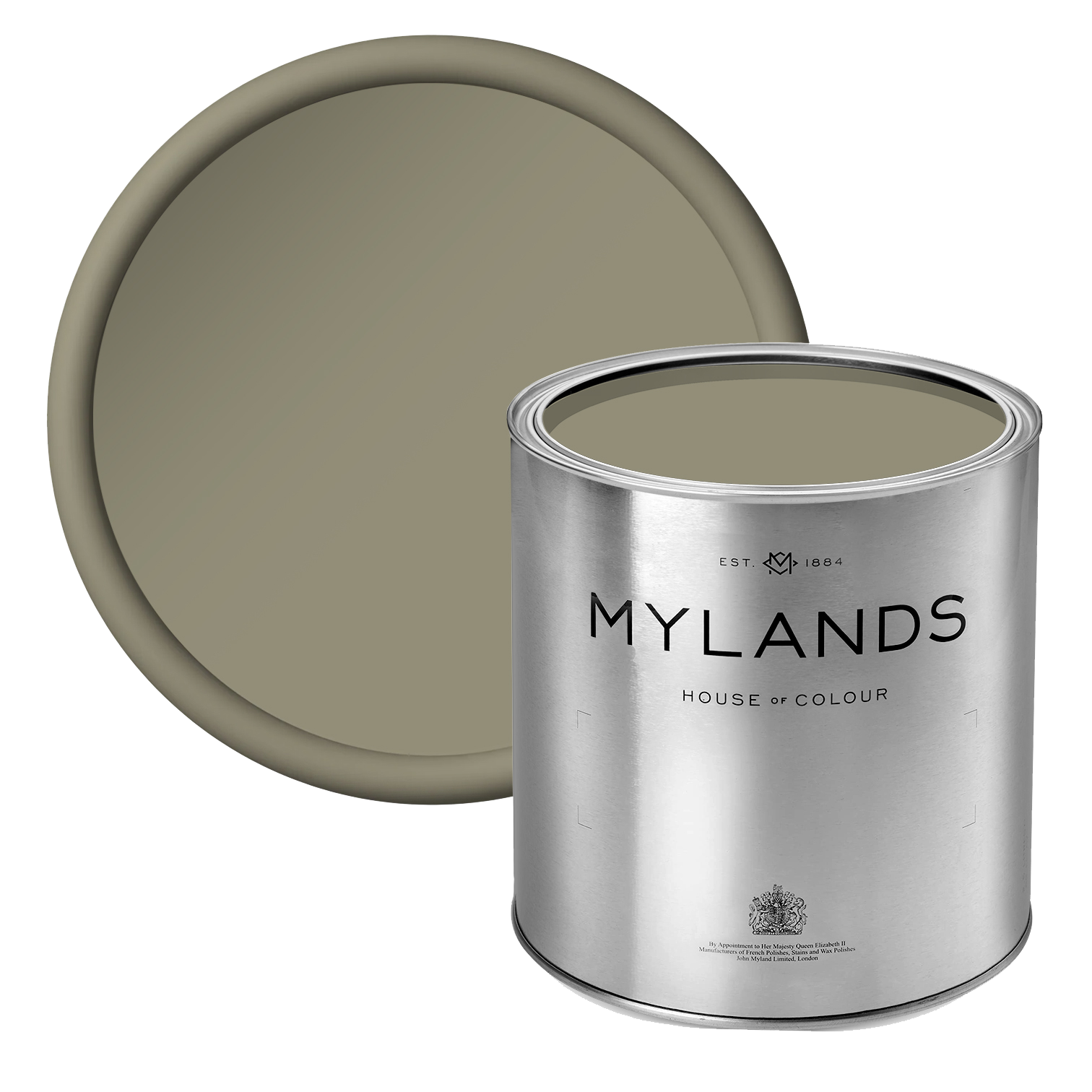
If you want to pump up the volume, use warm colours like emerald or olive green coupled with a hot pink. The jewel tones are bright and inviting. They work particularly well in living rooms.

Wall in Bloomsbury™ No.267 (Exterior Masonry Paint)
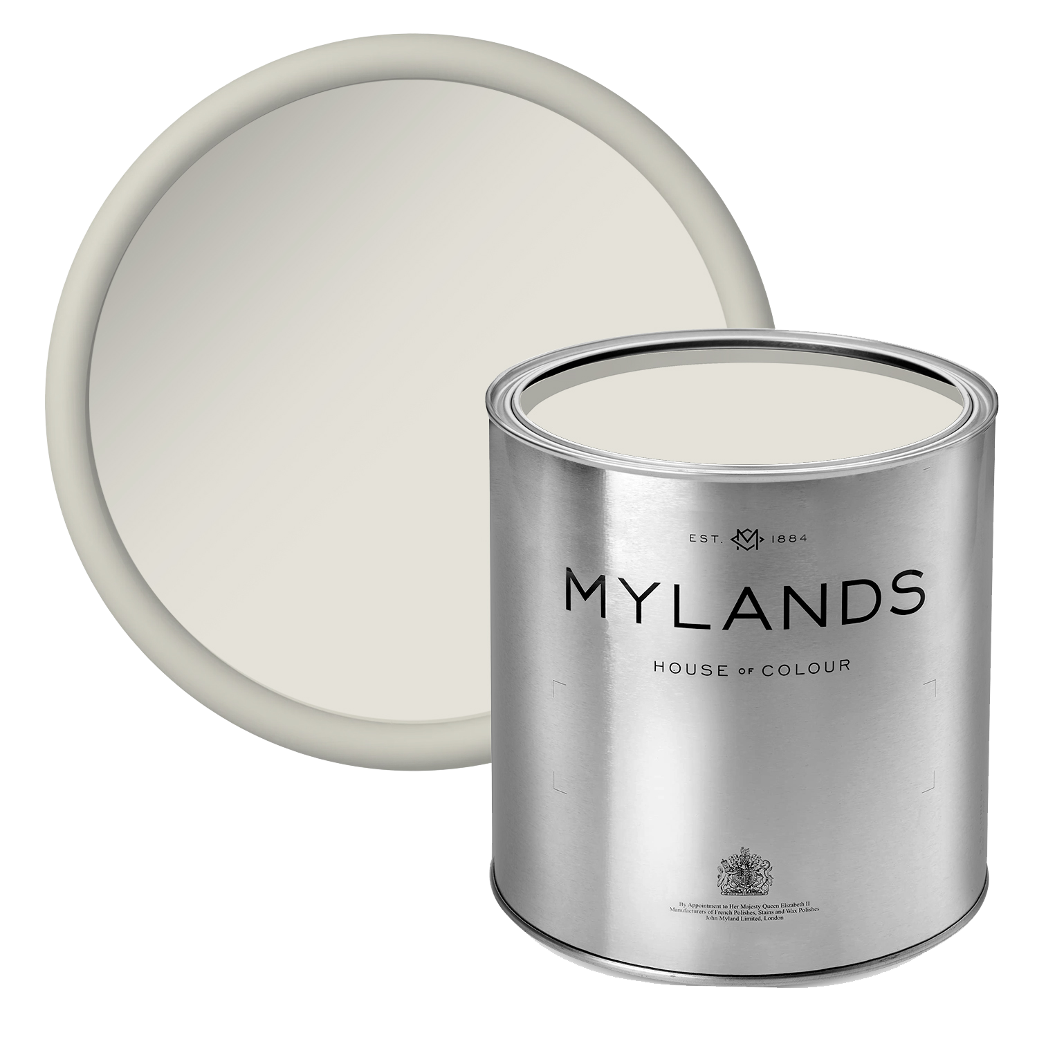
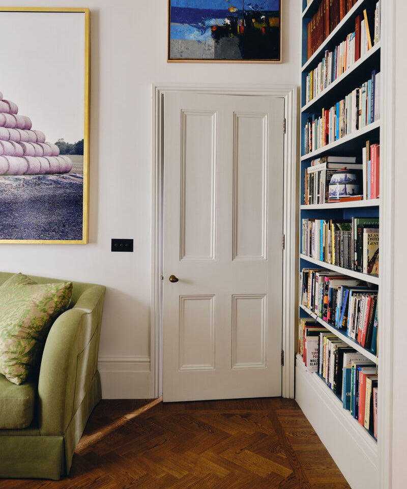
Warm pink and crisp white
Warm, cheerful pink walls are offset by crisp white ceilings and woodwork. It’s an easy combination that works every time, whether you have a bold, fuchsia or magenta pink or a subtle, baby pink. All different shades of pink will look great against a brilliant white.
In this photo, the walls are painted in Mylands' Covent Garden Floral™ No.270 paint. It’s verging on red in colour which gives it great warmth and depth. This is an archive colour, but it has a modern, floral appearance. It would sit nicely beside a bold, floral wallpaper with white woodwork and ceilings to provide balance.

Back wall in Covent Garden Floral™ No.270, front wall in Smithfield™ No.19

Back wall in Covent Garden Floral™ No.270, front wall in Maugham White™ No.2
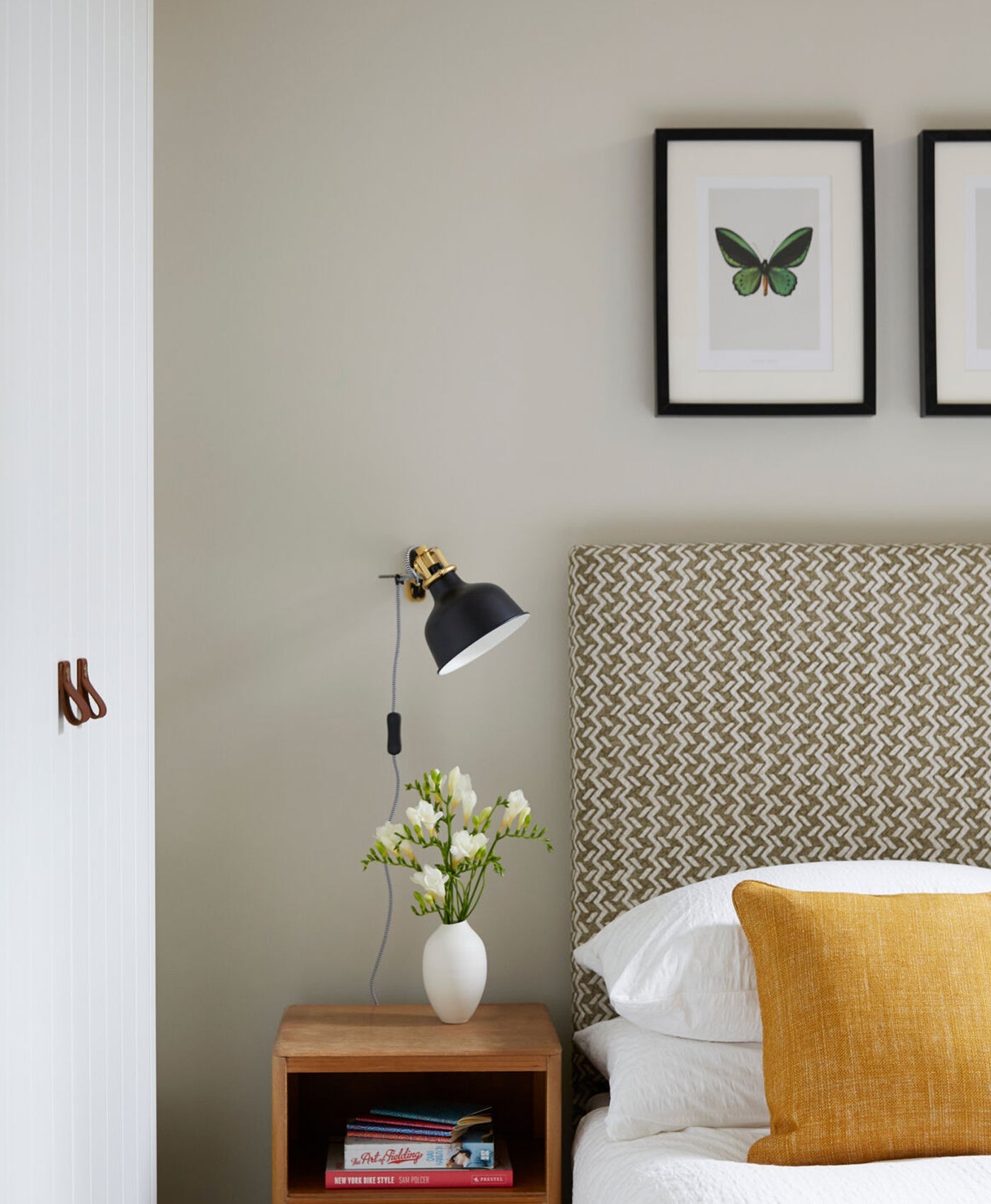
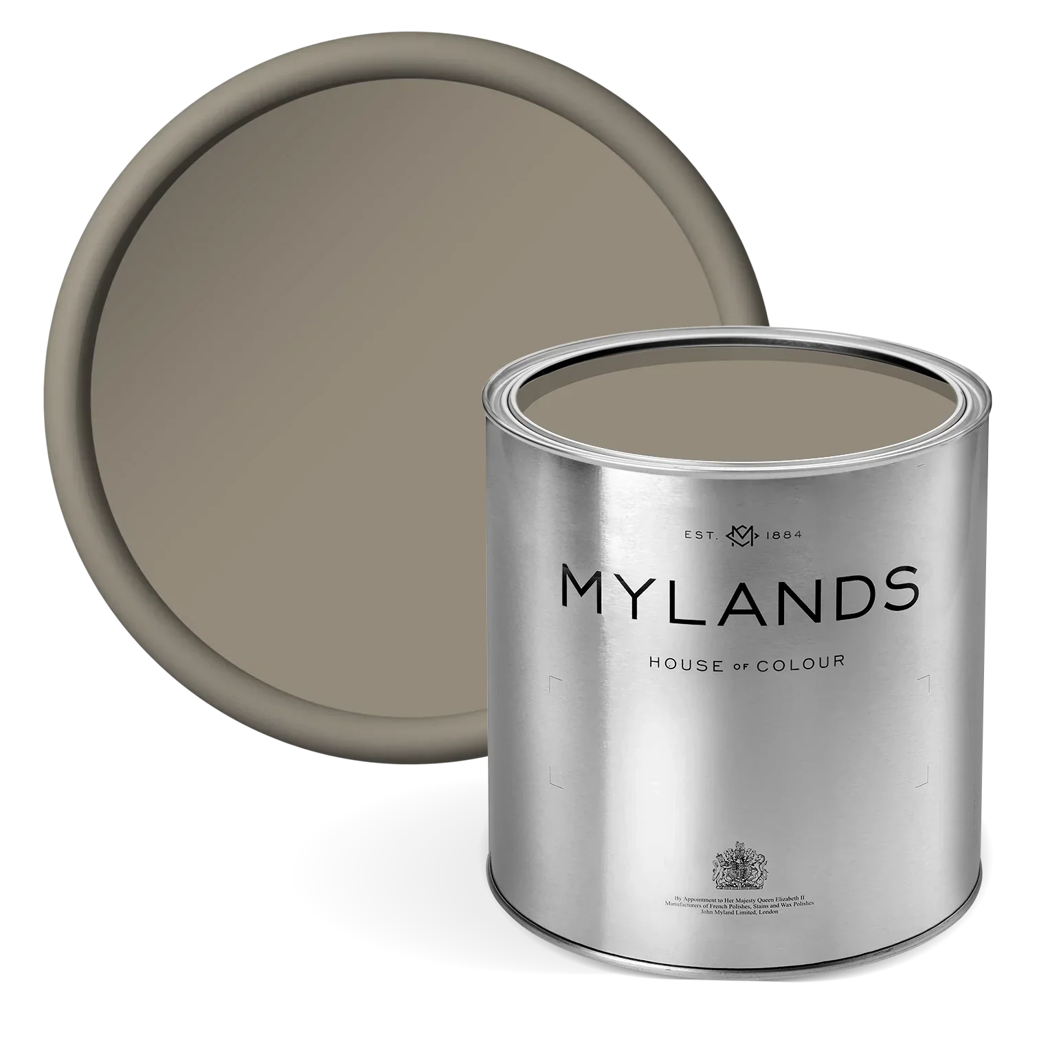
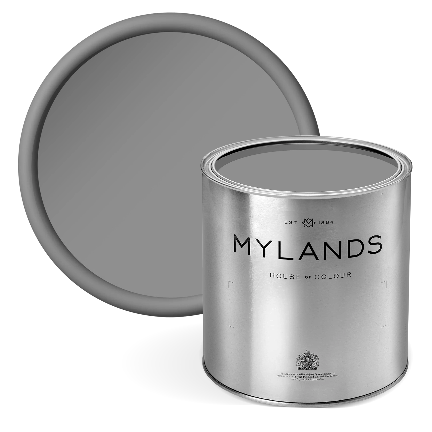
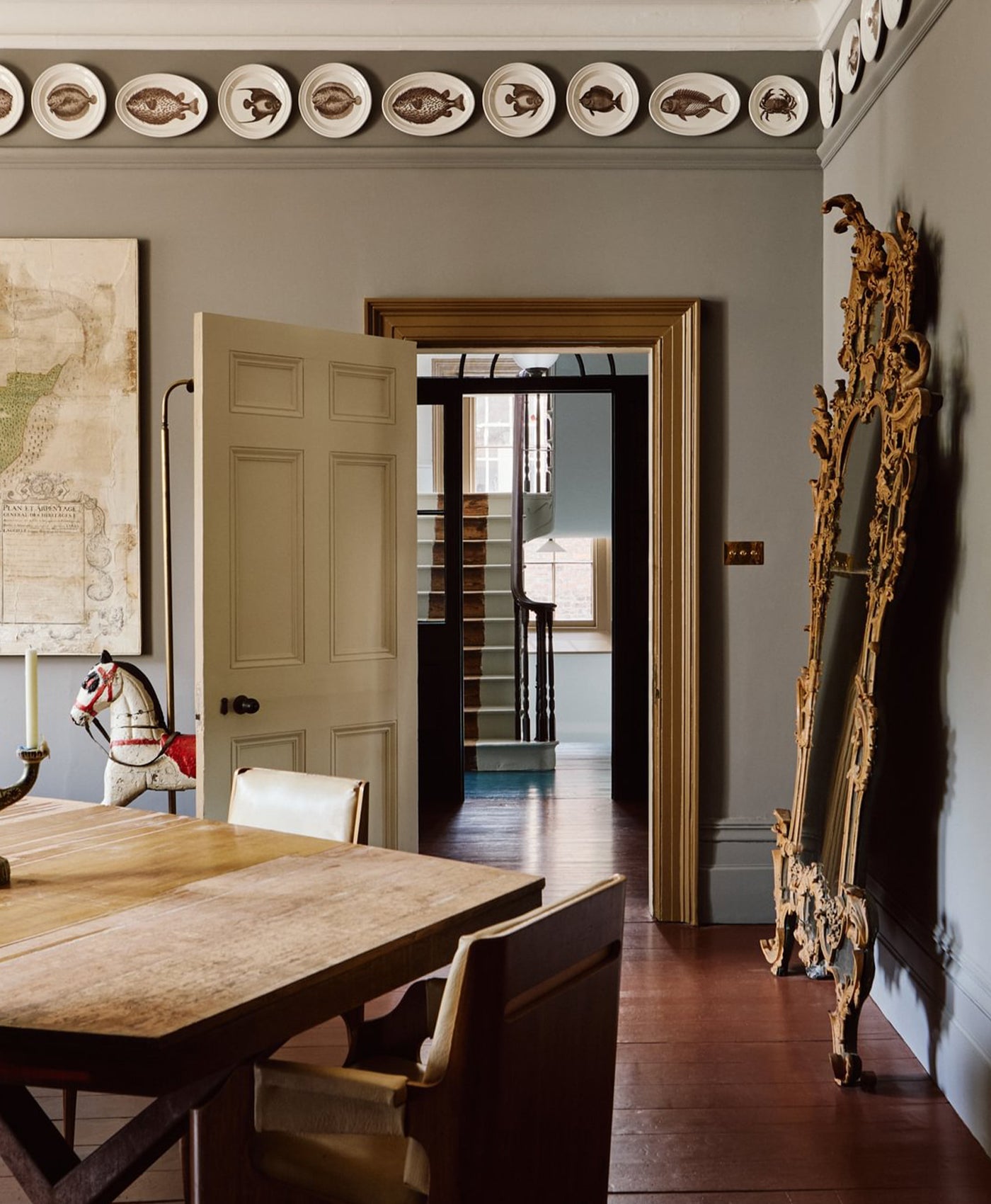
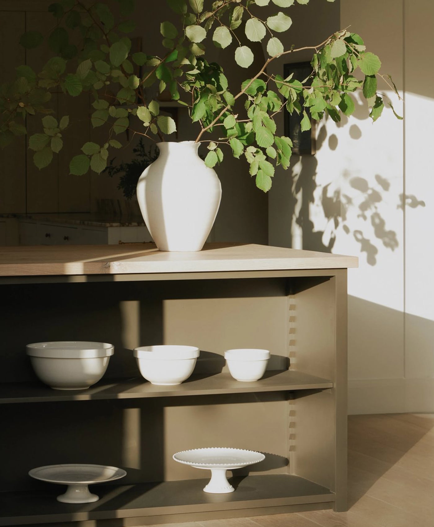
Subtle pink and steely grey
Home decor was awash with grey as a new neutral for a while there. Now, we’re moving on from that with new colour palettes and combinations.
Subtle pink and soft grey tones are very easy on the eye as a colour combination. Whilst the pink adds warmth and a touch of playfulness, the grey grounds it with a cool earthiness.
Pink can lift a room with grey tones. For example, with an industrial look, especially using on-trend concrete. The pink adds softness against stark, hard textures and tones. It provides a much-needed balance.

Upper wall in Rose Taupe™ No.292, Lower Wall in Gentleman’s Pink™ No.221
Light pink and rich burgundy
This light and dark pairing is a classic. Burgundy incorporates tones like aubergine and maroon too. A pale pink adds the lightness that will offset the rich, deep burgundy shade.
Opt for more lilac tones of pink, like lavender or even bubblegum pink. These complement the deep aubergine colour well and prevent the room feeling dark and oppressive. They contain some bluish hues that you find in the deep shades of burgundy.

Walls in Threadneedle™ No.262, Woodwork in Pale Lilac™ No.246 - @halfpaintedhouse
Panelling in Lavender Garden™ No.30
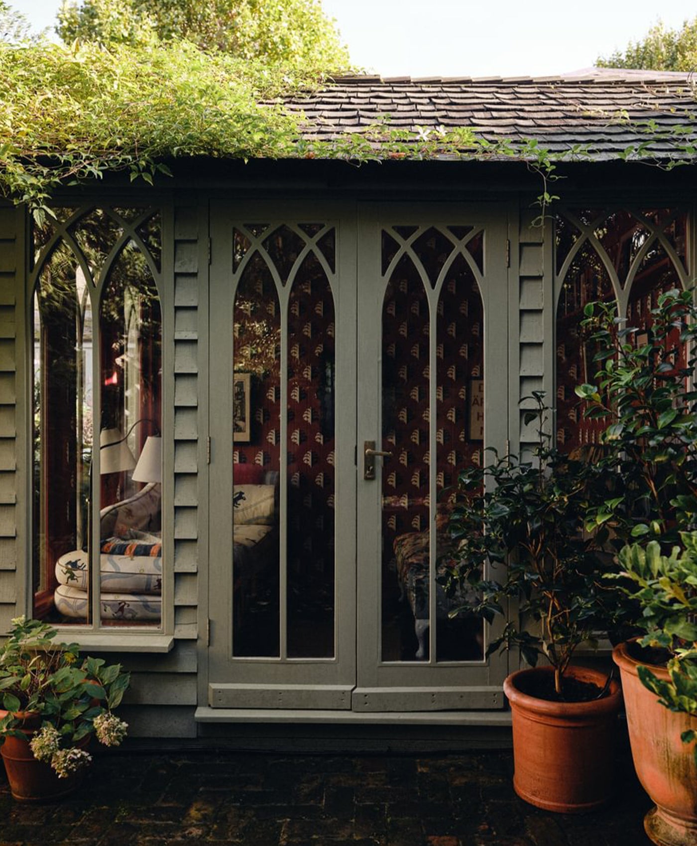
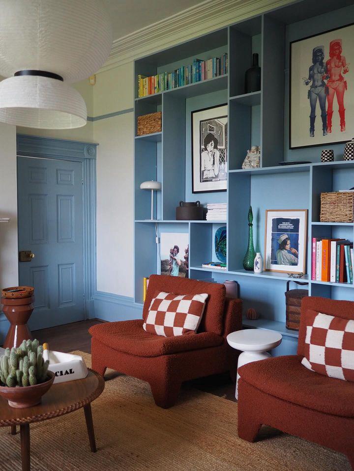
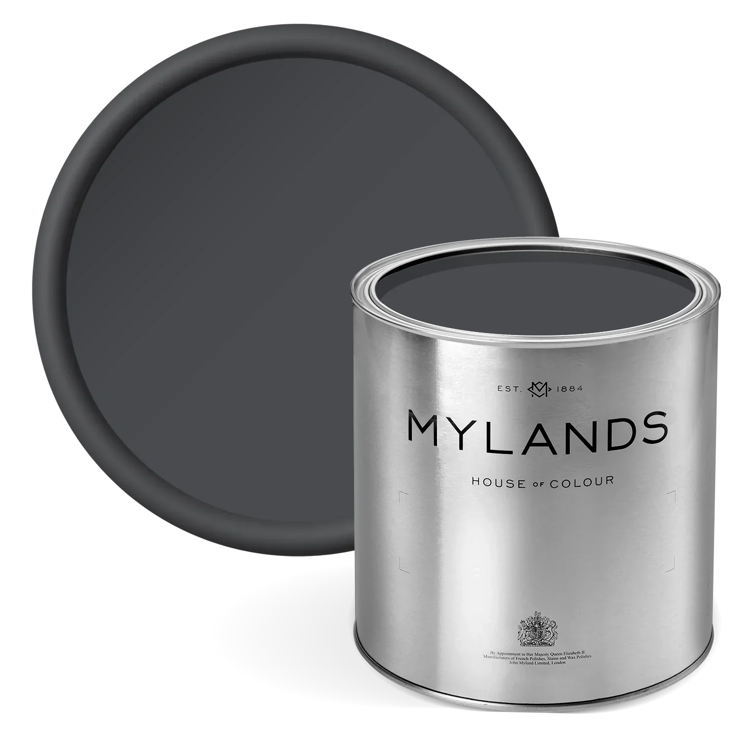
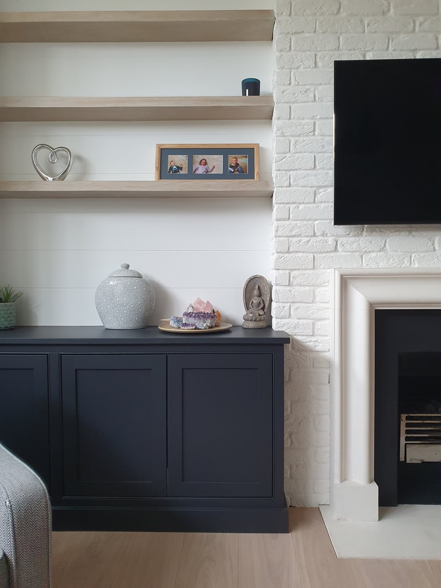
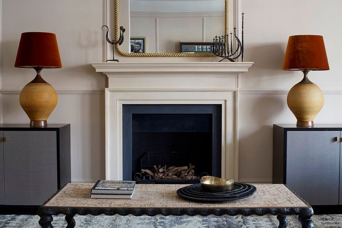
Soft pink and sleek black
This is a grown-up, sophisticated style. It’s a pairing of opposites - soft and light pink with sleek and dark black. Sensual, tactile textures like velvet or faux fur work well in this scheme. Add further contrast with smooth elements such as luxe metal or marble flooring.
In this photo, the walls are painted in the very pretty Mylands' Soho House No.266 paint. It has a slight grey tone to it, which sits well against the matt black floor and furniture. If you want to inject fun and excitement, splashes of flamingo pink or hot pink are the best colours.

Walls in Soho House No.266, Skirting in Oratory™ No.237, Floor in Downing Street™ No.10

Walls in Rose Theatre™ No.249 - @Claudiainteriors
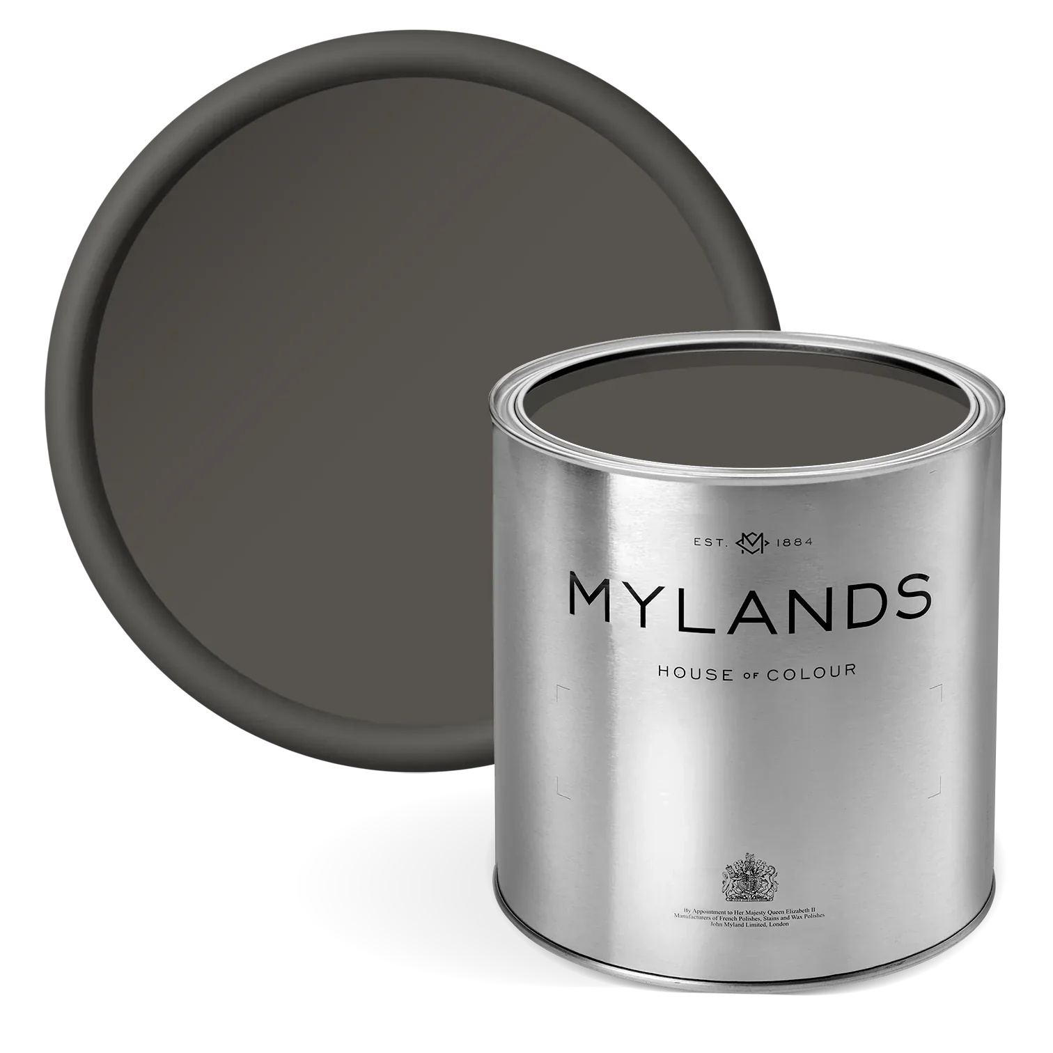
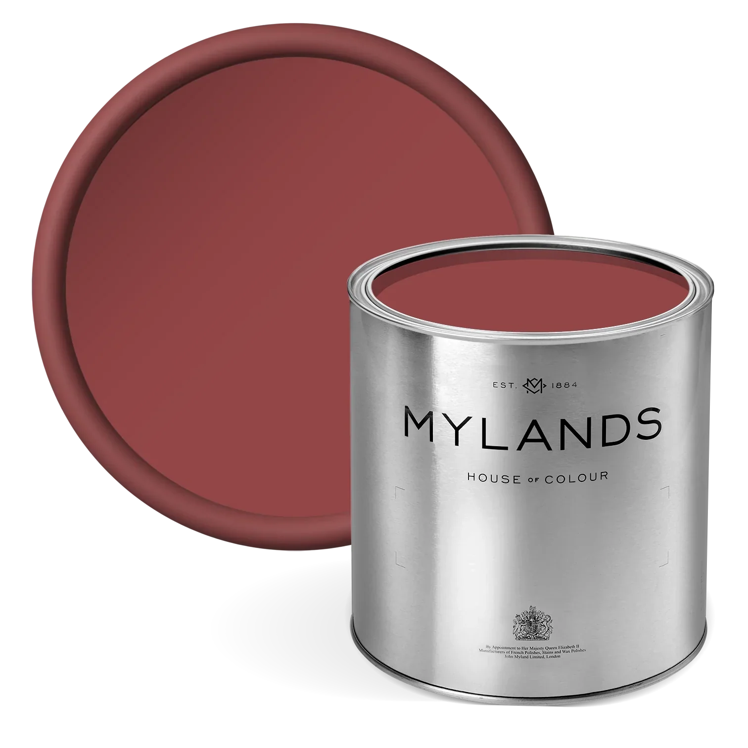
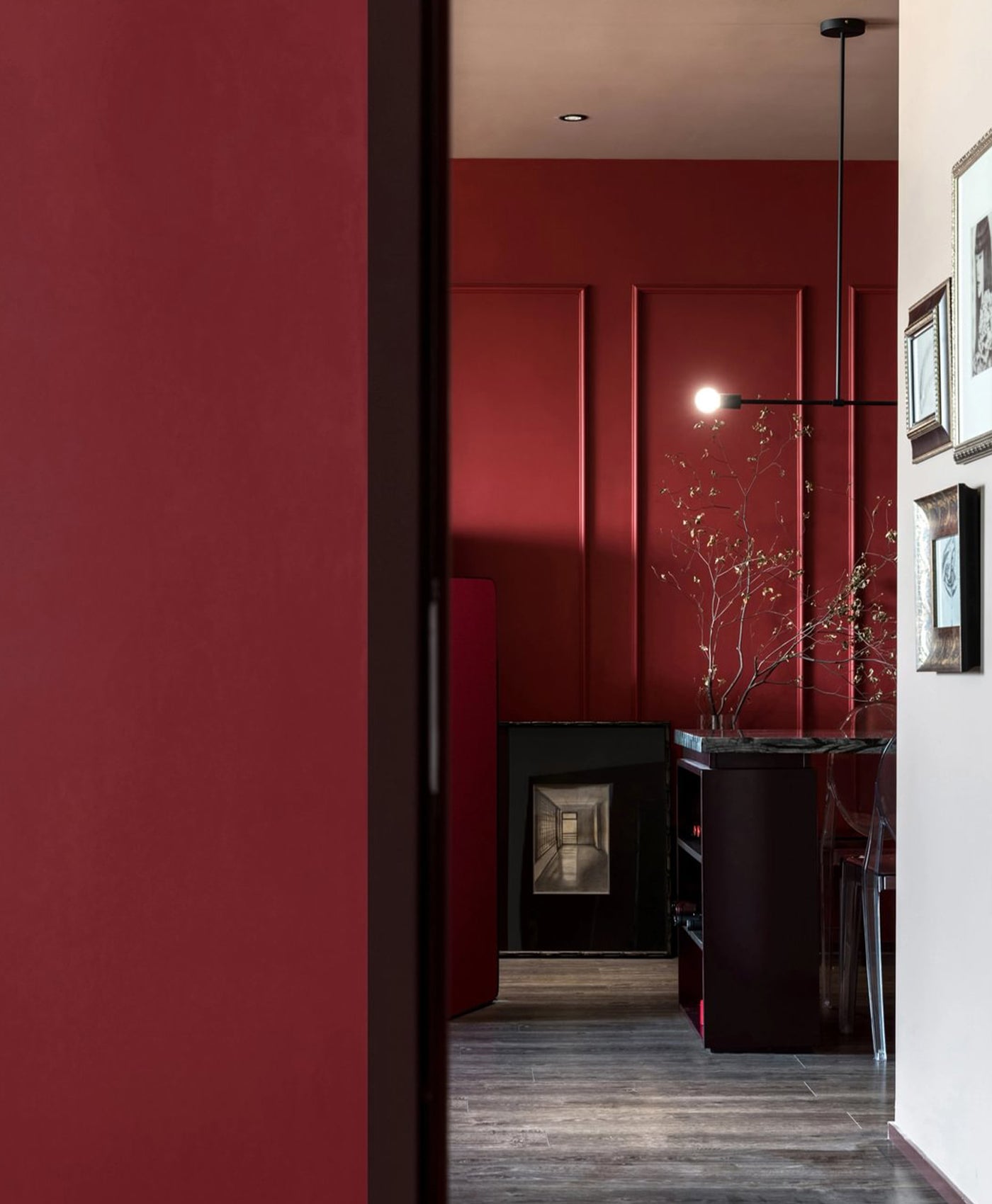
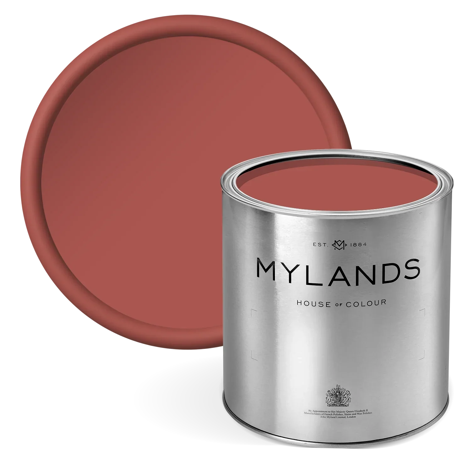
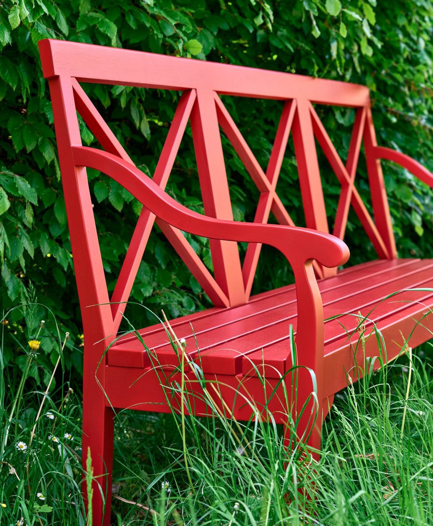
Cool pink and dramatic red
You may have been told that pink and red together is a colour pairing no-no. Well, we’re here to shatter that myth. These tones sit next to each other on the colour wheel and, as such, they can make an impactful combination.
Dark shades will add some drama - just look at this Mylands' Theatre Land™ No.282 red on the lower walls to see the statement it makes. Soften it with a lighter, neutral pink, or go really bold with another deep, rich shade of pink. You’ll feel warm and comforted by this colour combination.

Lower walls in Theatre Land™ No.282, Upper walls in Pale Lilac™ No.246
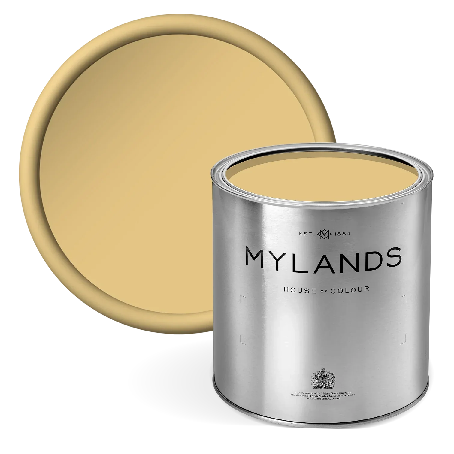
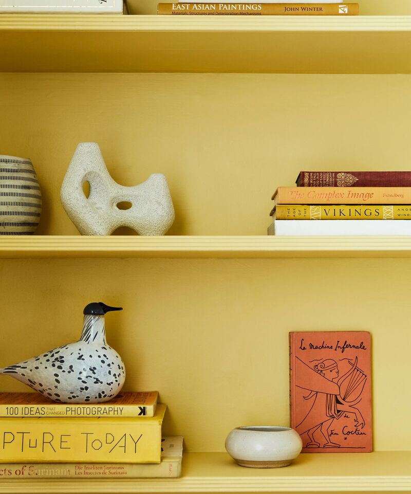
Cheery pink and metallic gold
We’ve seen this combination a lot in recent years, and that’s because it looks so good. Metallic golden accessories sit stylishly alongside a bright pink wall. As you’ll see in the photo below, the warm golden accessories work well with the light pink walls. If you opt for lighter gold items, choose a dark pink to compliment them.
This colour pairing lends itself to different styles. It can look super modern and luxe or retro and homely. It all depends on the accessories used and way that you style them.

Walls in Floris™ No.27, woodwork in Pink House Pink - @halfpaintedhouse
If you’re thinking pink, take a look at the extensive range of pink paint colours by Mylands. We’re here to help you choose your colour and the amount of paint you’ll need.